Today, we’ll be continuing on the topic of communicating research using R Notebook. We’ll continue working on a basic framework that you can use to communicate research findings using R. For the first part of this series on communicating reproducible research, check it out here.

Making The Hypothesis
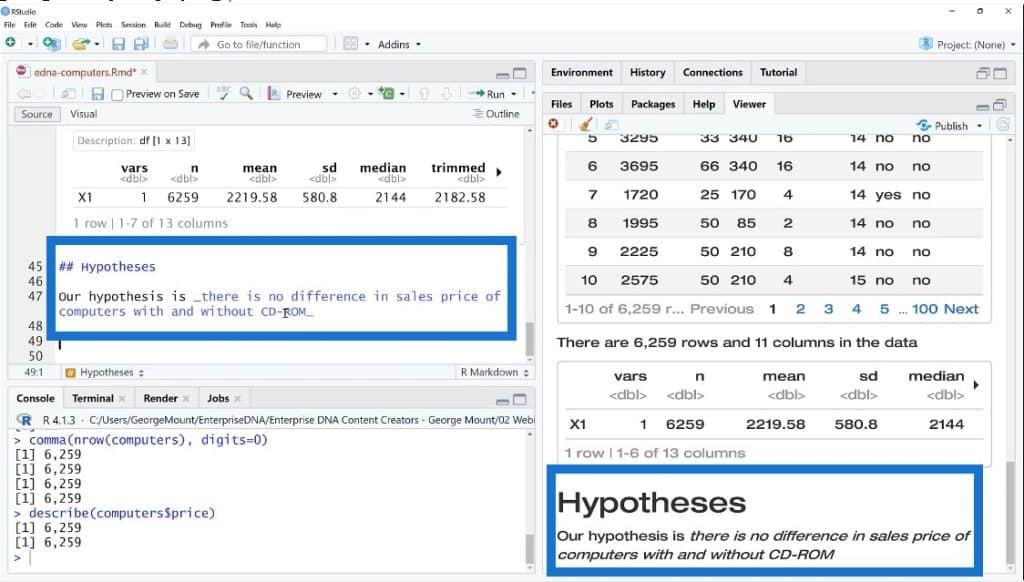
The next step in our report is making the hypothesis. We will create another section on the viewer pane and collapse the other ones so we can see the high-level reports.
For the hypothesis, we’ll write that there is no difference in the sales price of computers with and without CD-ROM.
Creating The Methods In R Notebook
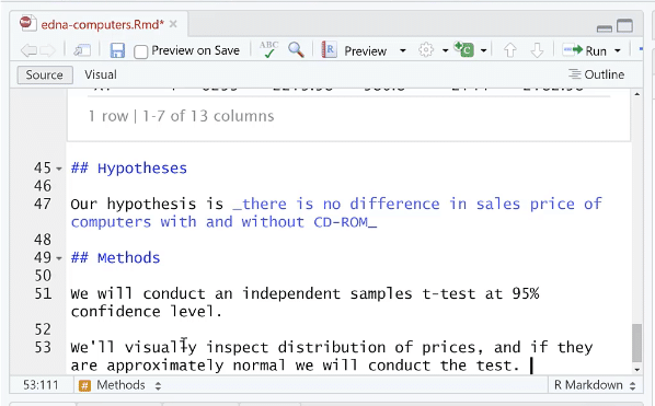
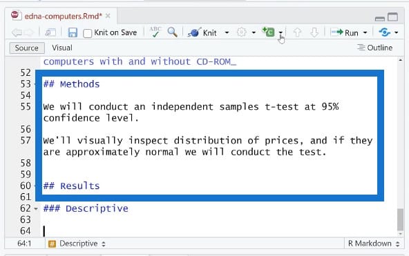
We’ll move on to the methods, which will address the actual techniques that we’ll use to answer that hypothesis. We may not need to do any kind of inferential statistics. Depending on the audience, we will be doing a high-level research report in this scenario.
We’ll be saying that we will conduct sample tests at 95% confidence level and we’ll visually inspect distribution of prices. If they are approximately normal, we will conduct the test.
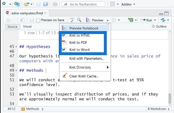
After we’ve saved our hypothesis and methods, we can render them as an HTML file, PDF document, or Word document from the Preview tab.
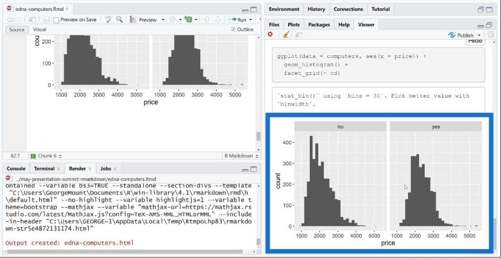
Once we send this out as an HTML, this is what we’ll see in the render box.

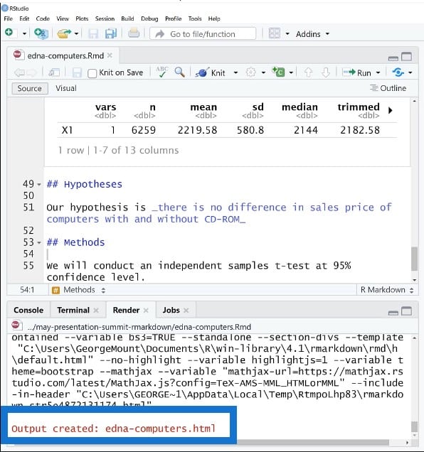
It says here that the output has been created, so let’s go over to our File Explorer to check this out. Once we have this opened in our HTML file, we can see that this looks really similar to what we had in the Preview button.
We are not seeing any error messages at this point and we also see room for customization. We can even write a whole book or website using these tools with R Markdown and R Notebooks.
Let’s get back to our script and continue along. We’ll write down the methods we’ll use as well as our results. We’re basically open sourcing our plan and we’re making it clear that we’re not throwing things at a wall just to see what sticks. We’re not improvising when we get to the data; we actually have a plan.
There is some benefit to trying out a lot of different things, right? But in this approach, we’re purposefully saying, “This is what we’ll do, and then we’re going to do it.”
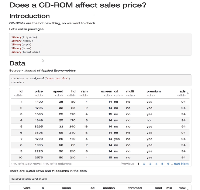
Working On Descriptive Statistics In R Notebook
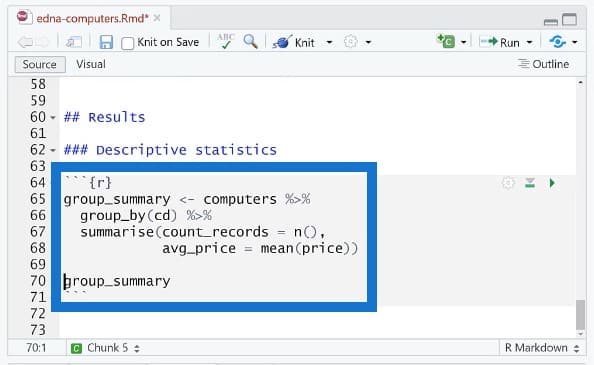
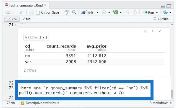
Let’s do our descriptive statistics. We want to find the price for each group with and without a CD-ROM. There are a few ways we can do this. We’ll call this group summary and bring in this pipe operator. If you’re not familiar with the pipe operator, you can check out the resources that I talked about earlier.
Then we’ll do summarize and count records to find the average price = mean price. Lastly, we’ll want to print this group summary and then run this.
And here we go. We now have our table.
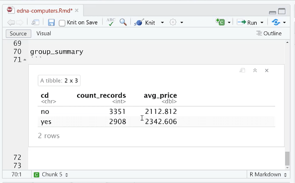
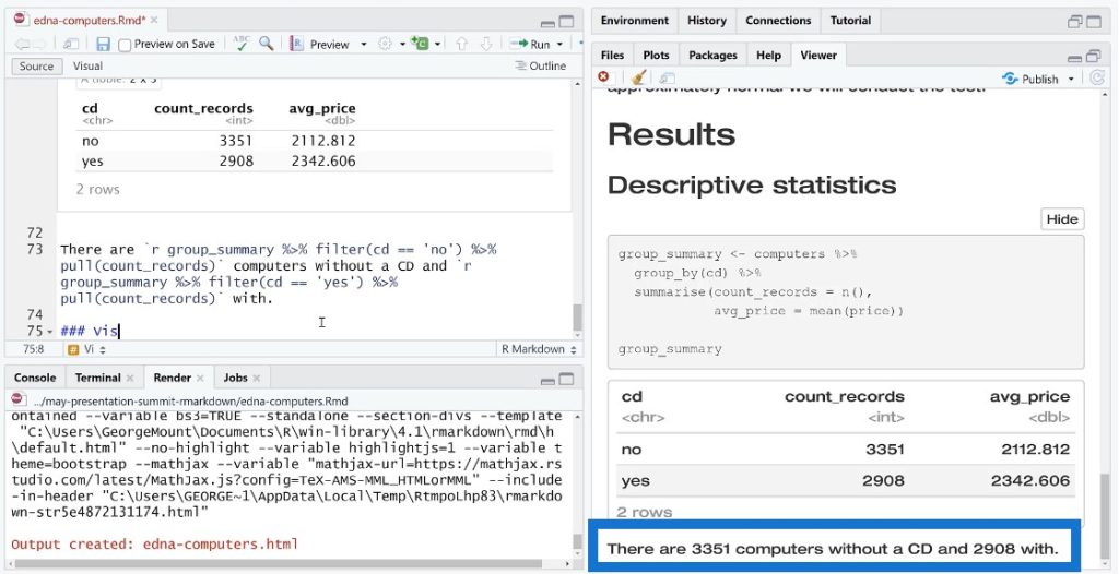
Like I said earlier, we want know how many observations there are in each group and what the average price is. We can make this totally dynamic with an inline reference.
We’ll do a group summary and use tidyverse operations. We’ll filter this row and then take one of these values and turn it into something that will actually render in our inline reference here.
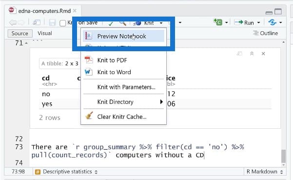
After saving, go to Preview Notebook to see the result.
Building Visualizations In R Notebook
R is very well-known for its visualization capability. For our visualization, we’ll use ggplot. We’ll put the price on the X axis and then create a histogram. We’ll also create small multiples for the facet, which is actually pretty easy to do in ggplot.
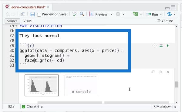
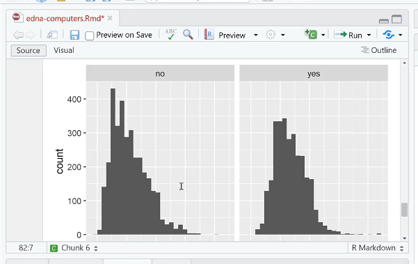
We could change a lot of things here such as the title, background, color, et cetera. Once we save this, we can see the plot. This is not interactive right now, but there are a lot of ways to make it interactive in R. For this example, we’re doing just a static plot.
Our results show something that looks like a bell curve distribution, which means we should keep going with our analysis.
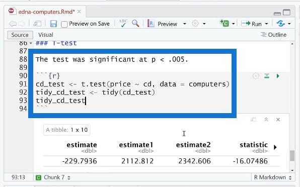
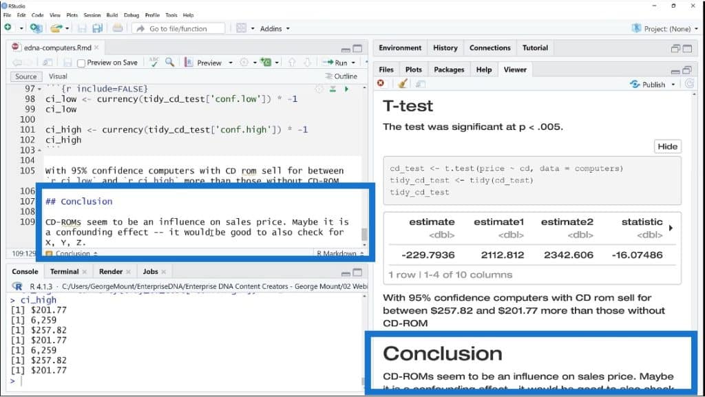
We’ll run the T-test results and plug them in to the report. We’ll add another R chunk and call it cd_test. If we run this now, the result will contain a lot of information and it will be very hard to pull out individual elements out of it.
We’ll use a tidy function to put this in a tabular format. Once we do a tidy cd_test, it will turn everything into a nice table structure. We could also print this to actually show in our report.

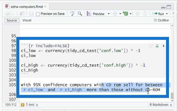
Another thing we could do is to find the lower and upper confidence intervals. We don’t want to show this part because this is just staging.
Overall, it looks like a live and dynamic document, and is so much better than copying and pasting individual data points and tables into a report. You can send this to a coworker and ideally, they can just click on Preview to know what you did and be able to build on this.
Ending With A Conclusion
We’re nearing the end of our report so we’ll be writing the conclusion.
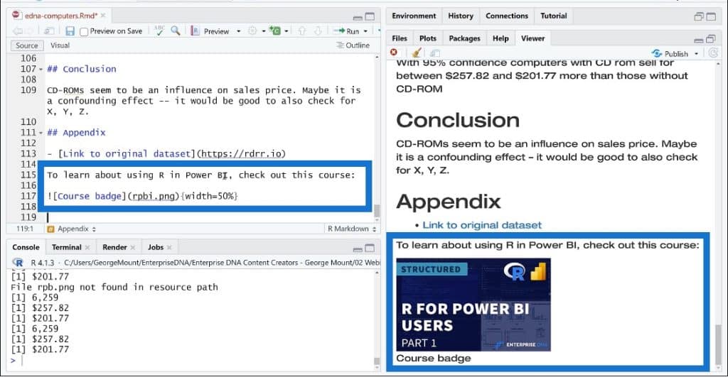
We could also include an appendix here to show our resources. The nice thing about having an appendix is that if you end up presenting this or showing this to somebody, they will ask who your data source is or how something was measured. These are all valid questions, and having an appendix with resources is really helpful because then you can just point to the appendix.
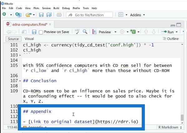
We could also include an image and use alt text. This is a good practice to basically describe what an image is showing. If you’re an HTML user, you could embed this image using HTML.
***** Related Links *****
Upcoming Course: Basics Of R For Power BI Users (Part 1)
Power BI With Python Scripting To Create Date Tables
Python In Power BI: How To Install And Set Up
Conclusion
For this tutorial, we actually went through an entire report. This is a very rough draft, but we’ve managed to use R Markdown to create a structure for our research report.
We started off by talking about reproducibility where everything is documented. You can use R Markdown and this framework to create things like websites, books, and blogs. Almost any kind of product that you need to build as an analyst can be created using RStudio.
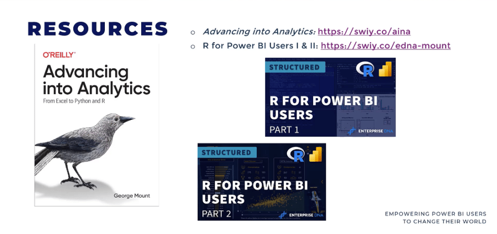
For further reading, feel free to check out my book called Advancing into Analytics. This is a good, basic introduction to data analytics and statistical analysis using Excel, Python, and R. I also have courses on R for Power BI Users. You may see a third course in this series at some point as well.
I hope you learned some things from this R Notebook tutorial, and would love to see how you end up using these tools.
George Mount