When it comes to presenting the story, we need to start with the layout. This is where the rule of thirds comes into play. What is the rule of thirds? The rule of thirds is a data storytelling method of arranging the elements within a composition.
If we divide the frame with two vertical lines and two horizontal lines, we end up with nine boxes.
The idea is to align the points of interest along the vertical lines or where the lines intersect to come up with a more pleasing, and balanced composition.
Importance Of The Rule Of Thirds In Paintings
This rule of composition is highly used in photography, video, and cinema.
In fact, during the Renaissance, they started to use this when new styles of painting emerge. The objective is to tell richer, and more complex stories.
Contrary to what they used before, the main character or main point of interest was placed in the center. When you have the subject in the center of the frame, there is an equal distance in all directions, which tends to make the size static with no movements and no interaction.
They discovered that they can showcase more of the background and create more conversation by taking the subject out of the center and moving it along to one of these intersecting lines in the frame.
There are nine equal blocks that we can divide with four intersecting points. Placing your subjects within these four intersecting points creates more dynamic communication.
When you take the point of interest and move it to one of these intersection lines, it creates more of a dynamic image. It allows the eyes to come into the frame, look at the object, look at the background, have a more natural flow, and connect to what they see.
One of the concepts or theories behind framing allows us to create more dynamic images.
Valentin de Boulogne Painting: A Great Example of Rule Of Thirds
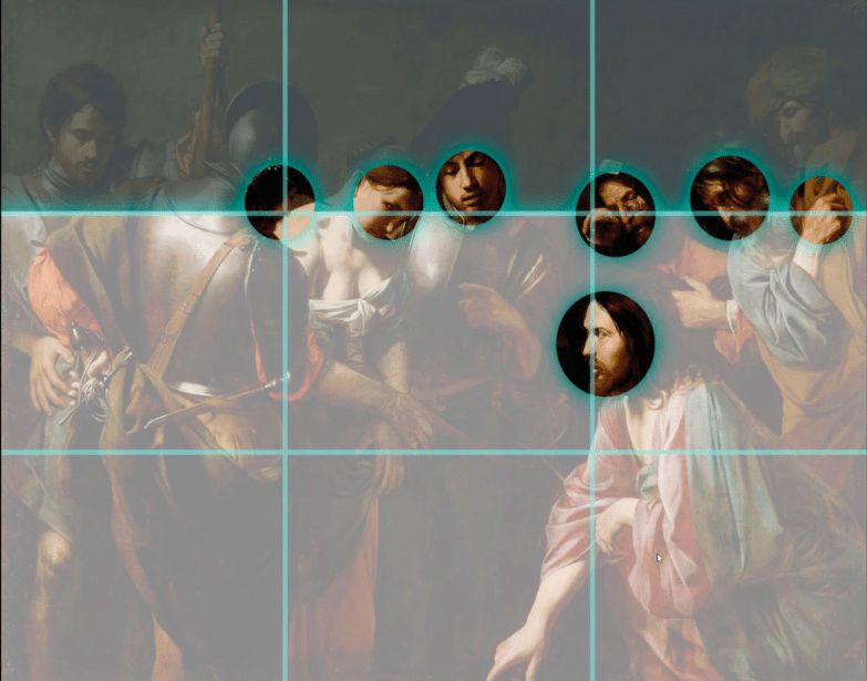
This painting by Valentin de Boulogne shows how the main character is all placed at the upper defining line, creating a dynamic arrangement of figures.
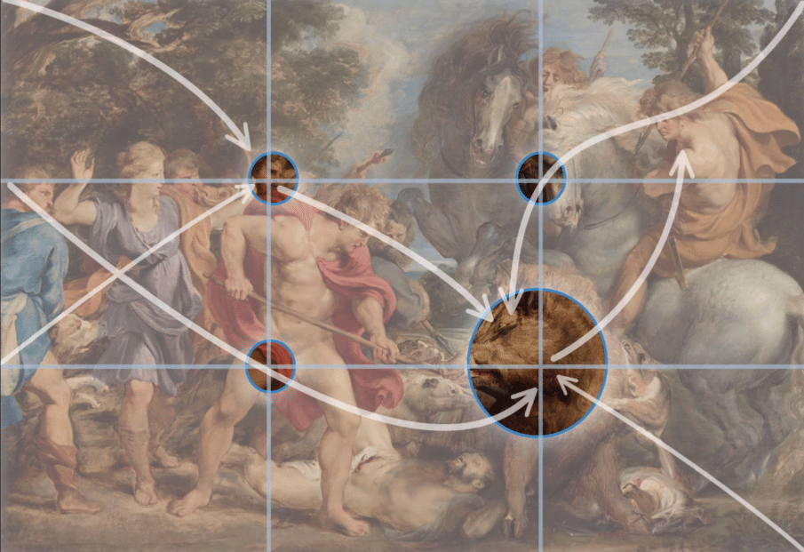
The ‘Eye Flow‘ is another great use of the rule of thirds in this painting by Rubens. The main focal point of the board is placed at an intersection, and the secondary point of interest follows intersections as well.
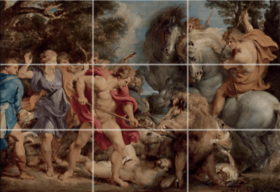
The action of the poses leads the eye from one focal point or intersection to another.
Importance Of Rule Of Thirds In Reports
Without a doubt, the rule of thirds can be very useful when creating reports as well.
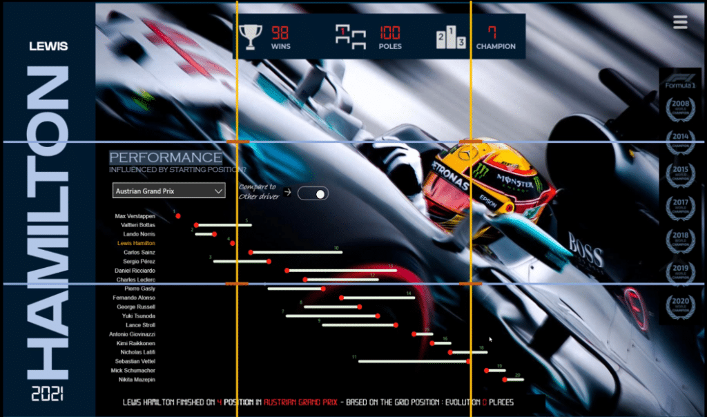
Let’s take a look at this report that I created inside Power BI. We see how the use of the rule of thirds points to the helmet of Hamilton.
One of the main ideas of the rule of thirds is creating a connection with a viewer and telling the story by anticipating or controlling how the eyes will move from one part of the screen to another.
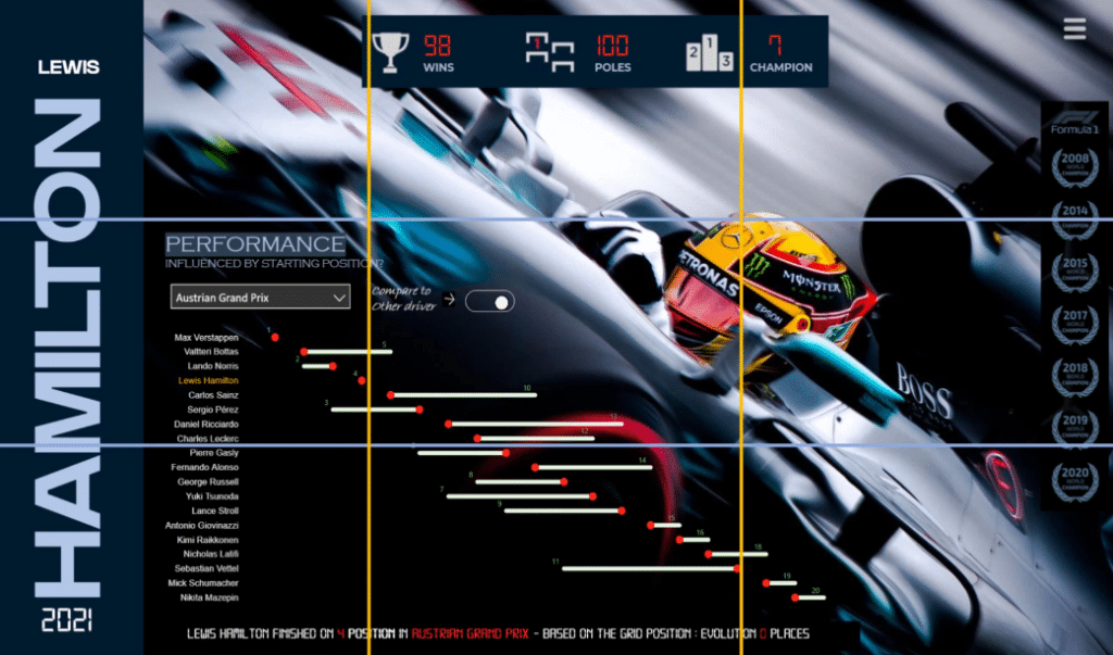
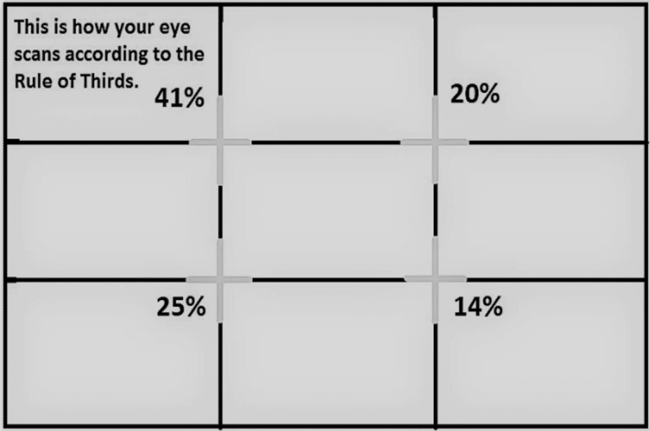
According to the rule of thirds, we know how the eyes are scanning a particular image or painting, which is why we divide our report.
In addition, the box’s position is hugely important in the order and the way the user will interact. We generally give more focus to the top left corner of any visuals or design.
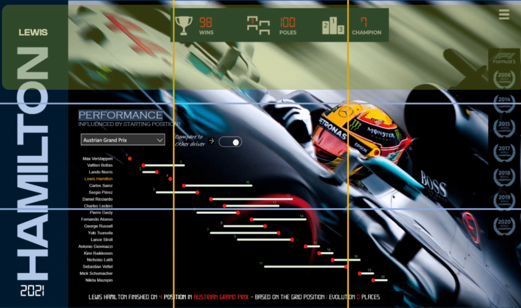
First, we look at the top left spot and gradually move to the right corner, then we continue by performing a sort of ‘Z.’ We give the least attention to the bottom right spot.
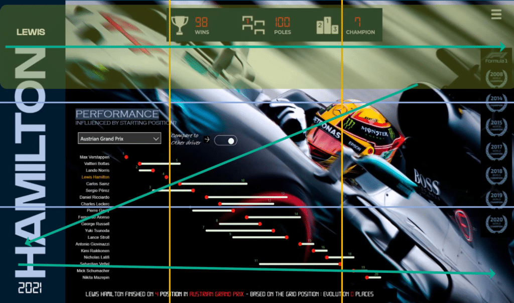
This is the visual distribution for our eyes.
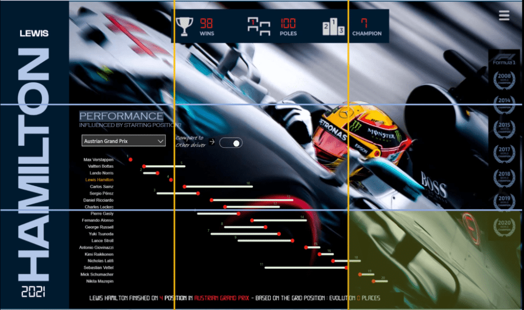
This is the primary reason we usually place the KPIs or filters on the top part or left part of the screen, and the title on the top left.
***** Related Links *****
Thoughtful Planning & Creation Process
Power BI Dashboard Examples: Less Is More
Report Visualization Framework In Power BI | Part 3
Conclusion
In summary, the designer can highly influence the way the user looks at the report by using color, shapes, size, space, and orientation of elements.
Grid placement should be evident in report design because it’s the way the report is consumed by the viewer. Lastly, consider how you place your visuals and pay attention to the size of the visual spaces, and the alignment.
All the best,
Alex


