I’m going to show you something quite cool that I saw in a recent Power BI challenge submission that we ran at Enterprise DNA. These are great techniques you can use when reporting in Power BI. You may watch the full video of this tutorial at the bottom of this blog.
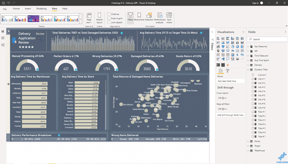
This topic is from the Power BI Challenge 4: Delivery App Review. The submission that I’ll showcase in this tutorial was made by an Enterprise DNA member. I loved the ideas that were embedded into this submission.
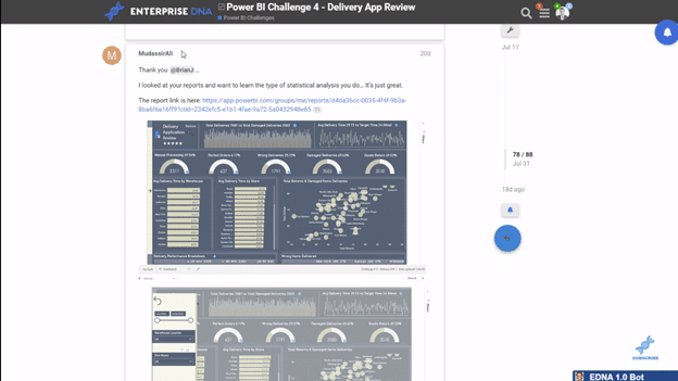
If you’re not aware of the Power BI Challenge, it’s something that we run on the Enterprise DNA Forum. The great thing about the challenge is that anyone can join and enter the challenges. Getting involved is probably the best learning experience that you can have for Power BI.
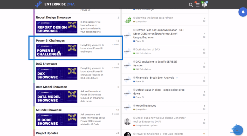
Just go to Enterprise DNA Forum and click on the category, Power BI Challenges.
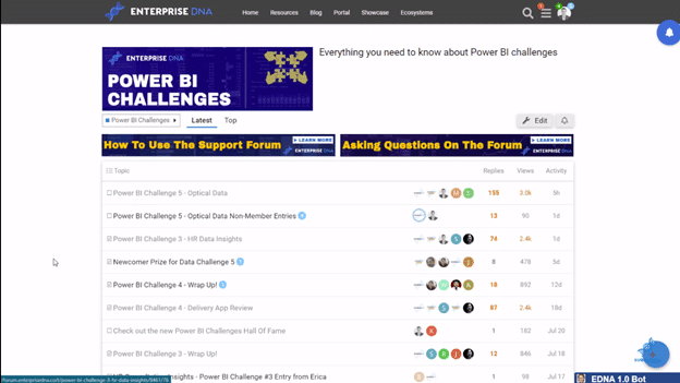
You’ll find the latest challenge on the page and you’ll see that there’s a huge amount of activity. It’s going to get bigger, so definitely check it out.
Using Bookmarks & Dynamic Measures
What I really liked about this report is the use of bookmarks and dynamic measures within text boxes. It’s a bit of a different experience on Power BI Desktop, but if you were accessing the Online Service, all you would need to do is literally click on these elements, as shown on the picture below (small blue circle on the upper right of the visualizations).
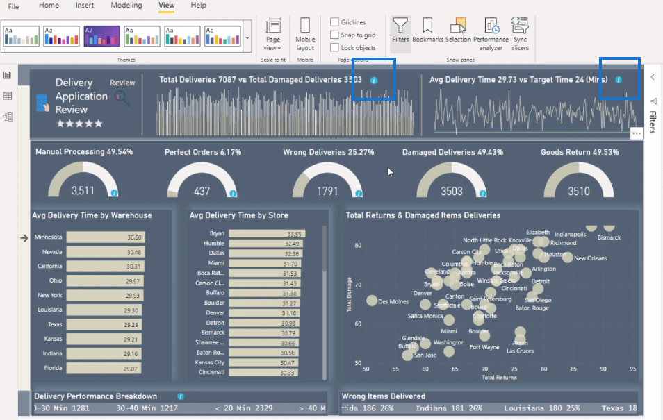
With these bookmarks, users can get some information about the visualization. If you’ve used PowerPoint, you’d put some text or details on what is shown in your report. But in this case, you can do it without taking up any room in your report. This makes reporting in Power BI so convenient and efficient.
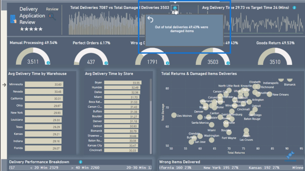
In this report this is just literally a rectangle shape. Within this rectangle, a card visualization is embedded. And within the card is a dynamic measure with text. You can see in the Fields area, there are Dynamic Titles.
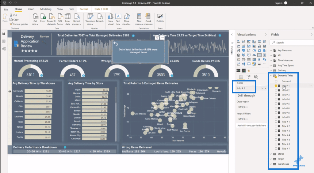
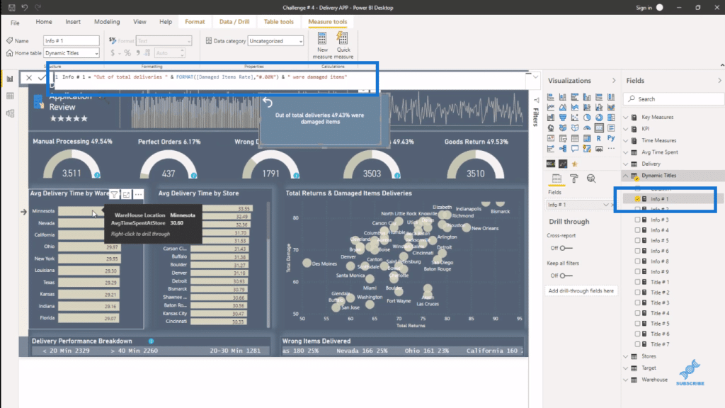
So, these titles (Info #1, Info #2, Info #3, etc.) are literally dynamic. If a selection is made then the result in the text box actually changes, along with the rest of the report.
For instance, I’ll select Nevada, you’ll see that the text changes dynamically as well as the results in the other visualizations. There’s also an arrow in the text box to click if you want to go back.
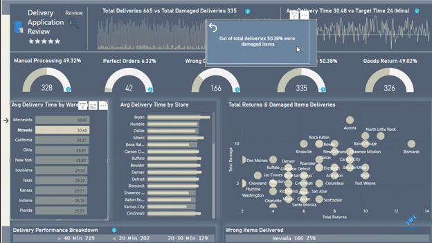
You can then just use your creativity here. You could add some logos or icons if you wanted. Why not explore this more and see how you can apply some creativity to your reports?
Creating Information Boxes
It’s all about combining Bookmarks. You can find some Bookmarks within the View ribbon. You have the option of showing or hiding the information box.
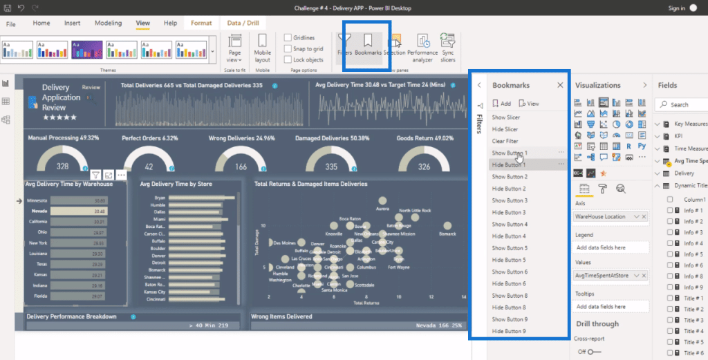
I also like how you can have these information boxes within the visual itself or a chart. And this is dynamic as well. If you click on the information box, it leads you to a measure, which has some text written out in. It’s embedded in the card visual.
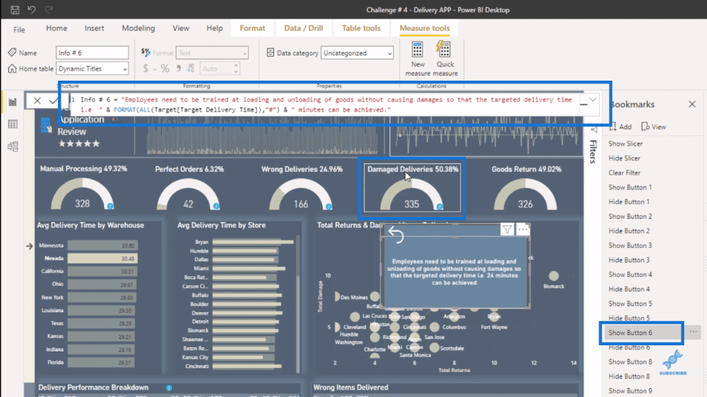
You can put anything any type of information into an information box. This an awesome idea and development!
This is why I love the Power BI Challenges because I would never have done this ordinarily. I wouldn’t have gone through and created something like this.
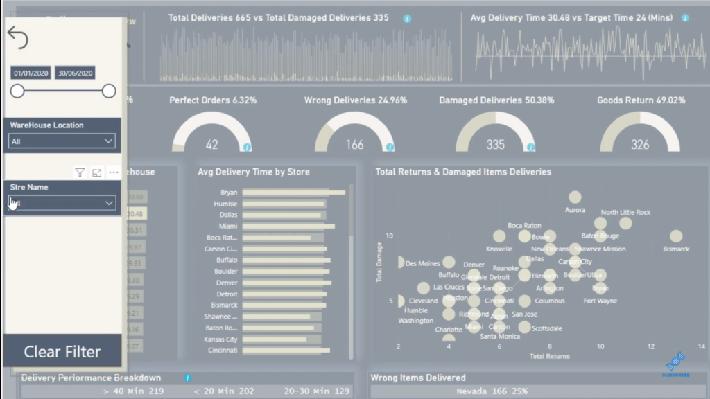
There’s also a filtering box here (click on the small arrow on the left). Just think about how much you can drill in and out in Power BI, and get more granular in your data sets through general filtering. You can already fit so much just on one page, but then think about how much more you could get in.
***** Related Links *****
How To Create A Dynamic Power BI Report
Sort Visualizations Dynamically In Your Power BI Reports
How To Add Custom Icons Into Your Power BI Reports
Conclusion
Think out of the box in terms of your visualizations when reporting in Power BI, and how you actually make it happen.
The team at Microsoft is making this easier all the time. A lot of this wasn’t even possible a couple of years ago. It hasn’t been up until recently that they developed the tools to actually enable these kind of things.
If you want further inspiration on how these are created, go to the Enterprise DNA Forum, and you’ll find individual write-ups on every submission.
I’m also reviewing a lot of these write-ups and giving tips, and we’re seeing enormous improvement. The submissions are improving because everyone’s leveraging off other people’s ideas. And that’s the great thing about this community. You get better because you’re part of it.
I hope that you learn a lot from this tutorial and use it when reporting in Power BI. Check out the links below for more Power BI content.
Cheers!
Sam


