
In this blog post, I want to teach you how to show your customers moving through groups over time in a dynamic way. You can do this ranking visualization in Power BI using a unique slicer. You may watch the full video of this tutorial at the bottom of this blog.
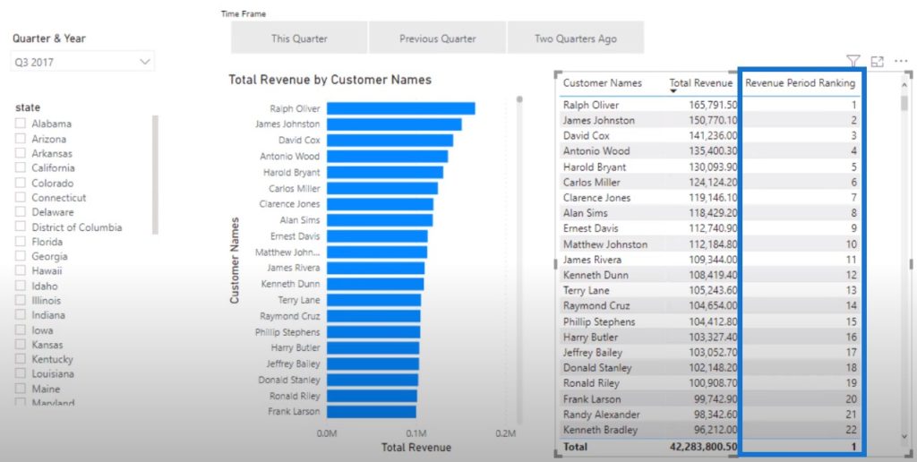
When I click This Quarter, I want to see who my Top 20 clients are within this ranking visualization. Then when I click on the Previous Quarter and Two Quarters Ago slicers, I also want to see who were my Top 20 clients for those time frames. This, for me, is a really compelling ranking in Power BI visual that was not possible not too long ago until Power BI enabled conditional formatting within the charts.
The first thing we need to do is to create the underlying calculations. Since we already have the calculation for our revenue from This Quarter, we need to create the revenue calculations for the Previous Quarter and Two Quarters Ago.

Calculating The Revenue From Last Quarter
I’ll create a new measure and name it as Revenue LQ. We’ll use the CALCULATE function, and reference the Total Revenue. Then use the DATEADD function, reference the Date table column, and then write minus 1 quarter.
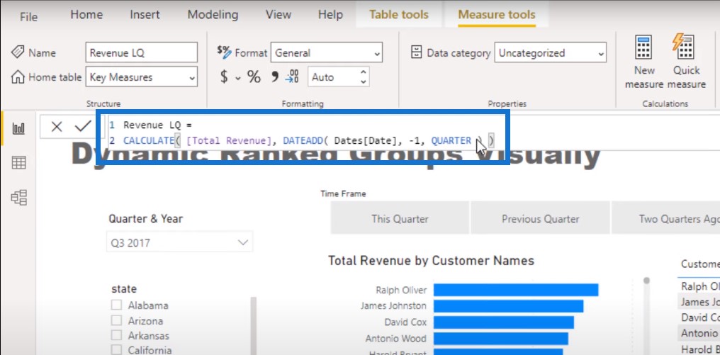
The DATEADD function is such a good formula to use because of its flexibility to quickly change to any timeframe.
Calculating The Revenue From Two Quarters Ago
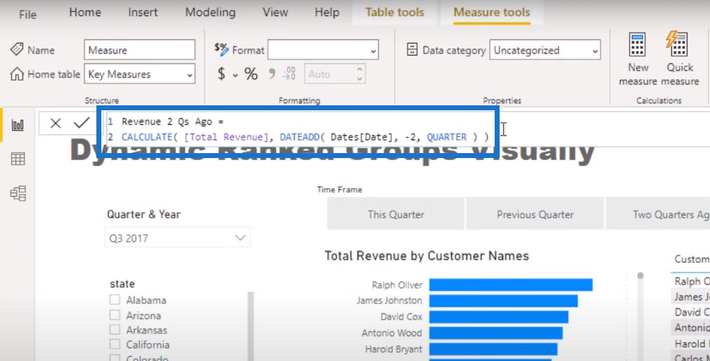
I’m going to copy this measure and paste it in the formula bar to create a new measure. Let’s call this one Revenue 2 Qs Ago, and then change the quarter from -1 to -2.
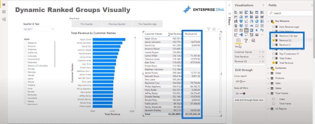
So now we’ve got all the revenues from the previous quarters. Let me just show you the revenue from last quarter.
Calculating The Ranking Of Clients
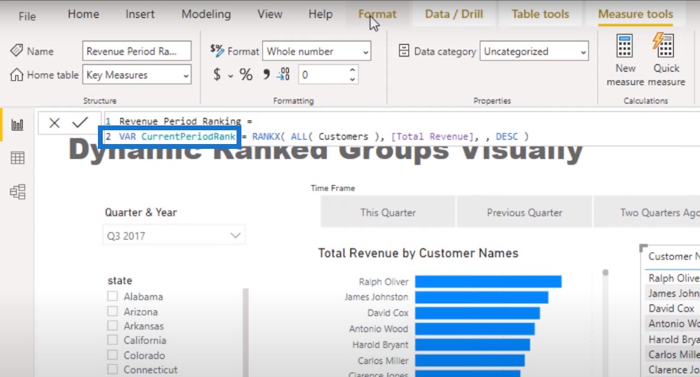
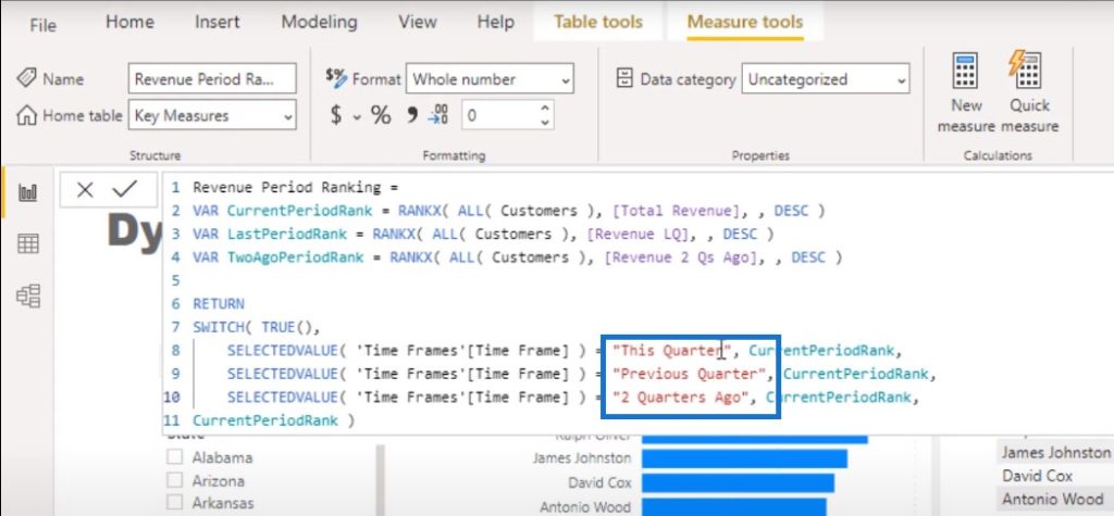
The next step is to create a ranking formula that indicates how a client is ranked. We’ll create a new measure and call it Revenue Period Ranking.
To start things off, I’m going to use the RANKX function and reference ALL of my customers. Then I’ll write an expression, which is Total Revenue, and put it in a descending order.

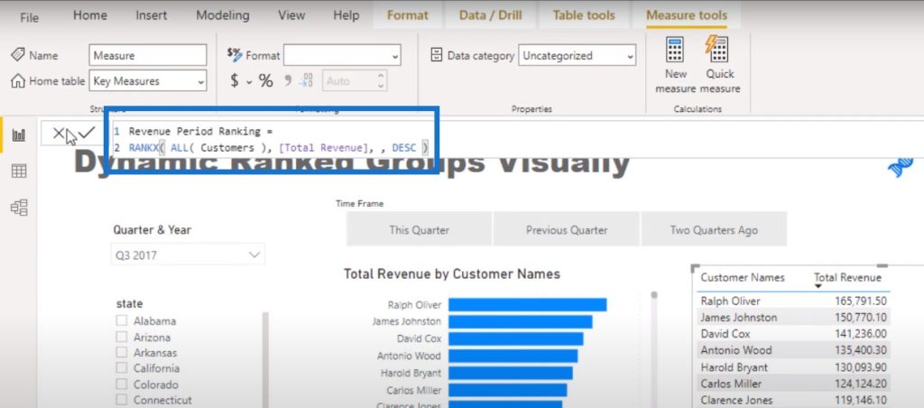
Now we can see our clients’ ranking.
I also want to embed the ranking measure we’ve made into the Total Revenue by Customer Names visualization in the left so I’m going to use some variables.
I’m going with VAR then CurrentPeriodRank. The great thing about variables is that you can name them whatever you like.
Then I’ll copy this down twice in the formula bar and change their names to LastPeriodRank and TwoAgoPeriodRank.
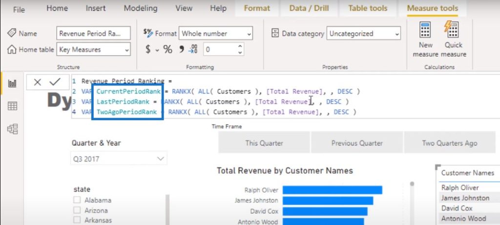
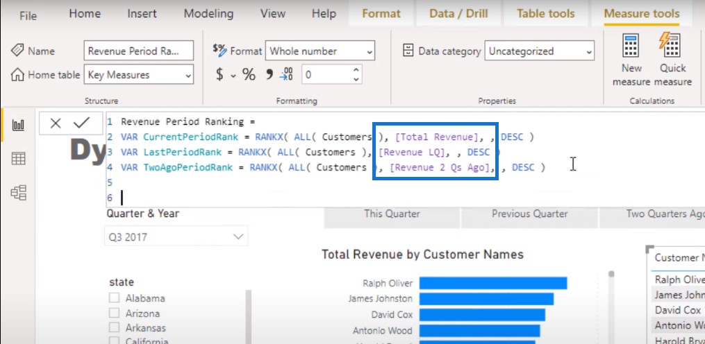
Then I’m going to input the Revenue LQ and Revenue 2 Qs Ago calculations that we just did.
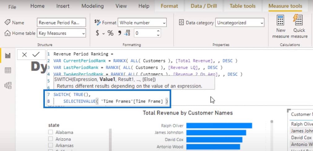
The next step is to match these up to whatever is selected in the slicer. We’ll use RETURN and then make a SWITCH TRUE statement.
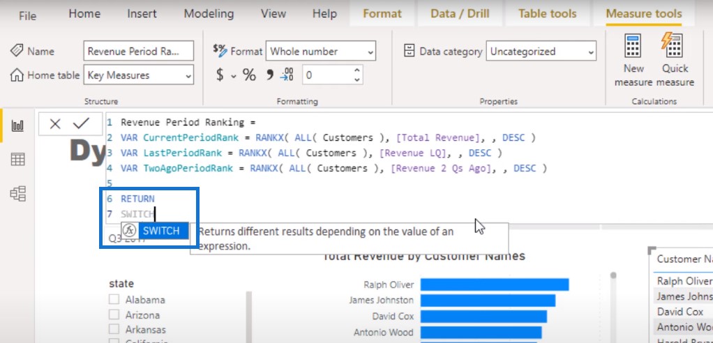
We’ll use the SELECTEDVALUE function and reference Time Frame.
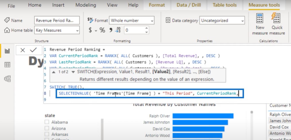
If the time frame is equal to this period, we want that to equal to CurrentPeriodRank.
At this point, I’m just bringing a lot of elements together here. I’m going to copy this portion of the formula twice.
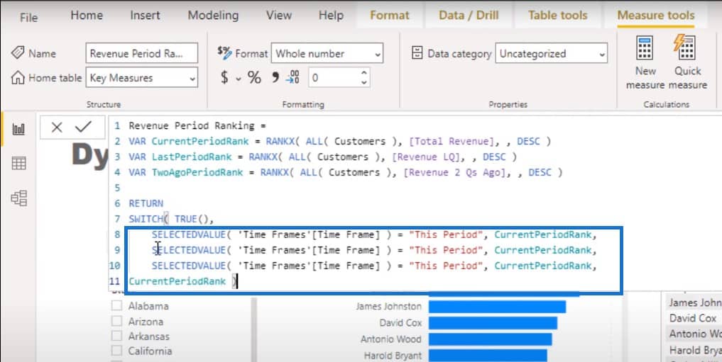
I’m going to change This Period to This Quarter, Previous Quarter, and 2 Quarters Ago.
The key here is that no matter what selection we make in the Time Frame slicer, the numbers under the Total Revenue column shouldn’t change.
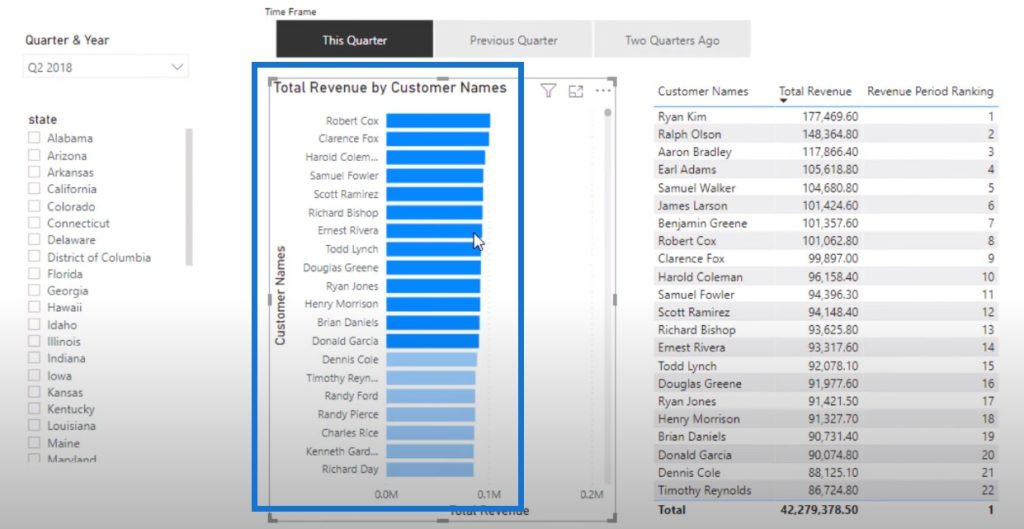
With Q2 2018 as the selected filter for Quarter & Year, this is the Total Revenue value for our customers and their ranking for This Quarter.
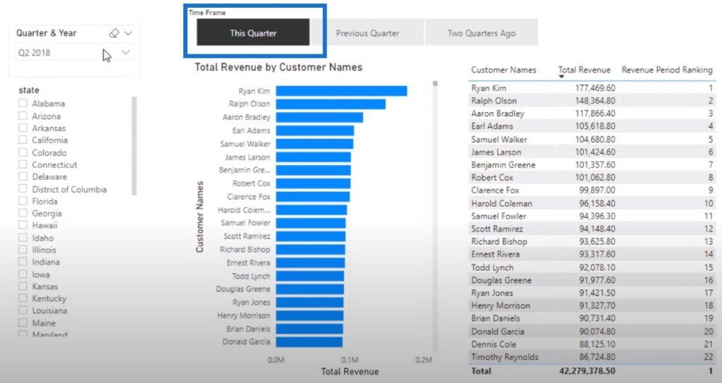
But we also want to see how these people ranked in the previous quarters. To do this, we just need to select the Previous Quarter and Two Quarters Ago from the slicer. Then the ranking number is going to change for each corresponding customer.
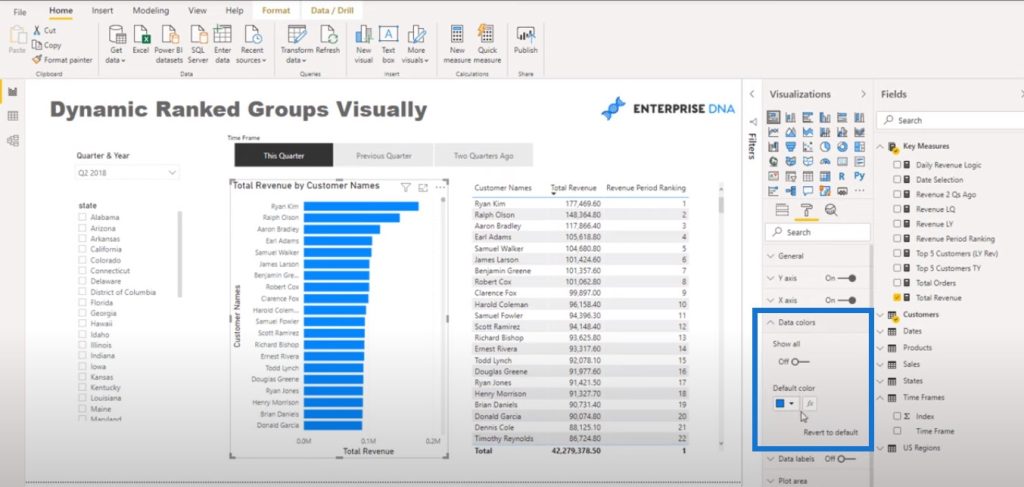
Using Conditional Formatting For The Ranking Visualization
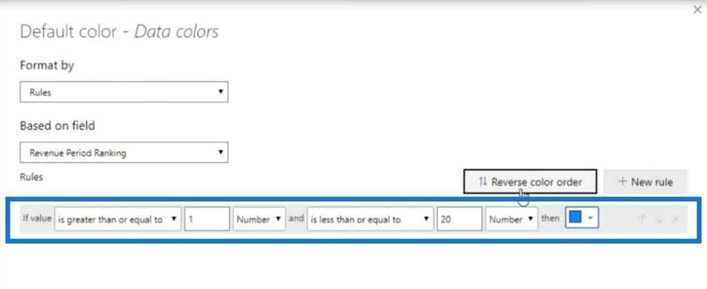
The last thing we need to do is go into the Data Color section, and then go to the Conditional Formatting area.
We’ll to the Rules section and then find the measure Revenue Period Ranking.

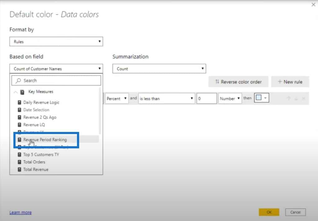
If the value of the number is greater than or equal to 1 and is less than or equal to 20, we want it equal to the darker blue color.
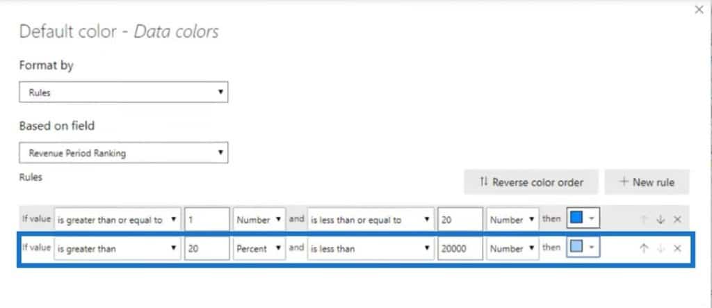
Let’s create a new rule. If it is greater than 20 and less than 20,000, then we want this to be equal to a much lighter blue color.
This is going to highlight the Total Revenue by Customer Names visual.
***** Related Links *****
Power BI Conditional Formatting For Chart Visuals – What’s Possible?
Showcase Unique Insights Using Conditional Formatting In Power BI
Custom Conditional Formatting Techniques In Power BI
Conclusion
To come up with this group ranking visualization in Power BI report, we used a couple of different techniques. We have a supporting table which determined the metric we’re looking at. Then within the measure itself, we used logic derived from a variable. And then to finish it off, we used conditional formatting within the visual itself to showcase some interesting insight.
I hope that with this tutorial, you’ll be inspired on how you can carry out these techniques in your own reports. There are so many different ways that you can use logic like this. That’s definitely the key takeaway that I want you to learn from this tutorial.
If you liked this content, then watch the accompanying video and don’t forget to subscribe to Enterprise DNA TV.
Cheers,
Sam
[youtube https://www.youtube.com/watch?v=IUI1M8HQenc?rel=0&w=784&h=441]


