Preattentive attributes play an important role in our report because they can enhance the user’s experience and overall understanding.

Our brain is prewired to process visual content much quicker than text that is why data design is so effective. By seeing the data, it is easier for our brain to intake and retain the information presented.
Preattentive attributes help you focus attention involuntary and spot patterns in an instant. The objective is to make sure that our information will clearly stand out to our readers.
To understand the preattentive attributes more, a great example is the Stop sign. We don’t even have to process the word written on the sign because the shape and color tell us exactly what we need to do and how to respond.

Here’s another example.
Take a few seconds to count the word DNA in the picture below. How many are they? The current answer is not impossible but is definitely challenging.
We cannot make a quick idea and we need to really focus, then manually count them. That’s not what we are going for when thinking about preattentive attributes.
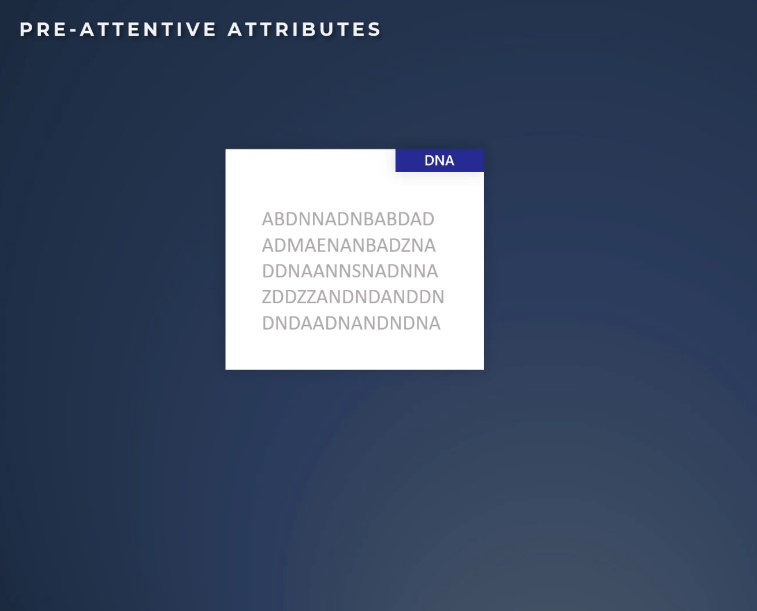
Right now, a simple change makes comprehension almost instant when it’s used properly. It can really direct our reader to what they need to see.
Different Types Of Preattentive Attributes
The enclosure is one of the several preattentive attributes and visual cues that are processed by the human brain in less than 250 milliseconds.
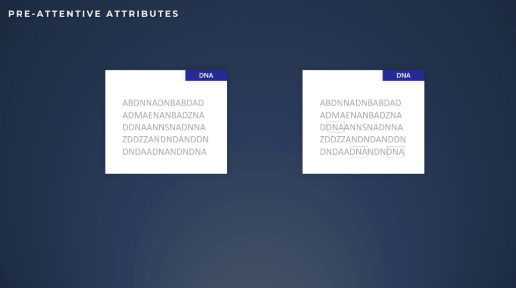
Contrast is also a very effective preattentive attribute.
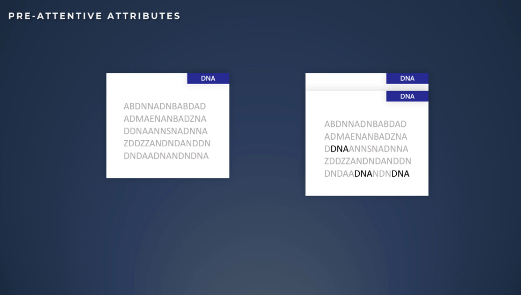
How about this example? Maybe it’s less effective than contrast but still good.
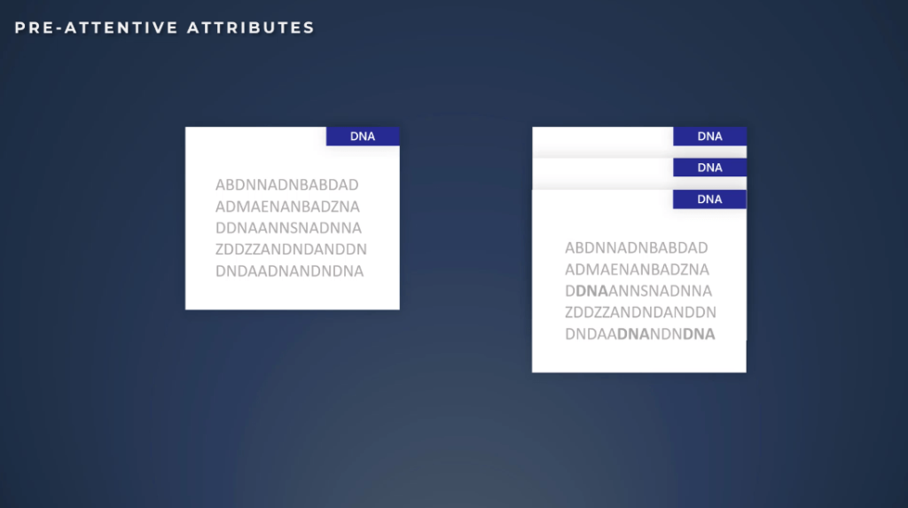
The size works perfectly in our example too.
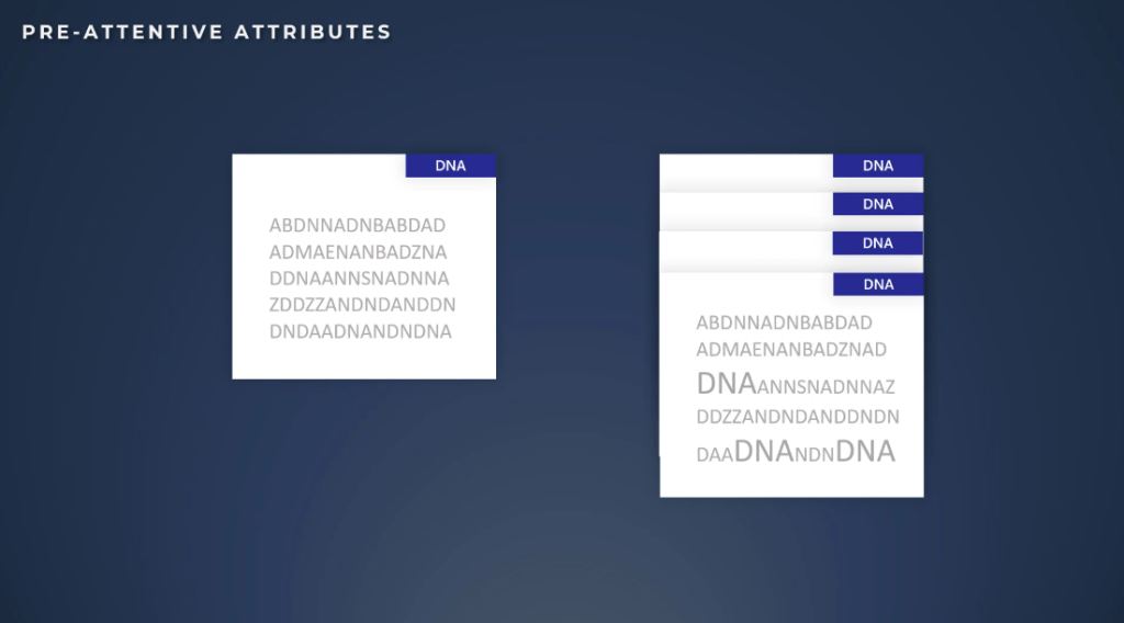
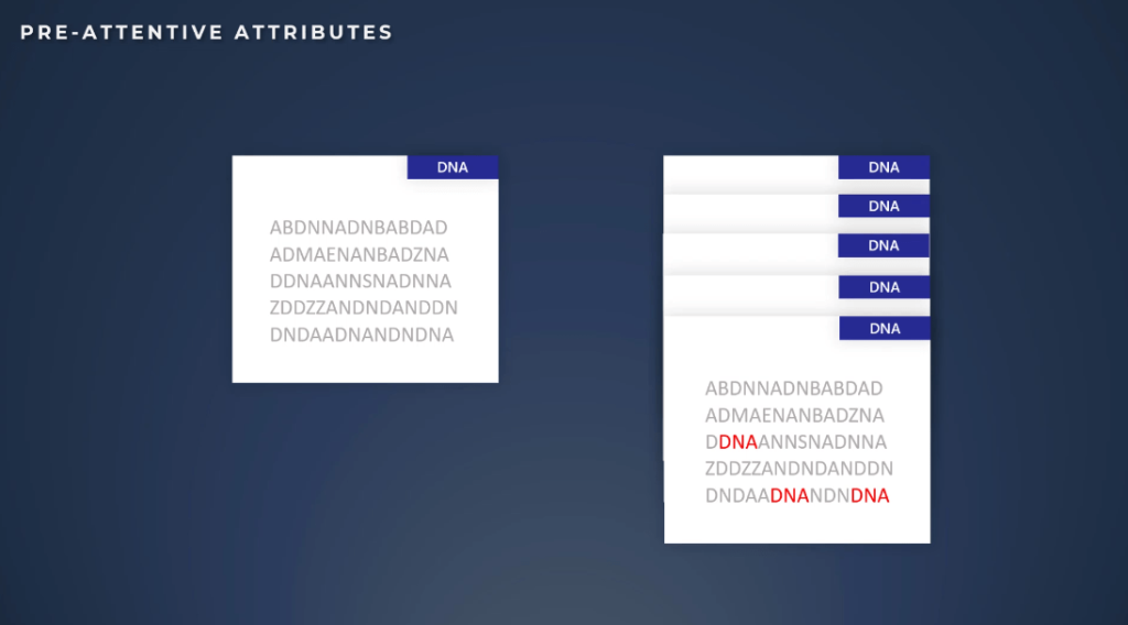
We also have color.
This is the most important weapon in our tool set. We can easily direct the eyes of the audience towards what we want to show even better.
In addition, we can accumulate multiple attributes if needed to see the word DNA clearly.
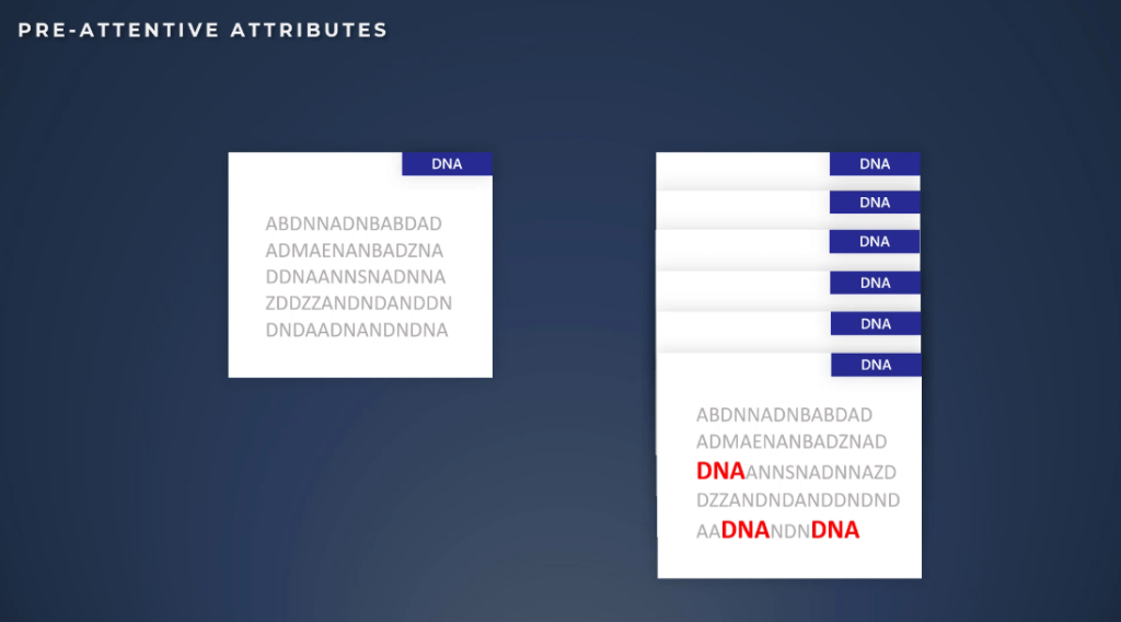
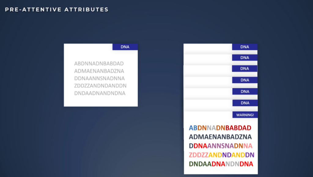
If the superhero in the design is color, it’s time to meet the villain.
Too much use of an attribute, too many things to highlight, and too many stories to tell at once can reduce effectiveness.
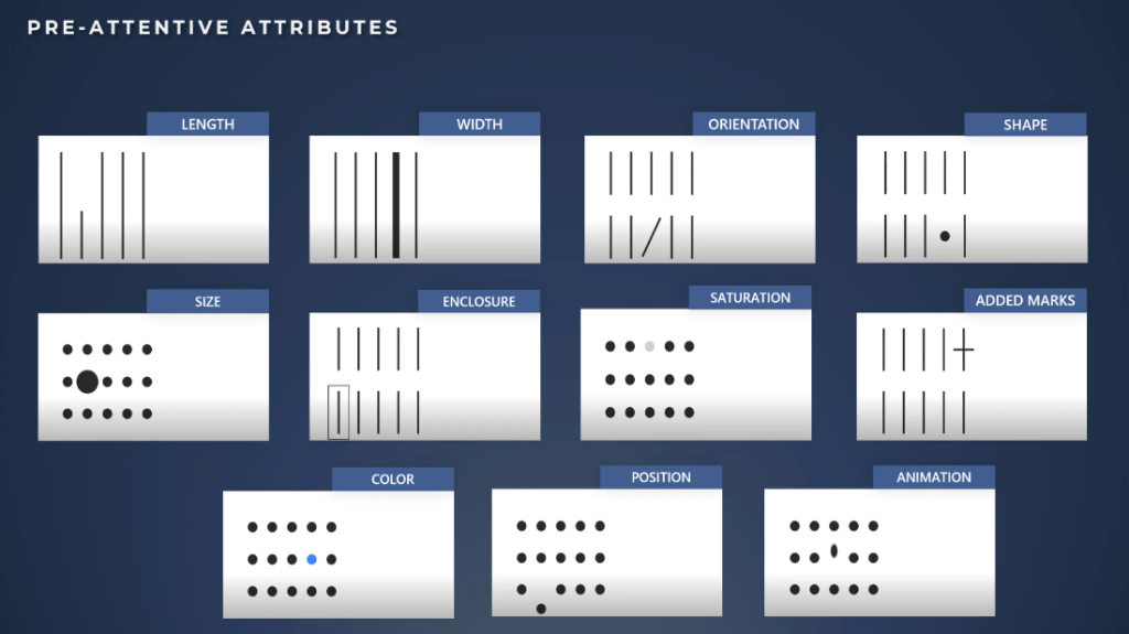
Let’s discover all the preattentive attributes. We have length, width, orientation, shape, size, enclosure, saturation, added marks, color, position, and animation.
Common Mistakes In Using Preattentive Attributes
Even though it looks like an easy and clear concept, many report designers misuse preattentive attributes.
Take a look at this example.
What do you see? Do you start focusing on the lower right side of the screen? What do you learn, and how does it make you feel?
You will probably see two preattentive attributes. One is color, which is used effectively because the color is consistent between the two scatter charts. In both cases, it is used for mid-category.
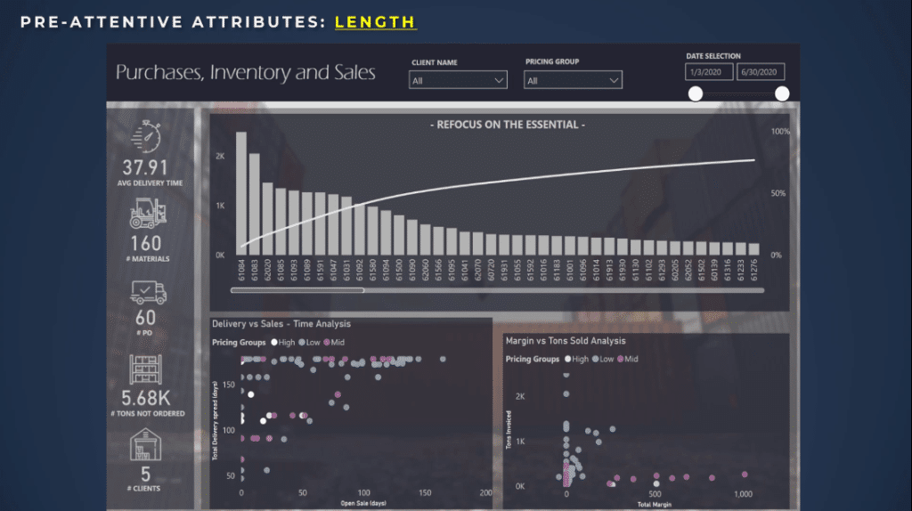
The second preattentive attribute is length.
Evidently, we can observe easily that the gap between delivery sales, time analysis, and the graph on the top is not at the same height.
A misuse of preattentive attributes can create deception and can lead to users questioning the integrity of your analysis. Basically, it reduces trust and it also breaks the order of the story we want to tell.
Based on the rule of thirds tutorial, the most important information should be placed on the top left corner. The bottom right corner is the place on the screen we see last, but the preattentive error makes the user look there.
The flow is lost, the user will get confused, and the connection is lost.
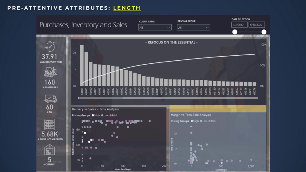
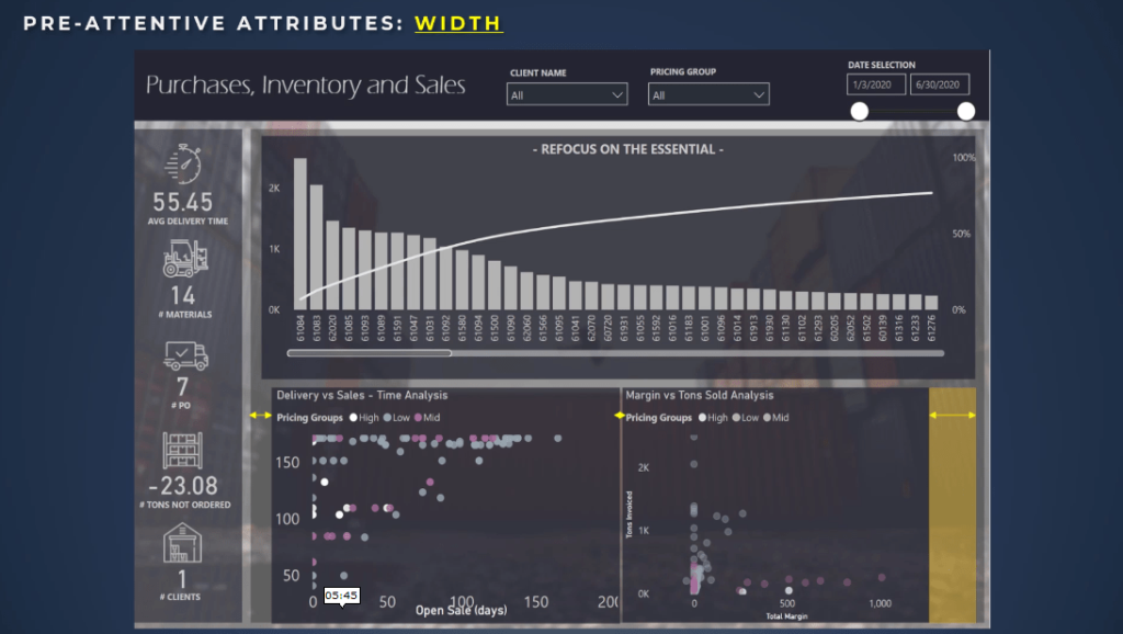
Another example is width.
In this case, we can see that the width is not the same between the two charts in the lower part of the screen. It looks weird, and the eyes will immediately notice the lower right part of the screen.
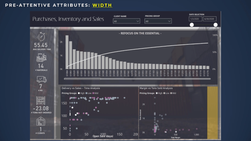
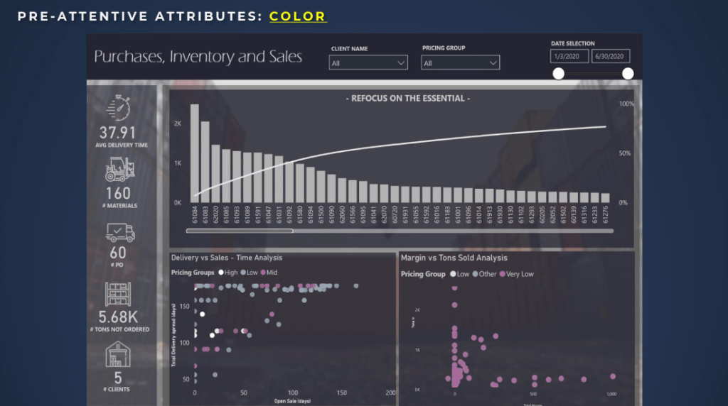
Another mistake is using the same color for two different things.
The Delivery vs Sales visual has purple color on the right part of the screen. On the left side, you can see the Margin vs Tons Sold analysis has a pricing group with purple color as well.
Without paying attention to the legend, the users will think that the color presented on the left side of the screen is related to the same color on the right part of the screen.
The above examples are common mistakes and something we have to pay attention to. These are very easy to fix.
Easy Fixes Using PowerPoint
Let’s jump in on how to fix the issues and have them integrated inside Power BI. PowerPoint is a great tool to use alongside Power BI for three main reasons.
First, every element we put on our canvas has a cost for every line, every shape, every button, every text, every formula, and every chart to better optimize the performance. It is a good practice to try to create all static elements outside.
Second, in line with the rules of design we discussed, it is easier to concentrate on the design rules. You can use advanced tools like Photoshop, Illustrator, or Figma. These will help you develop your report faster.
And lastly, you can reuse your design in different reports using templates. It’s very useful and can speed up your development.
Now it’s time to break down the steps.
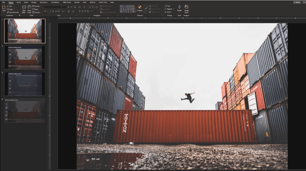
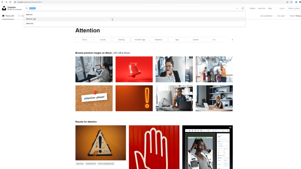
We start with the photo of the background. I downloaded this from Unsplash. This is the site where you can download free images for your reports.
Just type in the design that you want and search for the photos that you can use inside your reports.
From a blank slide, insert the photo and adjust it to make sure that the image is large as our screen.
Noticeably, it is covering the page but it’s bigger than what we wanted. Just double-click on it, then click Crop to adjust the size of the photo.
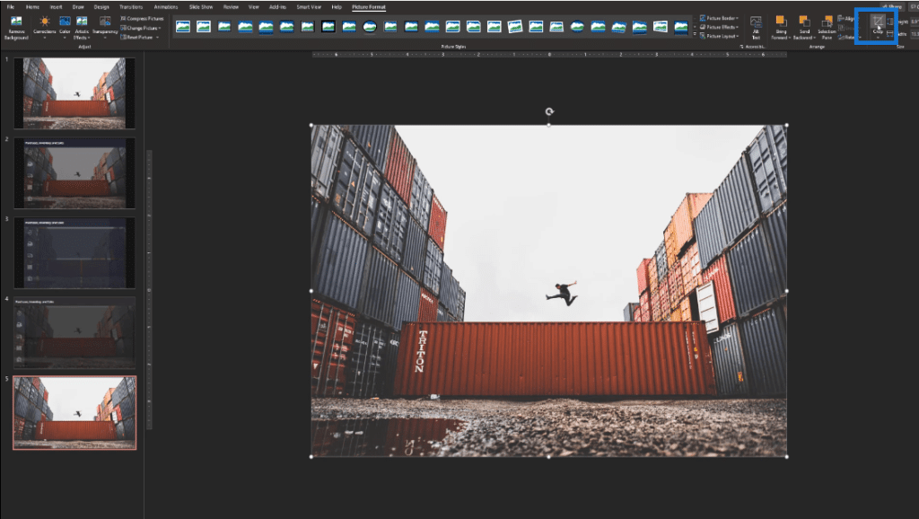
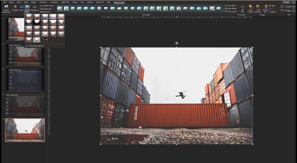
Now that our photo takes up all the space on the slide, double-click on it, go to Artistic Effects, and choose Blur effect.
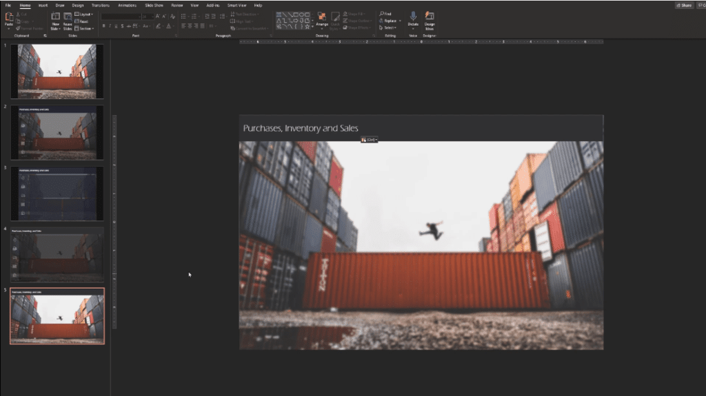
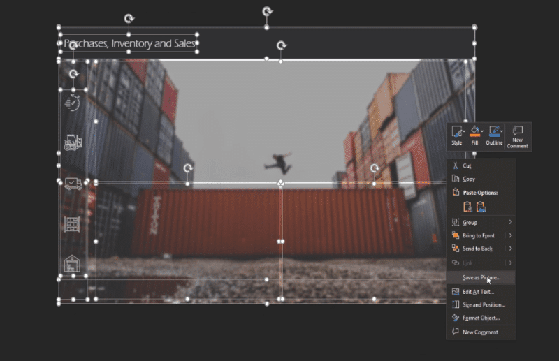
Next is to add a layer by adding a shape with text at the top.
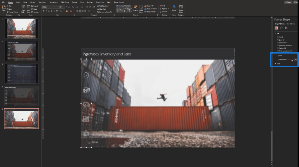
We also add a shape for the icons plus the actual icons on the left side.
As we move things around, we can see exactly the small red. The red line helps the designer perfectly align the elements.


For the icons, let’s slightly change the transparency of this element by clicking right-click, then select Format Shape and adjust the transparency level as you wish.

Now we can add other layers where we want to display the graphs. Let’s place one shape for the top visual and another shape for the scatter charts below.
Paying attention to the width on the left and right sides is very important to ensure that the alignment is perfect. Also, the same size at the top and for the lower part should be achieved.
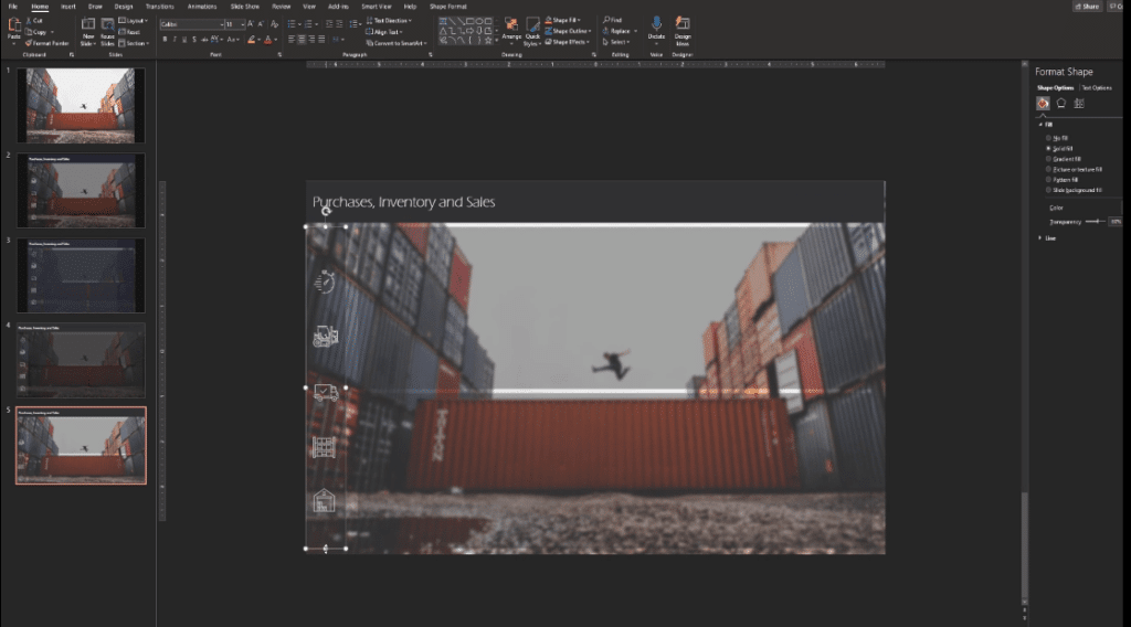
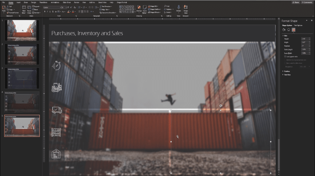
To see the size of our shape, click the shape then go to Shape Options. The width is 1187 so half of it is 593.
We can now put the shape at the lower left side and align it accordingly. After that, we will see how much it needs to be reduced. Since the height is 10, let’s reduce the shape by 5 so it’s 587.
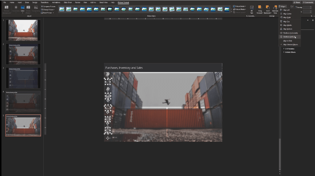
To give more space to the icons, just select all the icons and make sure that everything is aligned by going to Picture Format, select Align, and choose Distribute Vertically.
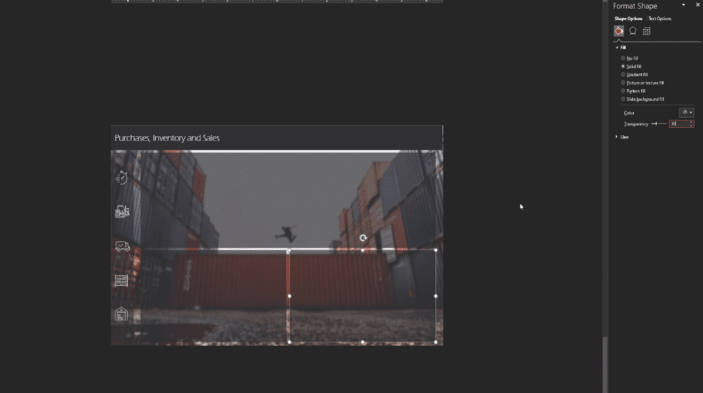
Let’s also adjust the transparency of the shapes to 30% to make them more clear.
The background is now complete and ready to import inside Power BI. In order to save the image, press Ctrl + A then Save as Picture.
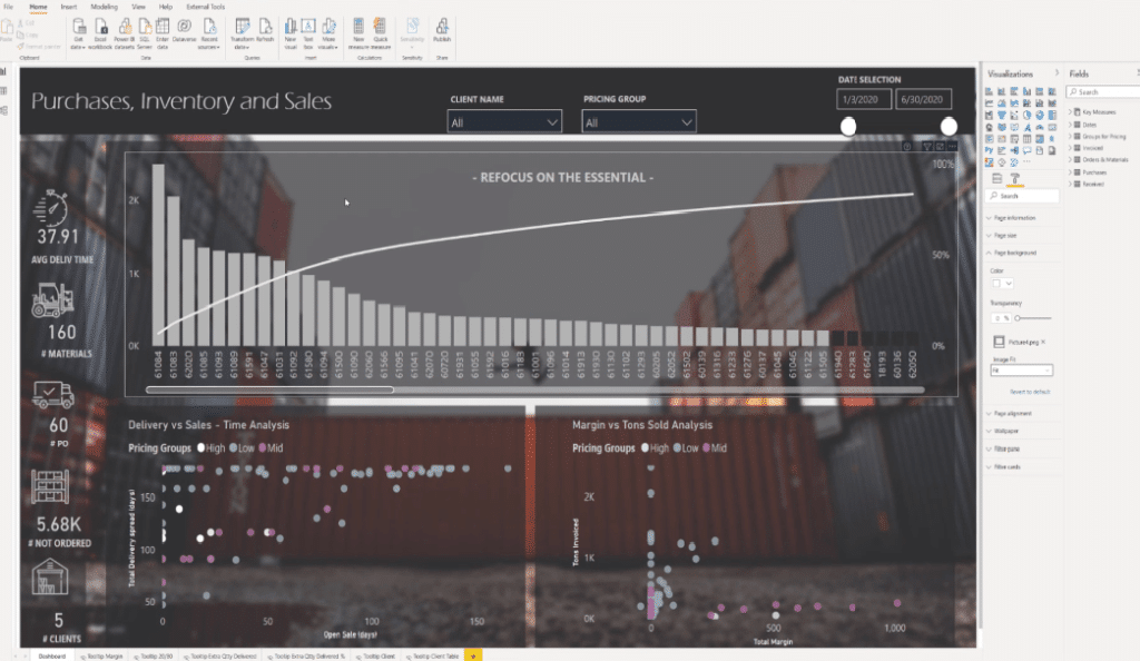
Open Power BI and go to Format. Under Page Background, import the image to see the background that we built.
***** Related Links *****
Power BI Designs For Compelling Reports
Power BI Design Tips: Creating Application-Like Reports
Report Visualization Framework In Power BI | Part 3
Conclusion
The main advantage of building the background inside PowerPoint is that it enables you to take care of all the alignments and prevent the above common mistakes that we discussed.
The perception of the audience based on what they see and the clarity of your communication as a designer are vital because it shows your capacity to spark the interest of your audience.
All the best,
Alex Badiu


