
This blog will show you how to do advanced inferential Power BI statistical analysis quickly and easily using what I like to call “Magic” Data Set Call. You can watch the full video of this tutorial at the bottom of this blog.
The Magic data set call lets you step out of Power Query into R or Python, run a lot of advanced analyses, and then seamlessly jump back into Power Query and continue processing your data. It also allows you to create a new function to solve problems related to prime numbers.

Power BI Statistical Analysis Data Set
The data set we’ll use for our example today comes from the Enterprise DNA Data Challenge 23, which focuses on Healthcare data for a substance abuse treatment program. As you can see in the image below, it involves pre-tests and post-tests for patients to measure the effect of the treatment programs they underwent.
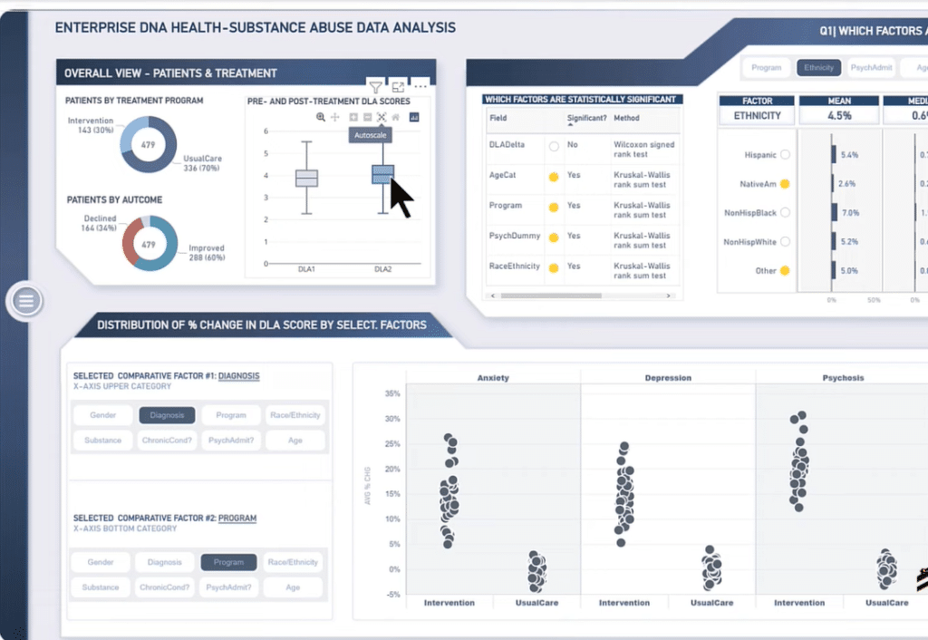
In the Overall View – Patients and Treatments below, we’ll find box plots of the general data for pre-treatment and post-treatment scores. You’ll notice that both plots look similar to each other and only have a slight difference their medians.
However, it’s important to remember that looks can be deceiving, particularly for non-normal data. Therefore, we can’t necessarily say that those two data are equal.
There are many cases where you can look at data from Visualization and not be able to tell whether the differences they are showing are significant or not from a statistical standpoint.
So, how sure are we that the differences we’re seeing are real instead of just artifacts of the sample we’re analyzing? Answering this question is impossible by using Power BI alone.
Paired T-Test
Power BI can’t do this sort of statistical analysis for more complex tests on data that doesn’t fit the simple inferential statistics we might want to use. I examined the data we’re analyzing and found that they are non-normal.
We typically need to do a paired t-test to examine our hypothesis of the difference between the pre-treatment and post-treatment scores. This test requires normality in the differences between the two scores, which appears we don’t have in this case.

Nevertheless, we’re still going to test that. If we find out it’s true that the difference in the data is normal, then there’s another test we will want to run, and I’ll show you how to do it.
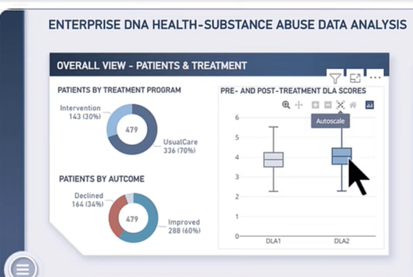
Power BI Statistical Analysis Main Data
The image above is our main data launched in Power Query, which has a date, patient ID, and numerous other demographic data we analyzed and tested. But there are only three data that we need to be looking at here.
First is the DLA1 or the daily living activities no. 1, the pre-test before their treatment. Second is the DLA2, the after-treatment and the last is the DLADelta, which is the difference between the two.
Normally, we start with the source and do all sorts of data transformations here. We then call the R script if we need to do an unpivot, data cleaning, or other processing. But since this data is very clean, all we need to do at this point is go to the R script from the Transform tab.
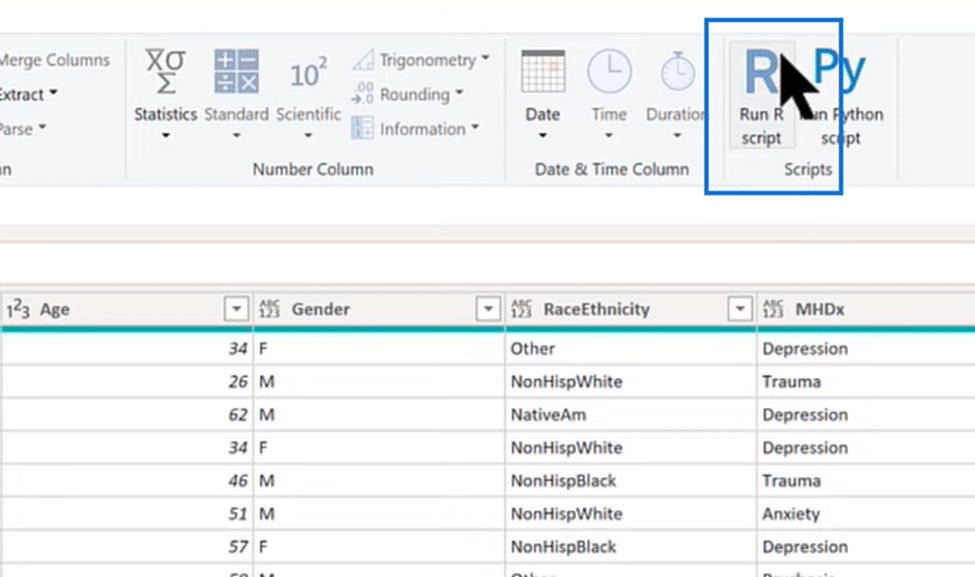
Power BI Statistical Analysis in R Script
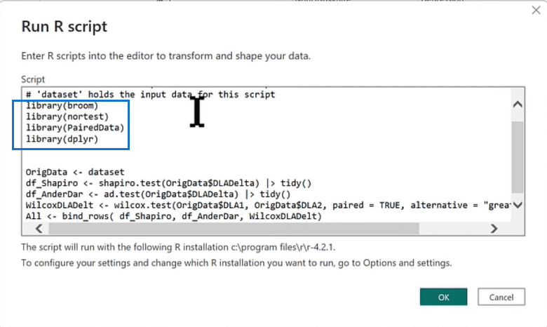
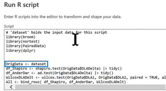
The image above shows the script we need for our Power BI statistical analysis, and we’ll go over every step. Inside the highlighted section we find the libraries we want to enter in our scipt to call four packages, broom, nortest, PairedData, and dplyr. Each package is like an add-in in R for running specific types of analyzes.
After entering our libraries and their packages, we call in our data set, where the magic happens. The data set takes everything that happens in the R script, which is just the data itself and feeds it into the OrigData table with no transformations needed.
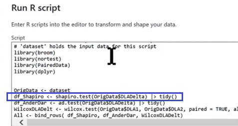
Shapiro-Wilk Test
We’ll also call a couple of technical tests in our script. The first one is called Shapiro-Wilk, which tests the normality of the data. All we need to do is call the column that we want to test (OrigData$DLADelta) and send the results to this tidy function which puts the results in a nice table form.
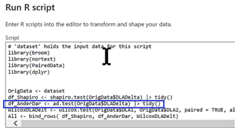
Anderson-Darlin Test
The second one is the Anderson-Darling Test, which is another normality test. It will call in the same column to ensure that were running a complete test. We’ll also send this test to the tidy function.
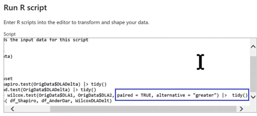
Wilcoxon Signed Rank Test
We are also running a non-parametric test, which compares what happens in the data before and after. This test is called the Wilcoxon signed-rank test.
Compared to the t-test, it doesn’t assume anything about the underlying distribution making it more flexible. However, it is less powerful in distinguishing differences than a parametric test or one that assumes normality.
But since that assumption doesn’t hold in this case, we will run the none-parameter version and call it in our DLA1 and DLA2 columns.
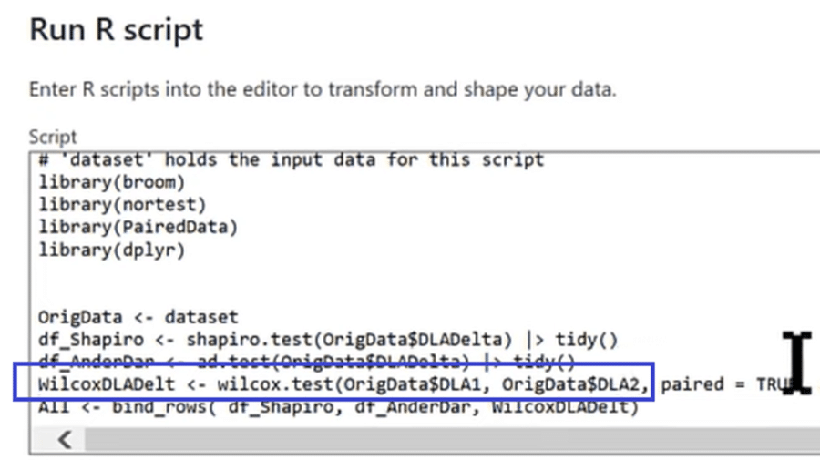
We then ensure that the paired data shows a before and after for the same individual with paired = true. Additionally, we have an alternative hypothesis (alternative = “greater”) that assumes the treatment will improve the patient, make insignificant improvements, or make him worse. Finally, we send that out to our tidy function.
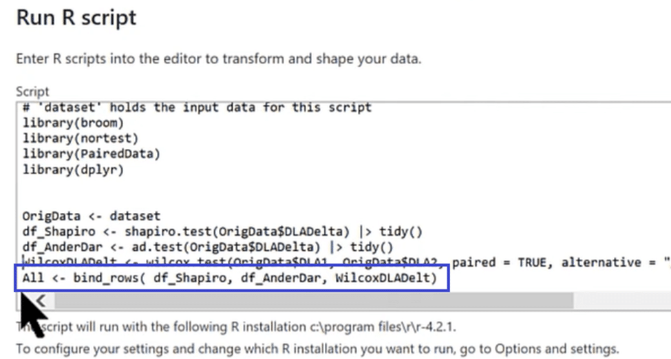
Bringing All The Tests Together
In the last line of our code, we are stacking and appending all three test results from Shapiro, Anderson, and Wilcoxon, into one table called ALL. You can see that we are running plenty of statistical analysis in just four lines of code.
Now that we have imported our packages and called in our tests, let’s run our script and see the results by clicking on the OK button.
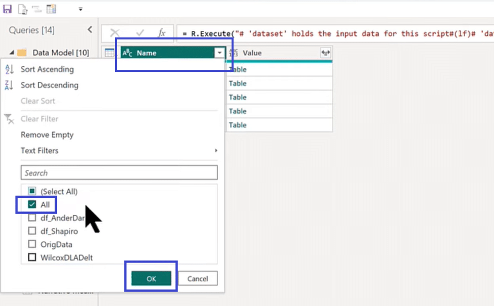
Statistical Table
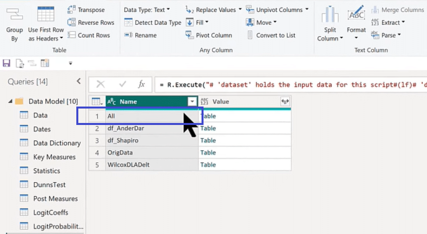
The image above is what we get after running our R script. You can see that it has all these different tables, but the only one we need is the All table because that’s the one that stacks up all the results that we want. So we click on the Name column header, select the All table, and click OK, as shown below.

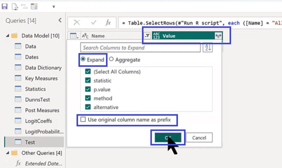
We then expand our table by clicking on the Value column header and selecting Expand. Check every box to select all columns except the one that says, “Use original column name as prefix,” and click OK.
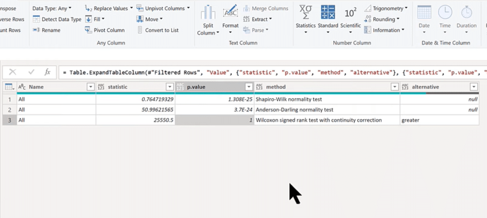
Now we have the table we need, as shown in the image below. You can see the statistic, p-value, and the three tests we ran in its columns.
Power BI Statistical Analysis Applications
There are numerous things we can do with this data. We can go to DAX to run logical tests and calculations, put them in visuals, place them on smart narratives, and many more.
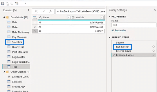
If you select Statistics from Queries and Run R Script from Source as shown above, you will find 150 lines of statistical codes.
We used these codes at Enterprise DNA for our entire analysis, and this was all run in one step from one data set call. It produces a series of tables that feed our results in the entire analysis.
You can see in the Applied Steps below that we took the results of that data set and expanded them by merging. We also removed some columns that we don’t need to clean that table.
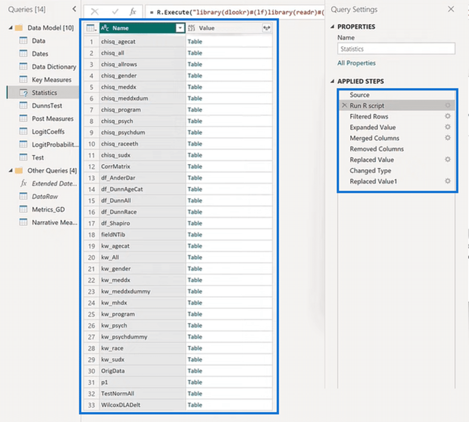
What we got is 33 different tables of results that came out of that one data set!
***** Related Links *****
New On Power BI Showcase – Health & Substance Abuse Analysis
Scatter Plot In R Script: How To Create & Import
Three Ways To Use R Script In Power BI
Conclusion
You just learned how powerful the Data Set Call is and the flexibility of what you can do with it. Aside from running statistical analysis, you can also use it for sentiment analysis, web scraping, and machine learning.
You can do anything that Python or R can and then feed the results into Power Query. You can then take that out of Power Query and put it into Power BI, visualize and analyze it further, creating an analytical powerhouse!


