The Power BI page navigation buttons play a critical role when it comes to storytelling. An organized and transparent navigation system acts as a roadmap to direct visitors to various pages inside your report.

These buttons are fundamental in encouraging visitors to stay, engage with your content, and have a positive user experience that would lead to more adoption and impact.
4 Things To Include In Your Reports
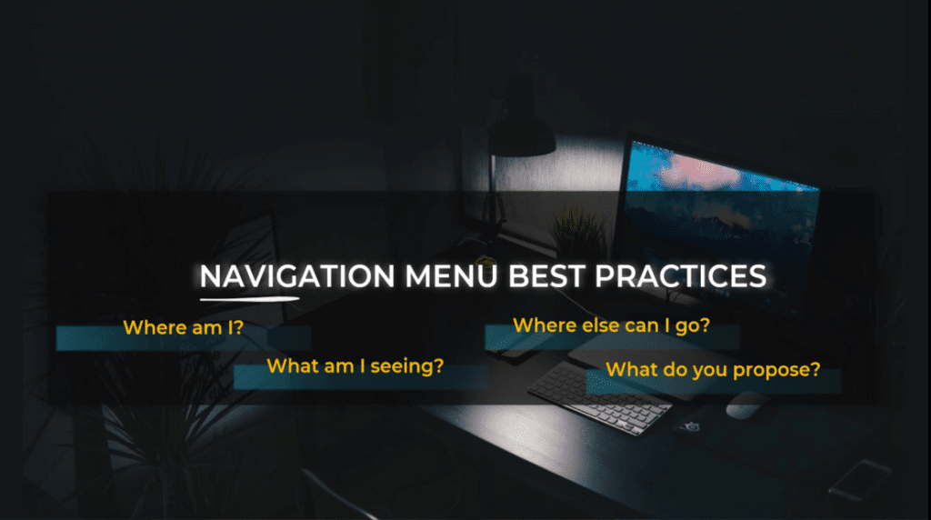
Users typically want to know four things during their visit to your report:
- Where am I?
- What am I seeing?
- Where else can I go?
- What do you propose?
By visibly demonstrating these answers within your navigational menus, there is a higher chance visitors will remain on your report for longer and come back to it more often.
In my previous tutorial, we discussed the necessity of adapting our speech to the audience as analysts and executives can have completely different ways to address a problem.
We can use an inductive approach where we prepare the audience for our conclusions or a deductive approach where we start directly with the recommendations.
The navigation will allow you to plot your story as you wanted. You have many options you can use to build great navigation such as:
- Power BI page navigation buttons
- interactions between graphs
- tooltips
- drill-through actions
However, no element affects usability as much as navigation design. If visitors can’t figure out what to do when they land on your report, it is a missed out opportunity.
Hence, the Power BI page navigation buttons are extremely important because they are setting up the framework and backbone of a successful report.
Power BI page navigation buttons are very commonly used in Power BI reports. Although there is a lot of content on how to build them, there is not so much content on best practices when it comes to Power BI page navigation buttons.
With this in mind, I prepared a list of several best practices that are the most important ones for building navigational menus.
Building Power BI Page Navigation Buttons
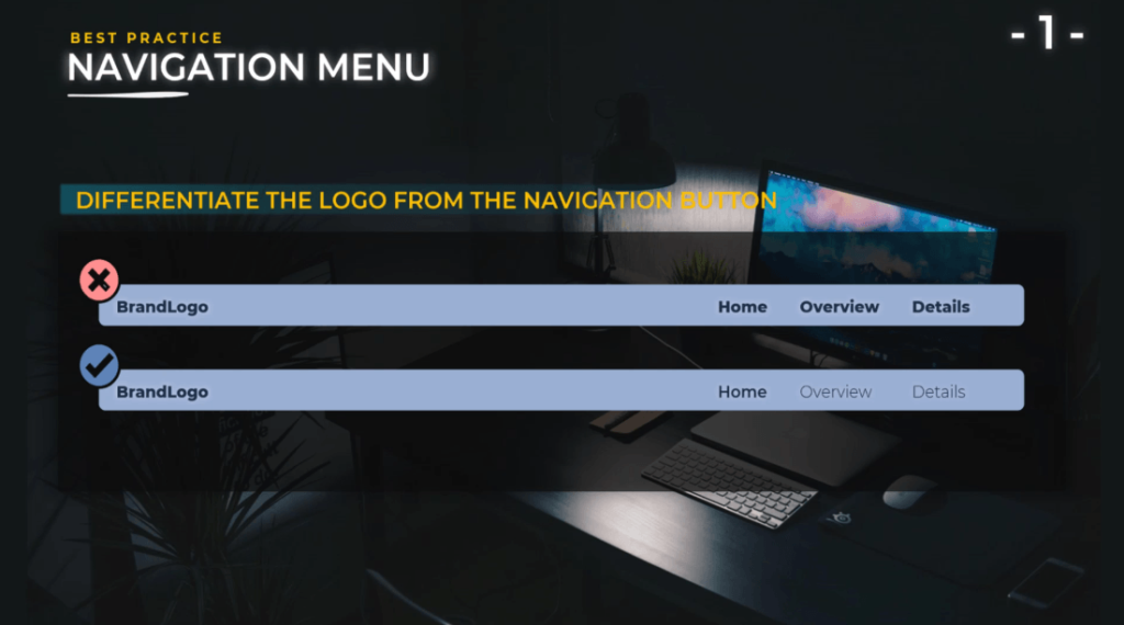
Differentiate the logo from the Power BI page navigation buttons.
The logo of your company is the way you brand your report. It is different than the Power BI page navigation buttons; hence, you need to make it extra clear in your report design.
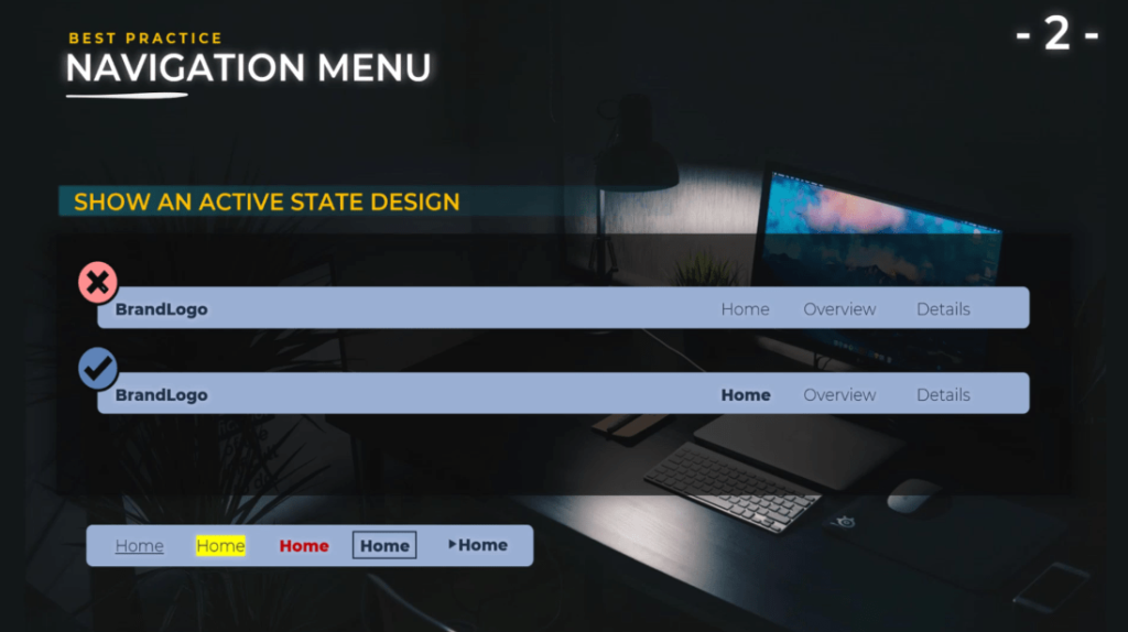
Show an active state design.
It should be very simple for the end users to know on what page they are currently on. You have a lot of options to choose from such as color, bold text, background color, or icons.
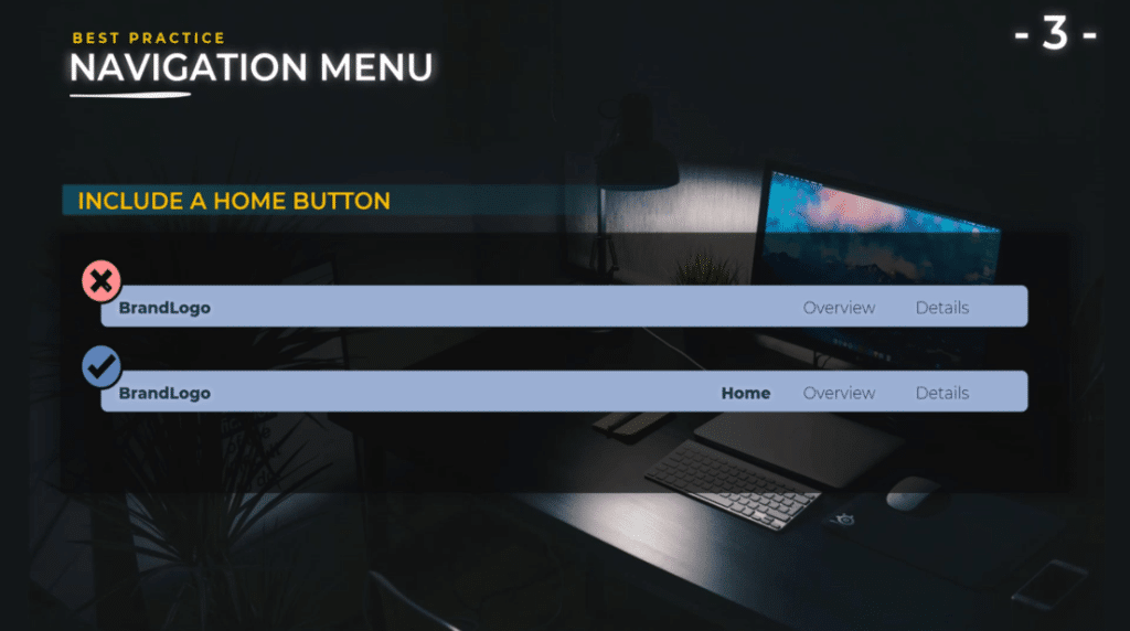
Include a home button.
Even though you have a company logo that can act as a home button, the best practice is to add also a specific home button because not all users will know that the logo can act as a button to the homepage.
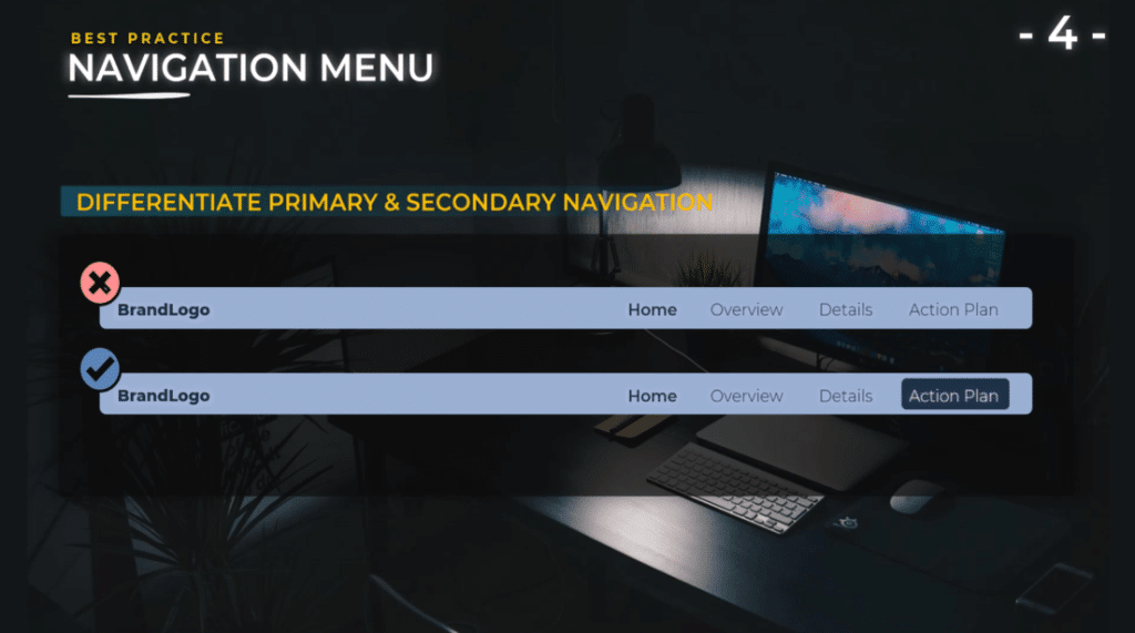
Differentiate primary navigation and call to action.
Your report should list a specific action plan, recommendations, and more. You need to make these clear from the start to the end user.
They will understand they are not looking at your report just to look at some nice fancy graphs, but that these graphs are telling a story, and that at the end of that story there is a conclusion and an action plan.
As a result, this will spark curiosity and engagement of the user. They need to pay attention to what they see because in the end, they will need to take an action or make a decision.
Provide hover states.
It is important because we want to make it extra clear for the end user that those are active buttons. It takes two seconds to add them and believe me it really adds to the user experience. You have many options to do this such as bold text, underline, icons, border, or alignment.

Ensure accessible colors and contrast ratios.
When we talk about accessibility, it includes color blindness because 8% of the male population and 0.5% of the female population are color blind. This means that you need to be careful when choosing your colors.
For example, many companies are using red and green colors. Red for negative results, and green for positive results. These colors are problematic because many people will have difficulties distinguishing these colors. Hence, it is important to check your theme and colors on different websites.

A very useful website is Asada, where you can import any image and see exactly how color-blind users will see your report. Just simply do a print screen of your report and add it.
In this photo that I added, you can see the different color-blind possibilities that you might encounter. As we can see, sometimes the difference between red and green is not that obvious.
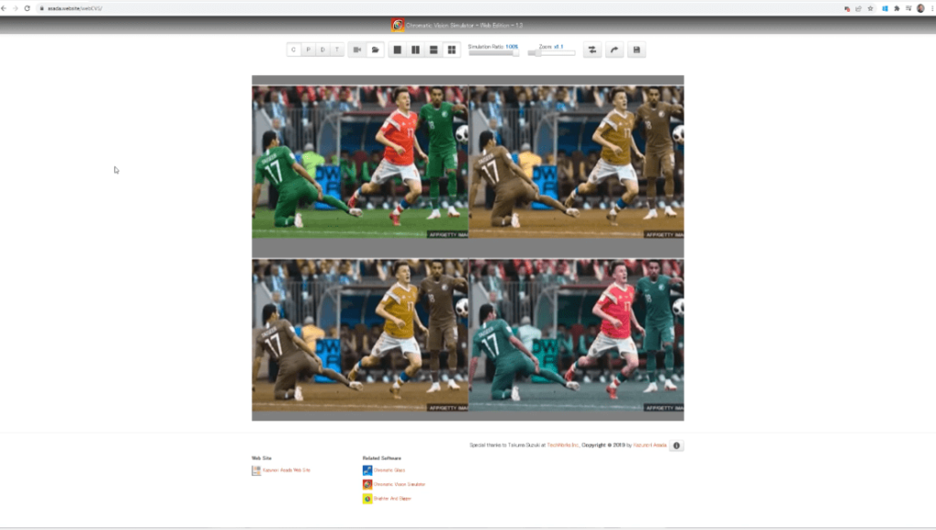
To address this, you need to use other color palettes like blue instead of green and orange instead of red so that it will be much clearer for the users.
However, if you can’t change these colors because you need to use red and green, then there are other tips that you can add to your reports.
For example, format your numbers to have a plus or a minus sign in front of the values that will allow users to see if your values are positive or negative.
Also, you can use dark red and light green. Even though the user will not distinguish the difference between the colors red and green, they will be able to see the contrast between the two colors which will be great for them.
Make reports accessible through contrast ratios.
Another factor of accessibility is the contrast ratios. As illustrated on my example, I wrote Overview and Details in a gray color, then used blue as the background. This is not clear and will not provide enough contrast for the users to read.

To prevent something like this, we can check using a contrast analyzer website called Color.Adobe.com.
Just simply copy and paste the colors of the background, text and the graphic components. For this example, we have a contrast ratio of 1.84:1 which is not enough to have a good contrast.
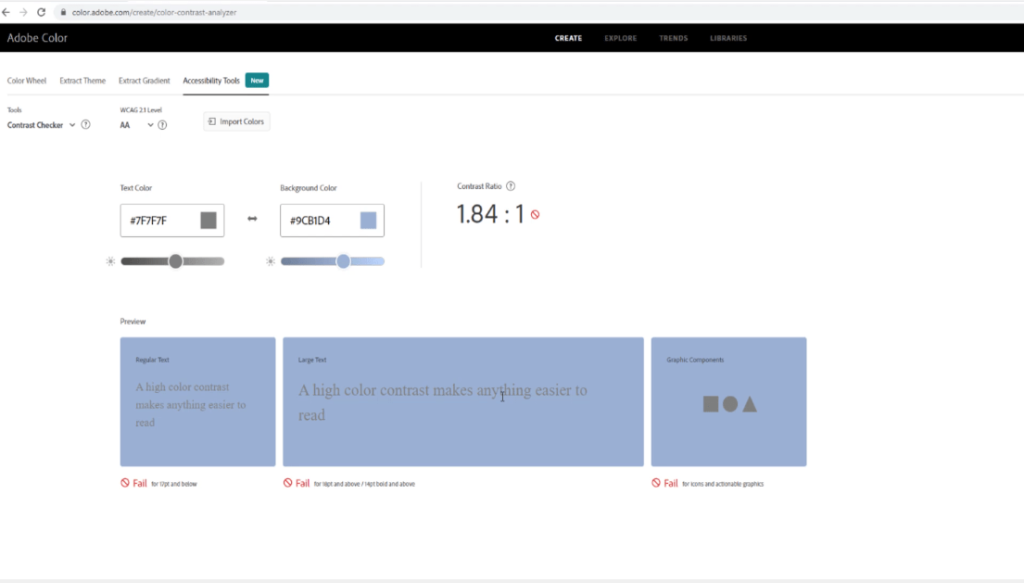
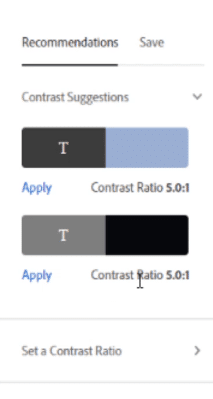
What is great about this website is that it provides recommendations on the contrast. The best contrast is 5.0:1. You can choose and apply different contrast.
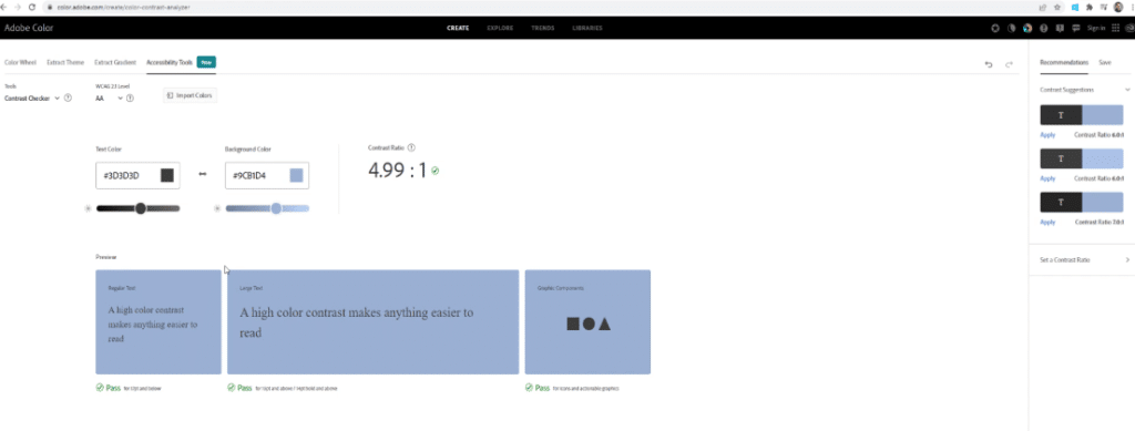
As you can see, I changed the color of my gray to dark gray and the contrast ratio to 4.99:1.
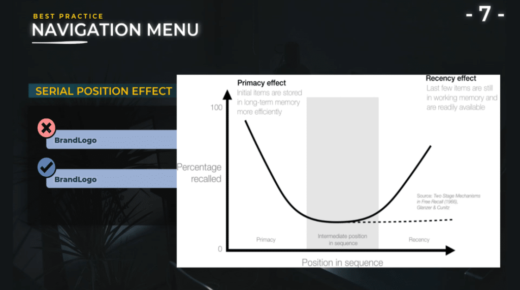
Implement the serial position effect.
The serial position effect describes how our memory is affected by the position of information in a sequence. Initial items are remembered more efficiently than items at a later position in the list. Items at the end of the list are recalled more easily immediately after the presentation.

Basically, you will want to present important items at the beginning and at the end of a list to maximize recall. If you want people to choose one item over another, present it in the end of the list if the decision is to be made immediately after the presentation.
This is because we tend to favor the last candidate presented to us. If the decision is to be made at a later time, present your preferred item at the beginning of the list.
Hamburger menu debate.
I wanted to present a debate concerning the use of hamburger menus. Some designers think that the hamburger menu should not be used in desktop applications, and if you do not have too many buttons.
In this example, we have Home, Overview, Details, and Action Plan. It is more user-friendly for users to see this menu than to open a hamburger menu.
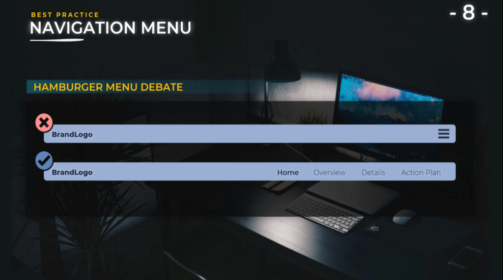
On the other hand, the advantage of using a hamburger menu is that it gives you more space, declutters the design, and allows you to have extra information presented only when the user opens this menu.
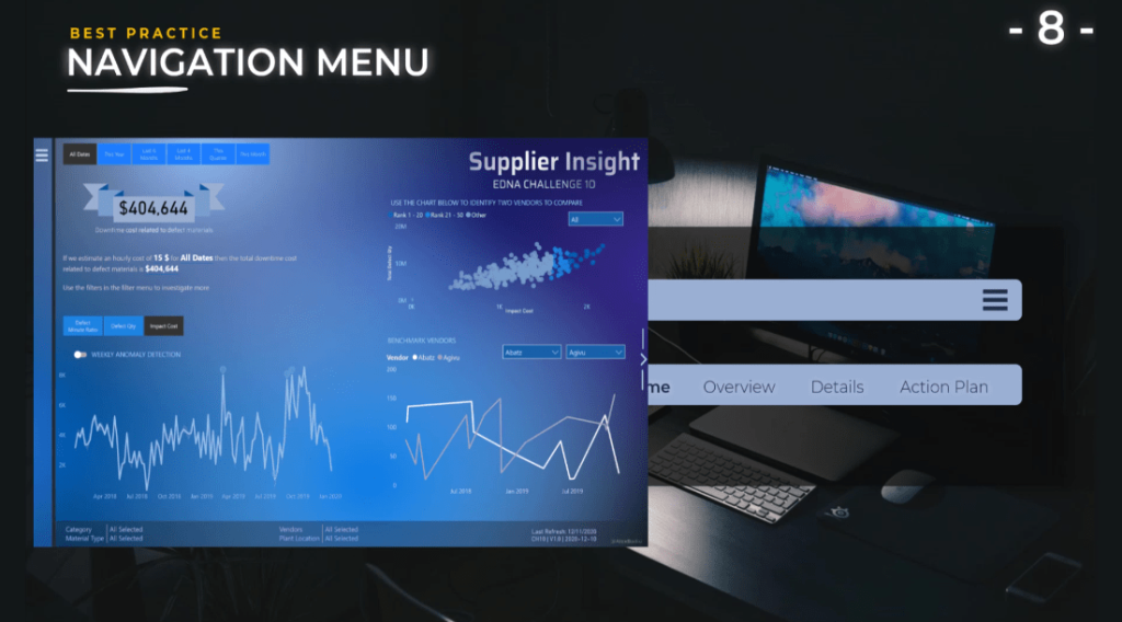
If you are using this hamburger menu, you need to pay attention if you are using filters inside. You need to recall it on your page so that the end user will not be forced to do an extra click to open the menu to see the filters that were applied on the report.
To illustrate, I created different challenges for Enterprise DNA where I used this hamburger menu. I used this menu on the lower part of the screen to recall the filters that are applied on this menu.
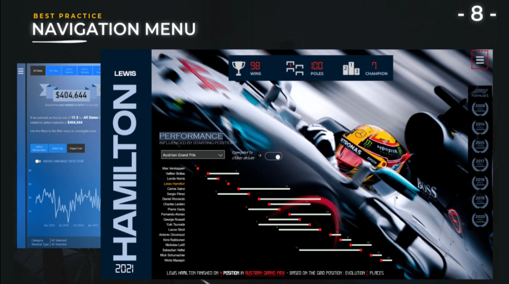
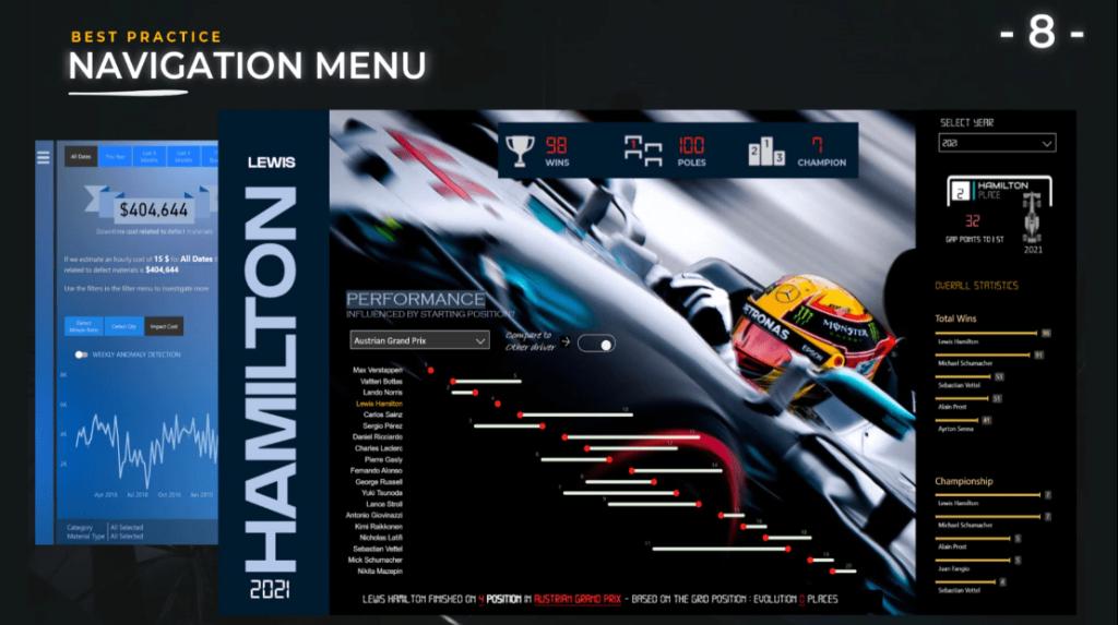
Another report that I created is Lewis Hamilton 2021. When you open the hamburger menu, it has additional information such as filters and extra graphs.
In this case, the only filter I have is the year. The year is also presented inside the main report just underneath the name of Lewis Hamilton so that the end user knows what information will be presented inside the screen without having to click on the hamburger menu.
Stick to known patterns.
You need to have a lot of imagination and try new things when you create a report, but you should stick to known patterns when using a hamburger menu.
In this example, it shows a brand logo that is in the middle of the top bar, some part of the navigation buttons on the left, and the action plan on the right which is not a good user experience.

The users are used to seeing the logo on the left and all the buttons on the right with the action plan at the end.
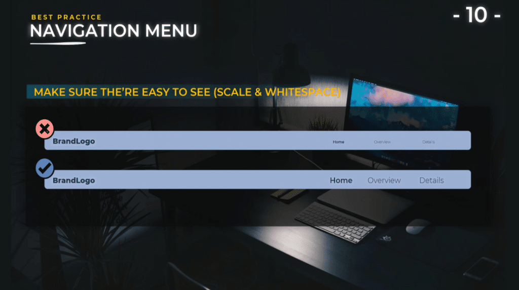
Make sure they’re easy to see.
Of course, this is a case that is encountered quite often because we tend to add a lot of information inside our reports. Unfortunately, in order to gain some space, we reduce the size of the texts and the size of the menus.
It is important that users can read the texts on your report, scale it to the right size, have a good contrast ratio, and pay attention to white space. When I’m talking about white space, I’m talking about the space on the top and on the bottom of the navigation menu.
This is to ensure that the end users have a dedicated place for the menu and you do not have a cluttered design where the end users will feel lost and will not know that those are buttons will direct them to different analysis inside the report.
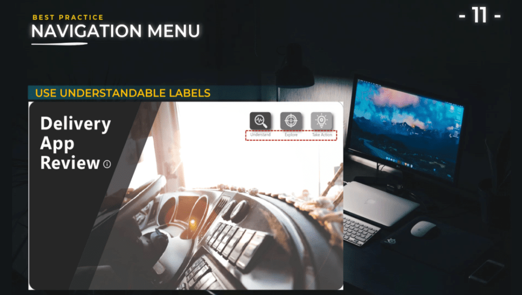
Use understandable labels.
For labels, use short names that make sense to the end user. Similar to my Delivery App Review report, you can use actionable names like Understand, Explore, and Take Action. Leverage visual elements, images and icons.
As you can see, by adding some icons or some images in addition to the text, we help the user to understand what you present and will allow them to take action to navigate much easier inside your report.
Use synchronized filters.
For example, if you open the menus to select a filter, this filter needs to stick even though you change the image.
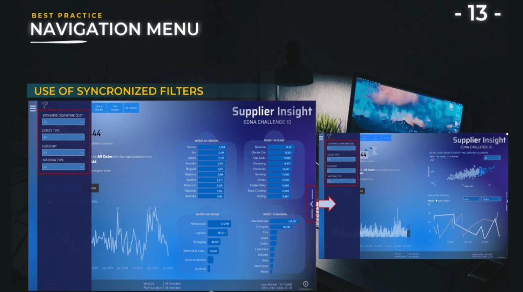
As illustrated on the screen, you see that I changed the Estimated Downtime Cost to $15, and when I clicked the button on the right side of the screen, I have my main page visuals that changed.
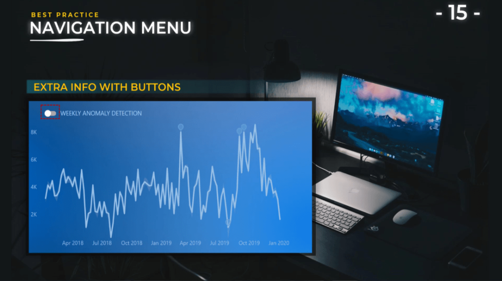
Another example is to change the Weekly Anomaly Detection which is the graph on the bottom left. I can change it from Anomaly Detection to Forecast but when I opened the menu again, I want to have the same selection and keep the filter on which is the Estimated Downtime Cost.
So, it is important to know the bookmarks in order to create a rich user experience with your navigation.
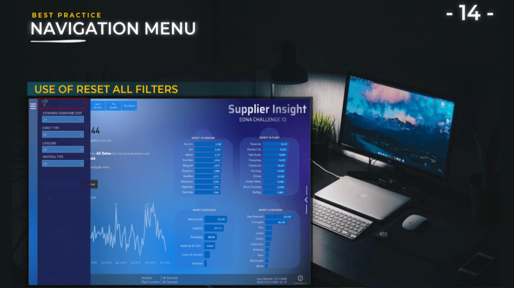
Include a way to reset all filters.
This is very easy to implement and it also adds a lot to the user experience. Every time you have a menu that has multiple filters inside, you need to have a reset all filters.
The end user will not need to go individually to every filter and put it back to the screen they had at the beginning. It’s very easy to do: just add an icon, create a button, and direct this button to a bookmark that has the initial view.
Provide extra information with buttons.
We can use buttons not only for the navigation menus; we can also use buttons inside our report to switch the view.
In this case, we can switch the Weekly Anomaly Detection to Forecast view by using a small toggle button. It adds extra information on the page without having to present everything at the same time. Also, this is an example of progressive disclosure and a great way to engage the user inside your report.
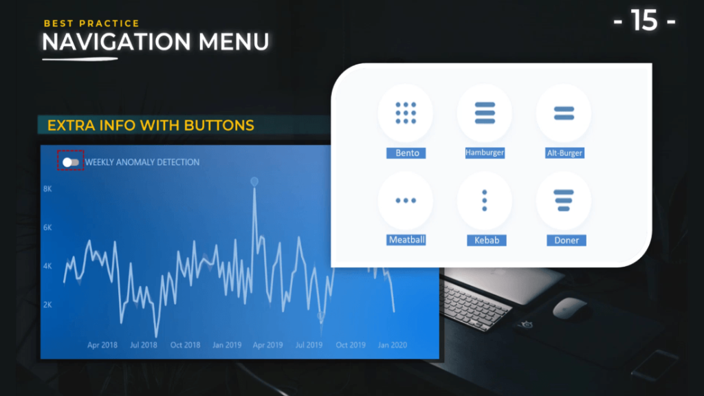
Of course, we have other options to choose from such as the toggle button and icons that are very popular on phone applications like the hamburger, bento, alt-burger, meatball, kebab, and doner.
All these icons are great, and users are familiar with them.
***** Related Links *****
Power BI Custom Icons | PBI Visualization Technique
Power BI Report Development: Creating Themes, Company Logos, Icons and Backgrounds
How To Add Custom Power BI Icons Into Your Reports
Conclusion
Without a doubt, placing Power BI page navigation buttons on your report will allow you to plot the story that can help your end users to understand what they are seeing, which parts of your report they can go, and the action plans that you propose.
I hope can you apply the best pratices that you’ve learned from this tutorial.
All the best,
Alex


