
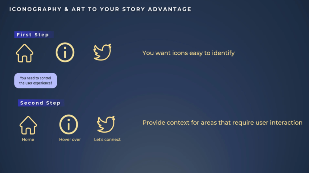
More often than not, icons are also used together with Power BI navigation buttons when making Power BI reports. If you see a home icon, clicking on it will take you back home to the landing page.
An information icon will give you more context about a specific graph or page. A LinkedIn or Twitter icon will direct you to the designer’s account.
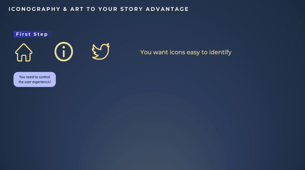
We want to use icons that are easy to identify, but this is not enough which is why we should always provide our users with additional context.


From the data story point of view, we need to control the user experience.
As a designer, we are responsible for what to show to the user, when to show it to the user, anticipate the questions, provide clear interactions and navigation, and provide additional context.
We should always have a purpose for our report, like driving change, providing recommendations, and more. If we use icons with specific interactions or Power BI navigation buttons and the user doesn’t see or understand it, our story is lost.
The end user will not see a part of your analysis that leads to a specific conclusion. Once again, context is extremely important. You never want to add an icon just to add it on the screen.
You want it for a specific purpose and if that purpose is not clear to the end user, make sure to add context.
When using a home icon as a button, tell your users to click on it to return to the landing page. If it is an information button, indicate to your users to hover over for dashboard description information.
If you’re using a Twitter or LinkedIn icon button, add this description as well. Let’s keep in mind that we need to provide context for areas that require user interaction.

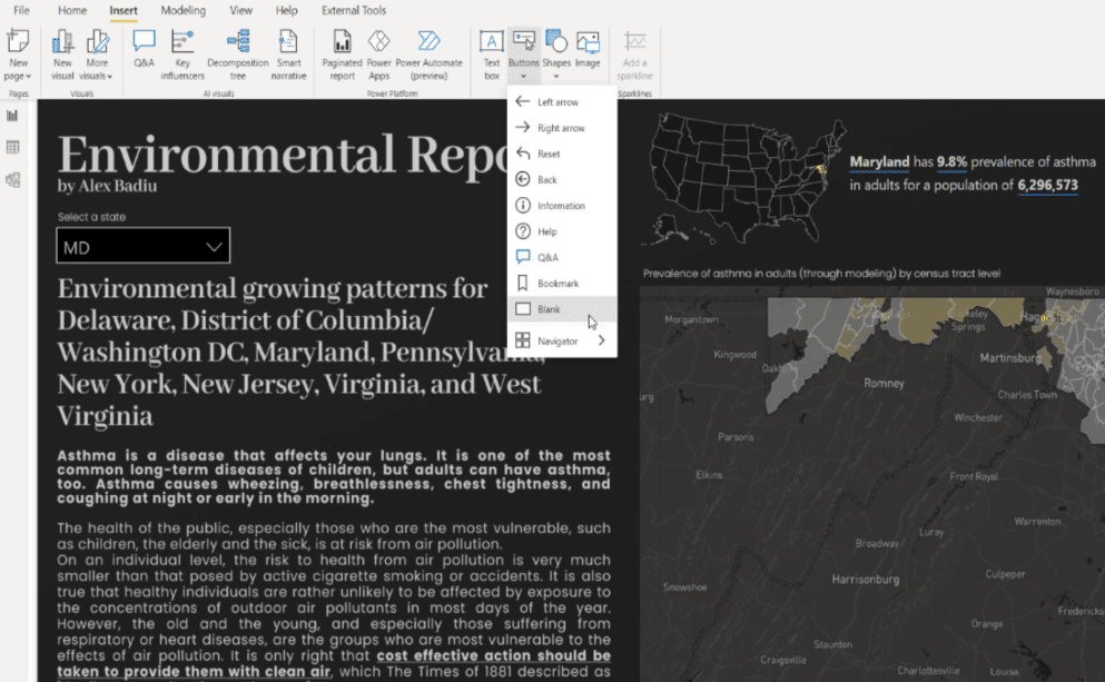
Power BI Reports With Navigation Buttons
Let’s now jump inside Power BI and see some real-life examples.
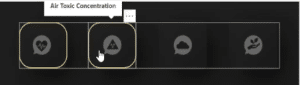
For this report, I placed the icons close to the navigation buttons. I associated them according to the principle of similarity for the style of the item and proximity between the buttons.
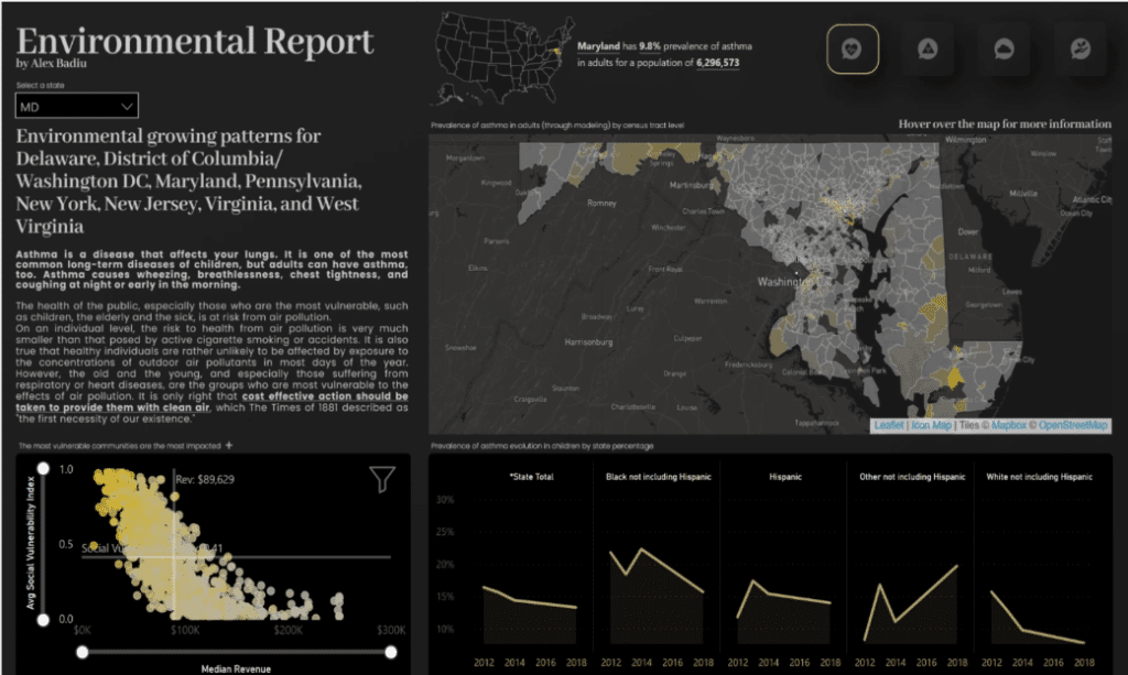
The position on the page, the negative space, and the color on the outline of the first item draws attention and it indicates that these are Power BI navigation buttons.
There is no label inside or near the button to act as an identifier; hence, placing additional context will be helpful to users so that they know which page they will be directed.
Using Tooltips In Power BI Reports
Information displayed in a tooltip when hovering over the button is a good functionality when building reports.
If you do not use this functionality, do not forget to disable this option because it gives an unpolished look to the reports when publishing on the service.
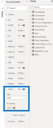
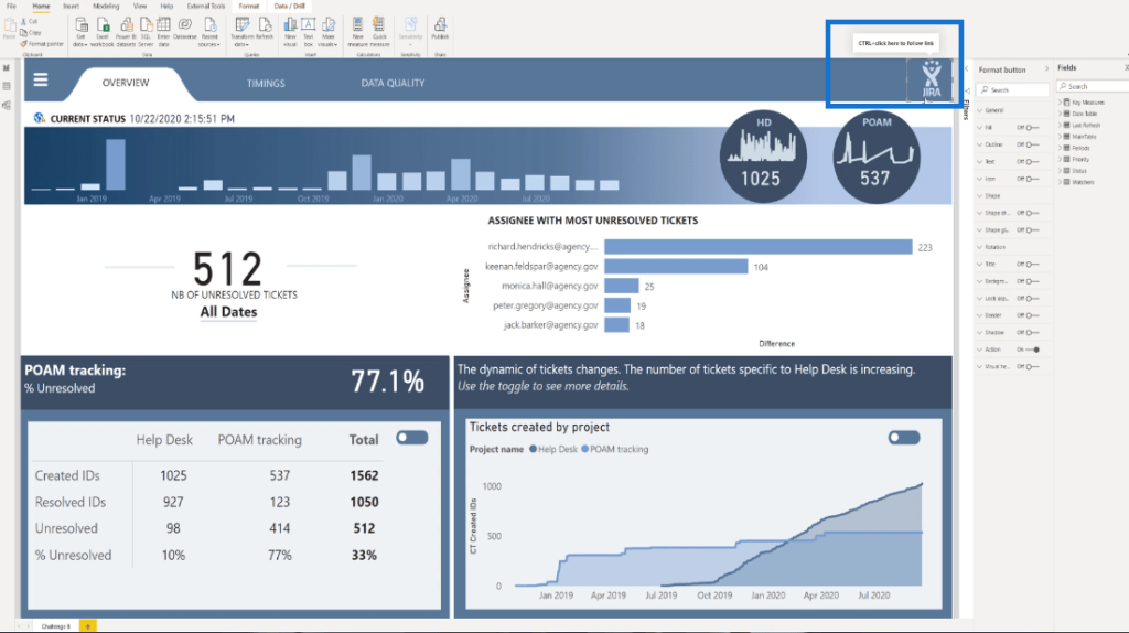
To illustrate how easy it is to keep tooltips activated and deactivated, let’s add a blank button to the page.
Under the Action button, the No tooltips option is not active by default.
It means that when you hover over this button, you will see the message “CTRL+click here to go to the previous page in this report,” which is not nice.
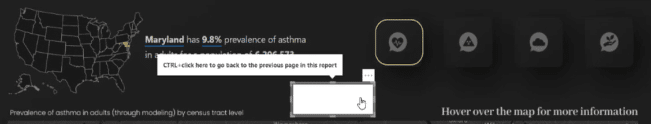
Hence, we have to activate it to disappear. My tip is to keep tooltips enabled if you are using them; if not, just disable them.
Power BI Navigation Buttons Directed To Websites
Another way we can use icons is to direct users to specific site pages. For example, clicking the logo of the company will lead directly to the website.
In this report, I have the JIRA logo and I have also this invisible button with the tooltip activated. Let’s just deactivate it to look better.
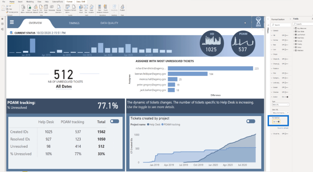
If I click on the JIRA logo button, I’ll be directed to the website of company, which in this case is Enterprise DNA.
However, most of the users will not know that this interaction exists. Even worse, they might expect it to perform as a home button. It is very common that on websites when you click on the logo, you are directed to the landing page.
Let us not forget about the perception of the user. The user might be used to this type of navigation from other websites and the best way is to have a tooltip saying, “Let’s connect or go to the website.”

Adding Icons Next To The KPIs
Let’s jump to another example.
According to the principle of proximity and similarity, you can also use icons next to the KPIs which can be associated with the buttons by keeping a similar style between them. Also, the label of the KPIs are the identifiers for the icons, so there is no need for additional context.
Adding Bands As KPIs
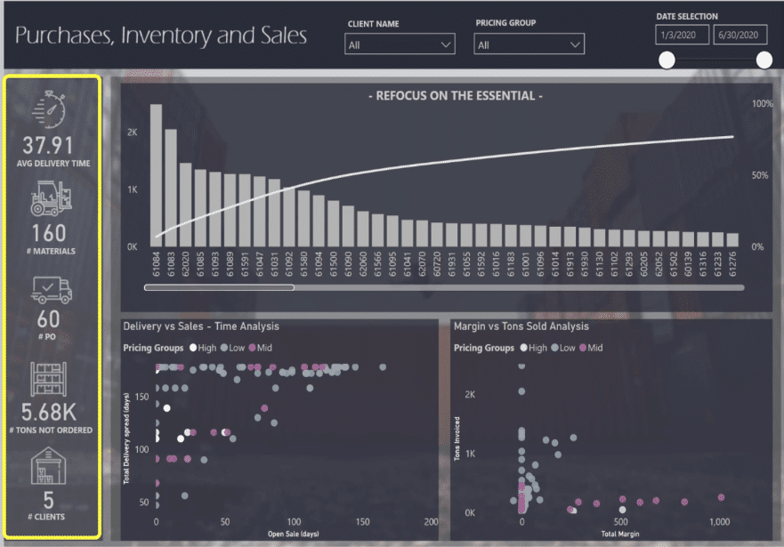
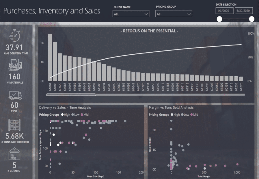
The KPIs are also known as bands. In this case, the kind of bands we are seeing are the main metrics that provide great information for tracking the activity. We have the Average Delivery Time, Materials, PO, Tons Not Ordered, and Clients.
However, are those numbers good or bad? And if they are bad, are the numbers bad for a specific month, or is there a bad dynamic? Is the trend going up or down? Why should I care about this?
While looking at this report from the beginning, I noticed that as an end user, I need to work, explore and discover by myself the information or the message the designer wanted to create.
When I hover over from the first KPI to the third KPI, there’s no additional information. But on the fourth KPI, we find some very interesting information that shows the total PO over delivered.
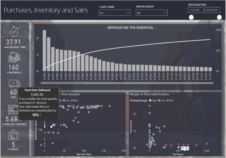
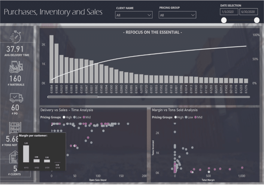
Then, when we go to Clients, we can see the Margin per customer, which is very important.
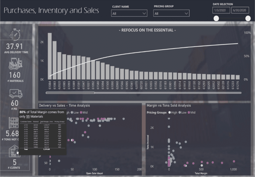
Also, we can see that 80% of the total margin comes from only 11 materials. This information is great.
In this tutorial, I explained how the users are scanning the screen in a Z pattern from left to right, and from top to bottom.
My main two KPIs are situated in the lower part of the screen. This is a bad design choice since those are the only two KPIs created with additional information.
Let me put myself in the audience’s shoes. If I wanted to explore the data by myself, why would I bother to ask a Power BI developer to create the report?
It’s funny because I was the one who created this report. This is one of my early submissions for Challenge #7 organized by Enterprise DNA last year.
I’m criticizing my own early work. In our journey to improve our reports, we all make mistakes and learn from them.
Adding icons next to the KPI is cool because it gives a professional look, but it is not enough to create a KPI. When you create a KPI, the first thing you have to ask yourself is, “so what?”
You can add a reference, make a comparison to a budget of last year’s forecast, or show how long it has been good or bad by adding a trend.
If it is really bad, anticipate questions from the end user. For example, if one of the KPIs caught a user’s attention, then they will need to dig into the details. You can add additional context or drill down to provide more details to the user.
Once the user has detailed information, what should he or she do about it? That’s where the user needs to be by the time you will present your recommendations for an action plan.
***** Related Links *****
Power BI Custom Icons | PBI Visualization Technique
Power BI Report Development: Creating Themes, Company Logos, Icons and Backgrounds
How To Add Custom Power BI Icons Into Your Reports
Conclusion
I hope that through these examples you will understand an important lesson concerning navigation buttons in storytelling.

Asking the right questions concerning the KPIs and placing additional context to the navigation buttons help the storytelling become more powerful.
As a designer, always keep in mind that we are not only creating reports; we are making a real impact.
All the best,
Alex


