I’d like to show you how incredible the Power BI Key Influencers visual is. I recently did a webinar wherein we ended up analyzing some health information to understand and even almost predict someone’s mortality or survival rate based on a whole range of biomarkers that the data set contained. Towards the end of the webinar, a participant suggested using the Key Influencers feature to check out the results, and I was absolutely blown away by the results. You can watch the full video of this tutorial at the bottom of this blog.
I’m going to share with you some of the insights we were able to find without having to do much. The Power BI Key Influencers visualization does all the work for you for this type of analysis.
Sample Report Using The Power BI Key Influencers Visual
Below is the data set that we were working on. We had patient information with details about the illnesses and medical conditions.
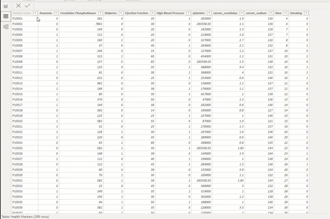
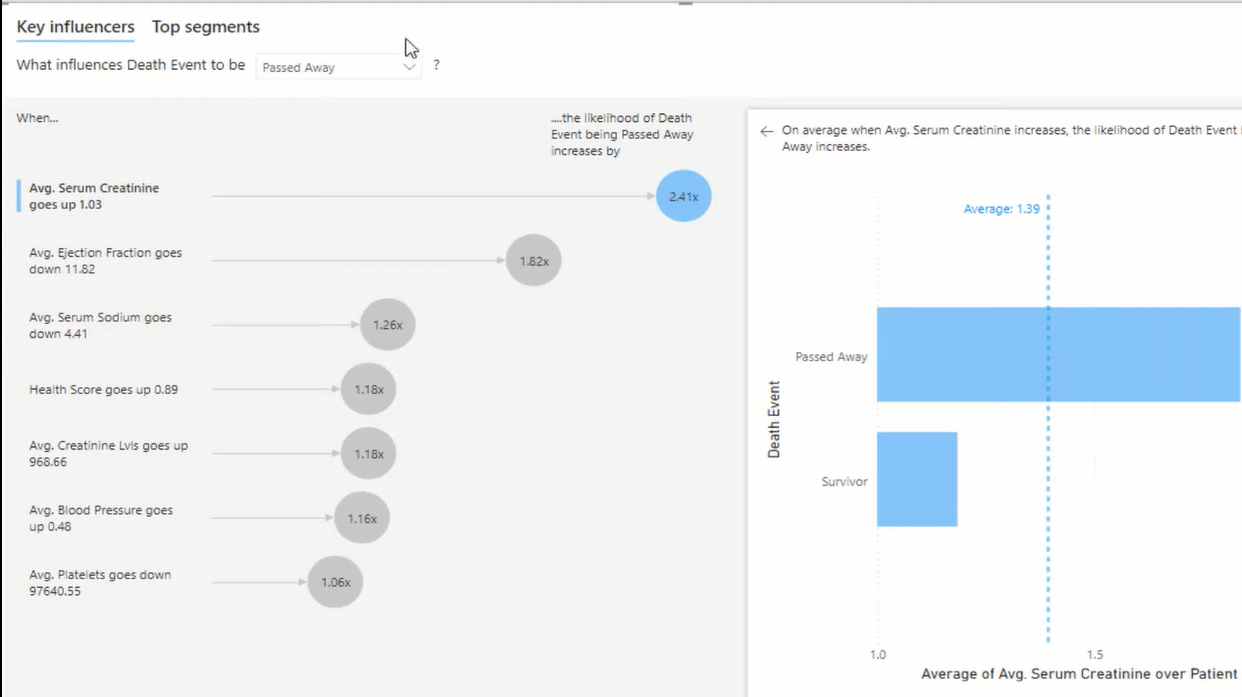
We were trying to configure things using X and Y diagrams to see if there were any trends, but when we looked at the Key Influencers tab, it did all the regression, the calculations, and the probabilities automatically for us.
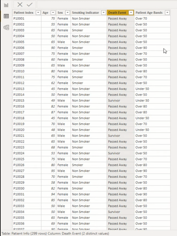
Within the patient information data set, we also had the data on whether the patients had passed away or had survived. And so, we wanted to drill into the likelihood that the patients would pass away based on their health details.
One of the key things that we self-calculated was the Health Score. We generated a score based on all the true and false readings that were in the data set, such as whether the patients were smokers, had anemia or high blood pressure, etc. The higher the rating, the more likely the patient is unhealthy.

With that calculation, this chart or visualization was automatically created. You can see in the chart the death event results, showing the ratings of those who had passed away and of those who had survived.
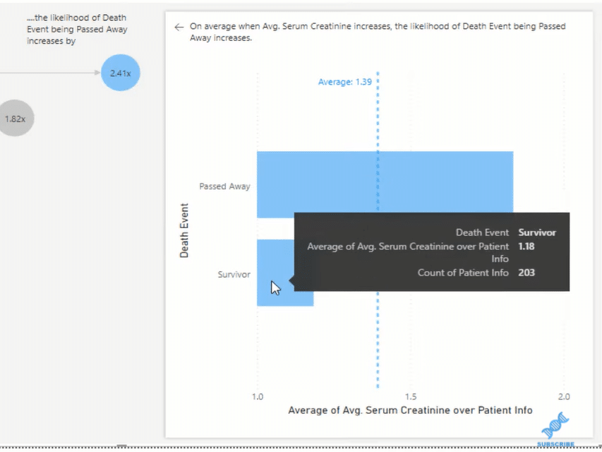
We can also click through the report visual on the left side to drill through the details.
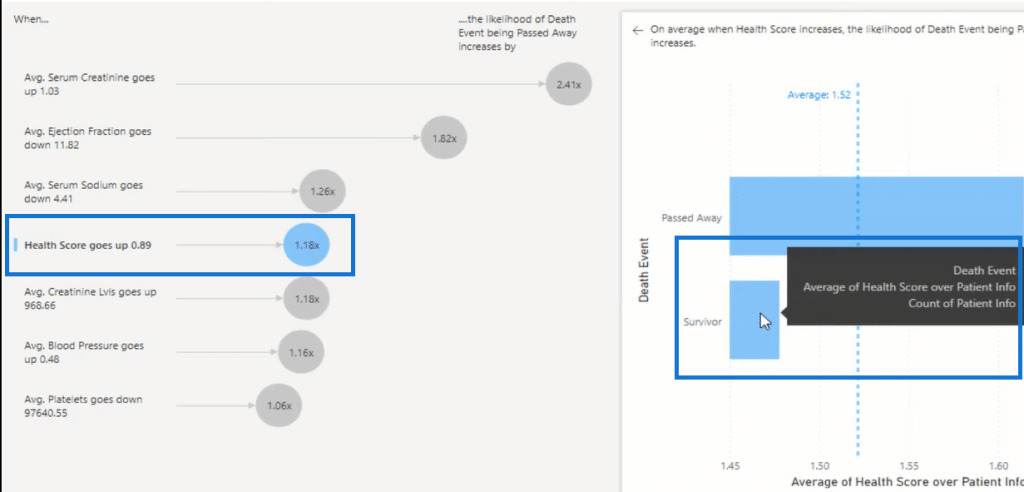
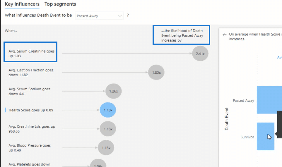
On the same visual, you can also see key insights, which are all generated automatically by the Key Influencers. You can also switch this around and see the likelihood of surviving instead of passing away.
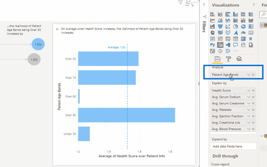
Another great thing about this is versatility. You can easily sub-in and sub-out key dimensions to analyze the data. For instance, instead of death events, let’s look into the patient age bands.
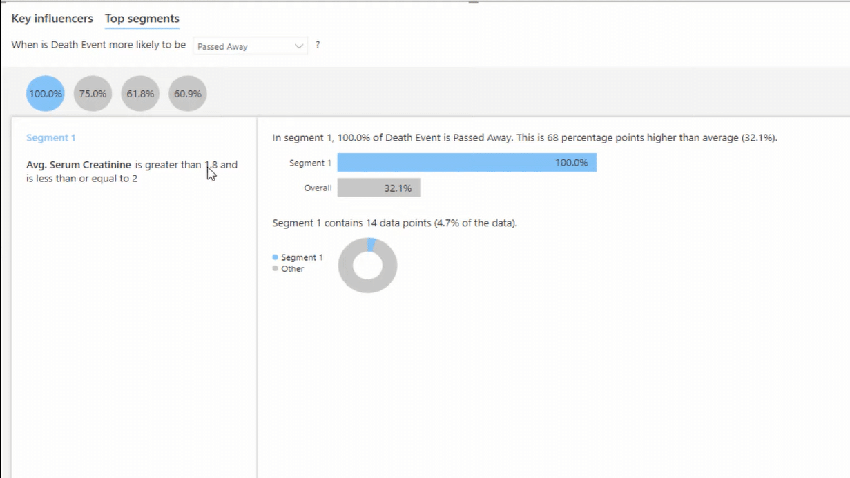
You can go to the Top segments tab as well and get more insights into the report. You can click through the different segments and see a more detailed presentation of the data.
There’s so much that you can do here. I highly recommend that you explore this visualization tool in Power BI.
***** Related Links *****
Best Practices For Data Visualization In Power BI
The Charticulator: Power BI Alternative Visualization Tool
Power BI Data Visualization Tips For KPI Trends Analysis
Conclusion
The Key Influencers visual is just incredible! Imagine using this visualization tool for a sales environment, where you’re analyzing whether your customers will buy or analyze the churn of your customers, etc. You can do a whole range of interesting things using this visualization.
I’m sure that there are so many other visuals in Power BI that could automate insights for you, and this is one of them. This can be used interestingly in other data sets, such as a customer database, an operational data set, sales data, etc. There are plenty of uses for this visualization. Be creative and just think about what’s possible.
Cheers!
Sam


