One of the most common concerns I see in the Enterprise DNA Support Forum relates to creating dynamic visuals. In this blog, I’ll focus my discussion on multi-measure Power BI dynamic visuals. I have a tutorial about this topic, which I’d like to highlight in this article.
The tutorial will show you how to work and present your results in a dynamic way and how you can change the measure in which you want to show a comparison to. I set up some calculations that I then feed into a measure that will allow me to dynamically change with a selection.
Here are some of the forum posts from the Enterprise DNA Support Forum that go over this particular topic. Perhaps you have similar scenarios with these members, which you can definitely learn from.
Multiple Financial Years For Different Companies
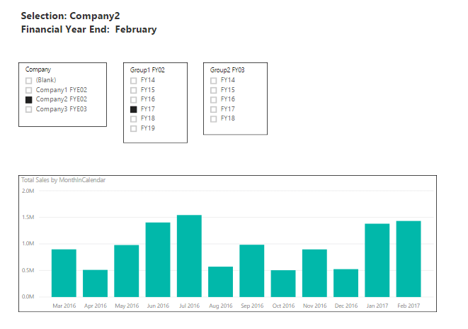
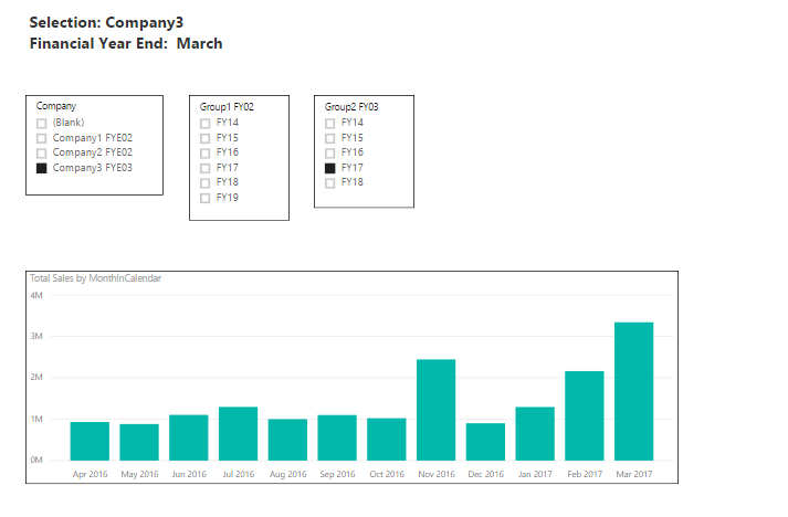
In this forum post, the member needed some filtering and merging of companies that have different year ends. One company has a February year end while the other has March. She was struggling with the Date table and time analysis in terms of filtering individual companies and consolidating the group.
This was how she did the filtering in her model.
1. Company 2 that has a February year end, and
2. Company 3 with a March year end.
So, there are two Financial Year (FY) dimensions. She wanted to create one dimension for FY, which would then give her a result of: if Company 2 is selected, February will be used as year end in measures and visuals. If Company 3 is selected, it will be March. Ultimately, she needed to consolidate the companies at a summary level.


The solution I gave her was to first create some measures to ultimately create what she required. So, instead of Total Sales, she should create Company 1 Sales and Company 2 Sales.
This is the formula I gave her:
CALCULATE( [Total Sales], Company = x )
After that, she’ll have to create a measure with the SWITCH/TRUE logic, wherein she’ll feed those measures inside it. This scenario has the same idea as the one discussed in the multi-measure dynamic visuals tutorial I mentioned at the beginning of this post.
In this case, the new measures created are then integrated into one measure with the SWITCH/TRUE logic.
Lastly, she needed to create a new table that has FY14, FY15, etc. Then, she’ll have to draw relationships from this table down to each column in her Date table with the unique financial years for each group.
This is how she can get the consolidation because she’ll be using the FY dimension in this table, which will filter the new measures concurrently based on the FY that she’ll select.
With that, she came up with this calculation that gave her the results she wanted.

Variable Selection
This is another forum with a similar case. The member wanted to create a graph that would dynamically change from Revenue, Margin, and Cost of Sales based on the selection made in the corresponding filter.
Then, ultimately, he wanted to have a chart that compares Revenue and Budgeted Revenue when the “Revenue” is selected, but then changes to Margin vs Budgeted Margin when the “Margin” is selected.
Here’s what his report looked like:

So basically, it’s the same concept to use a combination of the SWITCH/TRUE logic and create a supporting table that has all the selection options to be used as the slicer.
How To Filter With Date And Another Metric
Here’s another example of how you can create a dynamic visual with a filter slicer using the SWITCH/TRUE logic.
In this forum, the member was trying to make his P&L table dynamic to filter by date and have the value column change between Value or % of Revenue. He wanted to know how he could add a filter that allows to show either Value or % of Revenue.
The solution was for him to create a table with the metrics (Revenue and % of Revenue), then create a measure for a particular metric selected. This is how the formula should be:

Next, he has to create a measure to show the values if a particular metric is selected.

***** Related Links *****
Data Visualization Technique In Power BI – Multi Measure Dynamic Visuals
Creating Multi Threaded Dynamic Visuals – Advanced Power BI Technique
How To Create A Dynamic Power BI Report
Conclusion
Dynamic visuals using the SWITCH/TRUE logic is just one of the amazing visualization techniques that Power BI enables you to accomplish.
Creating dynamic visuals used to be very difficult and time-consuming with other analytical tools and programs. But with Power BI, you can do this very quickly.
However, it’s crucial that you understand and know your DAX well and build your data model well from the start. If you don’t know what functions to use or how to write the correct formula, you’ll be scratching your head for hours. If you have incorrect relationships and a too complicated model, you won’t be able to achieve the results you seek.
Dive into the related blogs and courses below to learn more about dynamic visuals. You can also check out the related forum posts for more information about the forum posts I featured in this article.
All the best!
Sam
***** Learning Power BI? *****
FREE COURSE – Ultimate Beginners Guide To Power BI
FREE COURSE – Ultimate Beginners Guide To DAX
FREE – 60 Page DAX Reference Guide Download
FREE – Power BI Resources
Enterprise DNA Membership
Enterprise DNA Online
Enterprise DNA Events


