I’m going to show you a really cool Power BI custom visual technique that I think you should explore and put into your reports. You may watch the full video of this tutorial at the bottom of this blog.
The report that I want to feature in this tutorial comes from Greg, one of our Enterprise DNA experts, doing amazing work on the forum. This was one of his submissions into a Power BI challenge about HR consultations.
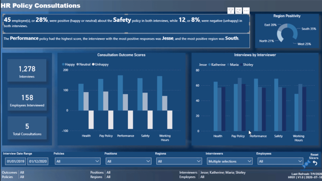
The thing that I want to call out in this report, which I think is awesome, is this idea of creating a dynamic piece of text in the report. Generally, in the past, it was static, which does not add much value. But this one is not static.
To be honest, I don’t love custom visuals, but this is one Power BI custom visual I really like. I didn’t even know this existed, as there are so many features and custom visuals in Power BI, and it’s hard to know all of them.
This is why the Power BI challenge has just been so valuable for me and for all those who’ve participated in it because we discover these valuable things and techniques.
Power BI Custom Visual: Enlighten Data Story
There are a lot of great things embedded in this report, but let’s focus on how to actually create these text summaries.
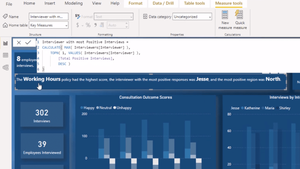
There is a Power BI custom visual called Enlighten Data Story. This enables you to layer a range of different calculations or measures and then put some text around these measures.
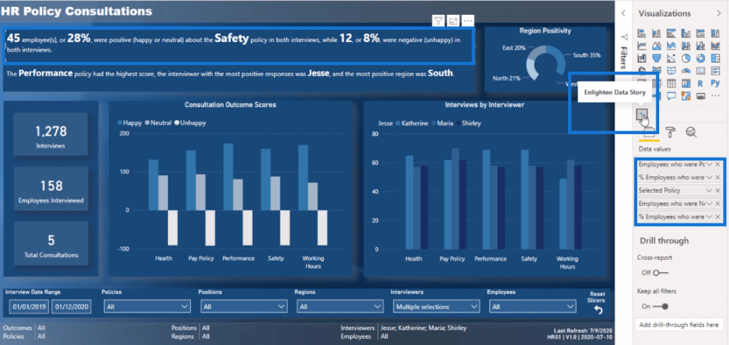
So, if I go to the Format section and go to Story here, you’ll see that it enables you to actually write a story. This is where you can write some text in those measures.
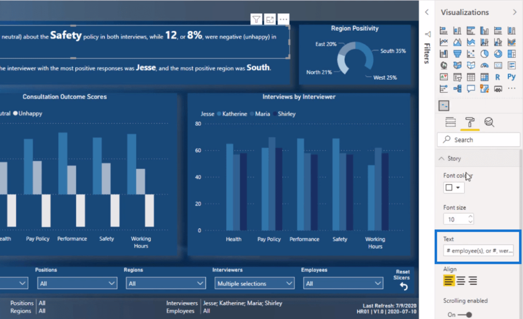
You just need to put a pound sign before you insert each measure. And then, that’s it. It just works like magic!
So, when I make a selection on the Region Positivity visualization, for example, all these measures in the text summary will update.
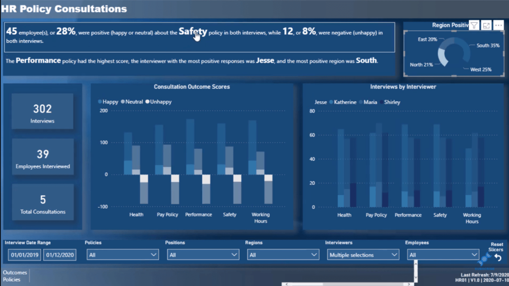
Embedding Dynamic Text To Showcase Insights
Notice the text measures below that you can put in there as well, which is really cool.
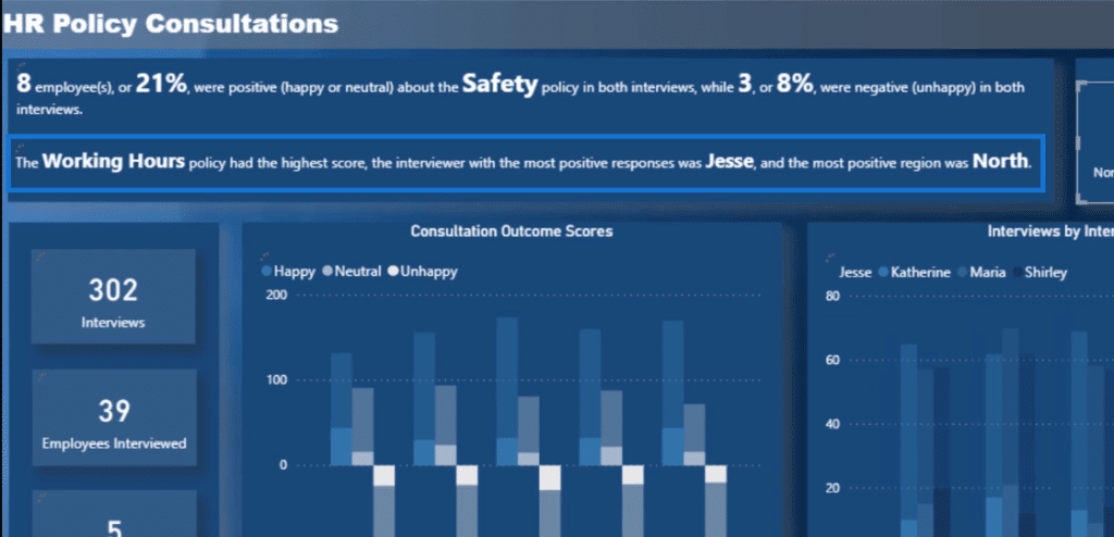
Greg has done some awesome work figuring out who was the most positive interviewer and what was the consultation with the highest score. He embedded some texts into a text box to really showcase all the insights.
***** Related Links *****
Power BI Data Visualization Technique: Creating A Dynamic Heading Or Title
Data Visualization With Power BI: How To Add Commentary To Your Reports In A Dynamic Way
Utilizing Custom Visuals For Power BI
Conclusion
I love the idea of using the Enlighten Data Story custom visual in this report. To be honest, I’m going to use it in my future reports. This custom visual is free. You don’t have to pay for it and it’s effective.
If you want to get creative, I think this idea is great. You can still create something similar to it if you’re using cards and text boxes. If you have a card visualization, you could just write some texts around it. Think about how you could do this in your Power BI reports.
Not everyone is visually inclined and with the features and custom visuals in Power BI, you can create a compelling and dynamic report like this.
All the best!
Sam


