
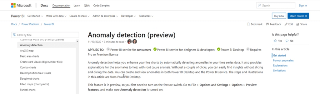
In this tutorial, I’m going to show you Power BI anomaly detection, which is one of the newest preview features released late last year. You may watch the full video of this tutorial at the bottom of this blog.
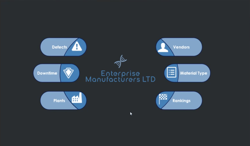
I was immediately able to use it in one of my reports right away, specifically in a report I submitted for one of the previous Enterprise DNA Power BI Challenges.

Power BI Anomaly Detection Overview
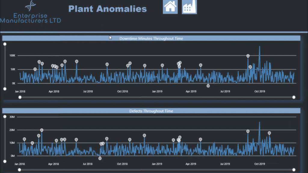
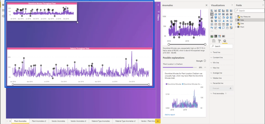
On the report I created, you’ll see that I created some of these anomaly detections in the Power BI desktop to show downtime minutes and defects throughout time.
First, you’ll have to turn on the feature if you haven’t done so yet. Just go to the file ribbon then click on Options and Settings.
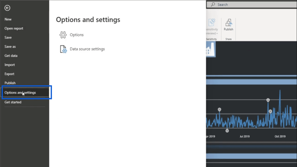
Then, click on Options. This will bring up a window.
On the window, click on Preview Features on the left pane. Then, look for Anomaly Detection and make sure it’s on.
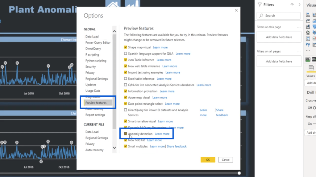
Once you hit OK, the feature will now be enabled.
In case you don’t see these options, make sure that you’re using the most recent version of Power BI. The Power BI format you’re seeing on my screenshots is from the February 2021 update.
Limitations of Power BI Anomaly Detection
The new Power BI anomaly detection feature is quite useful, but it does have a few limitations. If you click on the “Learn More” link beside anomaly detection in the Preview Features menu, this will take you directly to the Microsoft documentation for this preview.

This page is quite comprehensive in terms of what anomaly detection does and how it works, but I want you to scroll down until you see the list of limitations.
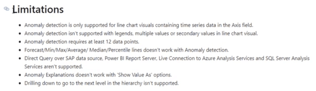
Now, this isn’t to deter you from using anomaly detection in your Power BI reports. I just want you to know what to expect once you start using this feature.
On this list of limitations, I believe that the most important thing to note is that the Power BI anomaly detection feature only supports line charts for now. This is extremely important information, knowing that visualizations play a huge role in making powerful reports.
What You Can Do with Power BI Anomaly Detection
I’m going to walk you through the different options you have when it comes to anomaly detection.
On the right pane below Visualizations, click on the icon that looks like a magnifying glass. You’ll find the different settings you need for anomaly detection beneath that.
One of the factors you can tweak is sensitivity. You can pull this up or down, with the number of anomalies rising as the percentage rises. In this case, I have that set to 70%.
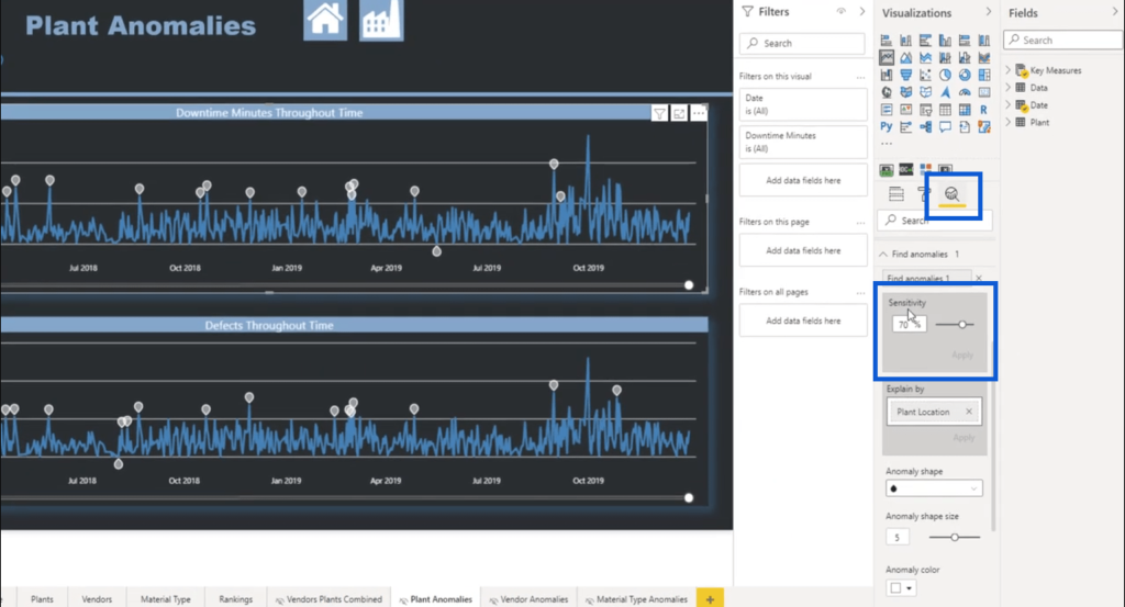
You can also choose which variable to use in explaining the anomalies. In this case, I’ve set that to Plant Location.
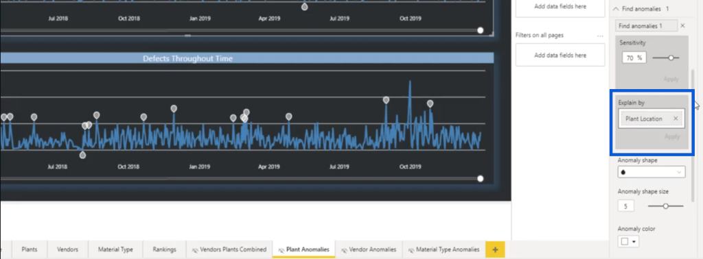
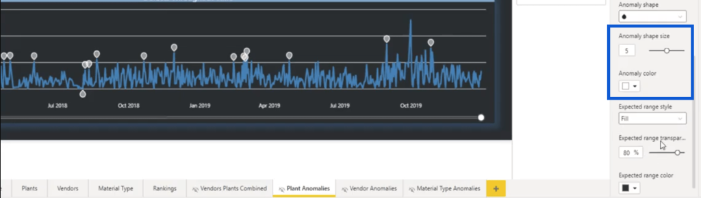
Looking at the anomalies on my chart, you’ll also see that I used the raindrop shape to point out where the anomalies lie. That’s another thing you can change, in case you want a different shape like a square or a triangle.
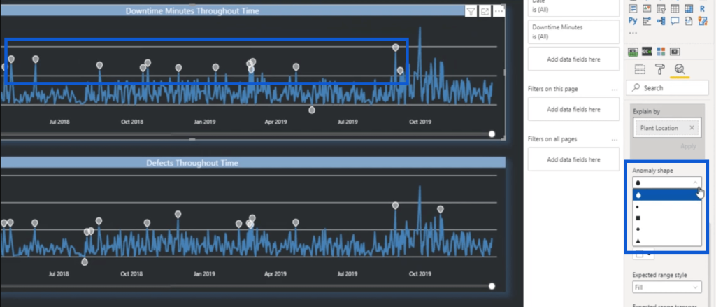
You can change the size and the color as well.
As you scroll further down, you’ll find other options you can use.
Choosing Themes for Your Visualization
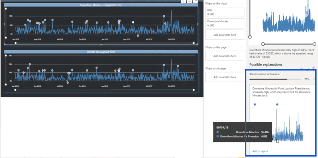
When I was working on this report, I noticed another limitation to this feature. As you can see, I used a dark theme on my report with limited colors. This poses a problem.
Basically, if you click on any anomaly, details of that anomaly will open up on the right pane. The problem is, the details will always be placed against a light background. As you can see below, because my anomalies are also light-colored, you can barely see them against the white background.
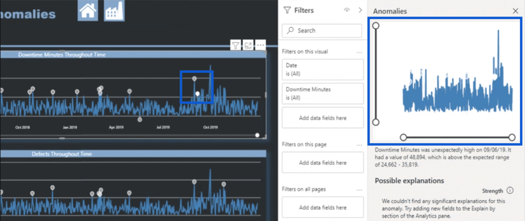
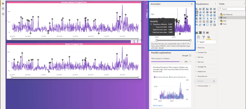
There will also be anomalies that have more detailed explanations at the bottom. If I click on one of those anomalies, you’ll see that below the line chart on top, there’s a plant location listed under possible explanations.
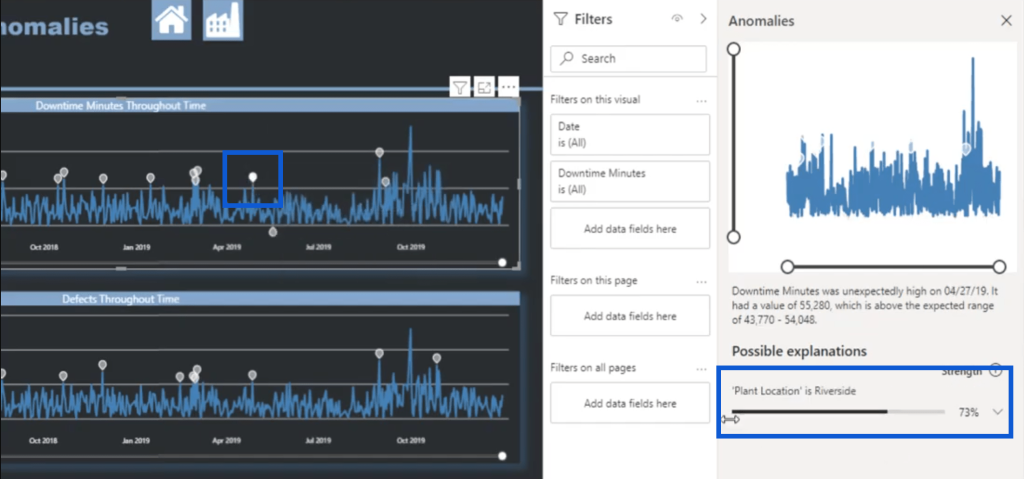
If I click on the dropdown beside the percentage, it opens up another line chart that shows the specifics of that location. The problem is, these details often use two different lines. Because I only used one color on my visualization, it’s impossible to tell which lines are which on the explanation chart.
There’s an easy fix to this problem. I created another PBIX file of my report, then I changed the theme I was using. To change the report’s theme, you can click on the View ribbon and pick any of the themes that show up.

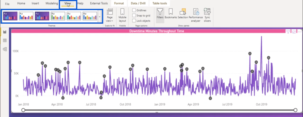
This theme does not only use a lighter background, it also adds more color to the visualization. So if I take a peek at the line chart under Possible Explanations again, you’ll see that it’s now easier to differentiate the different variables.
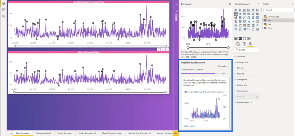
Looking at the chart showing the details of the anomalies, you can also see that the data points are now clearly seen.
What I’m going to do here now is to add the explanations to my report. So I’ll just drag the corners of my existing charts on the report page.
Then, I’ll click on “Add to report” on the explanation chart.
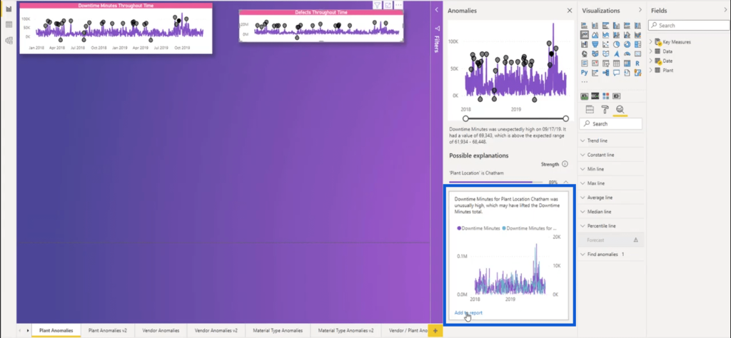
This will add that chart to my current report.
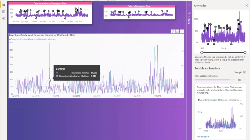
Without a doubt, this looks more appealing than my original report. Of course, you have the freedom to choose which theme you think will serve you best. Just make sure you consider the limitations I mentioned earlier before choosing a final theme.
Hopefully, the Power BI anomaly detection feature will let us choose our own colors in the future without having to rely on the preset themes from Microsoft.
Mastering Report Development Start to Finish
If you’re wondering how you can get a more detailed tutorial on how anomaly detection works, I actually have a course that discusses it. The course is called Mastering Report Development Start to Finish and it’s based on the Power BI Challenge entry I showed you earlier.
Don’t worry because although that report was the basis of this course, it certainly doesn’t fully focus on that. It’s more of a step-by-step guide on how I build comprehensive reports that give as much insight as possible.
You can find out more about the course through this post on the Enterprise DNA Forum when the course was first released.

The course can be accessed through Enterprise DNA’s education portal. Although most courses in the portal can be accessed either for free or by paying for each single course, you’ll get the best value through an Enterprise DNA membership.
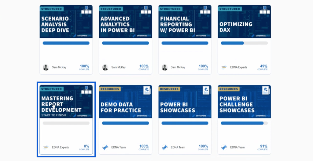
You can click on the course to see what’s included in the curriculum.
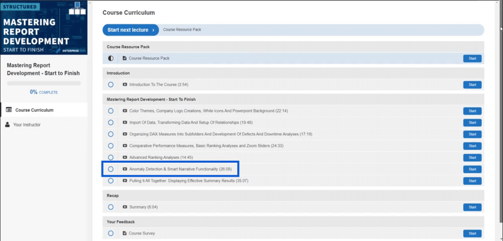
Here, you’ll see that anomaly detection is one of the topics discussed in this course, which lasts for around 26 minutes. I really go into detail in this course, so make sure you sign up for it if you want to find out more about anomaly detection.
Conclusion
Power BI anomaly detection is fairly new, so let’s give it some time and for sure, we’ll start seeing fewer limitations. It’s already helpful now as it is, so make sure you try it out on any report you might be working on.
Again, take this as a sign to sign up for an Enterprise DNA membership. For sure, it’s not just anomaly detection that you want to learn more about. Regardless if you’re a beginner or an expert user, there will always be more to learn especially if you consider Power BI’s dynamic nature. An Enterprise DNA membership will give you access to courses, resources, tools and exclusive events that can help you advance your skills in Power BI.
All the best,
Jarrett
***** Related Links *****
Creating Dynamic Outlier Trigger Points In Power BI
Showcasing And Understanding Anomalies In Power BI
Power BI Data Sets: Learn How To Detect Abnormal Behavior Using DAX


