In this tutorial, I’m going to show you how to start off from a blank Power Apps canvas and create an app from scratch.
Since this tutorial is meant for Power Apps users who are at the intermediate level, I will assume that you already know what screens, galleries, and data cards are. By now, you should also know how to change their properties and what triggers are. Having this knowledge will help you work through this tutorial easily.
In the past tutorials about Power Apps, I always started off with an existing template where everything has been nicely laid out. This time, we’re going to start on a clean slate.
Starting A Blank Power Apps Canvas
To create a blank canvas, click on New under the File ribbon. Then, go to Blank App. Let’s do a Tablet Layout for this app.
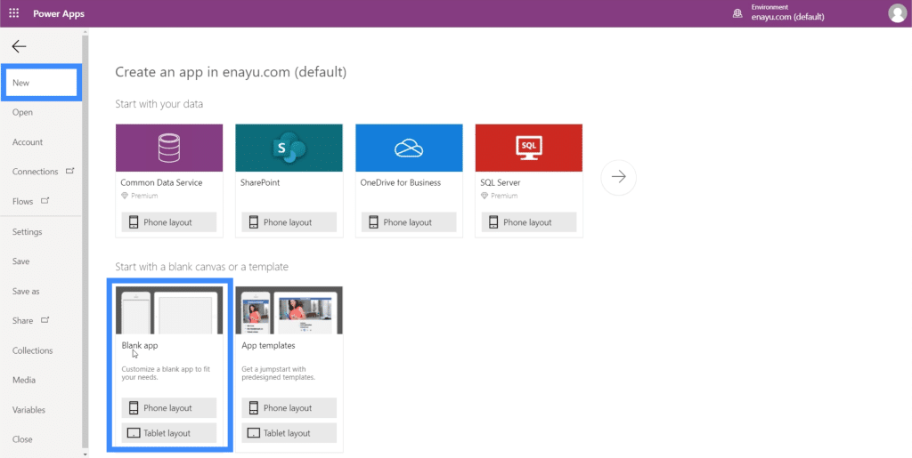
The advantage of a tablet layout is that it also looks good on web browser screens and on your computer. Not all organizations use mobile phones or tablets in the work they do. Instead, they just use web apps. The tablet layout would then be more convenient for them.
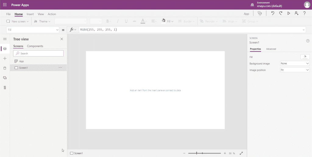
This is what the blank canvas looks like.
Before getting started on the app itself, save it first to make sure you don’t lose anything if something goes wrong. You can do that by clicking on Save As under the File ribbon. For this app, I’m going to save it to the cloud so that I won’t have to worry about retrieving my files if something wrong happens to my device.
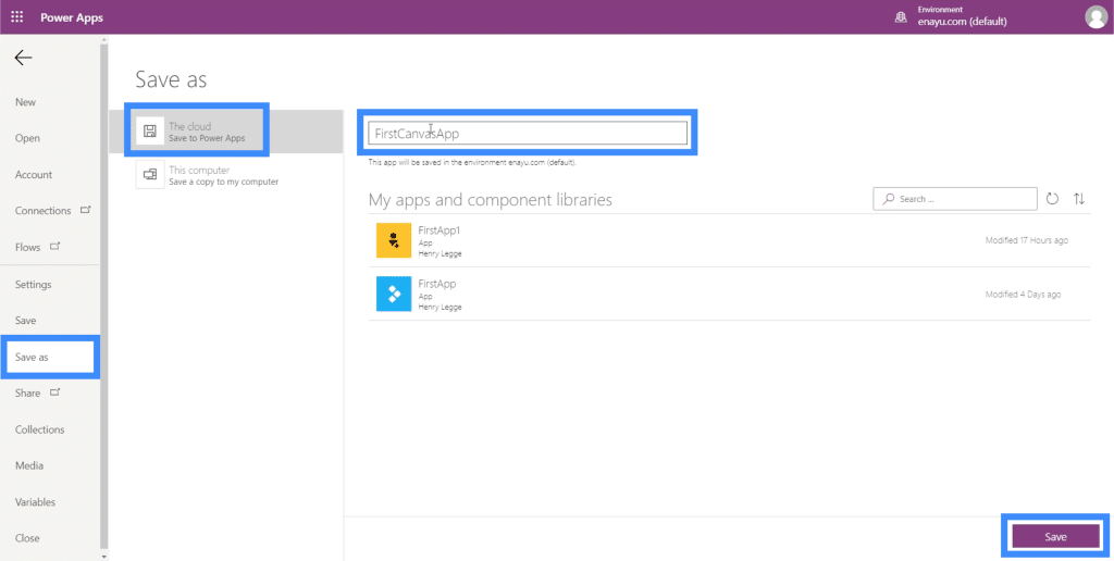
I’m going to name this FirstCanvasApp. Click Save on the bottom right part to save your work.
Creating A Master Screen In Your Power Apps Canvas
If there’s one way to make working with a blank Power Apps canvas more efficient, it’s starting off with a master screen.
A master screen serves as a base template where all your app’s screen will be based on. This allows you to create an app that maintains a uniform look all throughout.
Let’s use Screen1 here as our master screen. Just click on the menu on the right side to rename the screen.
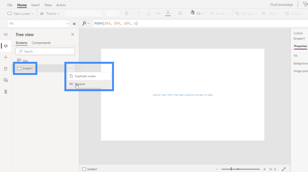
We’ll call this the MasterScreen.
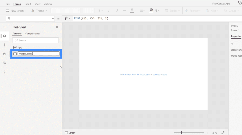
Now, let’s think about what we want to look like. Remember that because this is the master screen, all the other pages will look like this.
We can start off with a title at the very top. So click on Icons under the Insert ribbon, then choose Rectangle.
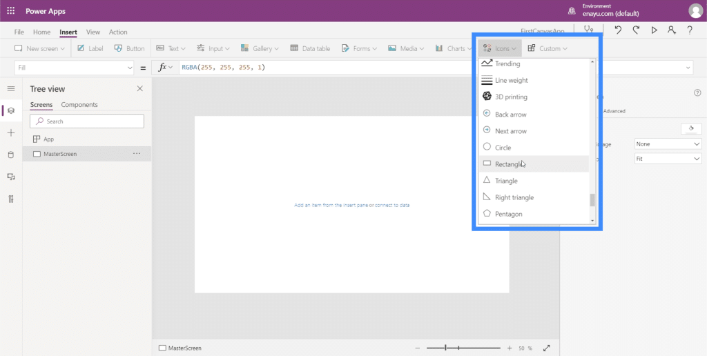
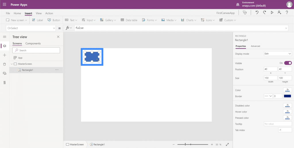
We’re going to use this rectangle as a banner where our title will be placed. Initially, it will come out as a small shape.
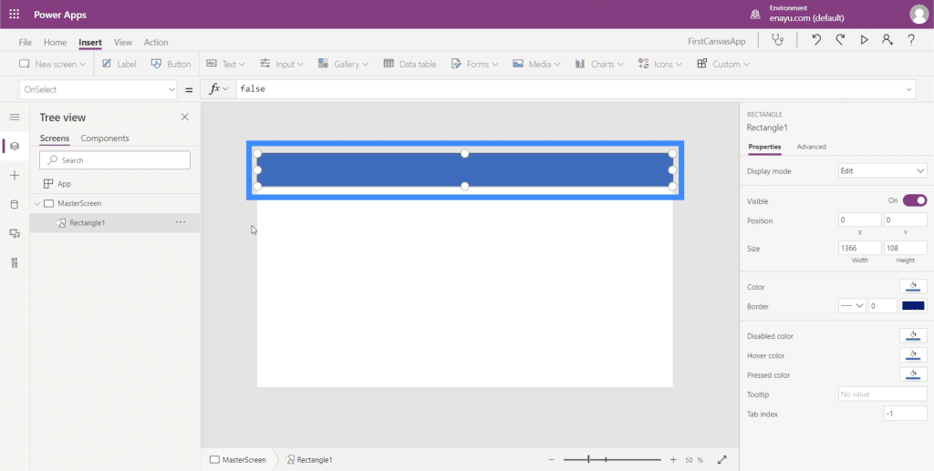
So just drag the markers on the sides and corners until it fully covers the upper part of the screen.
Next, let’s add the text. Still under the Insert ribbon, click on Text and choose Label.
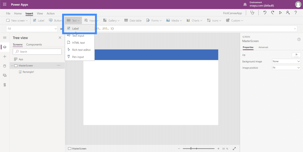
This will open up a small text box.
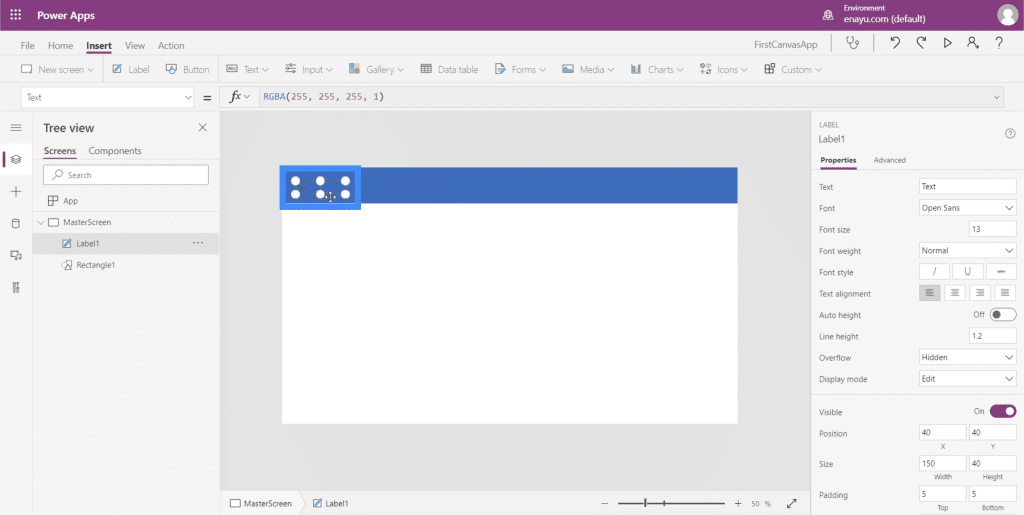
Just like what we did with the rectangle, let’s stretch this text box until it covers the top area.
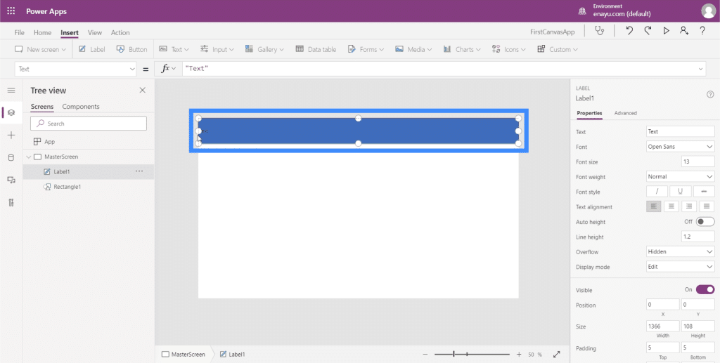
Then, on the formula bar, I’ll type in “Title of the Screen” and hit Enter. Notice that the contents of the text box also changes when I do that.
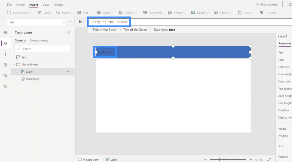
Let’s make it a lot bigger too, to make it more visible. I can change the font size here under the Home ribbon.
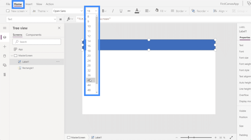
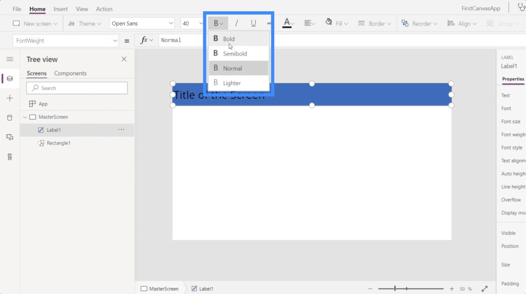
Let me change the format as well and set it to Bold.
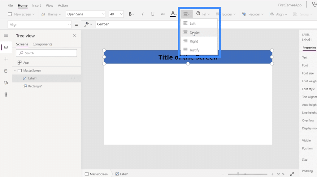
Then, I’ll change the alignment and set it to Center.
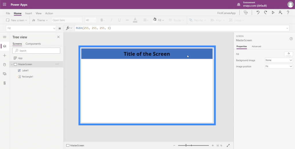
So this is what every screen in the app will look like.
Working On Documentation
Now that we have a master screen, let’s create a Documentation screen as well. The documentation screen will serve as a reference screen where all elements to be used throughout the app can be found.
Under the Home ribbon, just click on New Screen and choose Blank.
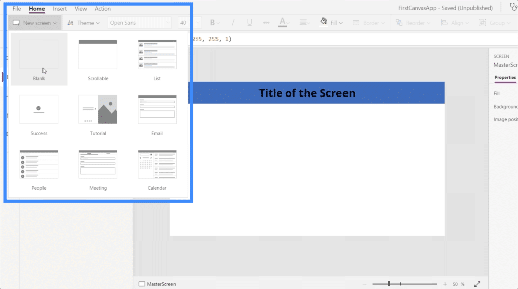
Then, let’s rename this screen to Documentation.
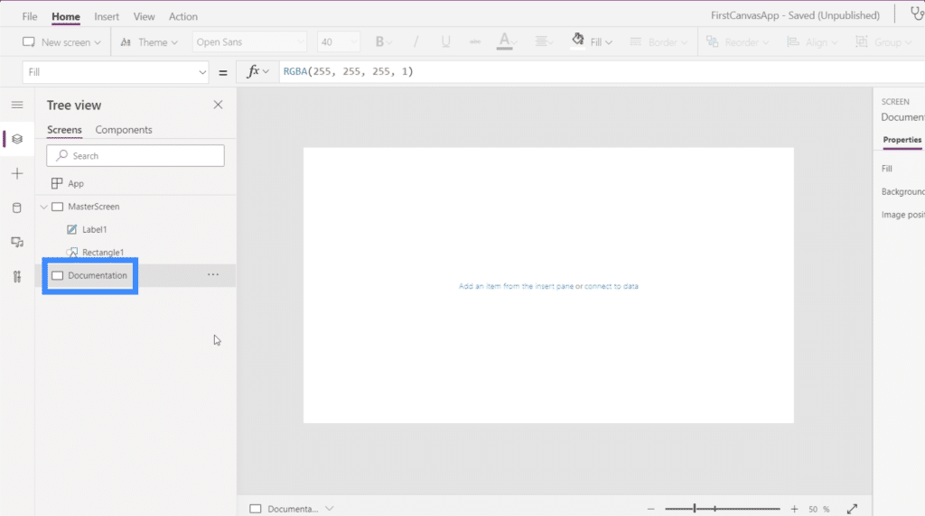
Remember how we used a rectangle on the master screen? Let’s create one just like that here in the documentation screen.
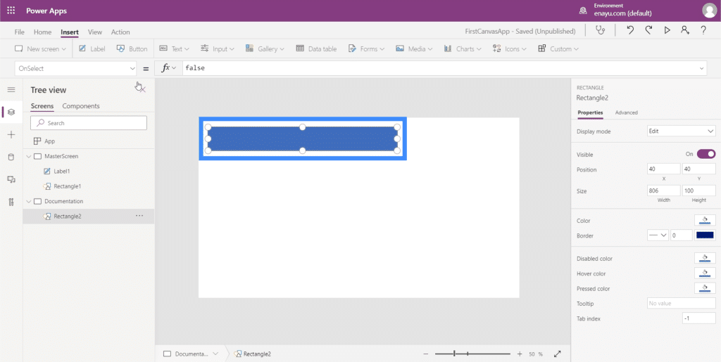
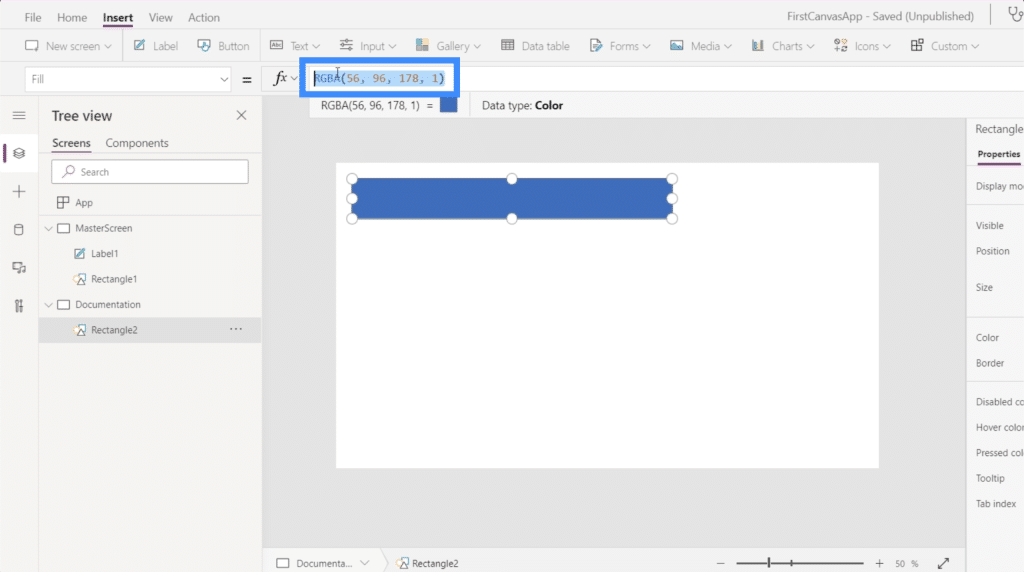
This time, I want to make it a different color. To do that, I need to change the shape’s Fill property. That can be found here on the dropdown at the left side.
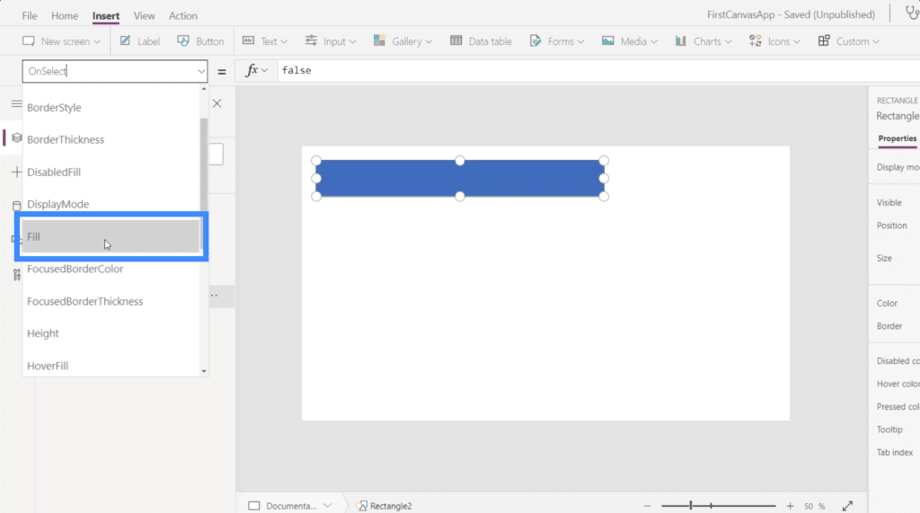
Notice that on the formula bar, it’s showing the RGBA color properties for the color blue, which is the rectangle’s current color.
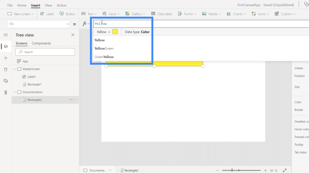
What if I want to change it to yellow? I don’t really need to know the RGBA properties for that. Just type in the word Yellow and it’s automatically going to show the different color options available.
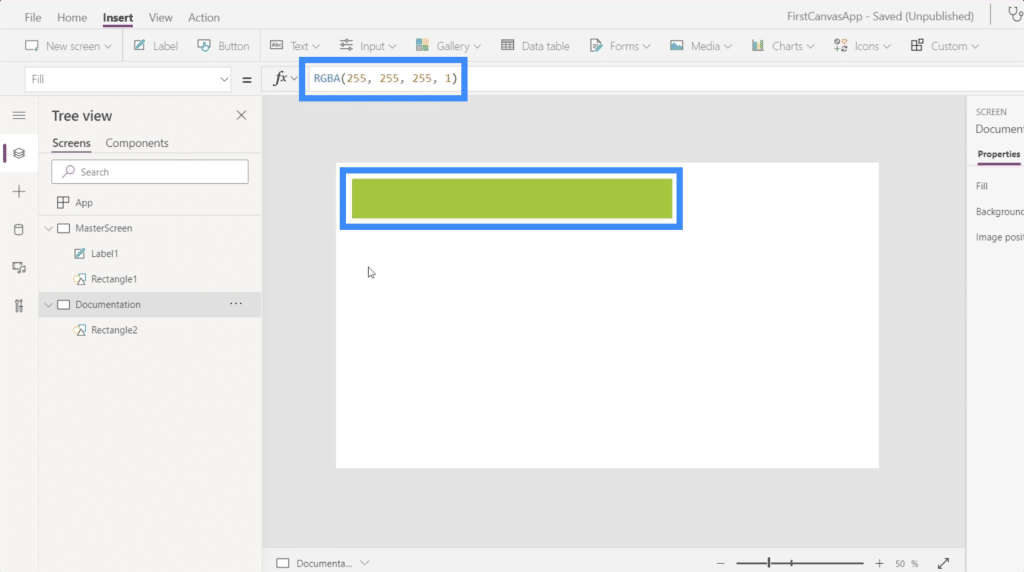
Let’s choose yellow green. Notice that once you choose a color, it also shows the RGBA properties while also changing the color of the shape.
Referencing The Documentation Screen
Here’s where we see the value of the documentation screen.
Because we like this color better, let’s go back to the master screen and change the color of the rectangle under the title. So once we choose the rectangle under the right screen, just choose Fill on the dropdown.
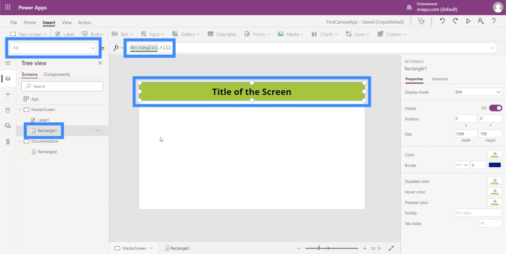
Notice that instead of typing in yellow-green like what we previously did, I only had to type in Rectangle2. Fill. This automatically references what we did for the element Rectangle2, which is found in the documentation screen. It then copies the same element we created in the documentation screen.
So imagine having up to 8 screens or more in your app. This means that if we decide to change the properties of any of the elements that appear across all screens, we don’t have to change them one by one. We just need to change the documentation screen, and all the rest will follow.
Let’s say a manager tells you to change the color to red because they don’t like yellow-green. Now, you just need to go back to Rectangle and change it to red.
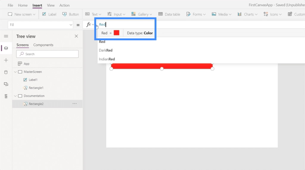
This will automatically change all other rectangles referencing this in your application.
***** Related Links *****
Power Apps Introduction: Definition, Features, Functions And Importance
Power Apps Environments: Setting Up The App Elements Properly
PowerApps Functions and Formulas | An Introduction
Conclusion
Working with a blank Power Apps canvas shows us even more how flexible this platform truly is. The ease of use really allows us to create powerful apps that align with our themes and branding.
As long as you start off with these two key screens — the master screen and the documentation screen — you can create apps with ease without worrying about repetitive work as you jump from one screen to another.
All the best,
Henry

