In this tutorial, you’ll learn how to create a line chart for your Power BI data reports using Charticulator. It’s one of the most common visuals that you can encounter in different reports. It plots data points using a series of lines which provide valuable information.
Creating The Dataset
The first thing to do is create a dataset that will be used for the chart. This is the dataset that will be used as an example.
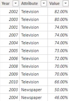
It shows the popularity that television, newspaper, and internet have gained throughout the years. The dataset consists of Year, Attribute, and Value.
Creating Line Charts In Power BI’s Native Visual
Creating the chart in Power BI’s native visual is easy. You just click the line chart in the visualizations pane and place the corresponding measures and categories in the Fields section.
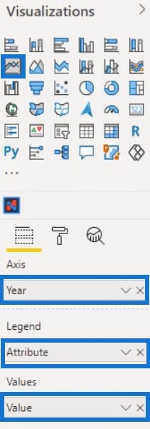
The line chart will then look like this.
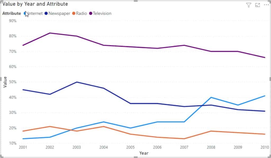
However, the downside of using the native visual for this chart is that you always have to check which color belongs to the attribute. This makes it difficult to get the overall view of the line chart visualization. So, using Charticulator for this visual is highly recommended.
Creating Line Charts In Charticulator
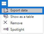
The next step is to export the dataset in Charticulator by clicking the ellipsis and selecting Export data.
Go to charticulator.com and click Launch Charticulator.

Locate and open the exported dataset file and click Done. You’ll then be directed to the Charticulator canvas.
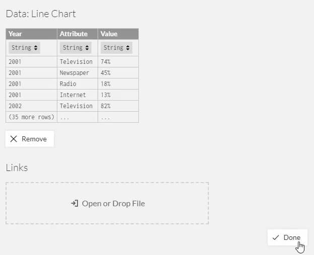
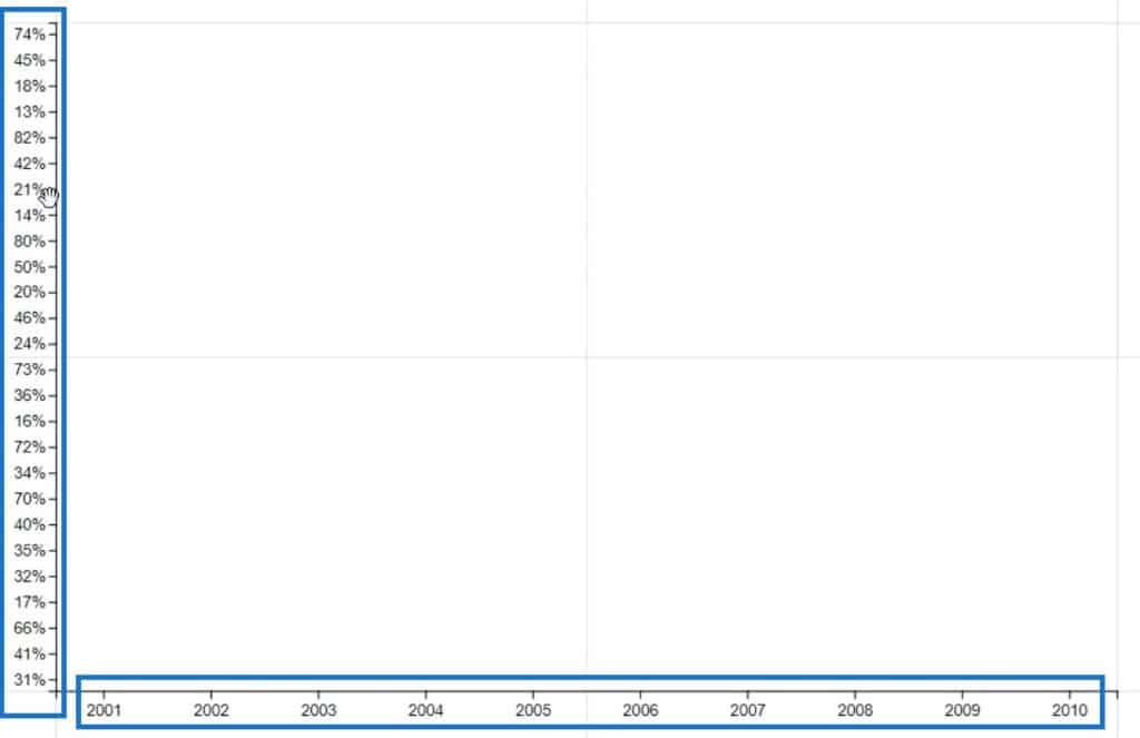
Bring in Year and Value in the X and Y-axis respectively.
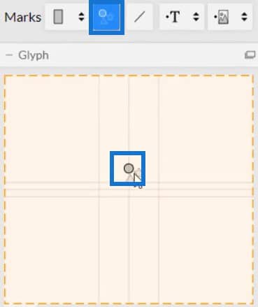
Next, place a circle from Symbols inside Glyph.
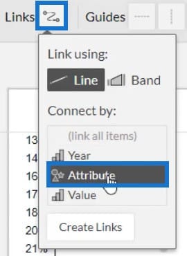
To create the line, click Links and select Attribute. This connects all the attributes using a line.
You can then see lines connecting the circles inside the chart.
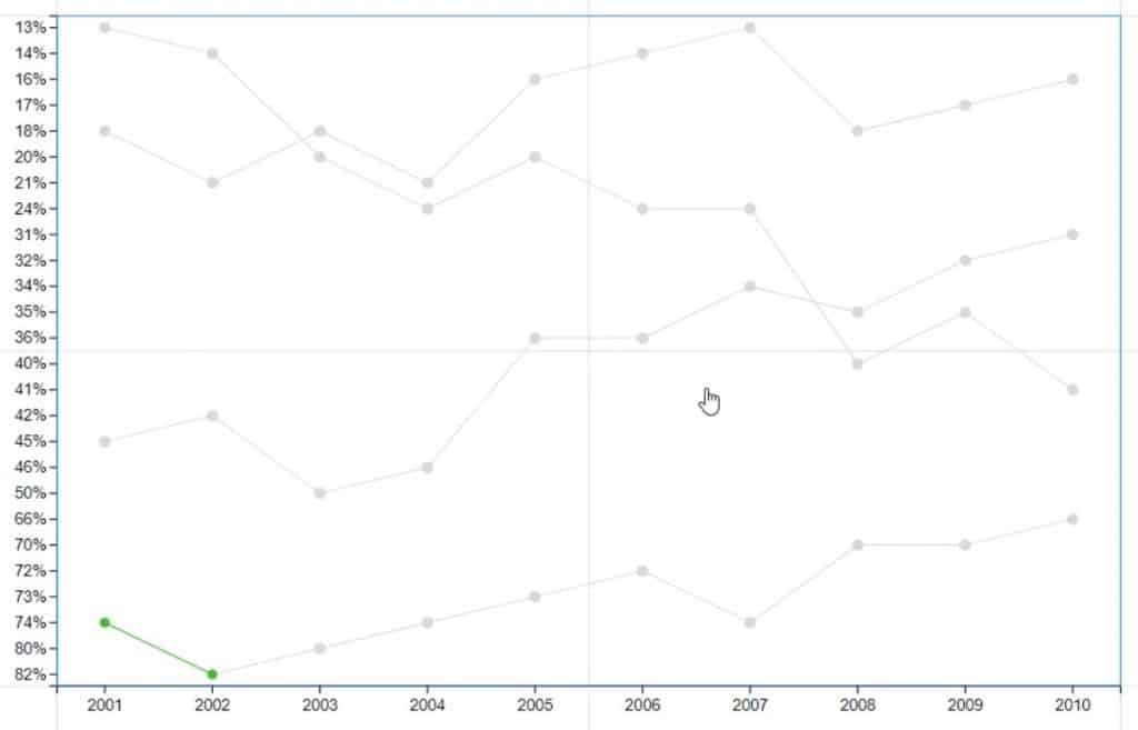
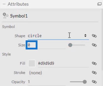
Now, remove the circles in the chart so that the lines will be emphasized. Open Symbol1’s Attributes and change the size to 0.
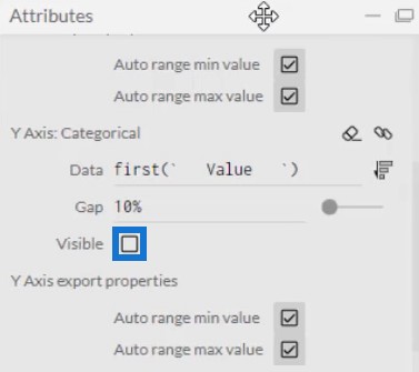
Next, open PlotSegment1’s Attributes and uncheck the Visible box for the Y-Axis. This hides the values or labels of the axis.
Add colors to the line by bringing Attribute in the Color section of Link1’s Attributes. You may also adjust the width of the line in the same Attribute.
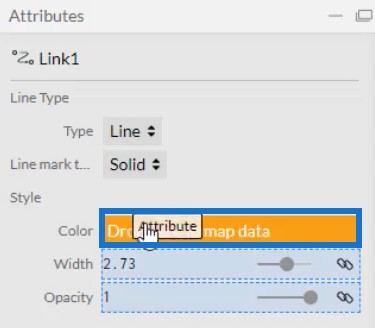
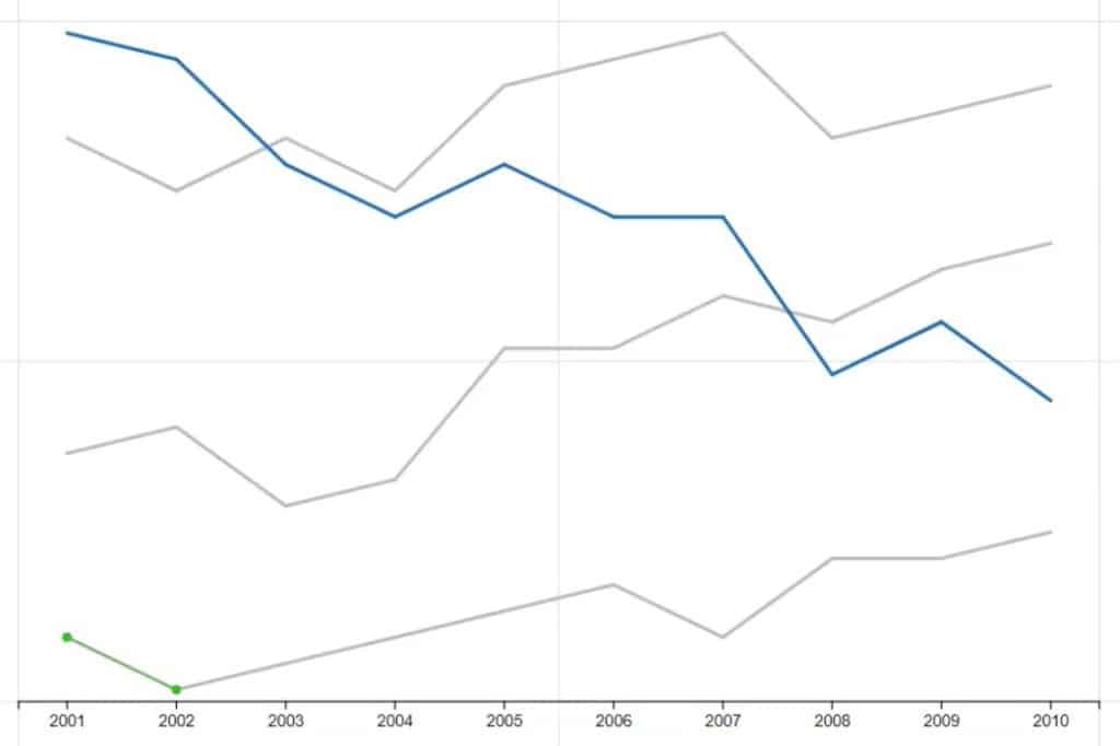
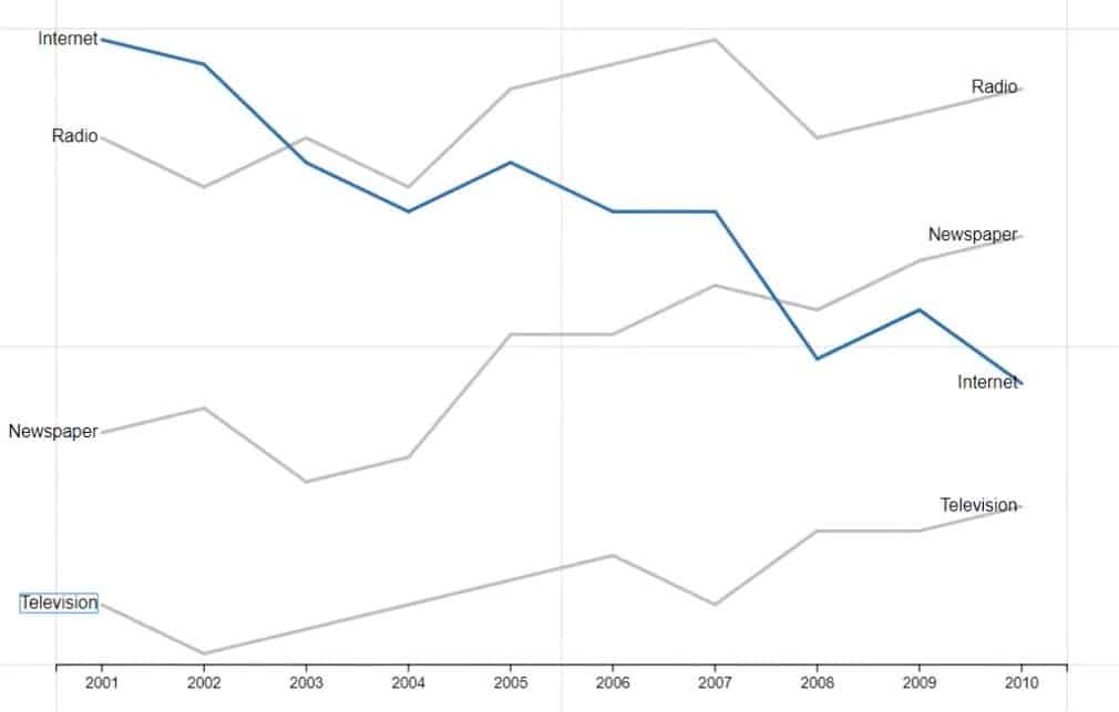
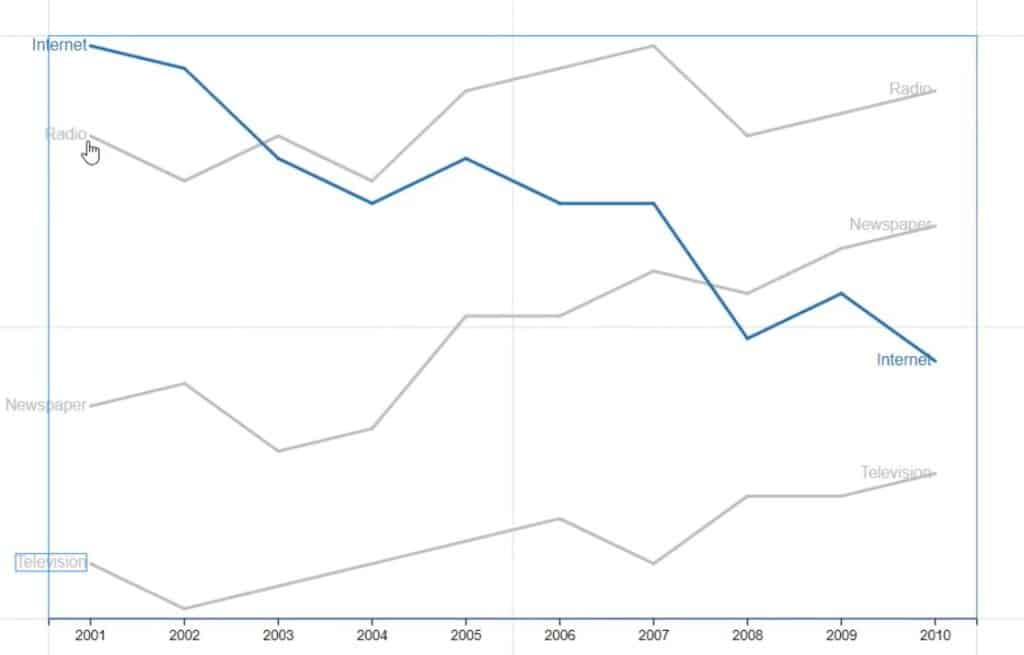
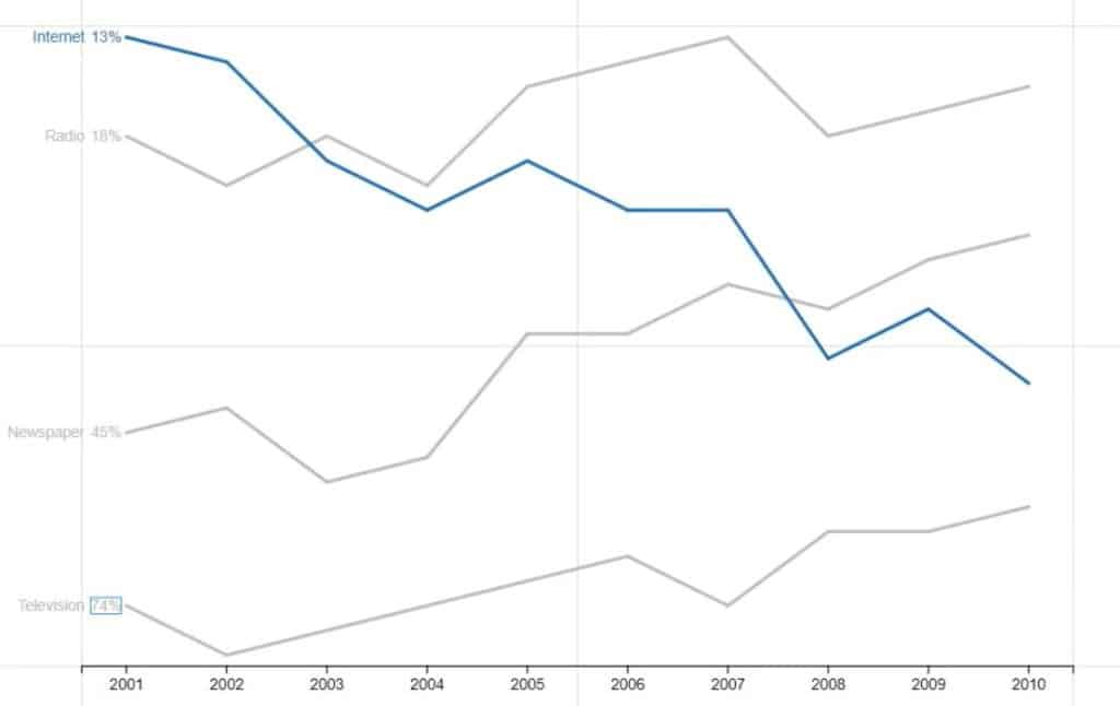
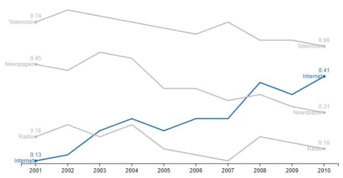
If you only want to highlight a single category, you can set the color of that category to any color and set all other categories to gray. In this case, Internet is set to blue and the others are set to gray.
With that, your visualization will look like this.
Add Labels And Values In the Chart
Show the categories and values in both ends of the lines by bringing Text inside Glyph.
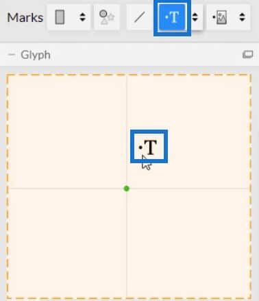
You’ll then notice that Text is added to all the years in the chart. You need to remove all of them except for the tips.
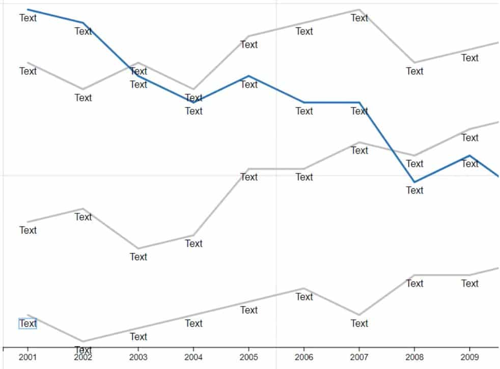
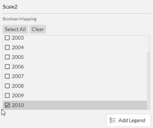
Open Text1’s Attributes and go to the Visibility section. Next, click Conditioned by and select Year.
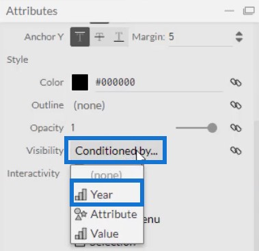
Then, uncheck all the boxes except the first and last.
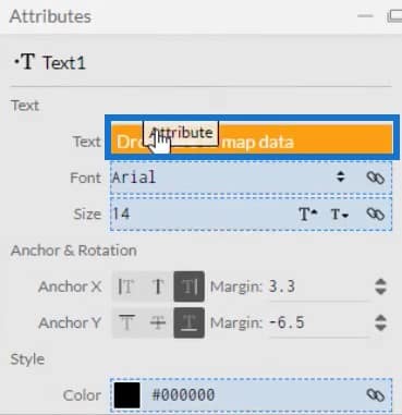
Move the Text to the tip of the line by placing Attribute in the Text section of Text1’s Attributes.
You will then see the categories at both ends of each line.
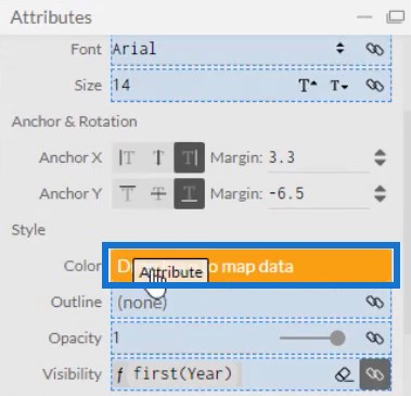
Bring Attribute to the Color section of the Attributes.
This will make the labels have the same color as their corresponding lines.
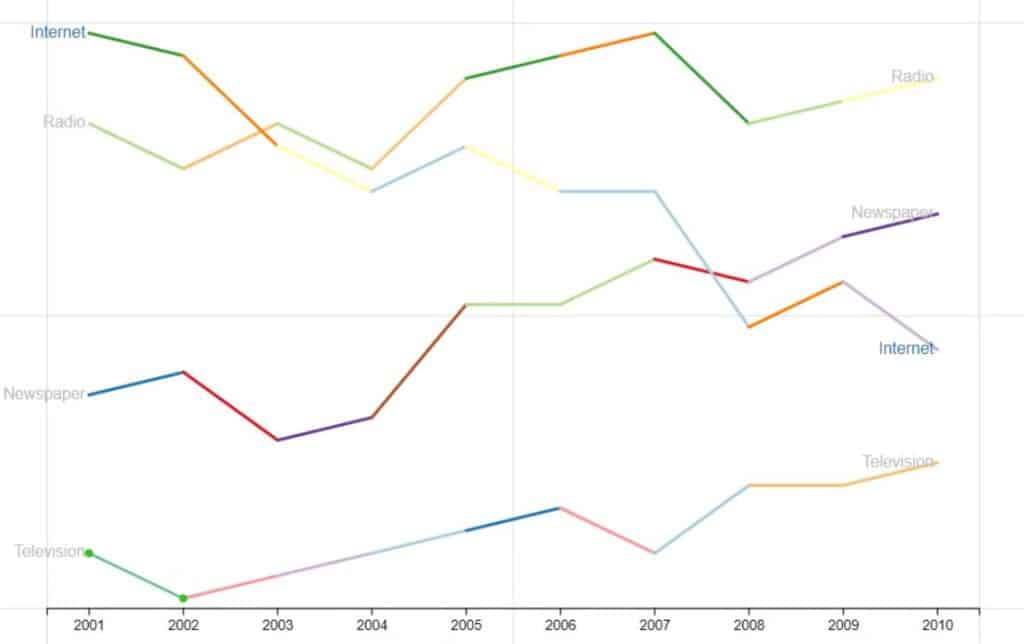
Another thing you can do with the lines is to add color gradients. If you bring Value in the Color section of Link1’s Attributes, you can see different colors in the lines along the years.
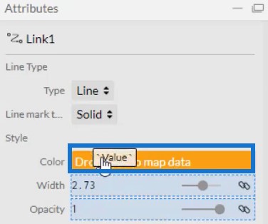
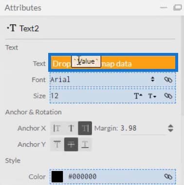
Now, bring in another Text inside Glyph for the values. Place it beside the category label and bring Value in the Text section of Text2’s Attributes.
Like the category labels, condition the values to only appear in the tip of the lines. Then, color it by putting Attribute in the Color section of the same attributes. The line chart will then look like this.
Exporting And Importing The Chart File
Save the chart and export it to Power BI Custom Visual.
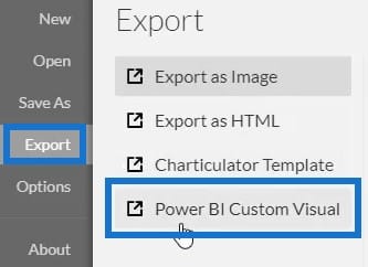
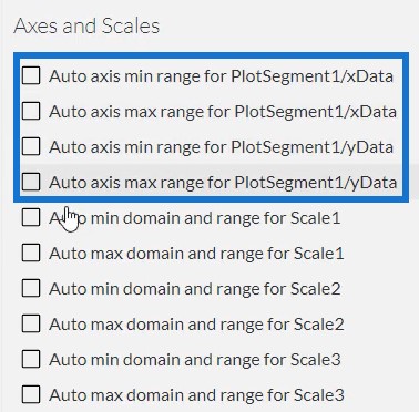
Uncheck the auto axis option in the Axes and Scales settings to prevent the axes from changing when a context transition is invoked. Once done, input a visual name and export the chart file.
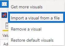
Open Power BI and import the file. Click the ellipsis below Visualizations and select Import a visual from a file.
Click the Charticulator link with the visual name and place the corresponding data needed in the Fields section.
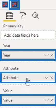
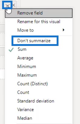
Next, click the dropdown button of Year and Value and select Don’t Summarize.
With that, your Line Chart visualization is complete.
***** Related Links *****
Native Visuals In Power BI: Basic Charts
Power BI Best Practice On Reports & Visualizations
Custom Visual Reports In Power BI
Conclusion
Most data reports use a line chart, which is one of the most common data visualization charts. It’s a series of data points connected by a line that shows the relationship among different categories. It’s an easy chart that you can create using Charticulator or the native visual in Power BI.
To learn more about line charts and other visuals, practice and maximize this tutorial using your own data.
Mudassir


