
For this blog tutorial, I’d like to go through a custom visual I used in the report I developed for my eDNA Power BI Challenge 16 entry that’s called a KPI ticker. It’s a pretty eye-catching visual, which is why I received many questions from our members on how I put it together. I’ll be demonstrating how to do this in this tutorial. You can watch the full video of this tutorial at the bottom of this blog.
I’ll walk you through the process for implementing that and I’ll talk about where it works well, and in some cases, where it doesn’t.

Building A Scrolling KPI Ticker In Your Power BI Report
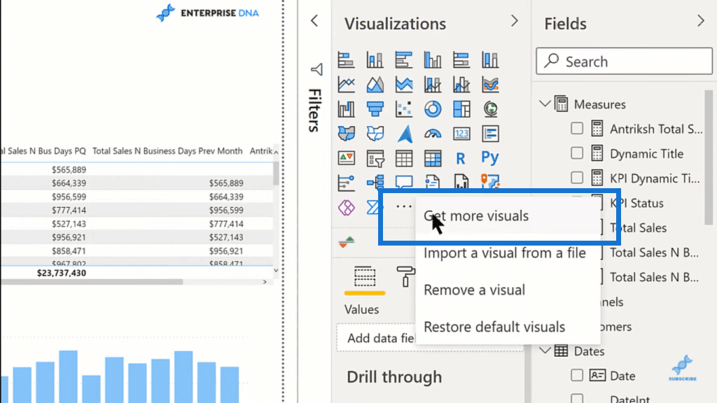
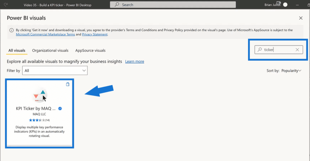
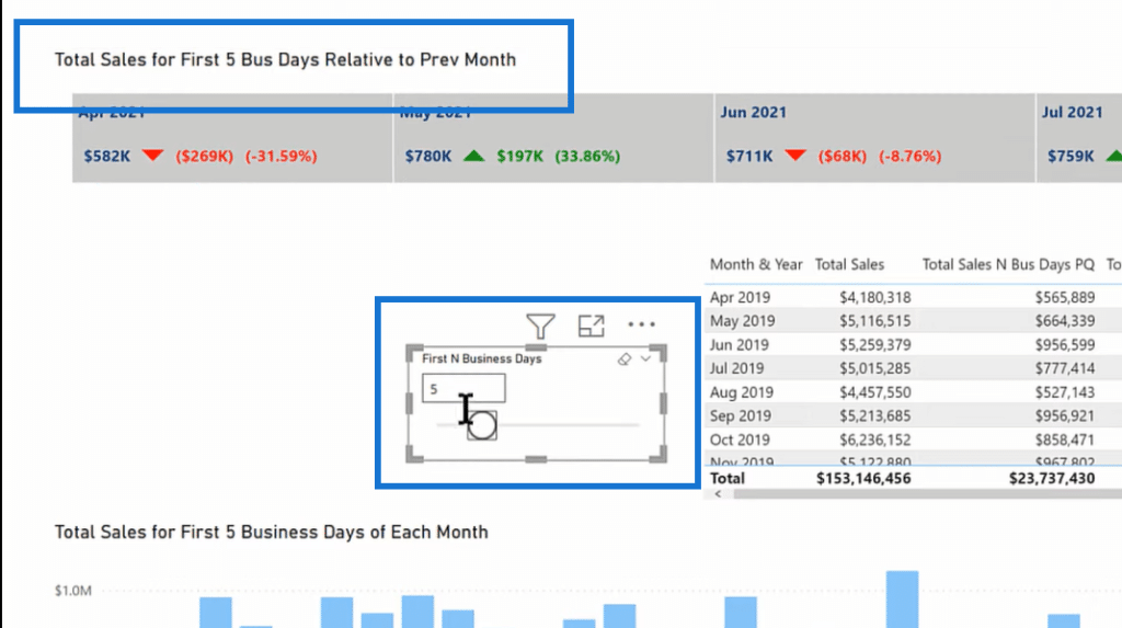
This is the data that I’ve been working with recently in terms of the dynamic comparison of the first end business days of each month and it just so happens that the data we created for this works well in the KPI ticker. The first thing you need to do is just go to the app marketplace and say, get more visuals. And we’re going to look for one called the Mac KPI ticker.
Search for the ticker, and just go ahead and add that in. It’s a free visual.
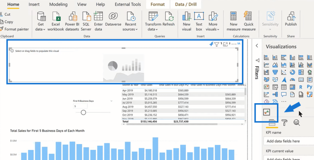
If you click on the icon, it creates an open canvas. There are four fields that you need to worry about in putting this together. There are a lot of formatting and animation settings that we’ll talk about in terms of getting it to look good.
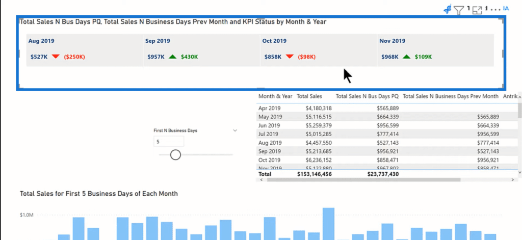
But the first thing we need to do is to look at Total Sales over the end business days that we’ve selected. We’re going to use Month & Year and drop that in the KPI name. And that’s just the Month & Year column from our Date table. Then, in terms of KPI current value, we’re going to take the Total Sales for the first N business days (Total Sales N Bus Days PQ).
Next, we need to develop a previous value since we not only want to look at the KPI, but we also want to look at it relative to the prior month. So, we drag Total Sales N Business Days Previous Month into the KPI last value section. This goes through and grabs the previous value for the current month and year that we’re focusing on in each of the cells.
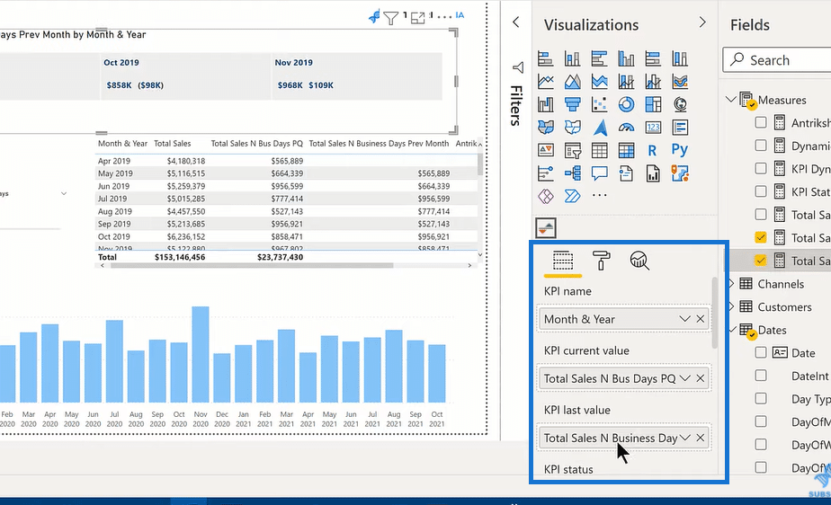
The last thing we need to do is KPI status, which is a specially formatted field that we develop in DAX for this visual. There are a number of ways to do this. You can do it with nested IF statements, but I find the easier way to do it is with a SWITCH TRUE construct.
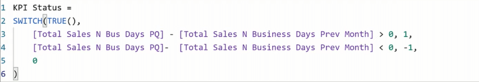
And you’ll see when we drop that KPI Status into the field, it creates the colored indicators, which are the arrows up and down. However, when you move off the visual, it scrolls way too fast to be able to read it. So, what we’ll do now is work through the animation in the visualization settings.

Animating The Scrolling KPI Ticker
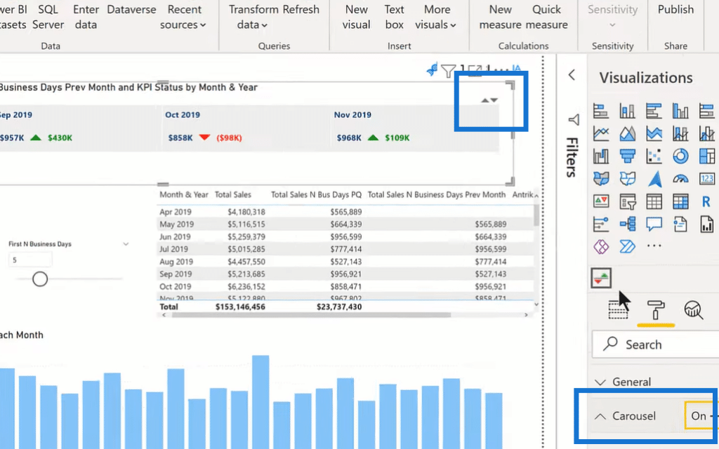
We click on the visual and then click on the paint roller. The first option is Carousel. If you turn this on, this gives you a little arrow up and down on your visual. You can manually control the scroll of the display, and your users can do that rather than having to wait for the observation that they want to see scroll through. I think this is generally a good option to add, and it doesn’t take up much space.
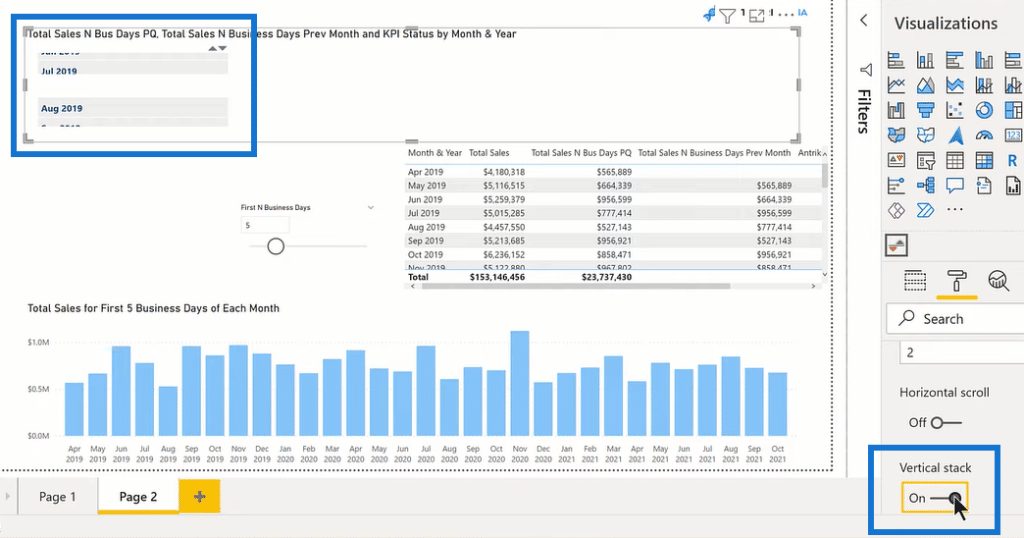
Then, if we go down Animation, we’ll see duration. There’s also an option to do a horizontal scroll to kind of fly in from the side, but I personally like the vertical scroll. There’s a vertical stack option as well, which lets you put everything into a single column. That might be useful in certain turn configurations where you don’t have much space, but I think here it’s not nearly as readable.
And then, for the animation, it’s got three different options. It’s got a fade, slide and wait, and no animation. I think the slide and wait is a more dramatic effect. It’s more eye-catching. I typically use that one. We also have Dimensions, Name (for the fonts, alignment for headers, etc.), Value, Formatting, etc. Feel free to explore these options and see what goes with your theme or how you want your visual to be.
For this sort of analysis, I like to use conditional formatting for the Title and set a dynamic title. In this case, I’ve got a DAX measure already set up, so we’ll choose Field value, then Measures, and then KPI Dynamic Title.
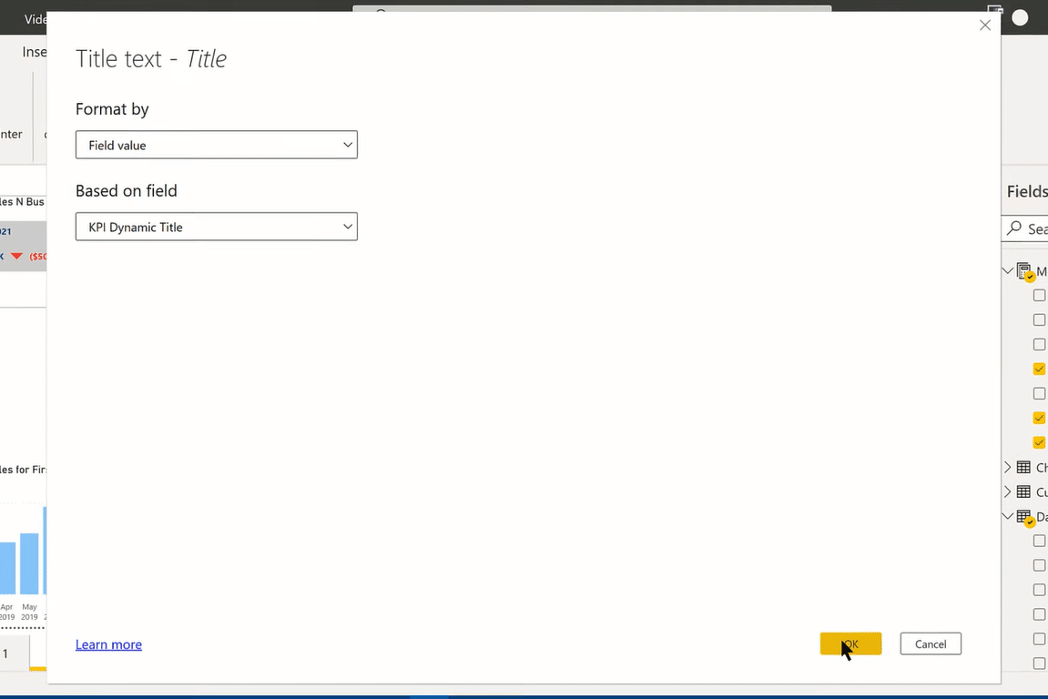
With this, we now have a dynamic way of capturing the value of that slider in the first N business days. So, you’ll see here the title is Total Sales for First 5 Business Days Relative to Previous Month. If we change this to 10, that title then changes, and all the KPIs change as well.
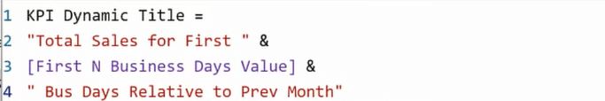
The way we do that is just a pretty simple CONCATENATE. A DAX measure, where we just take the first text part of the title, concatenate that with the harvested value from the slider, and then concatenate the final part of the title. Then, just use conditional formatting, which sets the title equal to that measure.
***** Related Links *****
Power BI Custom Visuals – Build A Reporting Application
Power BI Data Visualization Tips For KPI Trends Analysis
Data Visualization Tips For Your Power BI Reports
Conclusion
So that’s the basics. The reason why this works so well is that the visual is quite easy to put together when you’ve got one or two indicators and many observations.
If we look at our data model, we’ve got a Sales table, where our Total Sales is coming from this in one field and then linked to our Date table Month & Year. The way this gets quite complicated is instead of having one KPI with many observations, you need to have a lot of different KPIs with a relatively small number of observations.
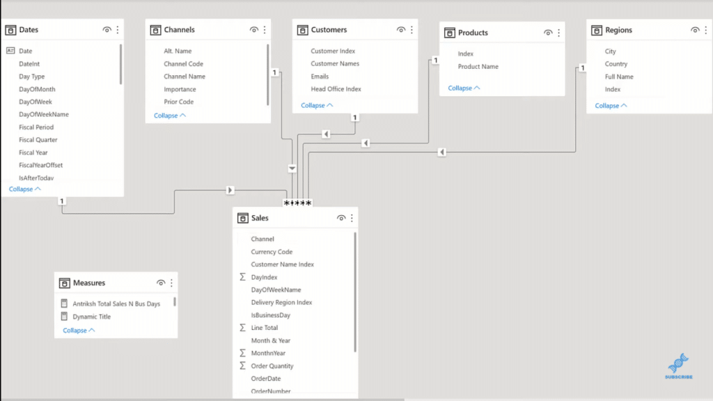
In that case, you’ve got to set up a sequence of measures – a Name measure, and then the Current Value measure, the Previous Value measure, and the Status measure for each KPI indicator. And finally, you’ve got to put those together in a calculated DAX table, and then reference that table in the visual selection.
I think it’s quite easy to put together and is a nice effect. I hope you found that helpful. You can watch the full video tutorial below. Check out the links below as well for more related content.
All the best!
Brian


