
Do you need to measure your business progress, your performance, or the distance to a target? In business, having a clear way to measure progress toward goals is vital. Power BI KPI functionality provides visual cues that can help companies hit their goals and stay on track with clarity!
Power BI KPIs can give you a quick and easy-to-understand visual layout to see how well your business is doing. In this article, we’ll explore what KPIs are and what the top questions regarding Power BI KPIs can help you measure your company’s performance.
Are you ready? Let’s do this.

What are KPIs?
Key Performance Indicators (KPIs) are generally used by organizations at different levels to measure their success in meeting business targets. KPIs can range from low-level goals to high-level targets, from focusing on specific processes to assessing overall organizational or personal performance.
KPIs should be aligned with the company’s core objectives, easy to understand and track, and should be actionable. Reporting cadences should also be set accordingly to ensure accountability and reliable results.
One simple example of a KPI in Finance is Gross Profit Margin, which is to measure the profitability of a company. In Marketing, Follower Growth shows the growth of followers acquired on a social media platform over a given period of time. For Customer Support, Average Resolution Time, which measures the average amount of time it takes to resolve customer inquiries is an example.
So, KPIs are different for each organization and each situation.
Let’s dive into how Power BI can help you visualize your KPIs.
Microsoft Power BI and KPIs
Power BI is a business analytics tool by Microsoft that enables you to create interactive visualizations to analyze data and produce actionable reports. After determining the desired KPIs you want to track, Power BI can clearly show progress in a visual way.
It is a cloud-based platform that enables users to connect to various data sources, including Excel spreadsheets, SQL, and online services, to extract and transform data for analysis.

One of the key features of Power BI is its ability to create KPI (Key Performance Indicators) visualizations.
Maximizing Efficiency With KPIs in Power BI
KPIs in Power BI are simple tools that offer various big advantages to businesses. Here are a few key things about the:
- As we know, these KPIs are simple to use and help in presenting complex information in an easy-to-understand manner.
- KPIs can be used to measure progress towards achieving targets, whether it is constructive or unproductive, just to be aware of your business’s strengths and weaknesses.
- These KPIs also help in analyzing the distance to the target and monitoring performance visually.
- KPIs enable timely reports and simplify the process of analyzing and advancing profits for modern businesses.
So, what do you need to create a KPI?
Requirements for Creating a KPI
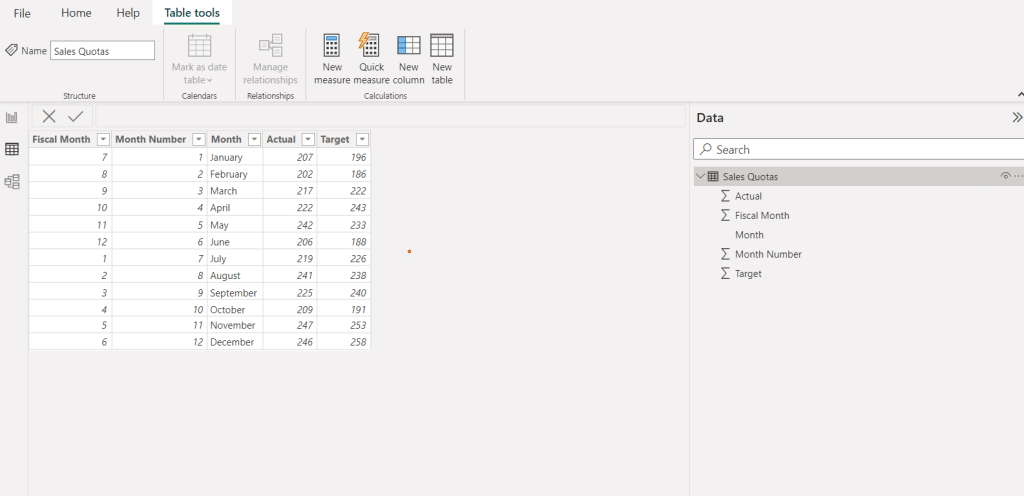
Power BI makes it easy to create KPIs by requiring only three elements, a base measure value, a target value, and a trend or threshold value.
You can select this information from the datasets used in the report, it is a simple process.
- The Base measure is the metric that you want to evaluate, such as sales revenue or website conversion rate. Ideally, this measure should be represented by a value that you can compare to the target value.
- The Target measure is the goal you want to reach. It can be a fixed number, like a fixed amount of sales goals you want to reach, or it can be a dynamically calculated number, like a percentage increase from last month’s conversion.
- The threshold or goal is the point at which we measure our progress. It can be a single number or a range of numbers, and it tells us whether we are ahead or falling behind on our goals and targets.
How to Create Goals For Your KPI in Power BI?
Setting goals helps to ensure that your data model is properly optimized and structured for maximum efficiency.
Here are a few simple steps:
- First, identify the column that contains the goal values for your KPI.
- Then, create a new table by going to the home tab, selecting “Enter Data”, and giving the table a name.
- Next, enter the goal values for each row in your table.
- Finally, you can add the Target column to the Target Goals field in the KPI visual and, choose the name of the goal table you just created, then select the column that contains the goal values for your KPI.
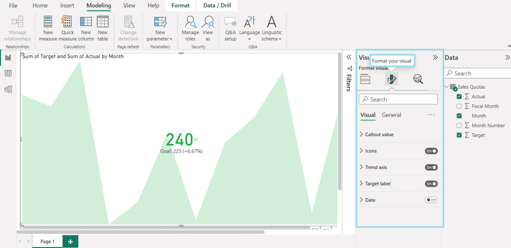
How To Format a KPI In Power BI?
Formatting options for Power BI’s basic KPI visual come in very handy as we try to customize our visual in our own unique style.
In the visualizations panel on the right, select the “Formatting” section. This section will allow you to customize the visual’s appearance.
The KPI has these three key features, which you can use to keep your KPI tidy and appealing; you can select from Formatting Pane prominent options like Indicator, Trend axis, Goals, and Color coding tools to customize the visual to fit your needs or to convey the relevant information.
Note that:
- The Indicator feature lets you customize how the indicator looks on your chart. You can adjust the text size, alignment, display units, and decimal places. You can also toggle off the trend axis, which removes the accompanying trend graph.
- The Goals feature allows you to hide the goal and distance from the chart. You can also customize the label, font color, and family.
- Lastly, the Color Coding feature is essential as it lets you decide whether a high or low value is good and also changes the colors used.
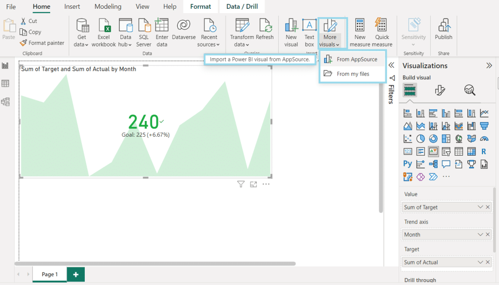
Customizing KPI Visualizations
Traditional KPI visuals are great such as bar charts, line charts, pie charts, and more but if you can use custom visuals to create your own unique KPI visuals then why not?
You can use pre-made and available visuals from the From Appsources to get started quickly. Just by adding custom KPIs and some conditional formatting, you can quickly track the success of your business and also introduce a unique business representation.
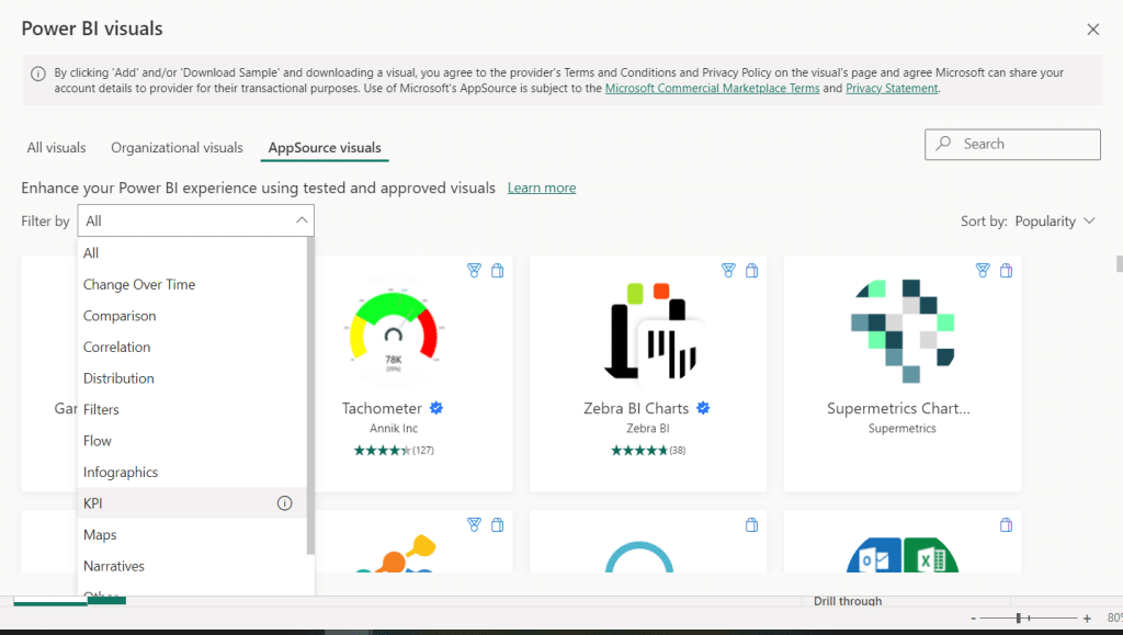
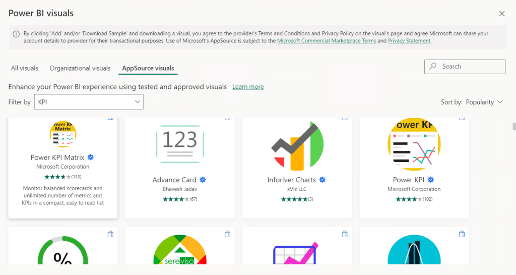
What Are The Top KPI Custom Visualizations?
These KPI custom visualizations from Power BI Marketplace (Appsource) can be installed to enhance your KPI tracking.
Here are some popular KPI custom visualizations available:
- The Bullet Chart is a replacement for dashboard gauges and meters, featuring a single primary measure, comparisons to other measures, and providing context for marketers’ performance.
- The Power KPI Matrix displays an unlimited number of metrics and KPIs in a single, customized list, enabling balanced scorecards in Power BI.
- KPI indicator is a visualization that displays the status of KPIs with a colored background. The KPI Indicator shows status as a color indication, comparing actual and target values and displaying deviation as a percentage. The trend can be presented as a line or bar chart, and the data granularity is customizable.
- Dual KPI displays two KPI visuals side by side, and they are dynamic, meaning they can change the information in the KPI. They are informative and do not require a lot of space.
Key Features of the KPI Indicator
The KPI Indicator in Power BI offers a range of customization options.
Here are some of the key features you can adjust:
- The chart type can easily be changed between a line and a bar chart.
- In the KPI properties, you can change the name that appears on the KPI Indicator.
- Under the Format paintbrush, there is one property section that is unique to the KPI Indicator. The others are standard for every visual.
- The Banding percentage allows you to adjust the threshold when something is set as red, yellow, or green.
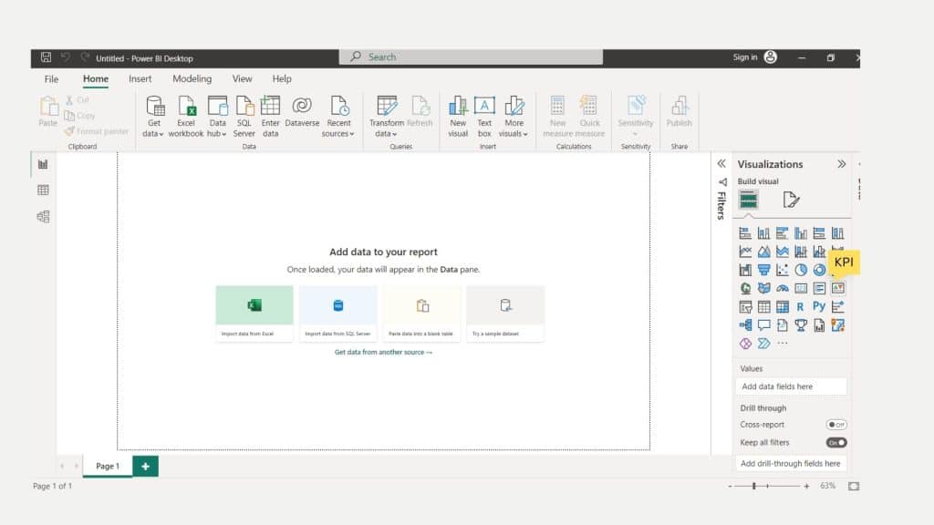
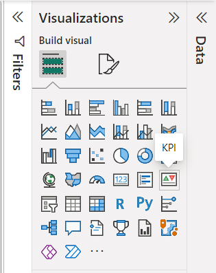
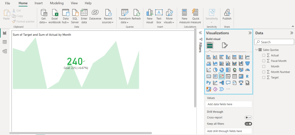
Creating a KPI Visualization in Microsoft Power BI Desktop
As data visualization is the core of Power BI reports, you can easily create a KPI visualization in Microsoft Power BI Desktop and start tracking your key performance indicators.

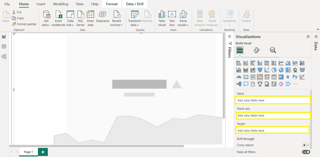
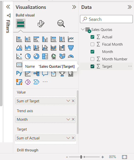
Power BI offers a KPI visualization type that requires a base value or indicator, a trend or time value, and a goal. By selecting the KPI visualization type, you can input these values for the Indicator, Trend Axis, and Goal.
Let’s create one:
- After you open Microsoft Power BI Desktop and load the data, you want to use for this report.
- In the Fields pane, select the measure you want to use as the base value for your KPI.
- Right-click on the measure and select “Add as KPI.”
- In the KPI dialog box, select the measure you want to use as the target value for your KPI.
- Set the threshold or goal value for your KPI by selecting the appropriate option under “Status thresholds” in the KPI dialog box.
- Customize the KPI visualization by selecting the appropriate options under “Visualizations” in the Visualization pane.
- Adjust the formatting and layout of the KPI visualization as you want it to be.
- Save and publish your report to share it with others.
Power BI Visual Updates
The latest updates of Power BI have introduced several highly anticipated exciting features in visualizations.
You could say the visualization pane has received a complete makeover, and now offers improved functionality and usability, new features include:
- Firstly, users can now apply a ban on specific visualizations, providing greater control over the presentation of data.
- Secondly, the addition of applying and clearing all buttons for slicers makes it easier to manage data and navigate dashboards.
- Thirdly, the user’s ability to add subtitles to visuals provides more context and clarity; with a little bit of conditional formatting you can easily add KPIs in the title.
Power BI KPI Best Practices
We can leverage Power BI KPIs to effectively measure performance, track progress, and make data-driven decisions. Try using these tips and best practices to make things easier and more effective:
- Identify your business goals and determine which KPIs are relevant to measure progress only focus on KPIs that are relevant, actionable, and easily understood by stakeholders.
- All power Bi services are here to serve, just avoid selecting too many KPIs, as it can lead to information overload.
- Regularly visit and update KPIs as the business may change goals from fiscal year to fiscal month, just keep it simple and effective.
- Use clear and concise labels to make KPIs easy to understand and explain every crucial data point.
- Choose appropriate visualization types for the KPI, and add slicer, charts, conditional formatting, or visual cues to make the power bi dashboard attractive and effective.
- Consider the audience when designing KPI power bi visuals and reports, and tailor the presentation to their needs and level of expertise.
Let’s round things up before we show you some awesome dashboards that will inspire you.
Key Takeaways For Using KPIs in Power BI
KPIs may look simple, but they can be complex to create and use properly. If you’re new to using KPIs in Power BI, it’s important to take your time and get a good understanding of how they work.
If you want to communicate your KPIs using visually appealing charts, Microsoft Power BI offers various options specifically designed for this purpose. These charts are highly interactive and use vibrant colors and symbols to grab your readers’ attention and keep them engaged.
The KPI visual combines multiple features, making it an ideal choice for monitoring and reporting critical measures. You can optimize your path toward achieving your goals by effectively tracking and analyzing KPIs.
Furthermore Power BI offers a collaborative environment that allows both experts in data science (data analytics experts and data scientists) and non-experts to share reports and work together on a variety of business projects.
We know Power BI can feel overwhelming sometimes due to it having so many components. The key to becoming good at Power BI is to stay up to date with the latest features and tools available and practice, practice, practice.
There are many online resources, templates, and tutorials on KPIs, Visual, DAX, models, and many others; you just need dedication and commitment.
In fact, the best place to start learning is with our Free Power BI Training Course.
Ready to be inspired, let’s check out some awesome dashboards created by our Power BI Community.
18 Power BI KPI Dashboards To Inspire You!
We have 101+ Power BI Dashboards available to test live and download in our community, but for this article, we are going to show your 18 of our favorites.
Let’s get to it!
1) Football Transfer Market Analysis Dashboard
Sometimes it amazes us how a business intelligence tool like Power BI can be used, and this is one of them. Peeling away from traditional business use, this clean and intuitive dashboard focuses on football.
Well, precisely on data related to transfers, metrics include:
- Most expensive transfers
- Biggest fee transfers
- Player stats inc age, nationality, club, fees, and position.
You can test this out in real-time, alongside 101+ Free Power BI Dashboards in our Dashboard Showcase.
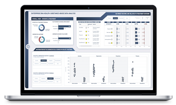
2) Substance Abuse Analysis Dashboard
The health and medical industries have huge amounts of big data to crunch; hence Power BI is present in both private and public health and medical businesses globally.
This dashboard showcases a detailed summary of patient data and goes deep into specifics including:
- Treatments
- Treatment results
- Treatment outcomes
- Comparative factors
Now, there is more than a single page here, be sure to check out page 2, and the report settings used to learn more, you’ll find it in our Dashboard Showcase.
3) Hotel Revenue Management
Now it’s time to round up your sales team and bring in your sales managers, this sales dashboard shows you very clearly the room sale or hotel revenue and guest breakdown, and more.

This interactive dashboard enables you to both see the figures and then visually shows you graphs to the right, further making it easier and faster for the report to be understood by employees.
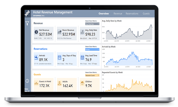
You can test this out in real-time, alongside 101+ Free Power BI Dashboards in our Dashboard Showcase.
4) YouTube Data Dashboard
Striking, clean, and clear, this YouTube dashboard is packed full of information and gives a great overview of a successful youtube channel.
As well as showing publishing metrics, it cleverly drills down to posting times of day and showcases the relationships between likes, dislikes, and subscribers gained and lost.
A great use of data and design, blending brand colors with generous white space to make things stand out.
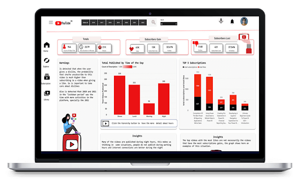
You can test this out in real-time, alongside 101+ Free Power BI Dashboards in our Dashboard Showcase.
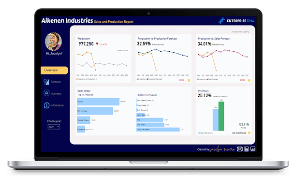
5) Sales and Production Analytics Dashboard
One of the leading uses and a great example of Power BI, is sales performance and production analysis. This Power BI dashboard example showcases clear performance metrics in a clean and organized manner, plus forecasts future sales too.
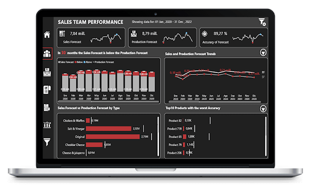
You can test this out in real-time, alongside 101+ Free Power BI Dashboards in our Dashboard Showcase.
6) Sales and Production Dashboard
Clear, concise, and easy to digest when presenting to business leaders, no matter the industry. This sales and production dashboard presents the facts clearly and incorporates a color theme that is very easy on the eye.
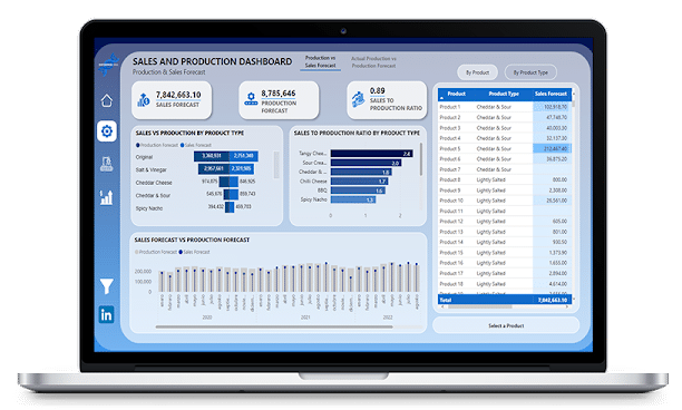
You can test this out in real-time, alongside 101+ Free Power BI Dashboards in our Dashboard Showcase.
7) Sales and Production Insights
Another example of data analytic visualization at its best. This professional design report is well thought out and developed using best design practices.
It is smooth, clear, and intuitive and makes for a great dashboard for business owners in any industry.
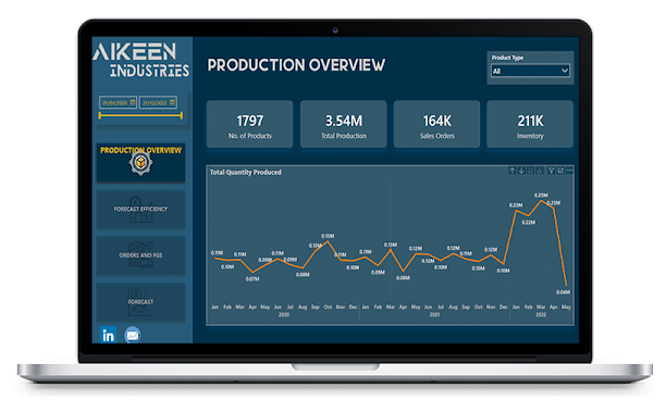
You can test this out in real-time, alongside 101+ Free Power BI Dashboards in our Dashboard Showcase.
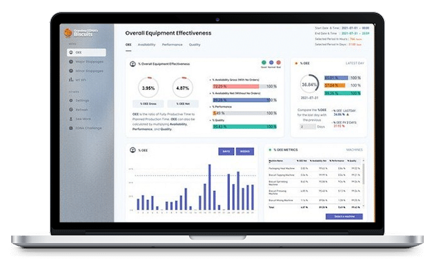
8) Equipment Effectiveness Report
A well-organized, clear, and concise Power BI dashboard showcasing OEE or Overall Equipment Effectiveness with creative visualization techniques.
Again, the true power of data is shown here, making something so simple and clean for anyone in the company to understand, irrelevant of whether they are the sales manager or the CEO.
Anyone can understand and use the data shown here, showcasing important metrics, quickly and efficiently. As we all know, track in KPIs is essential for success!
Power BI is great for OEE-type reports for all different product lines, have a look at our collection here.
You can test this out in real-time, alongside 101+ Free Power BI Dashboards in our Dashboard Showcase.
9) Overall Equipment Effectiveness (OEE)
I don’t love the term “next level”, but I am going to use it here. This design is ‘”next level”! As well as an abundance of data being displayed clearly, it is done so beautifully! Who said data is not attractive!?
This is a brilliant example of taking a lot of important information and making it clear and clean, making it easy to make decisions and maximize business performance.
White is always a clean place to start, but this design has moved away from the typical black text, used shades of grey, and incorporated a beautiful color palette too. Excellent use of the Numerro toolkit.
Find out more about this dashboard here.
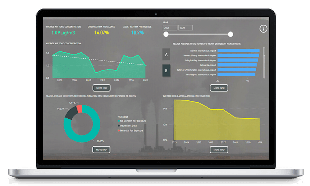
10) Environmental Insights
A simple, clean, and clear reporting dashboard brings in raw data to create a visually attractive and informative analysis.
As long as there is data produced, a Power BI Dashboard can showcase it visually, another great example.
You can test this out in real-time, alongside 101+ Free Power BI Dashboards in our Dashboard Showcase.
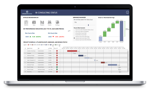
11) Earnings Maximizer Showcase
Sometimes it is just best to keep things simple; remember the old KISS principle? This compact, yet effective one-page report utilizes custom visuals and an intuitive UI.
With a solid focus on earnings, you will always know where you stand with this quality of reporting.
You can test this out in real-time, alongside 101+ Free Power BI Dashboards in our Dashboard Showcase.
12) Formula 1 Performance Analysis Dashboard
Start your data engines, ready, set, and calculate! Sorry I had to. Select your favorite driver or your favorite circuit to see facts and figures. Clearly designed by a serious F1 fan and showcases another interesting way to visualize data.
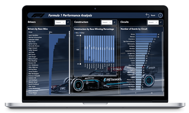
You can test this out in real-time, alongside 101+ Free Power BI Dashboards in our Dashboard Showcase.
13) Transport and Shipping KPI Dashboard
This multipage KPI dashboard shows endless amounts of usable information and critical insight, complimented by a tasteful design that is easy to interpret.
There is no doubt that such reports showcasing crucial sales data, total revenue, and logistics are absolutely crucial to data analysis and ultimately, business success.
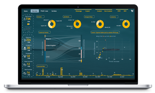
You can test this out in real-time, alongside 101+ Free Power BI Dashboards in our Dashboard Showcase.
14) Purchase, Sales, and Inventory Trends Dashboard
A well-designed dashboard showcasing a dynamic narrative summary that utilizes both Bookmarks and Selection Pane to create a comprehensive data snapshot in a one-page report.
You can test this out in real-time, alongside 101+ Free Power BI Dashboards in our Dashboard Showcase.
We have a large collection of Sales and Inventory dashboards you can check out here.
15) Customer Engagement KPI Dashboard
Understanding customer engagement is crucial to success. This specific dashboard focuses on showcasing the relationship between customer sales and marketing engagement based on email marketing open and CTRs (click-through rates).
This report is well made and makes for one of the best ways to showcase this type of data in a power bi report.
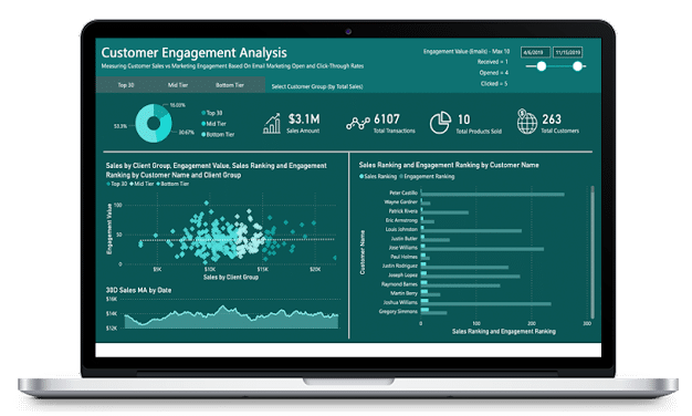
You can test this out in real-time, alongside 101+ Free Power BI Dashboards in our Dashboard Showcase.
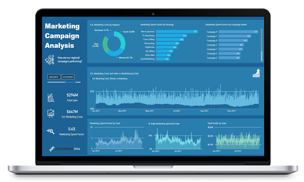
16) Marketing Campaign Performance
Knowing and understanding how your marketing budget was spent and the results you got for it are often overlooked.
But, when drilling down on product sales, total sales, and showcasing the marketing spend and split, there is no doubt you are setting yourself up for success.
This dashboard is another excellent use of Power BI and how it can help a business gain clarity and actionable insights into its data set.
We have a huge collection of Marketing based dashboards; you can try them out here.
You can test this out in real-time, alongside 101+ Free Power BI Dashboards in our Dashboard Showcase.
17) Product Sales KPI Dashboard
This is a perfect example of simplicity and effectiveness at its finest. Used to give your marketing team insights into sales, interactive reports like this dashboard take the guesswork out of business and showcase the simple facts.
With multiple categories and products, sales performance is also broken down into:
- Top 5 States
- Top 5 Countries
- Top 5 Cities
There is also a regional breakdown too.
To top it off it features charts and line graphs to enable easier strategic decisions; this is one of the simplest and best power bi dashboard examples for a clear snapshot of the business.
You can test this out in real-time, alongside 101+ Free Power BI Dashboards in our Dashboard Showcase.
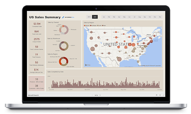
18) US Sales Summary KPI Dashboard
Irrelevant of what country you operate in, Power BI is an excellent option for showcasing a sales summary. This dashboard features clean and easy-to-understand high-level insights in order to make data-driven decisions.
Data visualization dashboards like this featuring solid power bi elements with key metrics are critical for marketing managers and business owners to gain a clear snapshot of business health.
You can test this out in real-time, alongside 101+ Free Power BI Dashboards in our Dashboard Showcase.
How to Download The Ultimate Collection of Microsoft Power BI Dashboards
Over the years teaching 220,00+ people real-world data skills, we have been fortunate enough to work with some of the most outstanding minds and talents in the business.
We never stop learning and nor should you. But, it doesn’t mean you have to start by yourself; we offer the largest collection of Power BI KPI Dashboards on the internet and a fun, progressive, and interactive data community to learn from.
You can check out our collection of Power BI Dashboards, test them out, and download them here.
Also, if you are just starting out in the world of data analytics, we’d love to help you on your journey.
Check out our Free Courses on Power BI; it is a great place to start and will give you the solid foundations to get you on your way to creating awesome Dashboards and reports like the ones in this article.
Alternatively, if you have a business and would like to get more out of your data, please get in touch with us here.


