Today, we’ll have a quick introduction to IBCS, which stands for International Business Communication Standards. These are the highest standards for business data visualization. In this tutorial, you’ll learn how to create clear and consistent reports in Power BI by following the IBCS reporting. You can watch the full video of this tutorial at the bottom of this blog.
Nowadays, we collect and store a lot of business data, but as we do so, we encounter the challenge of presenting it, understanding it, and making the right decisions faster. By following the IBCS reporting, you will achieve clarity and consistency across the whole organization.
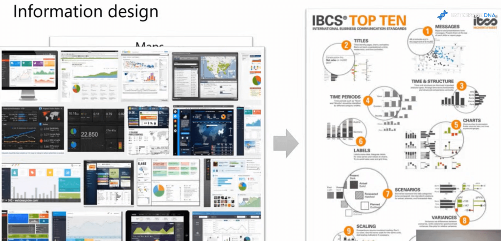
Let’s talk about information design and the inspiration behind IBCS. The idea is to have consistent data representation. There’s consistency in other areas such as maps, traffic signs, musical patterns, etc. because they all have standard designs and representations. But what about in business? There is no consistency and no clarity and no agreed-upon patterns in business reporting.
We have different sales dashboards and financial reports, different KPI dashboards, different software systems, data representation, legends ideas, etc. We have different ways of presenting the data. And the solution for this is an accepted and well-established pattern, which is the IBCS reporting standards.

The IBCS emphasizes how to represent messages and titles, how to show time and structure, how to represent different time periods, which charts to use in what case, how to label efficiently, and where to place those labels.
When we’re dealing with recognizing the patterns, we want to keep the consistent representation. If we are showing actual data, forecast data, planned data, or previous period data, we want to immediately be able to recognize them through pattern recognitions. This is one of the key elements of those standards.
In performance reporting, highlighting the variance is really important. As you know, the majority of the action is actually happening there. Scaling is also imperative in considering business data visualization. If you do not scale consistently across the entire dashboard, you can quickly get a skewed view of your performance. Lastly, you want to be able to highlight the most important parts of your dashboards, the biggest changes and outliers, and so on.
Implementing The IBCS Reporting Standards In Power BI
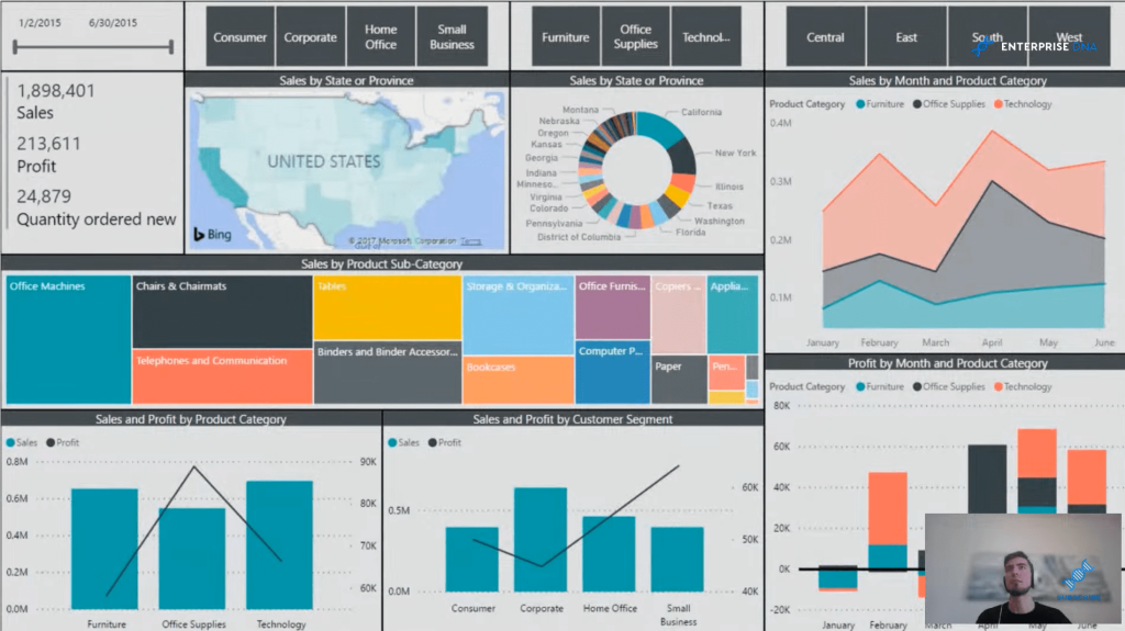
First, let’s look at an example of a report that does not live up to the standards. This is a typical sales dashboard done in Power BI.

We have here some time representations and some slicers at the top. Then we have the sales numbers. We can see that we have 1.9 million in sales. We are profitable and we have some quantities here. We’ve got the breakdowns by different states, timeframes, and some subcategories as well.
However, any dashboard should answer simple questions, such as: Is my sales performance good or bad? How good or how bad is it? Why is it so, and what are we going to do about it?
And if we try to answer those questions using this dashboard, we quickly see that we have some obstacles. Yes, we do see that we are profitable, but what if our profit targets for this time period were, say 300,000, or if the sales should be 20% higher? We simply do not get this information from a dashboard like this.
If we cannot determine if our sales performance is good or bad, how can we know how good or how bad is it? Trying to understand those sales numbers by different breakdowns, for example, using a donut chart or a tree map or a structural axis combined with the line charts can be really confusing and does not provide the needed information to understand why we achieved those numbers.
One thing that is quite common is using the donor charts. They are ideal when you’re comparing a maximum of three elements. A better visualization type would be just a simple column or bar chart because you can easily compare the differences in heights or lengths.
The treemap visualization can take a large portion of the dashboard. Apart from the volume, it doesn’t give us a lot of information. Moreover, I’d like to point here the use of colors. Colors in your report are not only for visual appeal, but they should represent something significant.
Moreover, mixing axes with time and structure can really be confusing. Usually, we represent time in a horizontal way, and we understand it going from left to right. But, if you mix it with structural elements (such as this combo chart at the bottom), especially when combining it with line charts, it can quickly give you a wrong idea of what is actually going on. The correlation here indicated by the line is wrong.
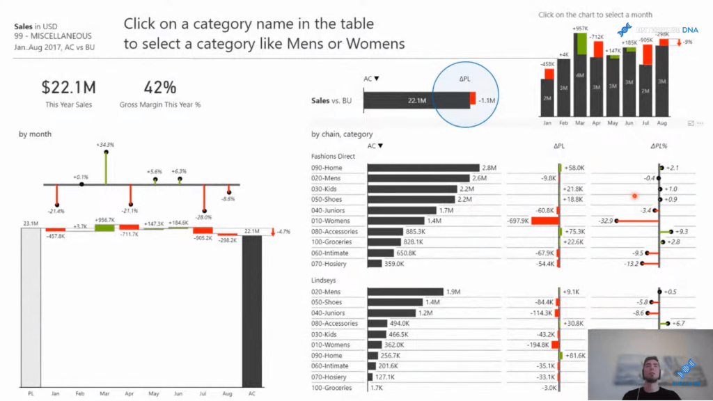
Now, let’s look at a similar set of data but done right in this case. In this report below, you’ll immediately see that our questions can be answered.

We have the KPI at the top that tells us exactly how good or how bad our sales performance is. We can see that we are 1.1 million below the plan. We know it is bad because we are using a consistent representation of the colors and the meaning behind the colors is standardized. We can quickly understand and get our attention focused on where the actual variances are happening, what is going on, and what we need to understand from the dashboard.
We can quickly see that from January to August, there are some up and down trends, but there is more red color than green. We can also see in the table visual that the breakdown is scaled. It makes it easy for us to see the outliers in relation to the size. We can understand why we have underperformance.
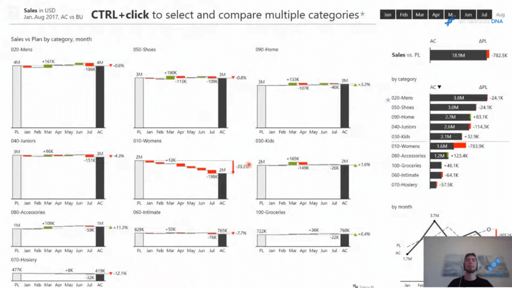
Here’s another example of an actionable report utilizing the IBCS reporting standards. This report is a really good example of trying to understand and compare different categories.

As you can see, this report uses the Small Multiples functionality. All these charts are set on consistent scales, and we can visually compare the heights of one column to another. This gives us the ability to quickly, just from a glance, understand the impact of our different categories because everything is consistently scaled.
***** Related Links *****
Data Visualization Technique | Power BI Dynamic Visuals
Data Visualization Tips For Your Power BI Reports
Power BI Charts And Visuals Inside Charticulator
Conclusion
In today’s tutorial, you’ve learned the importance of implementing the IBCS reporting standards in your Power BI reports. Implementing the IBCS makes your data and report much easier to understand.
You’ll be able to see the breakdowns clearly, the data is all sorted out, and colors and patterns are standardized. The outliers are also clear because everything is scaled properly. Using Small Multiples visualization instead of the tree maps and spaghetti charts is a much more efficient way to show your data.
I hope you find this helpful. If you’re interested in the IBCS reporting, watch the full video below and check out the related links below.
Cheers!
Enterprise DNA Team


