
In this tutorial, we’ll learn how to do a Huff Gravity Model analysis in Power BI. We can use this analysis to estimate the potential sales or attractiveness of a certain store location. We usually do this in Geographic Information System software. However, we can also do it in Power BI and make it dynamic.
The Huff Gravity Analysis assumes that the surface in square meters of a supermarket store, divided by the distance squared to potential customers will result in an attractiveness factor that sets off against other stores. This will also show the probability as a percentage for visiting customers.
The assumption is based on the fact that the more square meters a store has, the greater the assortment and presence of other servicing elements will be. So, the store may attract customers to travel a longer distance.

In this example, the driving distance has been used (postcode centroid to the store).
We can also use straight-line distance. However, in this case, there’s a river separating the boundaries. Thus, a straight-line distance is not reliable.
Ideally, we use smaller areas such as neighborhoods. This is for demonstration only. We can add more parameters to impact the probability like parking space, public transport, and use the methodology for other analyses as well.
We can also add a distance-decay factor to dampen the distance effect. People are prepared to travel further when shopping for furniture than they are for their daily groceries.
Huff Gravity Model Analysis Data
First, let’s have a look at the data.
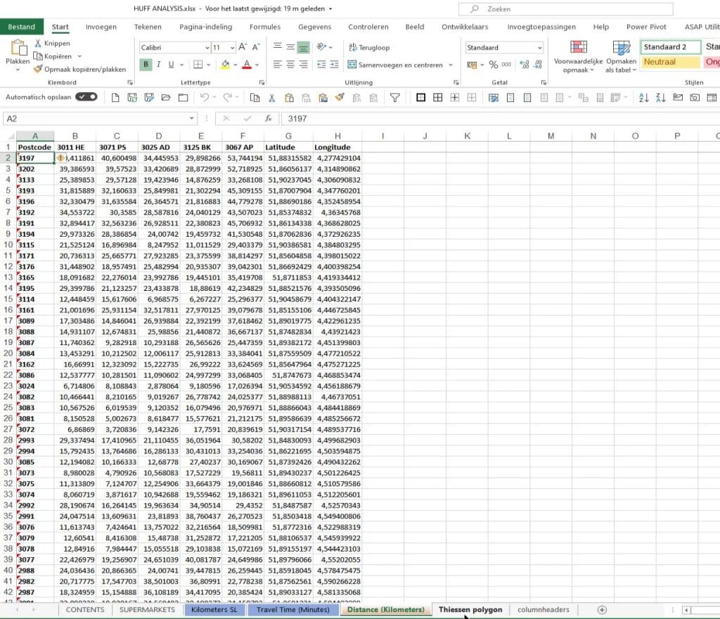
In this excel spreadsheet, there are six supermarkets.


It also has the Kilometers that contain the distance as a straight line.

Then, there’s a Travel Time tab which displays travel time in minutes.
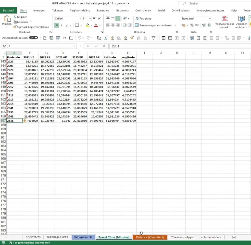
And this one’s the distance. We’re going to use this given the fact that there’s a river between the boundaries.
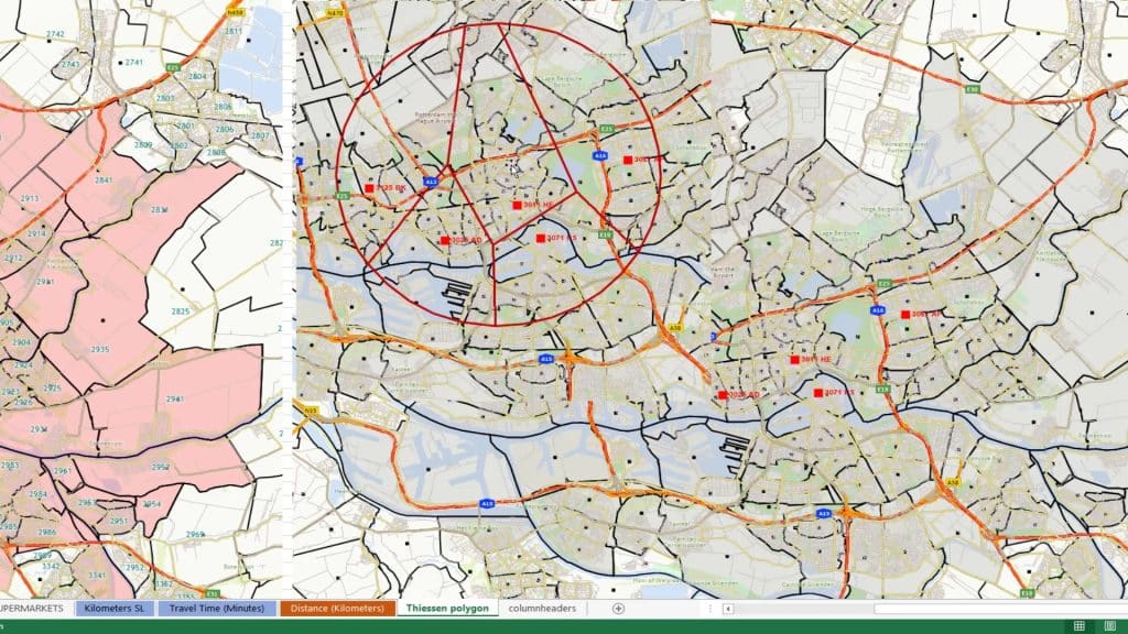
This one’s a Thiessen polygon created in GIS software. This is where we can create a so-called Thiessen Voronoi object to show you the distance from a point to each of the other adjacent objects.
Importing Data In Power Query Editor
First, I imported the data into Power Query Editor.
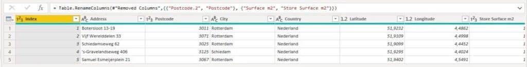
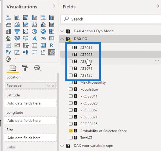
As you can see, I’ve taken five supermarkets.
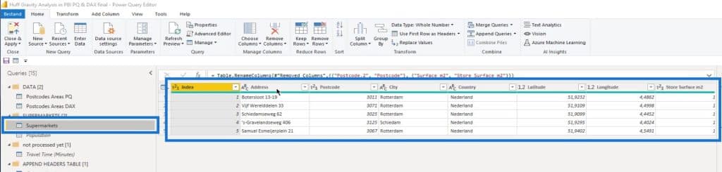
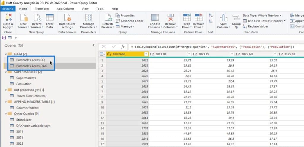
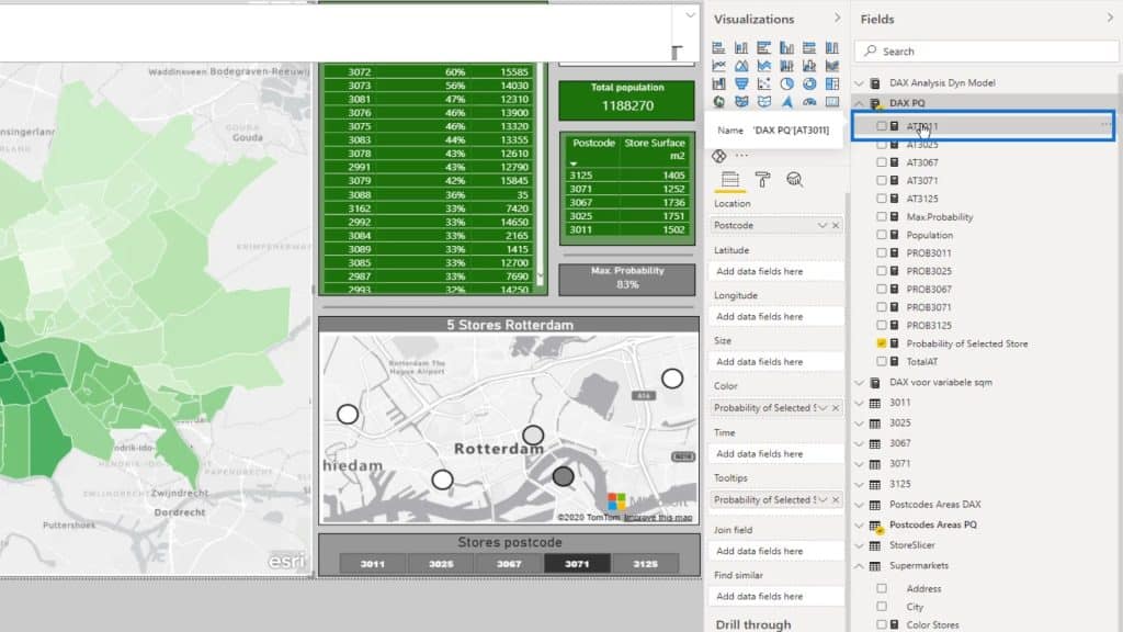
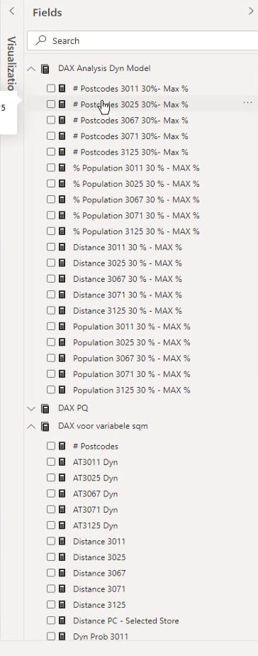
There are also two data sets here named Postcodes Areas PQ and Postcodes Areas DAX.
I’ve duplicated this so I can show you how to do it in Power Query editor with fully dynamic measures.
For the Power Query demo (Postcodes Areas PQ), I’ve rounded off the latitude and longitude. I always advise that if you take four digits behind the comma, your accuracy will be about 11 meters, which is by far, enough.
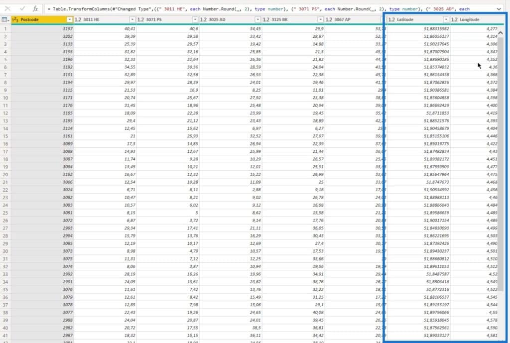
I also calculated the square of every distance. This is because as I previously mentioned, we’re going to eventually use the surface in square meters and divide it by the distance squared.
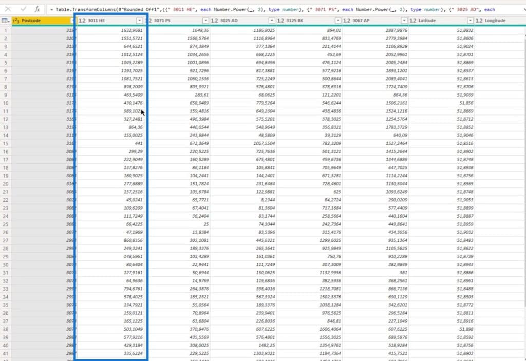
Then, I merged it with another table (Population table) to get the population. This is to get more insights on the population in the postcode areas.
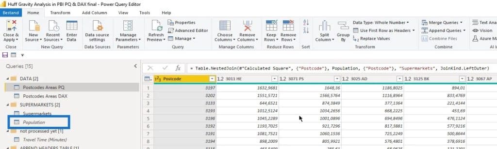
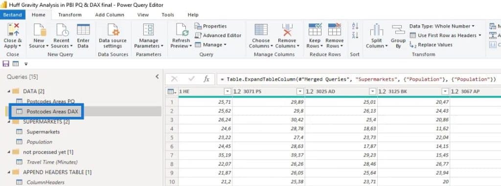
For the measures data (Postcodes Areas DAX), I also did the same thing like rounding the latitude and longitude and merged it again with the Population table.
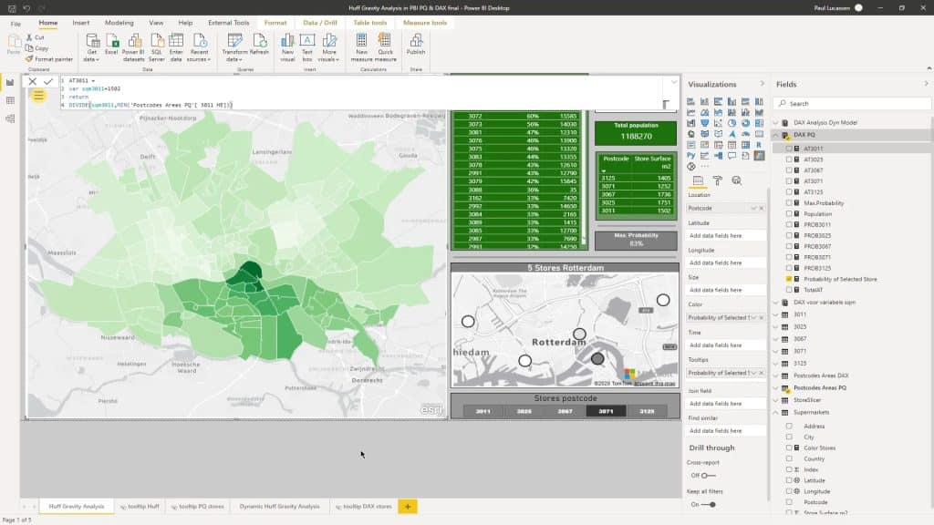
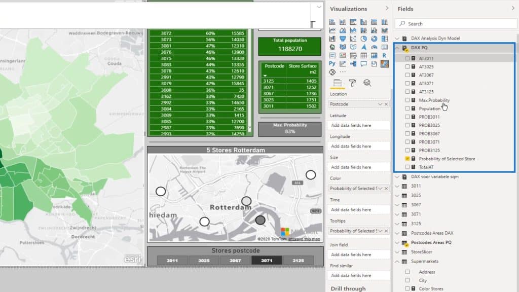
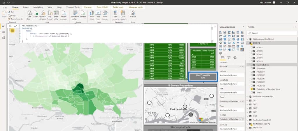
Now, this is the Power BI dashboard of the Huff Gravity Model Analysis.
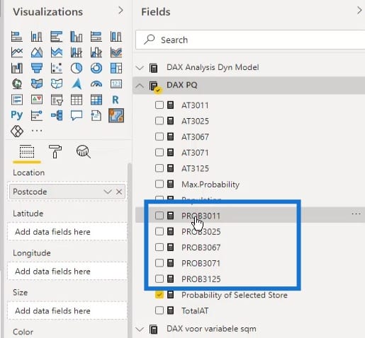
These are the measure tables that I’ve split up.
Huff Gravity Model Analysis Based On Attractiveness
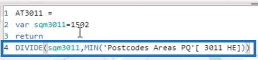
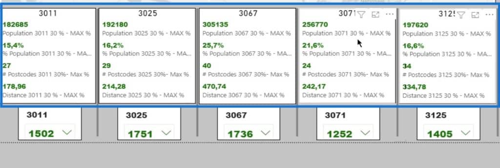
The first calculation I created is Attractiveness.

The Attractiveness is the square meters of the store divided by the Squared Distance. This store has 1,502 square meter surface.
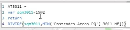
This is the column of the Squared Distance. In this example, I’ve taken the MIN. I could have taken the MAX or the average, but it doesn’t really matter given the context.
I did that calculation for all five supermarkets.
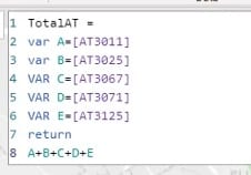
Then, I added them up in the TotalAT measure to calculate the total.
Probability In Huff Gravity Model Analysis
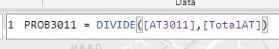
The next measure is Probability.
Probability is simply how likely an event is to happen. To calculate that, a single event with a single outcome should be determined. Then, identify the total number of outcomes that can occur. Lastly, divide the number of events by the number of possible outcomes.
Therefore, I divided Attractiveness by Total Attractiveness in this calculation.
These numbers will add up to a hundred percent.
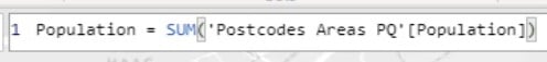
There’s also a Population measure from the merged dataset that sums up the population-based on postcode areas.
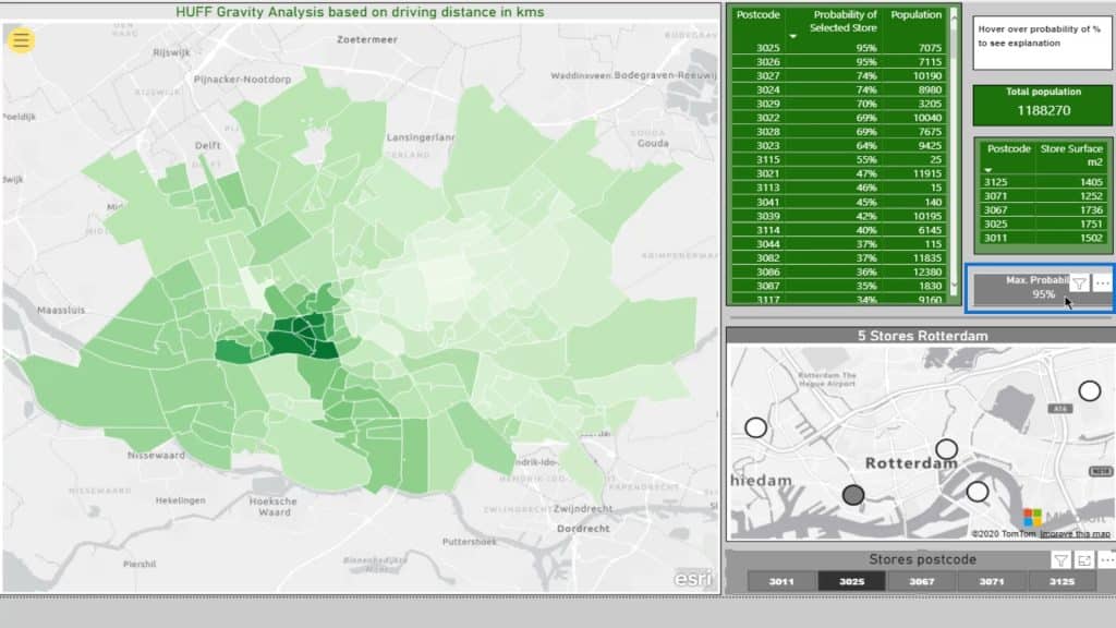
Then, the Max Probability measure.
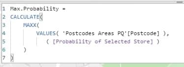
This card is displaying that.
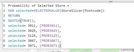
Lastly, I have a Probability of Selected Store measure. I used this measure to identify the probability of any selected store in my selection.
Let’s now discuss how it works.
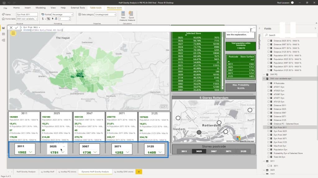
Probability Analysis
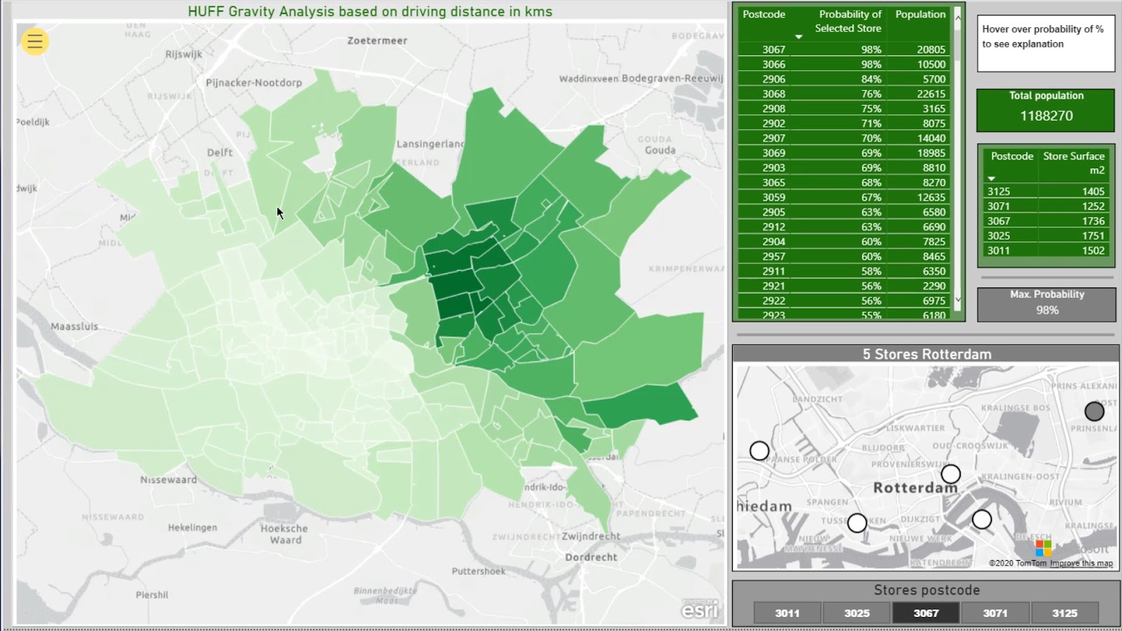
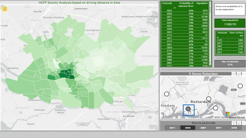
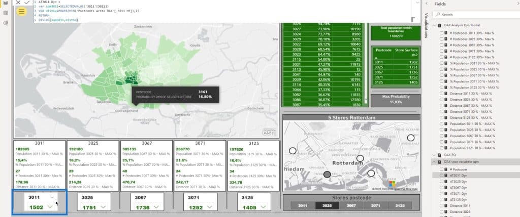
As I map, I’ve taken the boundaries as postcodes. I’ve taken a four-digit postcode.
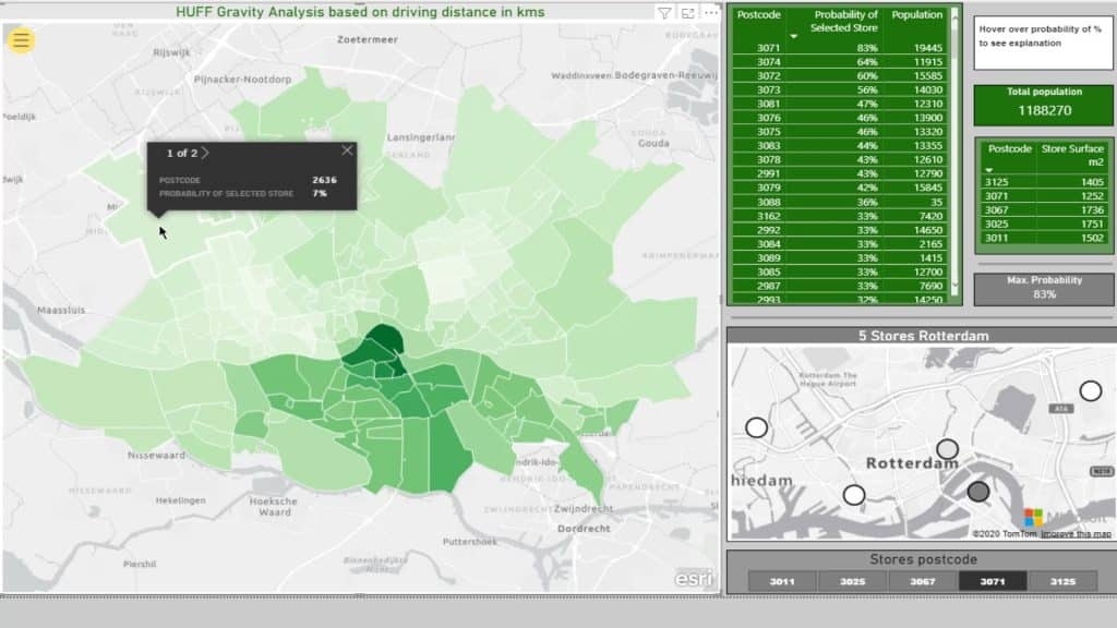
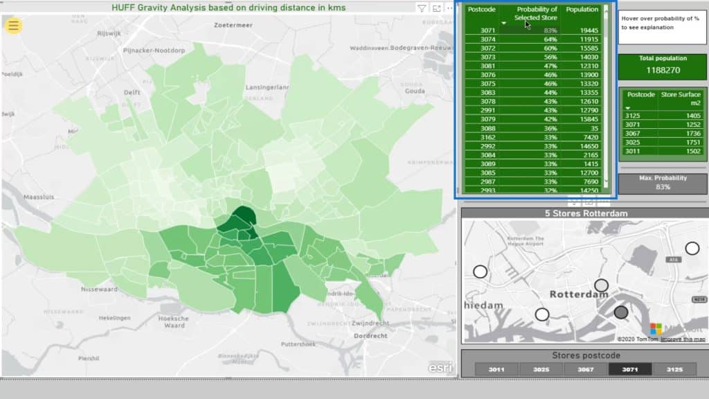
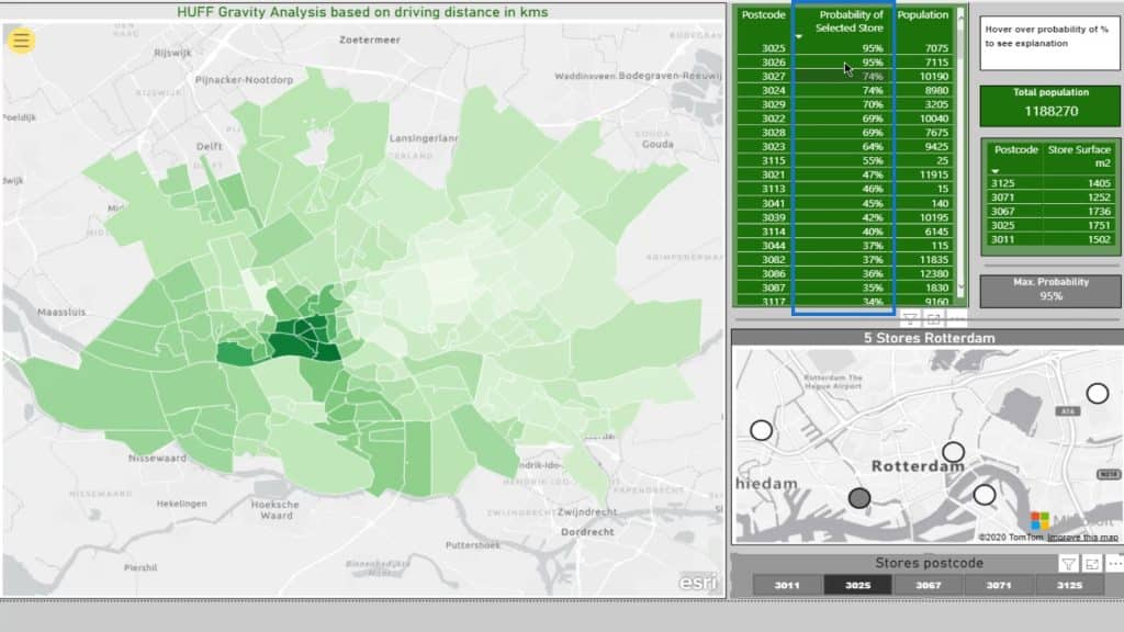
Here’s a table with the Probability of Selected Store.
This little map shows the actual location of the five supermarkets.
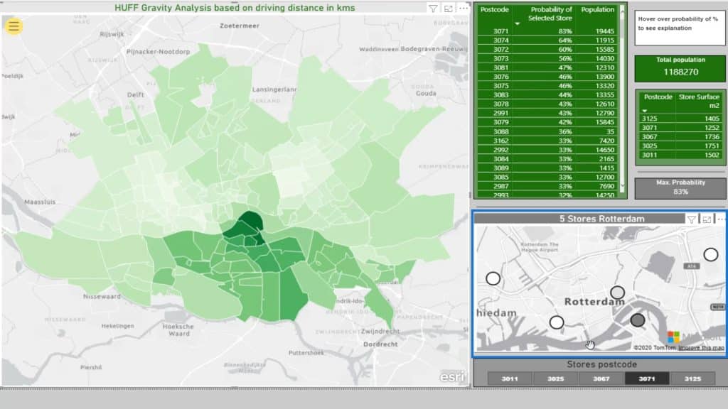
I can make a selection based on the stores’ postcodes from the slicer.

This little map (5 Stores Rotterdam) is not filtering the Choropleth map (ESRI) on the left. This is just meant to give us a clue where we are on the Choropleth map. Moreover, it helps us to subsequently see the impact on the main map.
As you can see, the darker the color, the higher the probability % for the selected store.
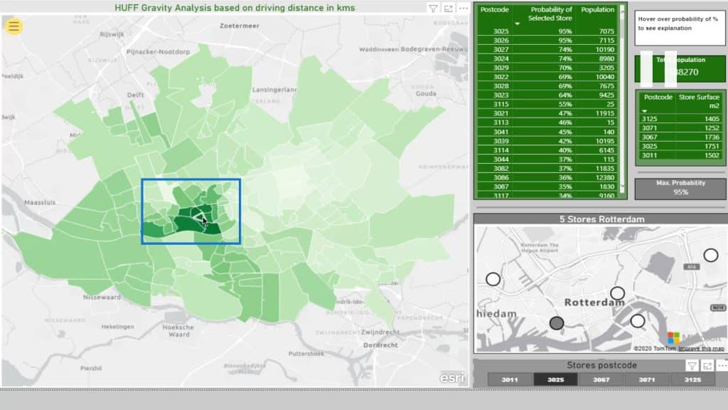
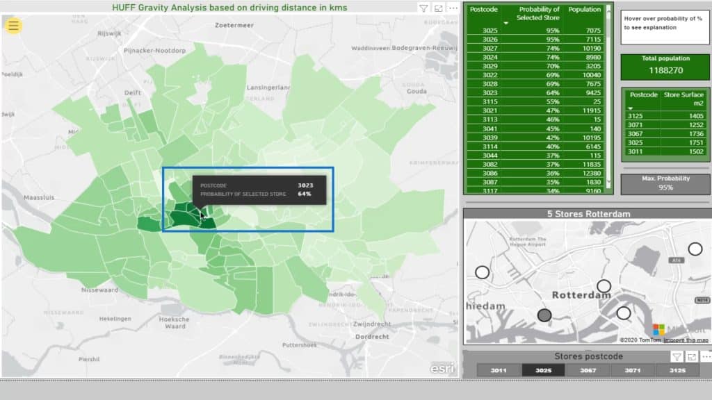
For example, I’ll select this location or supermarket.

If I check out this area on the map, It’ll display the probability of that store given the distance squared. Note that this is based on the driving distance.
The Max Probability for this selection is 95% represented on this card.
This part displays the included postcodes and the declining probability. The smaller the percentage, the more likely their particular postcode will be closer to another supermarket.
For instance, if I click this one, it’ll show that the probability is 0%.
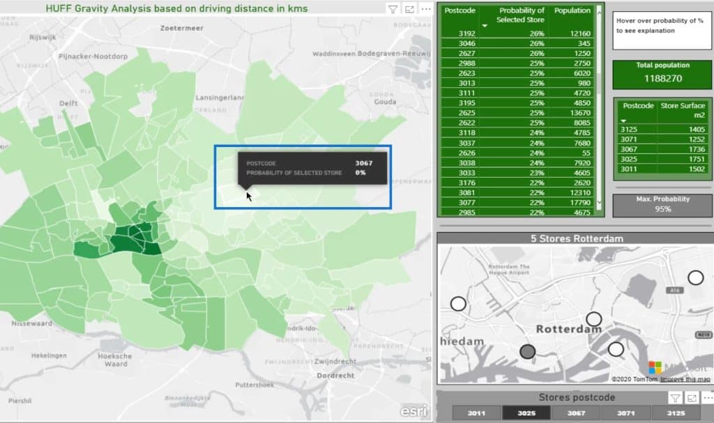
Obviously, the people in this area are living on top of the supermarket under postcode 3011. So, why would they go to another one?
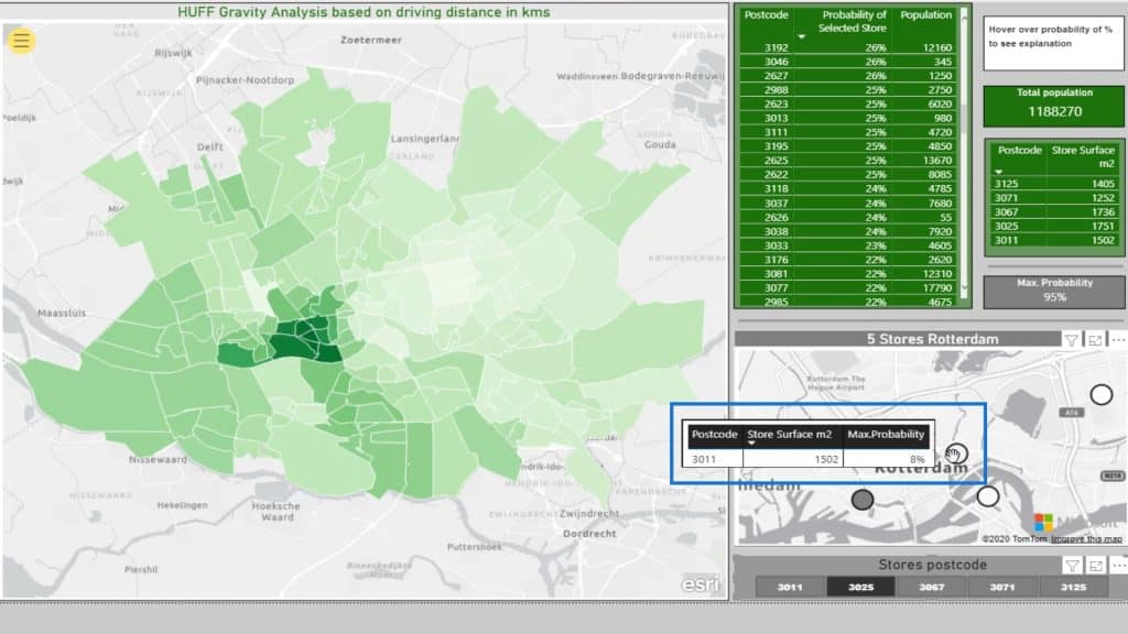
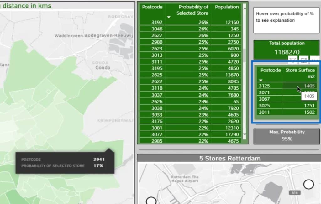
This part shows the actual store surface for reference.
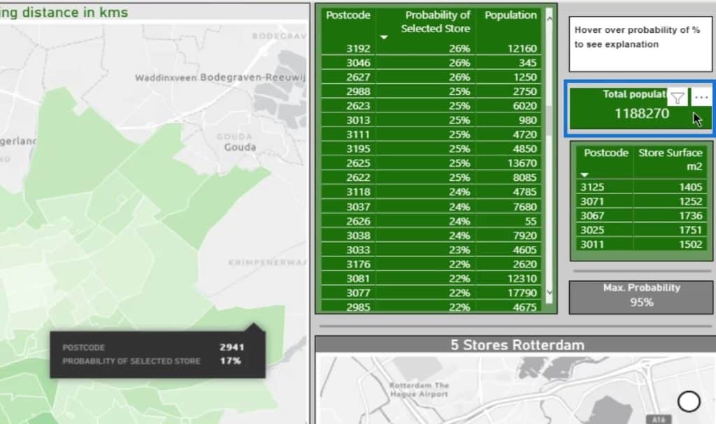
On the other hand, this displays the total population within the selection.
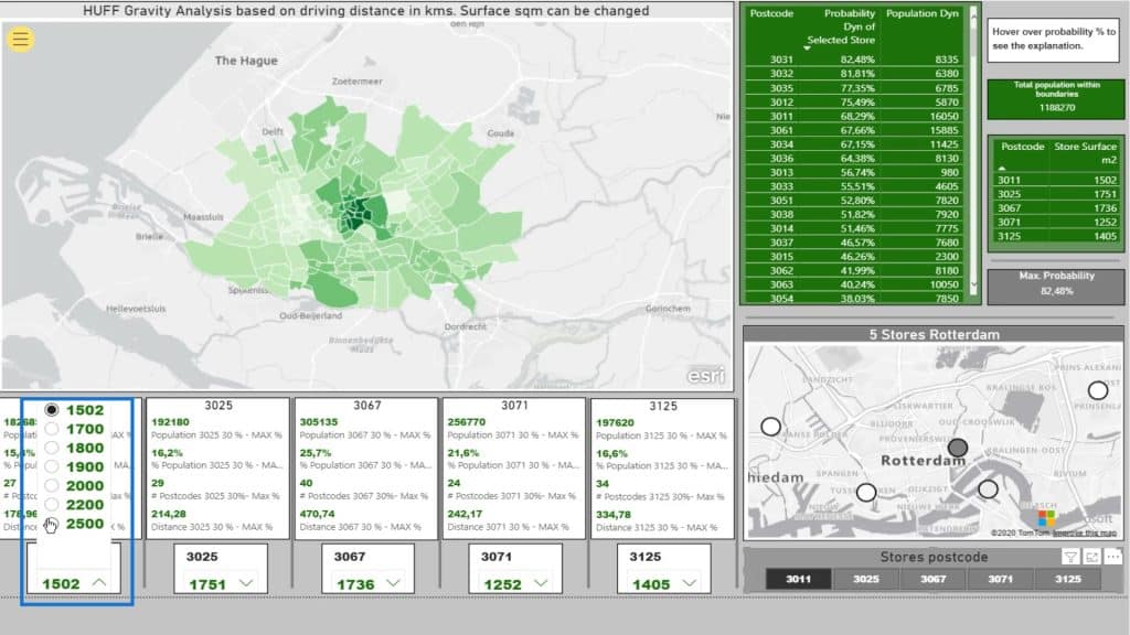
Dynamic Huff Gravity Analysis
Now that I’m done with the basics of a Huff Gravity Analysis, I’ll go a step further and discuss how I can make this dynamic.
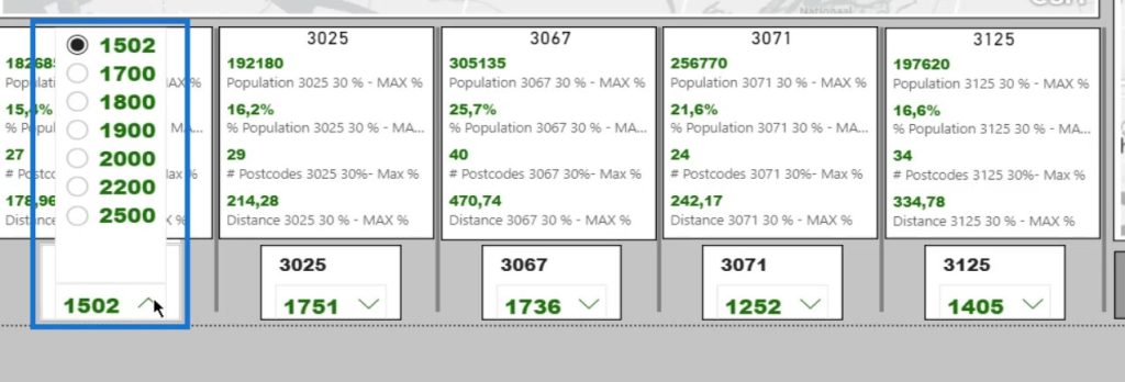
In this case, I created five slicers with the initial square meters and options for increasing the store area.
The rest of the steps are quite similar to the previous step. I now have a lot more measures because we need to calculate something that is dynamic. I’ve taken the steps apart to make it more insightful.
Dynamic Huff Gravity Analysis Based On Store Area
Let’s take a look at the square meter attractiveness. I’ll select the Attractiveness measure of Supermarket 3011.
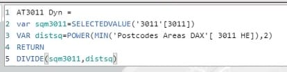
The square meters will be referenced from the selected value in the 3011 slicer.
The distsq variable represents the distance square, which is from the Postcodes Areas DAX dataset.
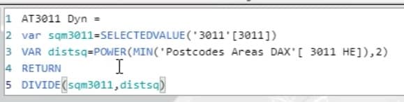
In this calculation, the value of square meters will be divided by the value of distance squared.
Again, I did that for all the five supermarkets.
Dynamic Huff Gravity Analysis Based On Distance
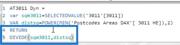
I also calculated the distance for this analysis. It’s basically just the sum of the store’s distance column in the Postcodes Areas DAX dataset.

The selected store is being referenced in the Distance PC – Selected Store calculation using the SWITCH Dax function.
Then, I also have another probability measure for the dynamic huff gravity analysis.
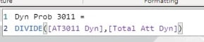
It’s dynamic because if we change something in one of the slicers, it will subsequently have an impact on the outcome of the calculation.
I’ve gone through all those steps and calculations for the dynamic huff gravity analysis. This is because I’m interested in the percentage of the population, amount of postcodes, and the included distance based on my selection from a customized slicer.
As you can see, there’s quite a difference in the population. These are based on the distance to the supermarket and the population within the postcodes.
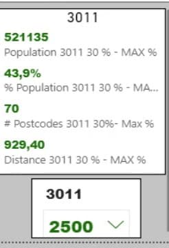
As an example, I’ll change the square meters of supermarket 3011.
Upon changing that, the impact will become evident in the data. This is because it’s more attractive for people to come into the center and go to this location given the driving distance.
***** Related Links *****
Data Visualizations Power BI – Dynamic Maps In Tooltips
Power BI Shape Map Visualization For Spatial Analysis
Geospatial Analysis – New Course on Enterprise DNA
Conclusion
The Huff Gravity Model analysis shows the correlation between patronage and distance from the location of the store. Hence, attractiveness and distance may possibly affect the probability of a consumer visiting a certain store.
This model can help you determine sales forecasts for business locations. Incorporating this analysis into your business model can provide a great deal of information about potential sites.
Again, this is another clear example of what we can achieve with analysis and Power BI by turning static data into a dynamic representation.
Check out the links below for more examples and related content.
Cheers!
Paul


