This tutorial will be about hierarchies in Power BI visualizations. This is a power query solution that enables you to have insightful visuals in your report and dashboard. You’ll learn how to create a shape map of countries and cities by using the original data form. You can watch the full video of this tutorial at the bottom of this blog.
Understanding Hierarchies In Power BI
This data set has the following levels of hierarchy:
- Region
- Sub-region
- Countries
- Cities
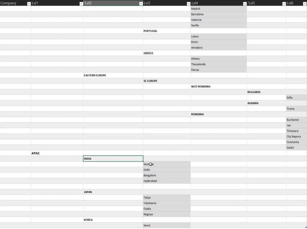
You’ll see that the data set has a natural ranking. The higher the level, the higher they are positioned in the table. You can also see that countries are written in capital letters.

Setting The Hierarchy Table
In order to create a shape map, you only need the two lowest levels of the hierarchy.
There are two important factors for the solution. The first factor is to unpivot the columns to allow them to work with the levels. The second factor is the natural ranking of levels to identify region, countries, and cities.
Add Custom Columns For The Data
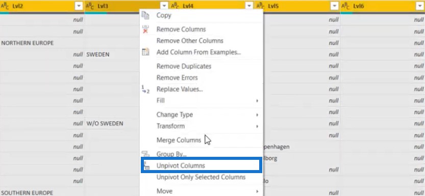
To unpivot columns, select the levels or columns. Then, right click and choose Unpivot Columns.
Next, right click on the Attribute column and choose Add Columns From Examples.
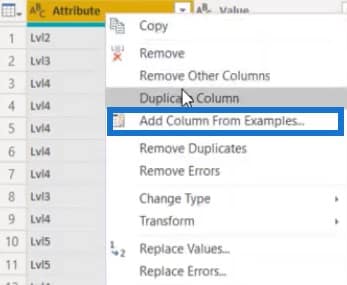
Input a number and it will automatically find the pattern of the columns. In this case, name the column as Lvl Nb.

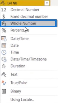
Change the column type to Whole Number.
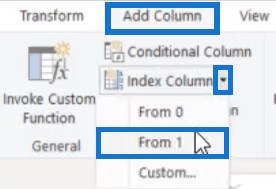
After that, create an index column by going to the Add Column tab and clicking the Index Column. Then, choose From 1.
The next step is to add a new custom column that will show the previous level.
Click Custom Column, then label it Previous Level. Next, input the formula below.
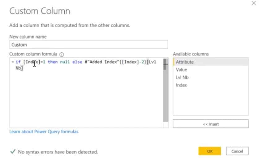
The formula simply identifies the previous level number of the Lvl Nb column. If the Index column is equal to 1, it will show a null value. If not, it gets the preceding level number.
After pressing OK, you can see the new column on the table. Make sure to set the column type to Whole Number.
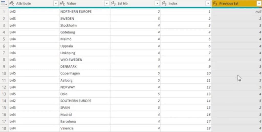
The next thing to do is compare the Lvl Nb and Previous Level column.
Add a new Conditional Column. Then, set the parameters so that if the Previous Level column is greater than the Lvl Nb column, it will generate an Index. Otherwise, it will give a null value.
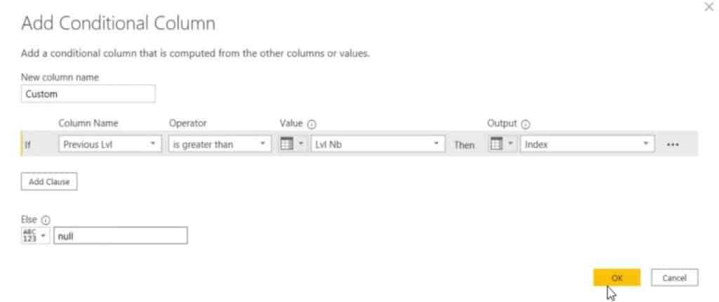
After clicking OK, you can see the conditional column in the table.
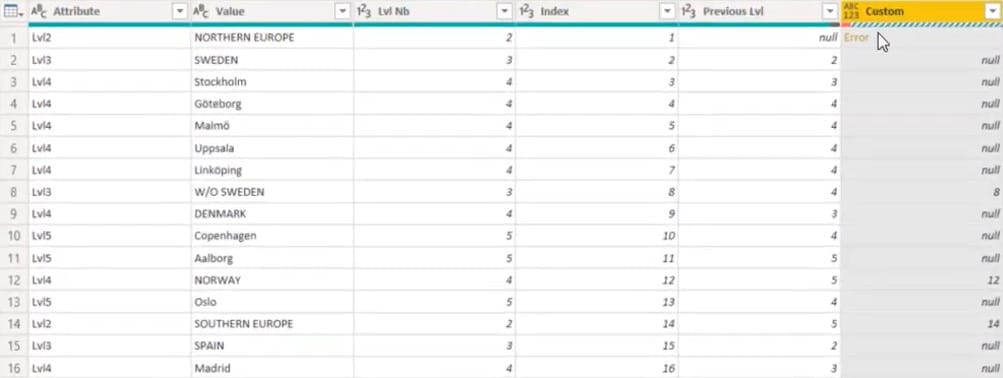
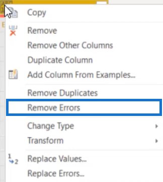
In that column, you’ll also see an error value and null value. To remove the error value, right click on the column header and choose to Remove Errors.
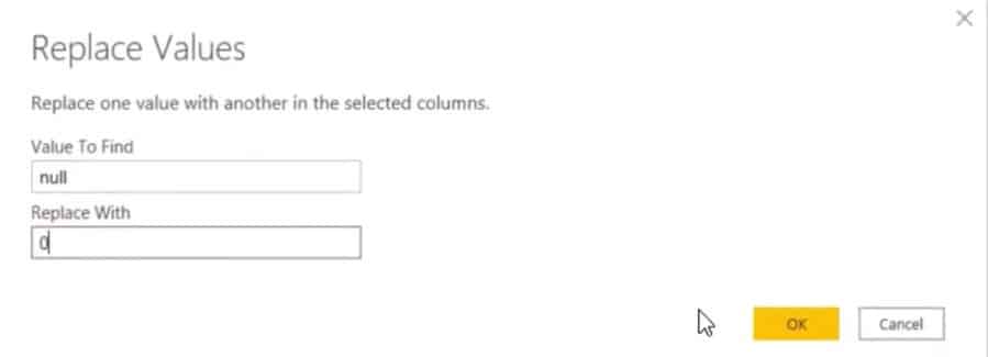
To remove the null value, right click on the cell and replace the value with 0.
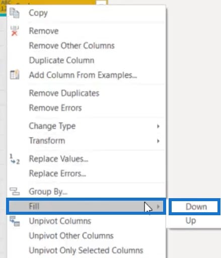
Next, you need to fill the column. Right click on the header and select Fill. Then, choose Down.
After that, your table is ready for the solution.
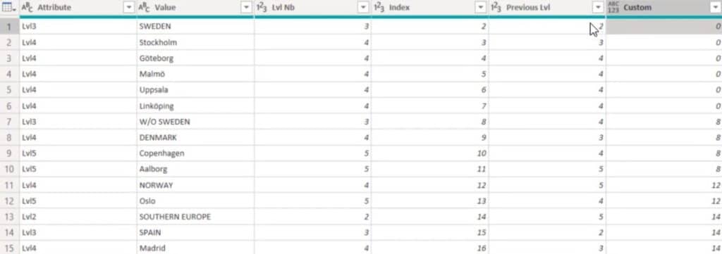
This information is important because you’re going to use Group By to find the maximum level of each group.
Finding The Hierarchies In Power BI
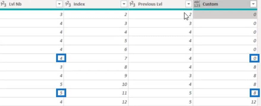
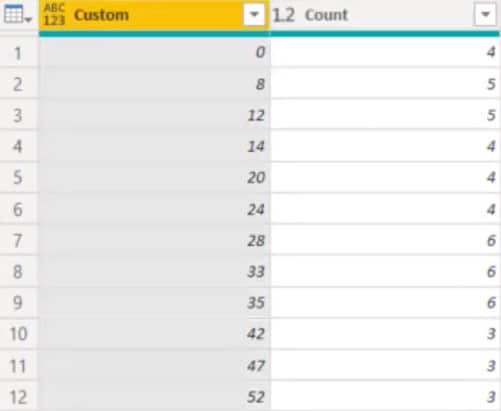
In the table, you can see that the highest granularity of the 0 and 8 group is 4 and 5, respectively. Those levels correspond to the cities containing the information you need to obtain.
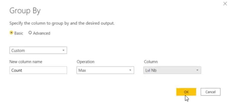
To use Group By, go to Home and click Group By. Then, set the parameters.
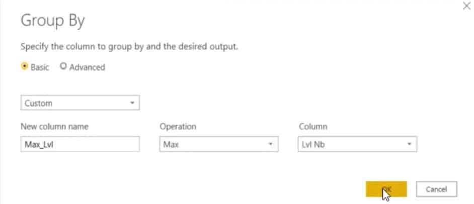
Group the Custom column and find the maximum value of the Lvl Nb column.
Once done, you can now see the maximum level of the hierarchy for each group.
Identifying Hierarchy Levels
The next step is to look for the hierarchy levels in the table.
The City Level
First, find the city name based on the data. To do that, you have to merge this step and the previous step.
Go to Merge Queries and merge the date based on custom and count with the Data(Current).
Next, change Grouped Rows to Replaced Value, and Count to Lvl Nb. Then, click OK.

You now have a table showing the cities with all Level 4 and 5 hierarchies.
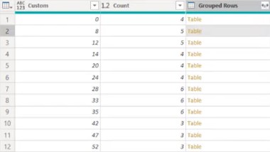
Since you already have the Grouped Rows column, delete the Custom and Count columns.
Next, expand the Grouped Rows column to see all of the data. Then, delete the default column name of the expanded grouped rows.
This is now what the expanded table looks like:
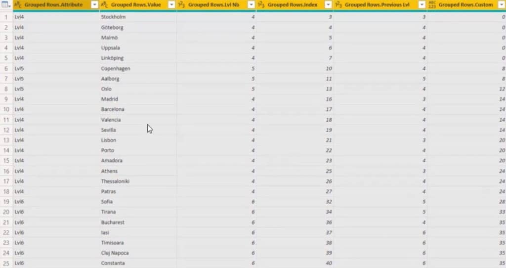
Remove all columns except the Value and Previous Lvl column.
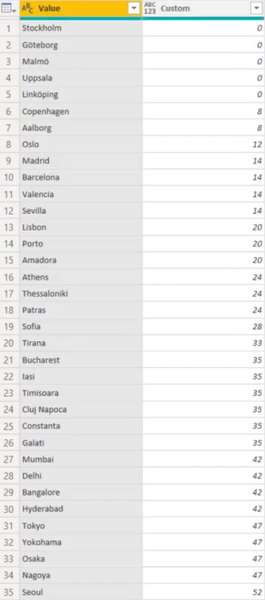
You now have a table showing only the city levels.
The Country Level
To find the country levels, you can use the same technique and logic.
Go to Merge Queries and copy the code. Add a new formula line and paste the code there. At the end of the code, change the LeftOuter to RightAnti.

In the merging of the custom and count values, LeftOuter selects the level of the cities.
This is what the code selects.
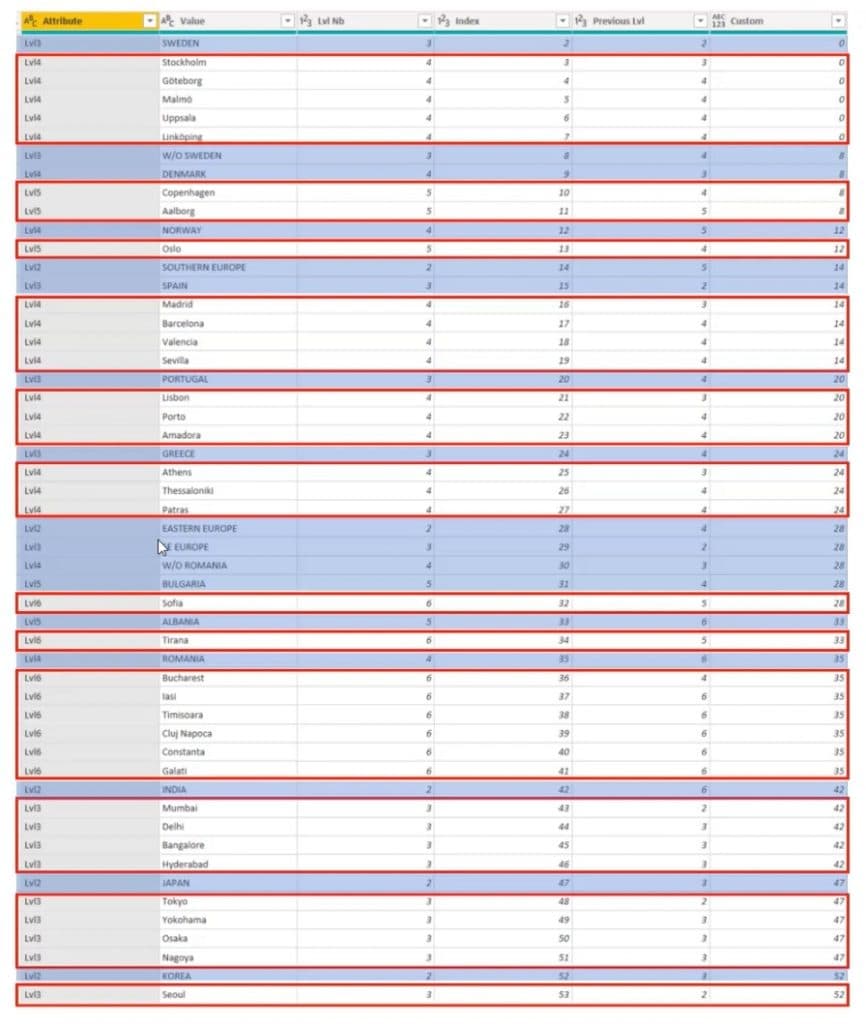
LeftOuter isolated the cities which are enclosed with red boxes. On the other hand, RightAnti chooses the values outside the boxes which are the countries.
After changing the code, you’ll get 3 new columns.
Again, remove all columns except Grouped Rows and expand it.
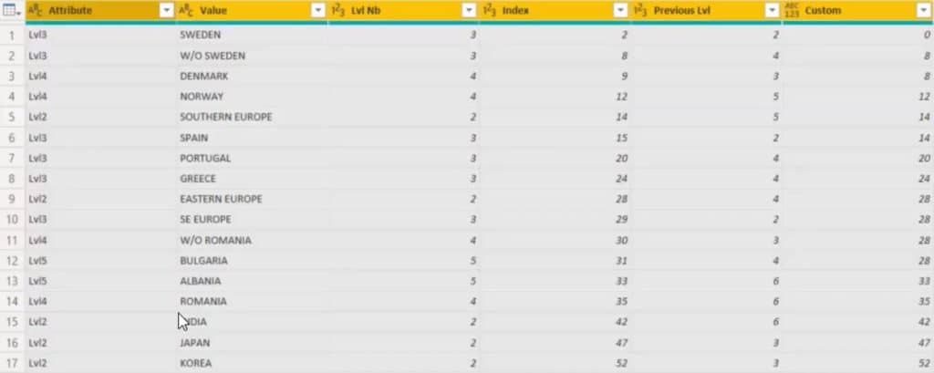
Next, use Group By and Input column name as Max_Lvl. Set the operation to Max and column to Lvl Nb.
Then, generate a code by merging the tables. Go to Merge Queries and merge the Custom and Max_Lvl with the Data(Current).
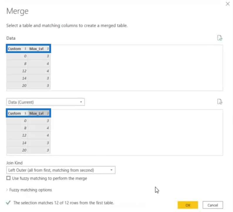
In the formula, change Changed Type3 to Replaced Value, and Max_Lvl to Lvl Nb.

After altering the formula, you now have the tables with all the countries.
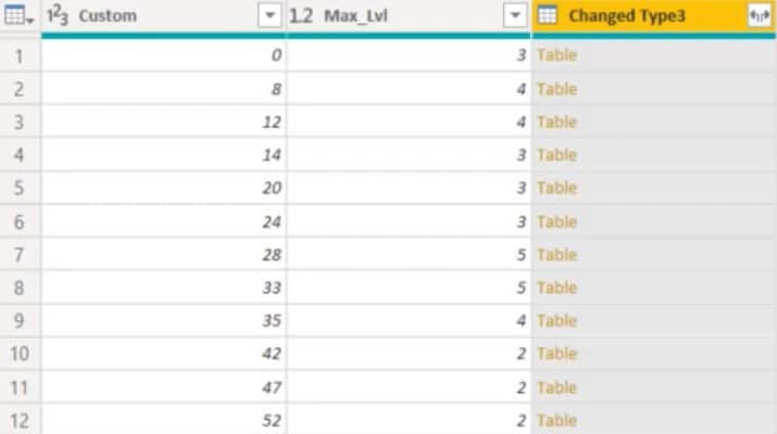
Remove all the columns except for the Changed Type3 column and expand it.

You can now see all the data inside that column. Make sure to change the name of the Value column to Countries.
You’ll only need the Countries and Custom column so remove the other columns.
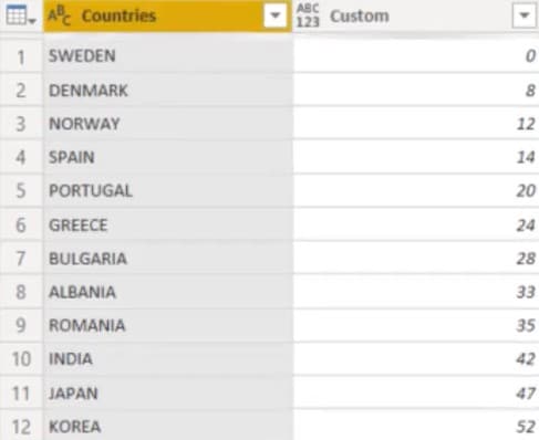
You now have the final table for the countries.
Merging Hierarchies In Power BI
Now that you have the Countries and Cities tables, you need to merge them.
Go to Merge Queries and merge the Custom table with the Data(Current)’s Custom table. Set Join Kind parameter to Inner, and then click OK.
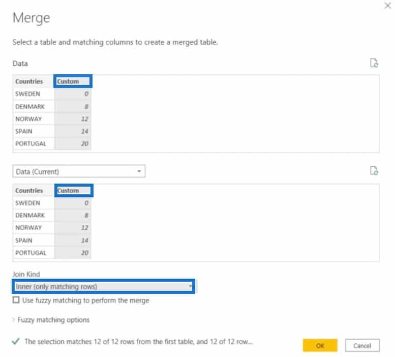
In the formula, change the COUNTRIES to CITY, and then press Enter.

Expand the COUNTRIES.1 column to view all the other columns.
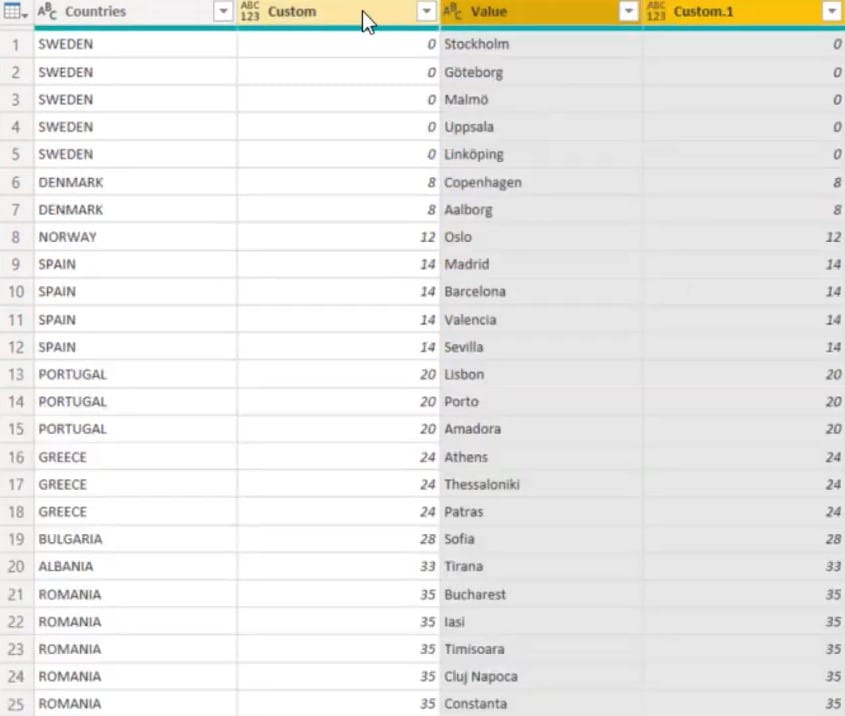
Remove all columns except Countries and Value. Then, change the header name of Value to City.
This is now the simplified table for countries and cities:
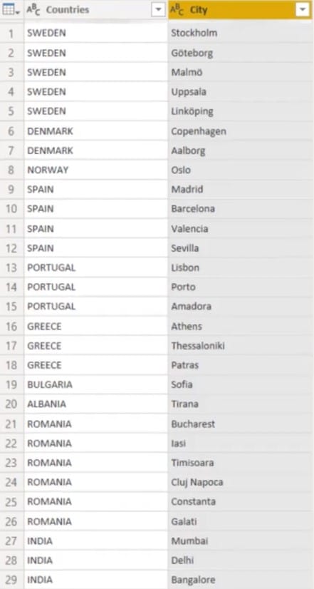
The last step is to add a shape map to visualize the data.
Put the Countries table in the Location parameter, and the City in the Color Saturation. Next, change the projection from Mercator to Orthographic.
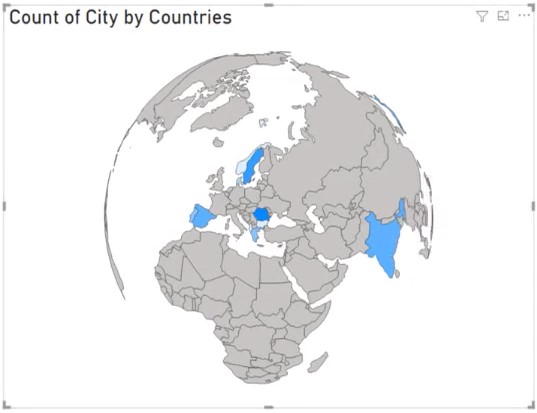
You can now see a map visualization with hierarchy information.
***** Related Links *****
Data Visualizations Power BI – Dynamic Maps In Tooltips
Sort Visualizations Dynamically In Your Power BI Reports
The Importance Of Creating Compelling Power BI Visualizations
Conclusion
Hierarchies in Power BI visualizations are important to gain valuable insights. They tell you specific details and data in your report by ranking them in levels.
I hope that this tutorial helped you understand the importance of these rankings in your visualizations and reports. They simplify your data in a more compelling way.
Alex

