The aim of the Gestalt principles of design is to understand how humans typically gain meaningful perceptions from chaotic stimuli around them.

To become a good designer, we need to understand and use the power of psychology in visual perception. How does someone react to a design when they see it? How does our mind interpret it?
Gestalt principles and preattentive attributes are methods by which we have organized the world so that it’s familiar, makes sense, and easy to process.
Gestalt Processing
A gestalt is a group of visual perception principles developed by German psychologists in 1920s. It is built on the theory that an unorganized whole is perceived as different than the sum of its parts.

Let’s take an example. When you look at the picture below, what do you see? Do you see a bicycle or do you see every component separately? How about on the right side, what do you see? Do you see a dog or do you see separate dots on the screen?
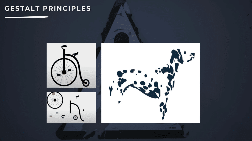
You’d probably say a bike and a dog because our brain looks for familiar clues and tries to simplify it.
Preattentive Processing
On the other hand, preattentive processing is cognitive perception. As its name explains, it’s a process. It is the sorting of visual information to quickly make sense of what we see.
Just like psychology, it is focused on the way we perceive things. We perceive stimuli in connection to one another and their context.
Gestalt in German means whole. We are bombarded with several stimuli each day; hence, Gestalt psychology helps us perceive these stimuli in groups and helps us interpret them. It tells us how we perceive stimuli in an organized manner.
Basically, our brain forces us to reduce the chaos created by the bombarded information from the many parts and tries to make relations from a group, then assign these parts to the group.
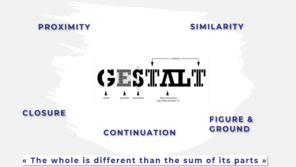
Gestalt psychology revolves around this mantra: the whole is different than the sum of its parts. It states that we perceive the things around us, in relation to each other, as a group, as a whole, or as similar to each other.
Importance Of Gestalt Principles
So why is it important to understand these laws of perception when working in data visualization?
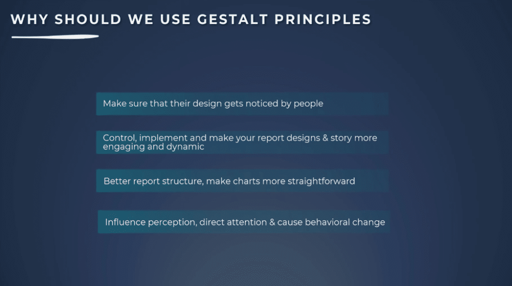
The most important goal for designers is to make sure that their design gets noticed by people. Just as the rule of grammar is the foundation for effective writing, Gestalt principles are the foundation of visual grammar composition.
We can apply some of these ideas to report design by leveraging the essential laws of the human attempt to find order in disorder. This helps us get a better report structure or make our charts more straightforward.
It can help us determine which visual elements are most effective in any given situation to influence perception, direct attention, and cause behavioral change.
Using Gestalt Principles For Storytelling
The use of storytelling is beneficial when it comes to the intuitive design. The Gestalt principles attempt to describe how people perceive visual elements under certain conditions.
Principle Of Similarity
Now let’s discuss the easiest to understand and the most broadly used Gestalt principle, which is similarity. It states that when things appear to be similar to each other, we group them together and think they have the same function.
The human eye tends to build a relationship between elements with design similarity using basic elements such as shapes, colors, orientation, texture, and size.
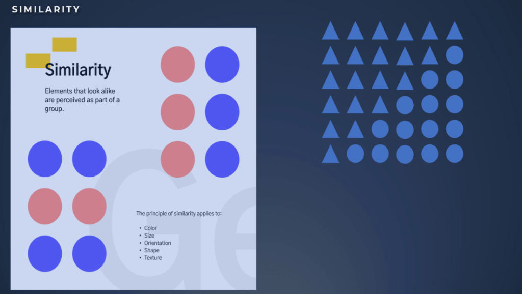
Let’s see the example below. Look at the round shapes on the right side of the page. How many groups do you see? You will most probably say one group of elements with the same size, color, and shape.
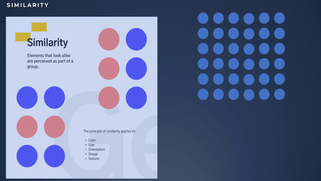
In this example, we will group the elements together based on shape.
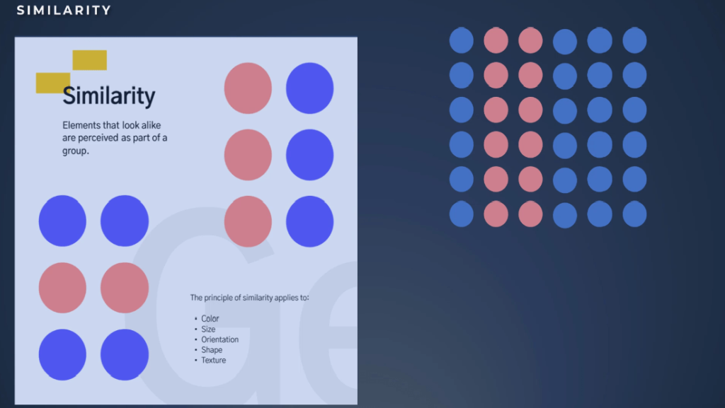
For this example, we will group the elements together based on color.
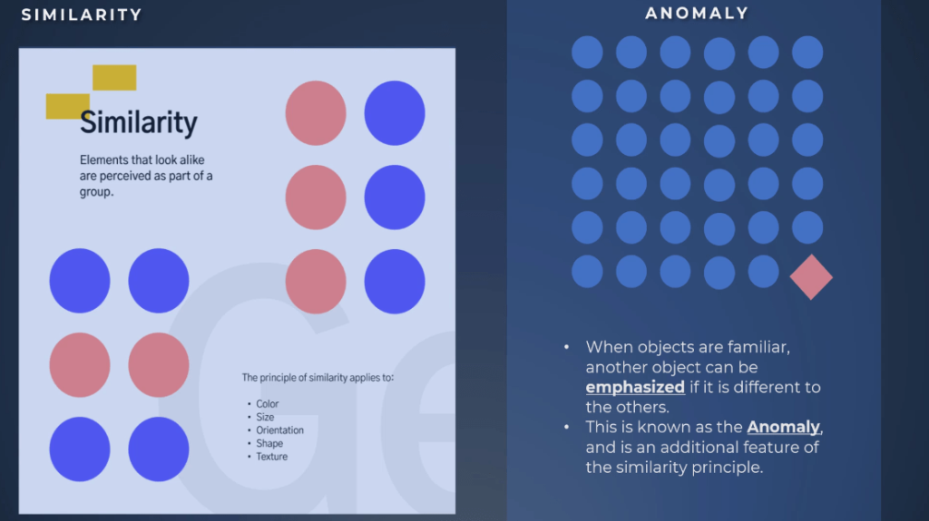
Another additional feature of the similarity principle is the anomaly.
When objects are familiar, another object is emphasized if it is different from the others. As a result, anomaly draws the eyes as you can see in the example on the right side.
In this case, to make it really stand out, we used a different color, shape, and orientation.
Applying Gestalt Principles In Power BI Reports
Let’s see now some examples of how we can use the principle inside our Power BI reports.
In this first example, we see that we have three blocks of graphs that are very similar. We have a shape on the left, a KPI on the top, and a graph on the right. This allows comparison for the end users using the similarity principle.
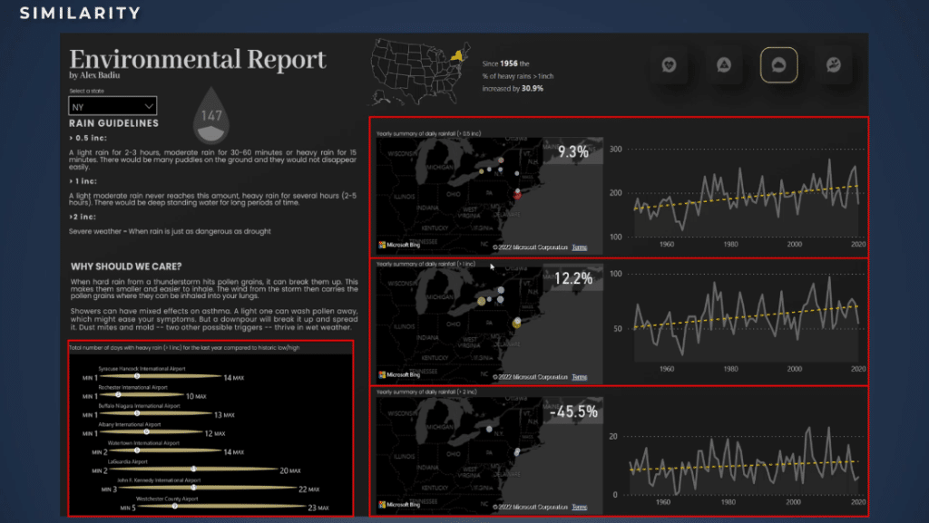
Another key point is on the lower part of the screen. We can also compare different airports with a minimum low-end, maximum high of days of rain above one inch, and we can also see the value of the number of days with rain for the last year.
Another example is this asthma prevalence analysis. We can see through the use of color the relationship between two different charts. One is a map while the other is a scatter chart.
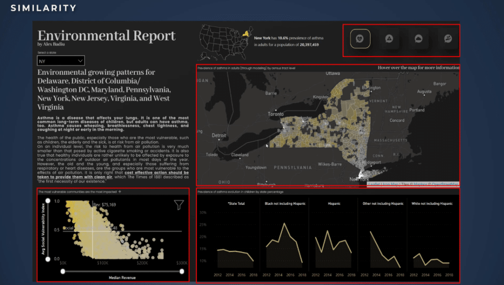
In the same way, we can also use as an example of the use of small multiples. Based on the principle of similarity, small multiples are very useful when creating a story because it allows comparing different information which in this case is the ethnicity of the children with asthma.
It is also worth highlighting the upper-right corner where the navigation has icons and buttons. It is a good example because these buttons are in the same place. In fact, the designer did not only apply the principle of similarity but also the principle of proximity. It allows the user to understand there’s a relationship, and that they can use this navigation.
Another example is this report created by Julie Boche. This is a perfect example of the principle of similarity.
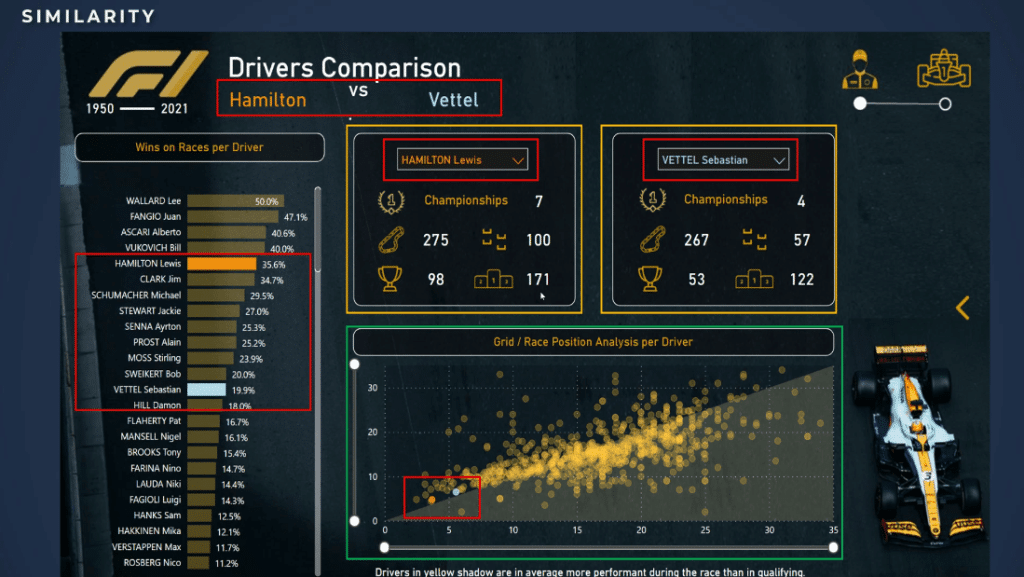
Inside the report, she used two different colors for the name of the two drivers that she analyzed. The fact that she used the color is very intelligent because by using this she doesn’t need to create legends everywhere.
Noticeably, she used the same colors to create an indirect relationship between the title and the colors in this graph. To compare all the drivers, she also used the same colors for the scatter charts.
Without a doubt, the creation of the two KPI blocks is a good example too. They are exactly the same and allow the user to easily compare the metrics of the two drivers. It’s a really good example of similarity and harmony principles inside a report.
Last but not the least, we have the scatter chart which is also very useful and powerful in design for telling a story. We have a lot of similar elements and we can compare them based on the same metrics and the same rules.
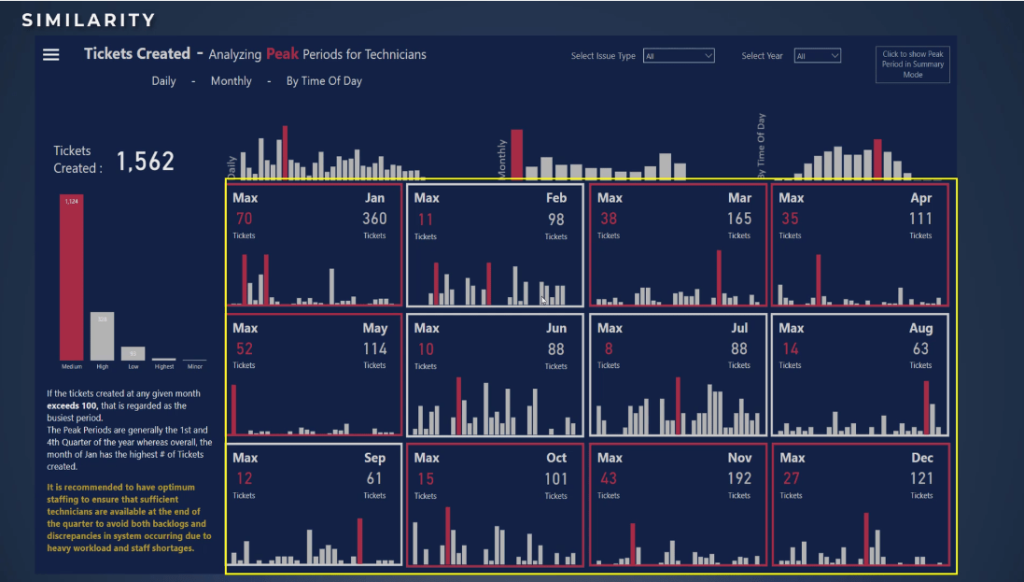
In addition, this report created by Mudassir Ali is also an example of similarity. We see similar blocks that are positioned together. The principle of proximity is also applied because it creates a really nice page that allows comparison and harmony to dominate the overall page.
Lastly, this is an example of a similarity anomaly. In this report, I would like you to look at the upper-right corner of the screen. This is an example of an anomaly because of the color of the round shapes, compared to the shape of everything else on this report.
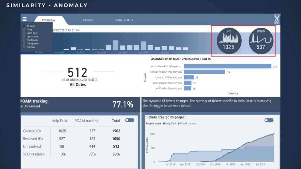
Evidently, I created these round shapes to draw attention to these metrics. A user will stay maybe one second or two to analyze what I wanted to show through this example.
***** Related Links *****
Enhanced Data Visualization And Reporting Frameworks
Data Storytelling: Thoughtful Planning & Creation Process
Power BI Feature Bookmark Navigator: Tutorial & Review
Conclusion
You’ve learned in this tutorial the significance of Gestalt and the similarity principles in Power BI designs. It is also important to realize that once you understand these simple principles, you’ll be able to control, implement, and make your report designs and story more engaging and dynamic.
All the best,
Alex


