
In today’s blog, we will demonstrate a handy feature inside a Power BI—the combination of field parameters and small multiples. There are indeed a lot of automation and productivity tools in Power BI, but when we layer this technique into them, we can create even more incredible insights and visuals. You can watch the full video of this tutorial at the bottom of this blog.
Demo Data For Field Parameters and Small Multiples
For this blog, we will use a recent demo that I created around oil and gas.

I created a range of measures called core measures that are all relatively simple. It is a totally random data set on oil and gas areas within the States.
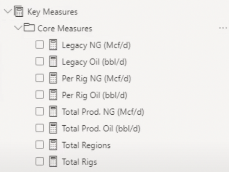
Looking at all of these measures, we can see that there were entries that were not exactly the same, but were similar.
For example, there was a measure for Oil Production Per Rig and another for Gas Production Per Rig. The same is true for Legacy Oil Production.
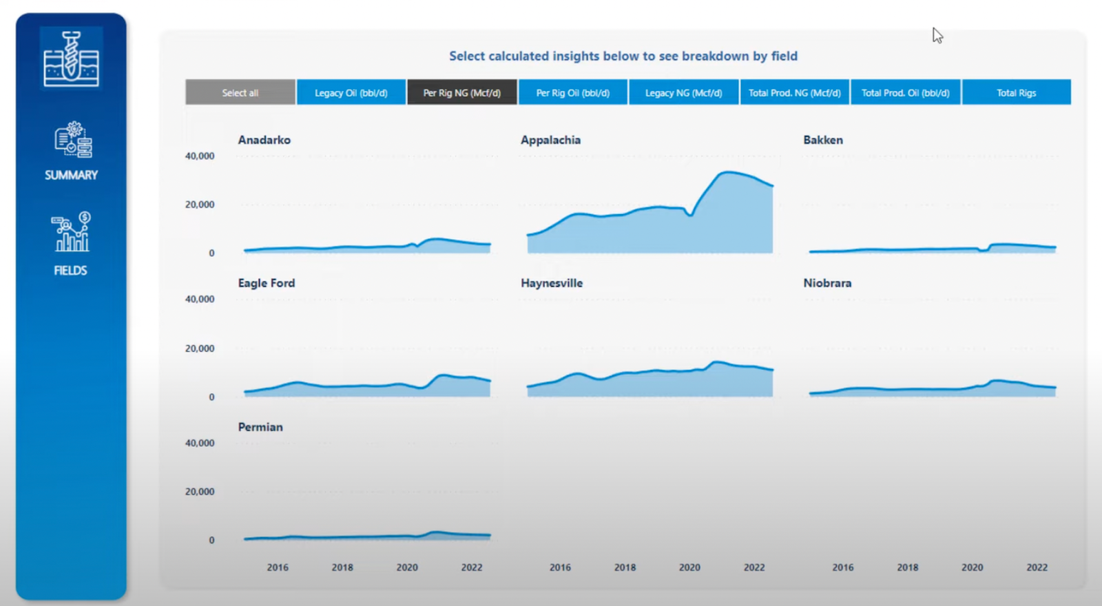
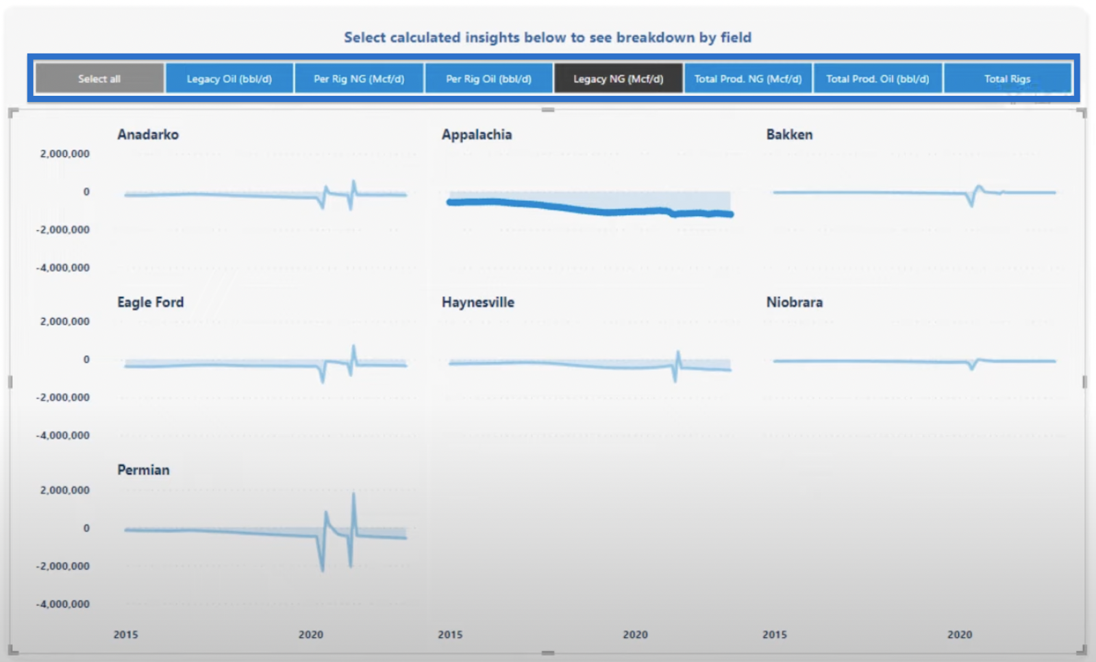
The terminologies used in these examples were not exactly the same, but they provide similar types of insights. For this reason, it would be better if one is shown after the other because they all relate to a certain particular dimension in the dataset. In this particular case, it’s the region.
We can create visualizations for each of these individually. However, what we want is to be able to click through them separately and be able to showcase them as quickly as possible in tabs like this.

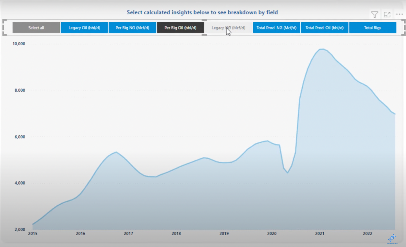
In this format, let’s say we want to look at total production, legacy, or per rig production. We can sort them easily and go to the tab that we need to go to.
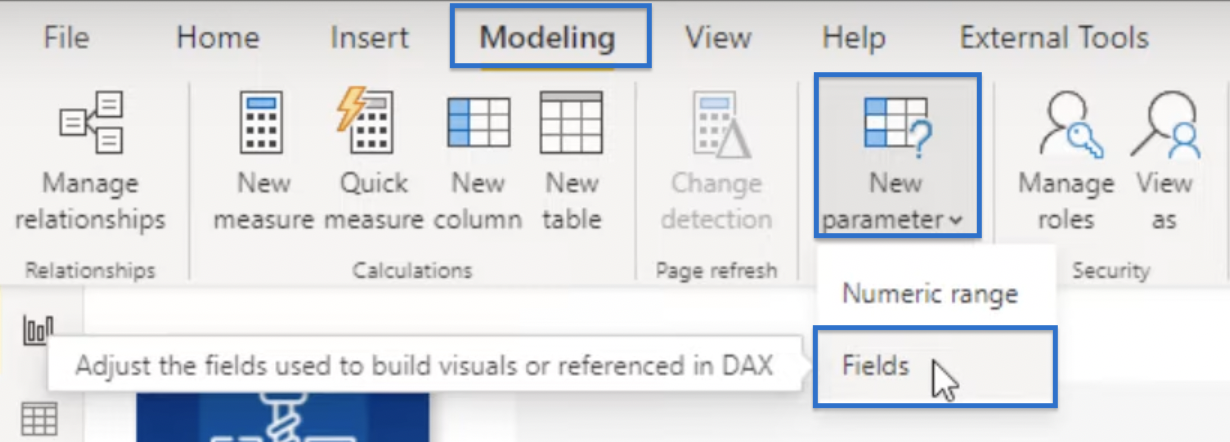
Applying the Field Parameters
Let’s try to apply the Field Parameters. We will start by going to Modeling. Choose New Parameter, and then click Fields.

A parameters window will open. Let’s choose Field in What will your variable adjust? Then go to Key Measures and Core Measures, then select the measures that you want to include.
We can also rename it in the Name field and Add slicer to the page by checking the appropriate box. Once done, click Create.

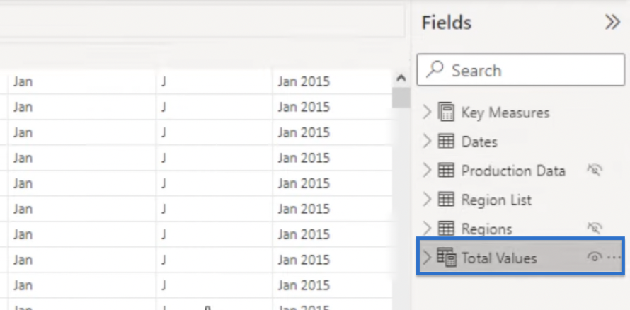
To see the results, go to the Table Icon on the left.

What we did is create an automated table using a formula. Inside of the measures, it allows us to do measure branching and reference measures within measures.
To access the formula, go to the Fields Pane and select Total Values.
We can see the formula below, which is already set up so we don’t have to write it out ourselves.

And it does other automated work as well. For example, we can see in the table that it’s calling the actual measure within a particular row.

This technique will set up our slicer quite easily.
There are a lot more diverse ways that we can utilize the field parameters, and as a technique, that makes it incredible.
Using the Small Multiples Feature
In the image above, the visuals were segregated based on the region. But what we could have done was simply show them as totals and have another filter for the regions as shown below.
However, we can agree that more insights are available in the former visualization. That is why I love the Build Visual tools such as area charts and line charts because they have small multiple parameters.
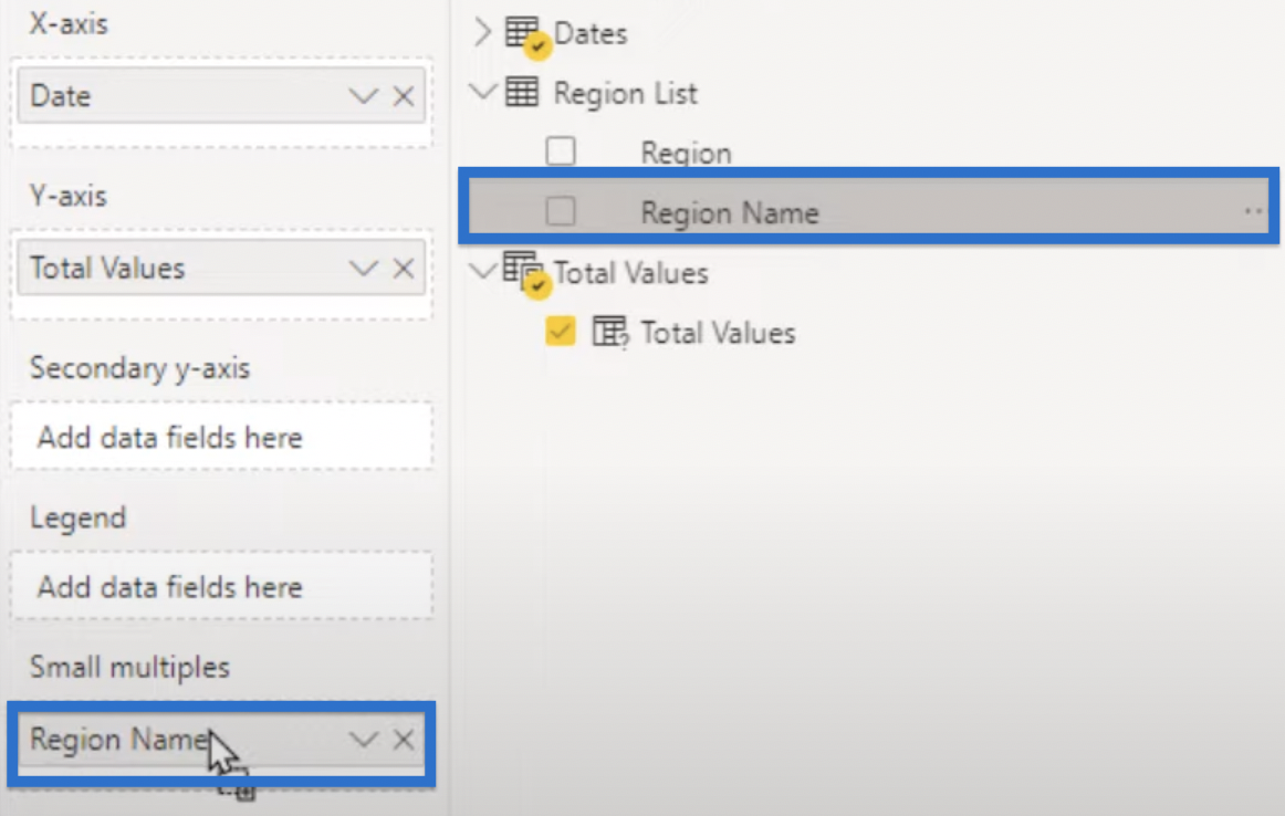
To start, let’s drag Region Name from the Fields pane to small multiples under the Visualizations pane.
Our small multiples break down our total into small mini charts. With it, we are able to click through each of the calculations and they are automatically updating for each individual region as well.
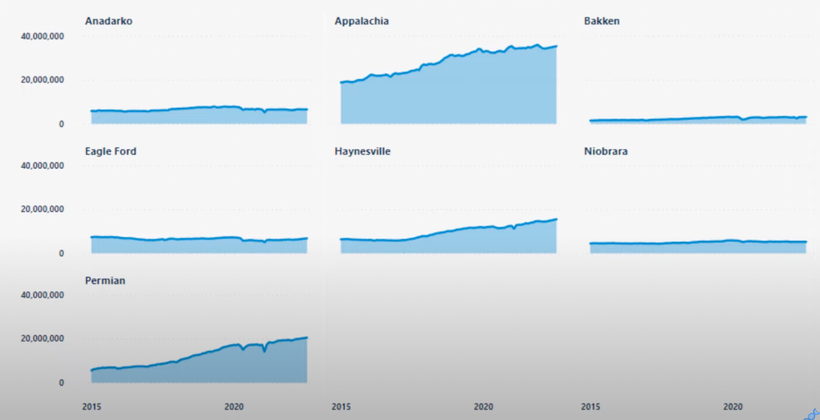
The number of calculations and the speed at which they are calculated is also remarkable, allowing us to view trends quickly.
Additionally, we can do a lot of manipulation on the small multiples. For example, we can change the grid size, which I typically do to make sure it fits into one page. There are various other things we can do as well, and they are all easy to apply.

***** Related Links *****
Using Filter Fields & Visual Interactions To Create Compelling Visualizations In Power BI
Small Multiples Chart In Power BI: An Overview
Power BI Small Multiples Visual – New Feature
Conclusion
In conclusion, combining field parameters with small multiples in Power BI is not difficult yet very handy. Using the field parameters by itself is useful, but layering it with small multiples is phenomenal. It’s game-changing what they can do and how quickly it can be done.
As we know, dealing with historical data is time-consuming, but using the technique we have discussed would only require you to spend around 10% of the time. You can include more data and create valuable insights that can be easily understood by consumers. And with the visuals, you’ll probably get a lot of great feedback too!
All the best,
Sam McKay
[youtube https://www.youtube.com/watch?v=t7lY_JEcm_4&w=784&h=441]


