This tutorial will feature different examples of how to use the Expression Builder in Report Builder to format elements in your paginated reports.
Three examples are shown below. The first example discusses how to perform basic formatting on chart data labels. The second example demonstrates how to format a chart to make it more coherent. And the last example shows how to perform a more advanced formatting style on chart data labels.
Expression Report Builder Ex. #1: Basic Data Labels
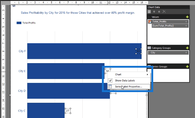
Right-click on a data label in your chart and select Series Label Properties.
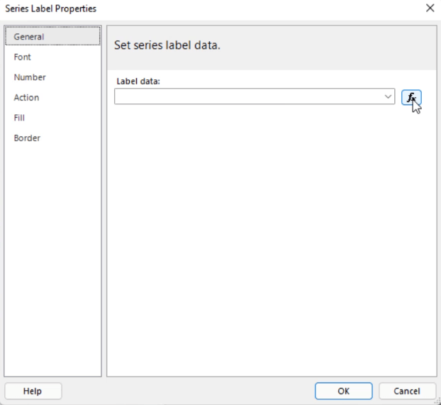
When the Series Label Properties window pops up, click the fx button to open the Expression Builder.
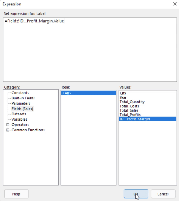
Then, in the Fields Category, double-click the Item you want the data labels to be. In this case, it’s the Profit Margin. Once done, click OK.
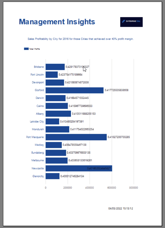
When you Run the report, you’ll see that the chart data labels show the Percentage Profit Margin.
Expression Report Builder Ex. #2: Chart
You can also use the Expression Builder to format a chart, sort it alphabetically, or by ascending or descending order.
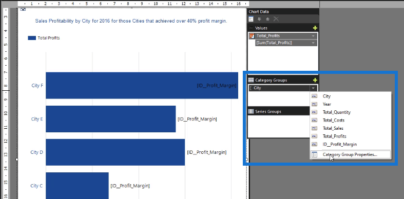
In the Chart Data, click the drop-down arrow of the item under Category Groups and then click Category Group Properties.
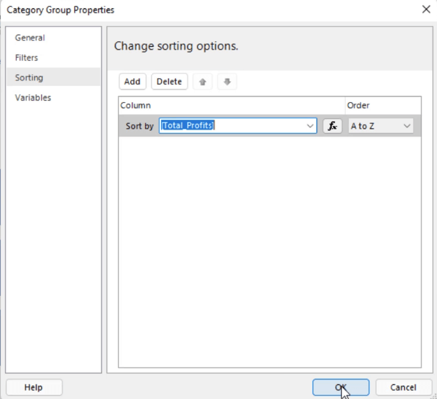
Under the Sorting tab, choose to Sort by Total Profit and then click OK.
When you Run the report, you’ll see that the chart data is now ordered according to the Total Profit amount.
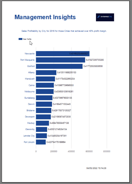
The sort option applied on the chart makes it look uncluttered and easy to understand.
Expression Report Builder Ex. #3: Chart Data Label
Another thing you can do with Expression Builder is format your chart data labels.
To start, click on the data labels. Then in the Properties pane, click the Label drop-down arrow and click Expression.
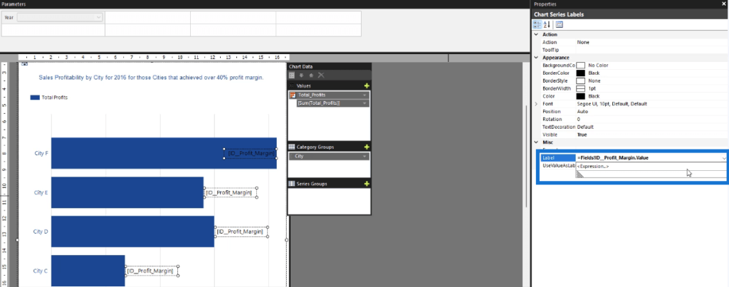
In the Expression Builder, write the format you want apply on the data labels. In this case, the data labels show the Total Profits and the Percent Profit Margin.
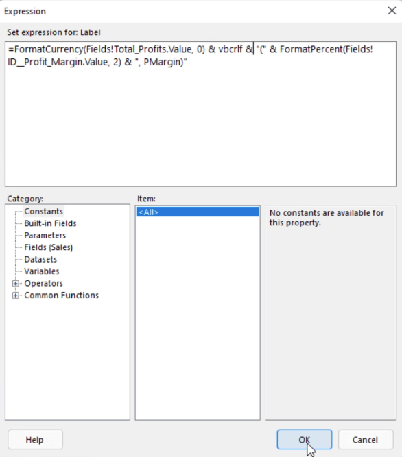
The Common Functions category contains a sub-category called Text. In this sub-category, you can double-click on the FormatCurrency item. This item allows you to format the Total Profit as a Currency.
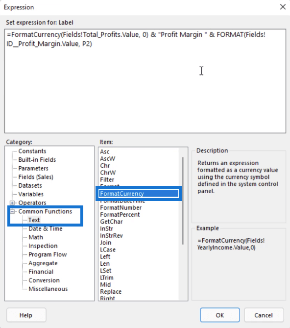
Meanwhile, the FormatPercentage item allows you to format a percentage to your desired number of decimal places.
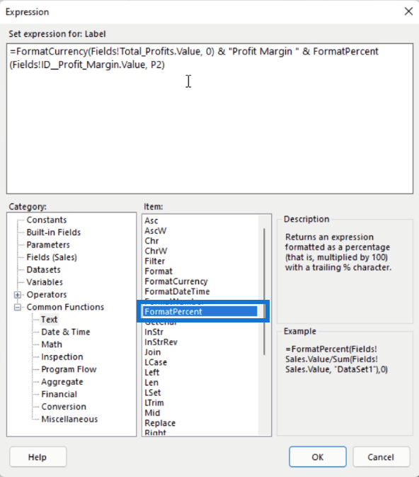
Use ampersand (&) to concatenate the items in your expression. You can also use the vbcrlf, a visual basic line return that allows you to start the succeeding items on the next line.
Once you’re done creating the expression you want, click OK. This is now what the formatted data labels look like.
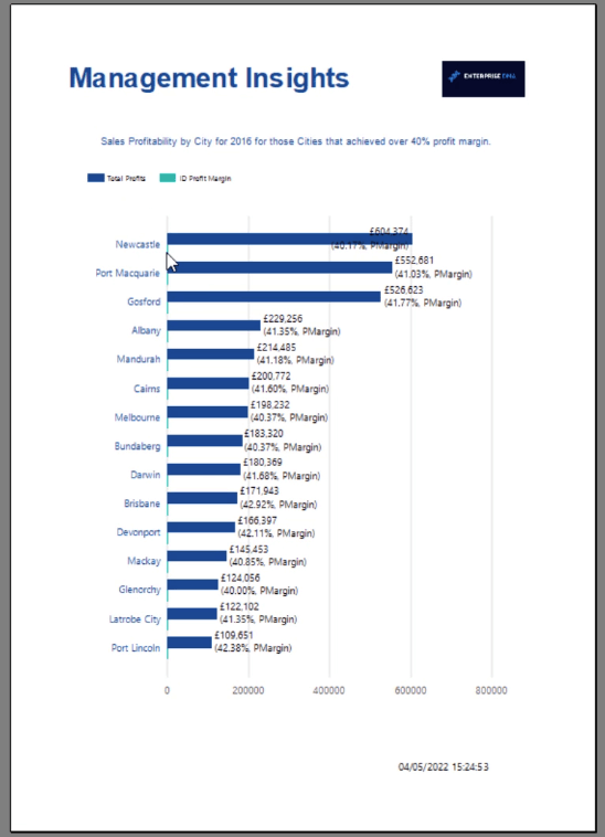
Because the Profit Margin is also shown on the chart, the bars for the Total Profit look small. So go back to the Design view and remove Profit Margin from the Values in the Chart Data.
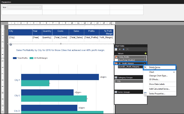
This makes the chart look better.
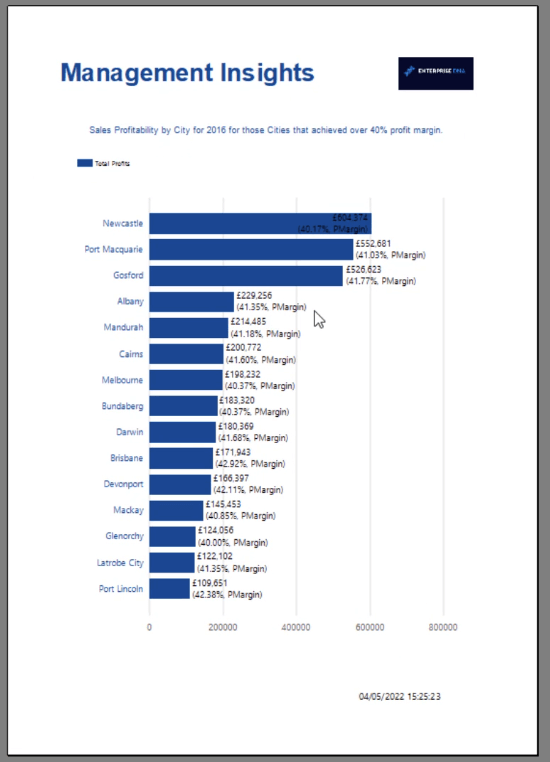
You can go back to the Expression Builder and change the data labels’ other formatting options. And in the Properties pane, change their position and rotation.
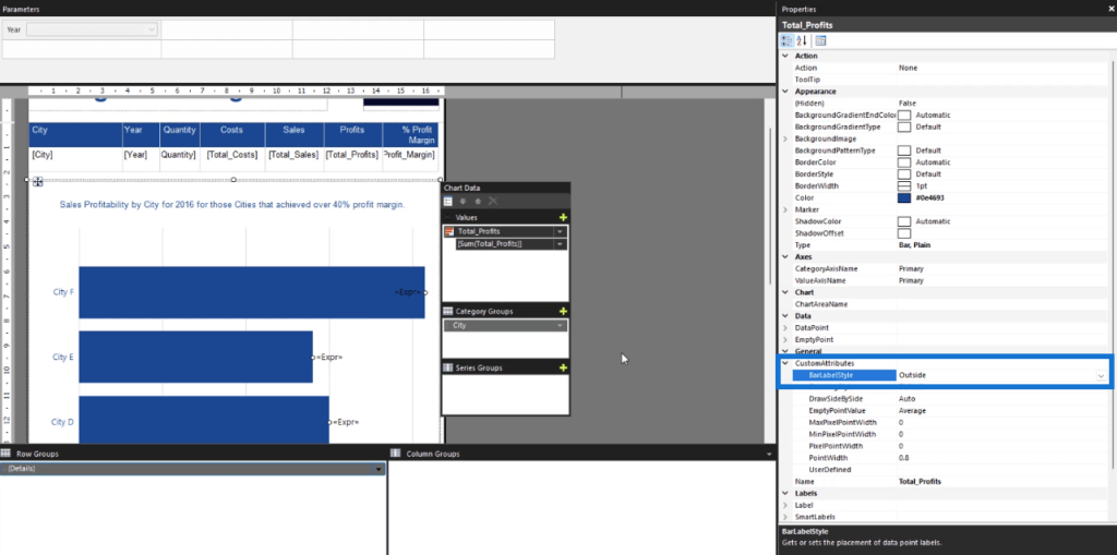
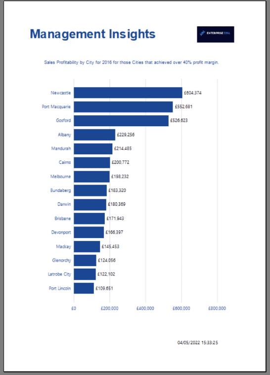
There’s also an option to change the Bar Label Style to set the placement of the data labels in each bar. In this example, it’s formatted to be on the outside.
Format Chart Axis
Let’s also try formatting the chart axis.
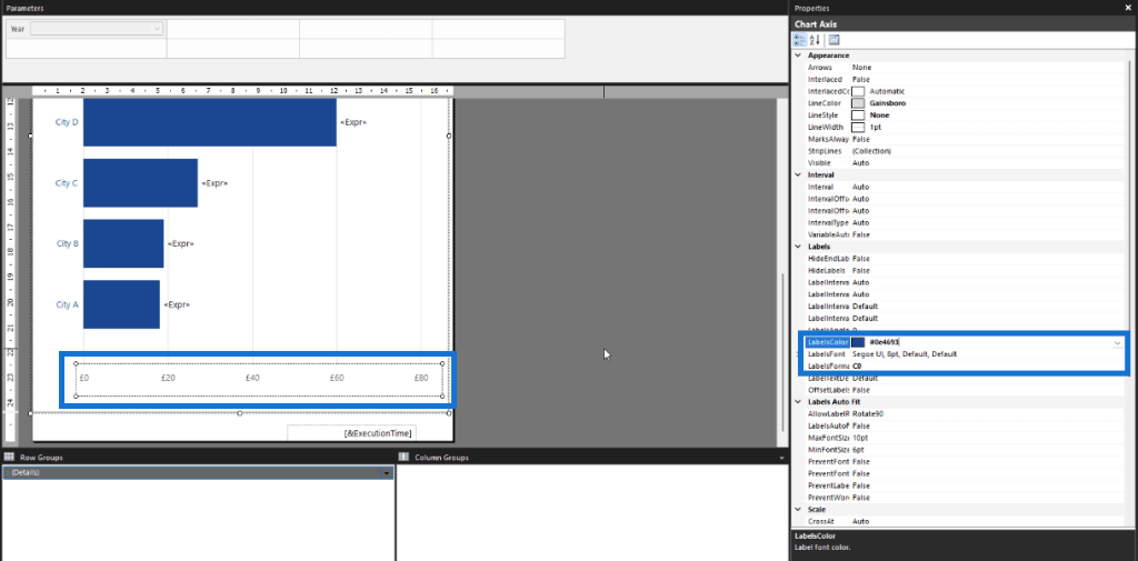
Double-click on the axis. Then in the Properties pane, change the label color, font, and format. You can type C0 in the Label Format to turn the axis into a currency.
Final Step
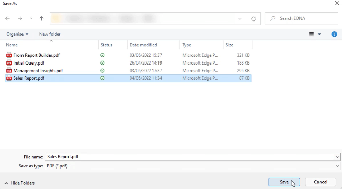
When you’re satisfied with how your paginated report looks, you can save it as a PDF.
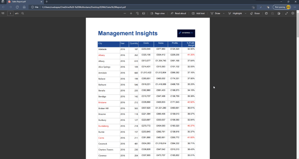
The PDF file shows a pixel-perfect table and chart for your report.
***** Related Links *****
How To Filter & Sort A Chart In Report Builder
Expression Builder: Applying Conditional Formatting On Paginated Reports
Paginated Report In Power BI: An Introduction
Conclusion
This tutorial presented three ways of using the Expression Builder to format elements in your paginated report.
The examples used in this tutorial only covered the tip of the iceberg when it comes to formatting in Report Builder. The Properties Pane and Expression Builder offers a wide range of formatting options that you can modify to make your report more coherent and business-appropriate.
You have the freedom to do anything. The important thing to do is learn to identify whether the changes you’re making are necessary or not.
All the best,
Sue Bayes


