
Here we’re going to look at customer margin contraction. We’re going to try and work out what customer margins are contracting and why are they contracting. Is it because of their purchasing frequency? Is it because of the products they’re buying? Or because of some other reason? You may watch the full video of this tutorial at the bottom of this blog.
We’re going to solve this analytical problem with Power BI using a number of techniques.
This sort of example is perfect to run through if you want to improve your own analytical capabilities when using Power BI.

Not just your analytical thinking, but also the practical application of using Power BI as a tool to solve these types of challenges.
Through Power BI and by implementing a number of techniques, which I showcase, you can actually work out this insight quite effectively.
Not only that, you can work it out in a dynamic way. Say, for instance, we have customers across a range of different regions. Well, we might want to also select through those regions, and then discover which of our customers margins have contracted in any particular region over a certain period.
This is a really high quality analytical insight, and that’s the key. That’s what we want to use Power BI for. That’s what I want you to implement in your own models.
Demonstration Of The Insights You Can Get From This Technique
In my example here, I’m evaluating what has happened between this year and last year, whether customer margins contracted or expanded, but really drilling into the ones that have contracted.
Within this dashboard, we can click each state. We could set this up in many different ways, say our retail shops if we want to drill into a specific store. In this case, we are looking at the states where we sell our products.
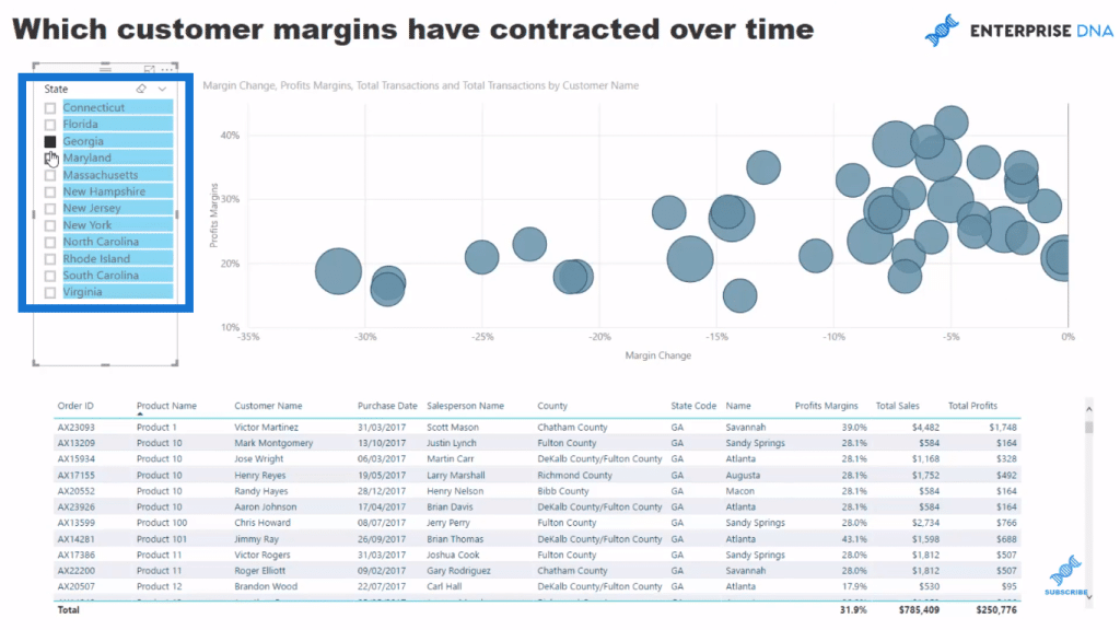
We’re only focusing and looking at the margins that are less than zero. We use some natural filtering inside Power BI to achieve this insight or extract this insight from the information.

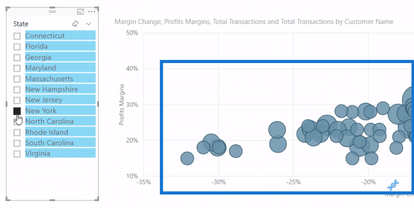
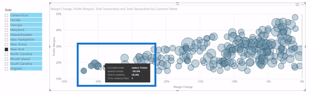
For instance, we are specifically looking at New York, we see all of the sales we’ve made in New York. If we look at all of the customers here, we might want to know whose margin has contracted the most and why. In the cluster of customers here, we want to know what products they purchased, who was a salesperson, which particular store did they buy, etc.
If we want to know how much was the actual sale and profits, we can actually come into our scatter chart here and select all of these elements individually.
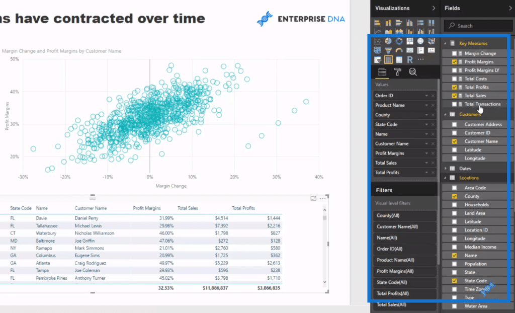
Down in this table here we have every single order, each purchase, and all the details for that purchase. We have the customer, the salesperson, the county, state name, the name of the city or the name of the store, the actual profit margin of the sale, total sales, and total profit.
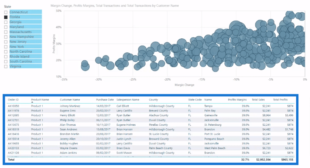
So we really have very specific information there. If you think about it, this is a massive data set. And we’re really drilling into the detail here, discovering what is going on and why.
Is it because we had these products on sale or we discounted them? Are there any common products? Are there sales people who are just cutting the price every time to make a sale?
Working Out The Formulas
To build this analysis, we utilise natural filtering. We don’t need to write complex DAX formulas. The first thing to do is to create some simple core measures, such as Total Sales, Profits, Costs, etc.
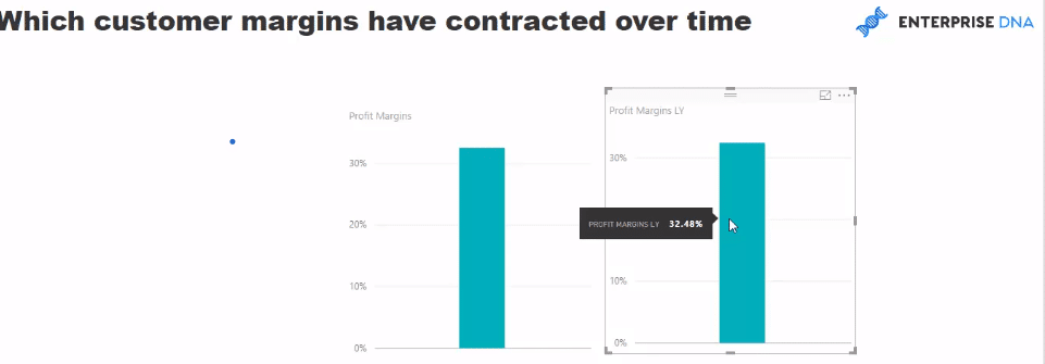
We go to New Measure, then create our Profit Margins measure. For this formula, we simply divide Total Profits by our Total Sales. Then, we make sure that it is formatted as a percent.

Now since we want to analyse overtime and compare 2017 and 2016, we’ll put a page level filter on 2017. So for example, Profit Margins here is for all we’ve sold in 2017. We can then compare 2017 and 2016 profit margins using some Time Intelligence functions.
So we go new measure again, and create Profit Margins LY (for last year). We use CALCULATE Profit Margins, and then SAMEPERIODLASTYEAR.

With that result here, we can now work out the customer margin expansion or contraction over time between 2017 and 2016.
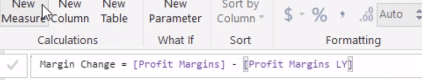
So we create a new measure once more, the Margin Change, which is equal to Profits Margins (this year) minus Profits Margins LY (last year).
Creating The Dashboard And Making Further Improvements
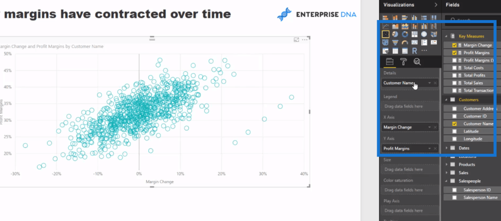
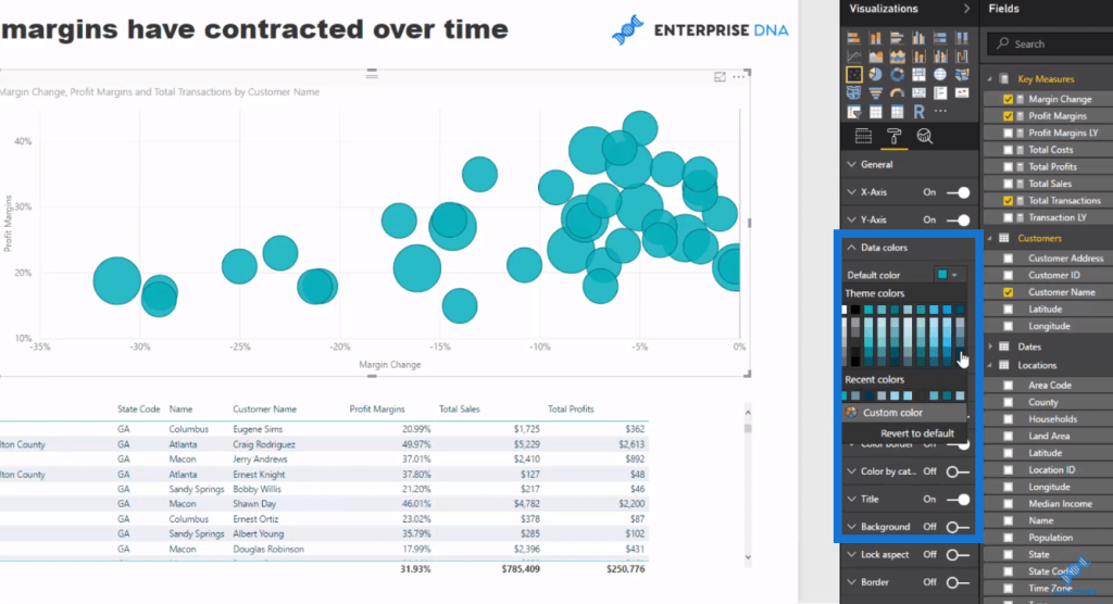
Once we have all these measures in place, we can start making our dashboard. This analysis is perfect for a scatter chart because this is where we can find clusters of information.
To do this, we put our Margin Change in the X axis, and our Profit Margins in our Y axis. We bring in our Customer Name into the Details to get that cluster in our chart.
Next, we set up our State, where we can filter on the states. Then, we set up our table down below. Because of the data model we have here, we can bring elements from all of our Lookup tables, and compare them to anything in the Sales table or to any formula we’ve done over the Sales table.
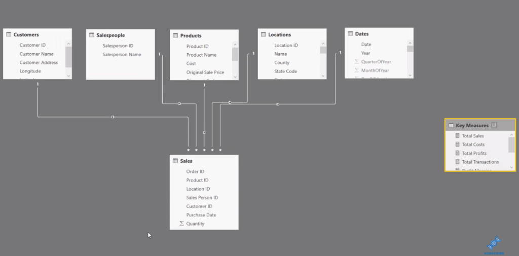
So we can grab our Order ID, as we’ll look at every individual order, and then bring in all the other elements, including our Product Name, the County, the State, the Store, the Customer who bought it, Total Sales, Total Profits, and Proper Margins.

One issue here is that the Margin Change is exactly the same as the Profit Margin. Why? Because there was actually no sale the year before, and it’s a useless insight. It will show a massive Margin Change because the margin last year was zero.
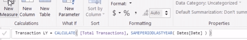
What we need to do is get rid of those by creating a measure this works out what the total transactions were last year. Now we already got Total Transactions (measure) for the current year, 2017, and so we’ll create a formula called Transaction LY (last year).
We’ll do exactly the same technique we used just before. We use CALCULATE Total Transactions, and SAMEPERIODLASTYEAR. Then, we put in our Dates column.
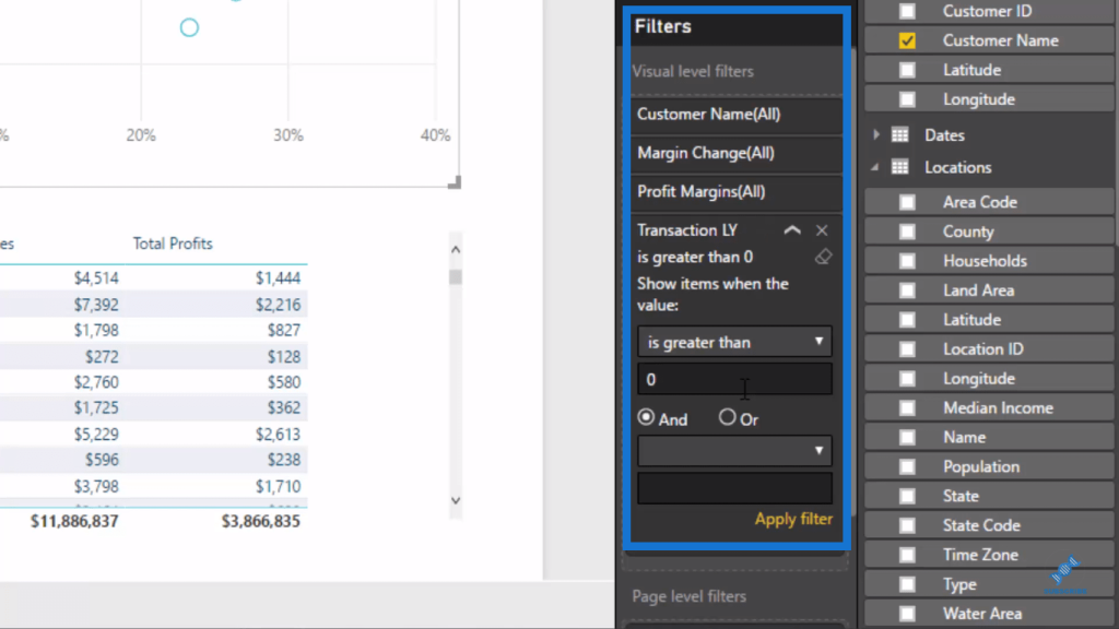
We can also use these filters on the right hand side. We can select the visual, Margin Change and Profit Margins by Customer Name, then grab the Transactions LY measure, and put it into the visual level filters.
Moreover, we can put an additional filter, we don’t have to write complex DAX formulas for all these little things that we might want to filter.
By putting this filter here for only those sales last year that are greater than zero, we can very quickly get rid of all of those erroneous numbers that don’t actually mean anything.
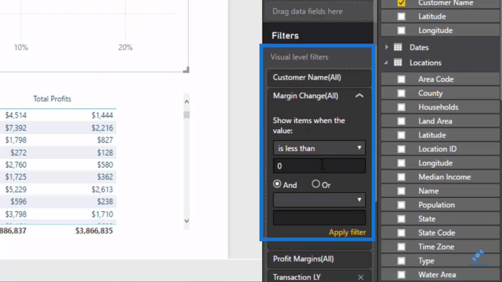
Now since we’re looking at the contracted margins, we want to get rid of anything that is expanded. To do this, we go back to the filtering section and look at values that are less than 0. We click Apply filter, and it automatically change the chart quickly.
Now that we have the insights we seek, we can play around and improve the visuals, such as the background, the colors, etc.
***** Related Links *****
Analyze Margin Changes Overtime – Analytics With Power BI And DAX
Answer If Margins Are Expanding or Contracting Through Time With Power BI
Calculating Percent Profit Margins Using DAX In Power BI
Conclusion
In this tutorial, I’ve gone through a number of techniques, including how we branch through some DAX logic, and drill even deeper into a particular insight by utilizing these additional filters on the right hand side, and the visual level filter.
The key thing here is that this technique allows you to find or drill into these information without having to write really complex formulas.
Dive into this content and try to replicate it. Understand how you can do it, and then replicate it over your own data sets.
That’s how you’re going to get the most out of this material and out of some of these tutorials that I run through.
Cheers!
Sam
[youtube https://www.youtube.com/watch?v=3D6jPCc8800?rel=0&w=784&h=441]


