
When aiming to create astonishing reports, following the laws of UX is a must. The laws of UX are the most important principles you need to know and consciously implement inside your Power BI report because they will guide the design of your report and story.
For this tutorial, let’s focus on the laws of UX, and take a look at some examples. In addition, let’s discover the main takeaways to better understand how to put each law into practice.

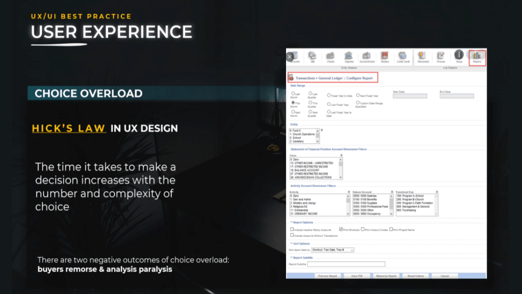
With that being said, let’s get started with Hick’s law, which is a personal favorite of mine. It states that the time and effort it takes to make a decision increases with the number and complexity of choices. This means that the more requirements or options available for a task, the more time and effort are needed.


When faced with too many options to choose from, users can easily get tired from comparing options and may end up not making a choice at all. Choice overload is a behavioral economics principle that describes the negative effects of having too many options to choose from.
Laws of UX: Choice Overload
When users are enabled to make a decision due to the number of choices, analysis paralysis occurs. Analysis paralysis happens when a user overthinks or over-analyzes a decision to the point where no decision is made and no action is taken.
Alternatively, when users have too many choices and have limited time to make a decision, they experience Buyer’s remorse. Buyer’s remorse is the sense of regret you feel after purchasing a product or service. When too many options are presented, users will question whether or not they choose the best options for them.
The best way to reduce choice overload is to reduce the number of filters you put at the user’s disposal.
Laws of UX: Lessen The Filters
Use interactions between graphs instead of filters.
You can leverage the filtering capabilities by choosing the right visuals at a different level of granularity or by using different dimensions.
By using interactions, menus, drill-through actions, and graphs, we can create a story and a story path for the user. You should always consider interactions between graphs.


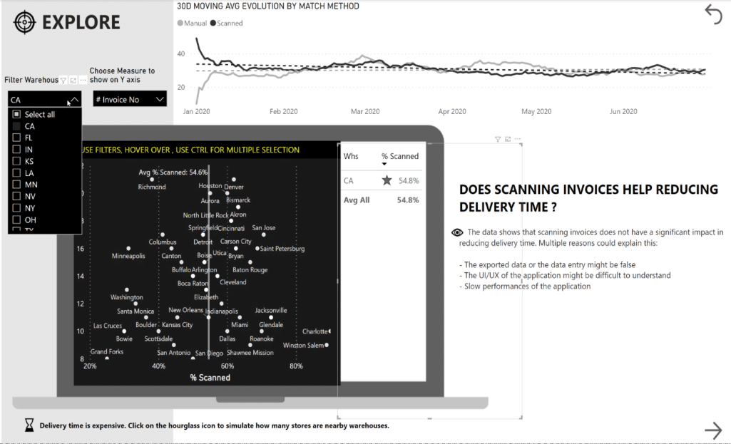
As an illustration, let me show you the report that I submitted for Power BI Challenge # 4. We have the warehouses, the name of the warehouse, and the percentage of scan invoices.
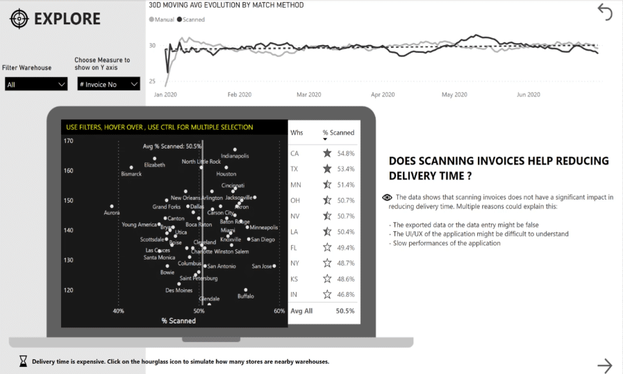
For example, when we click on the highest warehouse, you will notice that the graph filters the data.
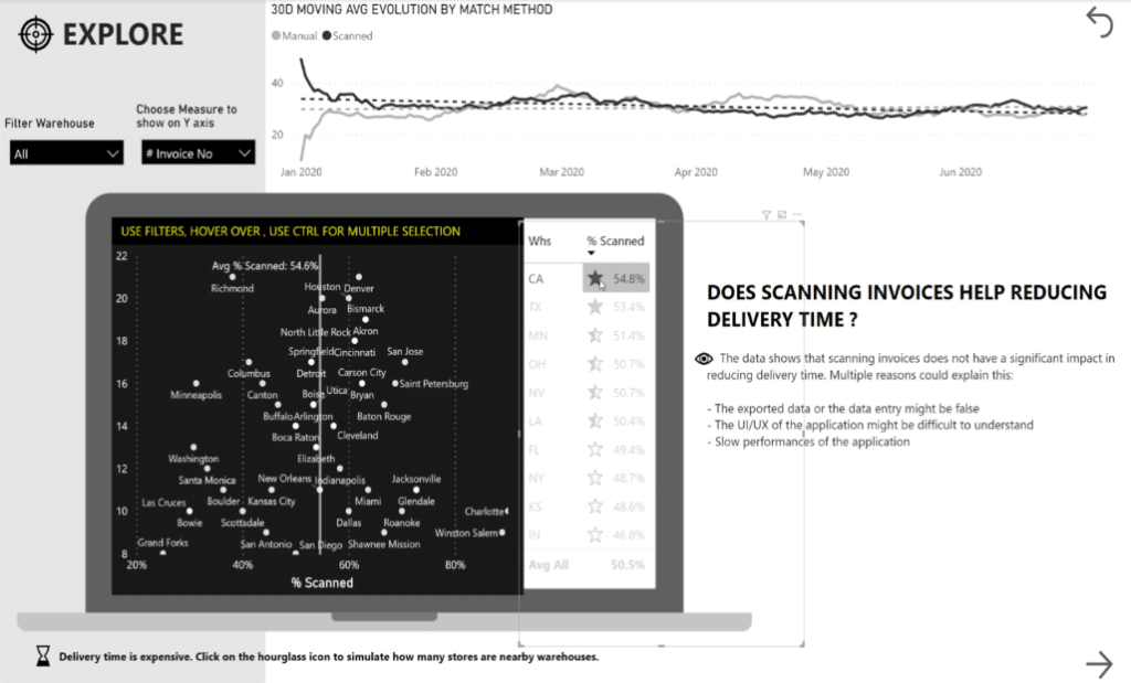
The same thing happens when we click the last one – we can also see additional information with the tooltips.
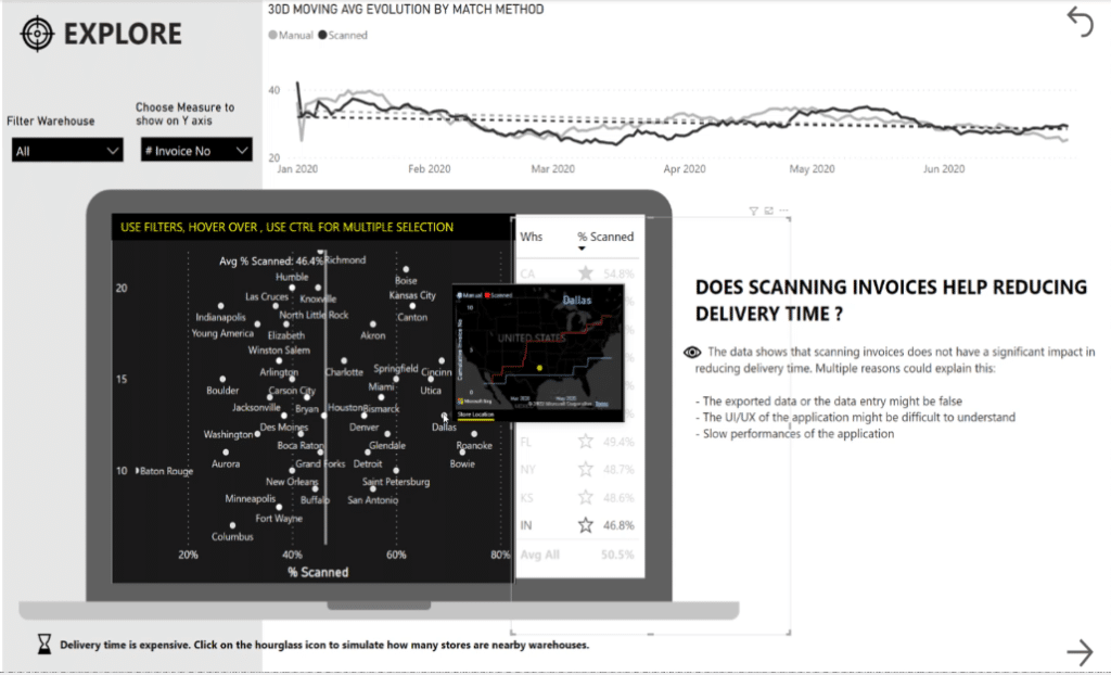
At the same time, if we choose California from the Filter Warehouse filter, we can see that it filters the data in that specific state too.
Therefore, it’s redundant to have both an interactive graph and a filter because they provide the same results.
In this case, the filter should not be used anymore. It is better to use interactions because in this way you can also guide the users to select what’s interesting for them in terms of metrics and drill down the information.
Another method to reduce the number of filters is to group filters together. You can create a hierarchy of filters, which works particularly well for geographies.
For instance, you do not need an individual filter for city, country, and continent. You can simply create a hierarchy to minimize the number of filters on the page.
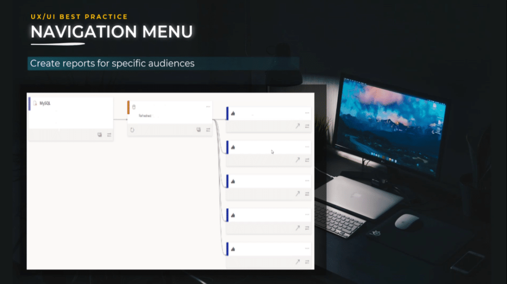
Create reports for specific audiences instead of reports for all audiences.
This is a tip to not create a report for 10 different audiences with different needs. Instead, create one golden dataset and separate the dataset from the report.
Make sure your data model is clean, clear, and documented. It should use incremental hybrid tables or aggregations. If needed, invest time in your model data transformation, audit your work with a team of experts, and certify the dataset.
Do not use your dataset for only one report, but create multiple reports based on the same dataset, with a specific report for every audience and adapt it to the right granularity.
As a result, it will be easier to maintain, develop, and document. It’s less complicated because it will enable you to drastically reduce the number of filters, as well as reduce the analysis paralysis and buyer’s remorse.
Highlight your findings in the data.
As a report designer, focus on what is important by using data composition techniques and strongly advise users to consider one option over another. We should keep in mind that users will use your report to find guidance, not to do the whole work by themselves.
In the example below, if you choose a country it will automatically highlight. Additionally, if you’re interested to know more details on a specific point, just simply hover your mouse over it and the important information will show.

Take inspiration from video games.
Decide what your users need from your analysis by giving them various filters in specific situations.

I take inspiration from the storytelling used in video games because you have new options appearing when you advance in the game. However, you do not have all the options and information displayed at once when you start the game.
This technique can be implemented inside Power BI reports as well.

Jakob’s Law In Laws of UX
Jakob’s Law explains that users spend a lot of time on other websites and apps. This creates an expectation that your reports or apps will look and function in the same way. You should develop your new reports to function and look similar to other projects.
Takeaways From Jakob’s Law
The laws of UX teach us an important lesson which is to boost the adoption and the speed of the report development. We don’t want to create unnecessary new experiences because it takes a lot of time.
If you are a report developer, you might have experienced the blank page syndrome. It is another word for writer’s block, which describes the creative blocks that many writers suffer from at some point. This blank page syndrome can also be experienced by report designers.
A great technique is the reuse of building elements. For example, you concentrate on the navigation and build the first page. Then, you duplicate that page multiple times and change a minimum number of elements. You speed up the development of your report and obtain great harmony when it comes to user experience.
Another takeaway from the laws of UX is achieving consistency between different reports. Think about the Power BI reports you created for your company. Do you propose a similar experience in terms of the color, theme, fonts, shapes, and navigation? If not, then you need to seriously reconsider.
This is where Power BI templates come in handy because you gain time and have less blank page syndrome. Also, the user will feel more familiar when having similar navigation experiences. Users will focus more on their tasks rather than adapting to something new.
This is also the reason companies create brand identities for PowerPoint presentations, logo templates, icons, slide libraries, and colors. Similarly, we can apply the same to Power BI such as date tables, icons, and templates.
The Power Of Community
As the last takeaway, I have to mention the power of the community. Why work alone if you are not the only Power BI developer in your company?
If you really want to have an impact in terms of adoption, user experience, and consistency, join forces with your colleagues and create the best experience possible for your users by creating multiple templates based on use cases and more.

Fitts’ Law In UX Design
The next law of UX I would like to discuss is Fitts’ law which states that the time to acquire a target is a function of the distance to and size of the target.
A target is what the user is trying to interact with. The distance to the target is how far away that target is from wherever someone starts out. Close targets have the lowest interaction cost, while some targets that are far away have the highest interaction costs.
While distance is an easy-to-understand concept, things that are far away are usually longer to reach and the size of the target is usually easily overseen.
Takeaways From Fitts’ Laws of UX
The size of the buttons has an important role to play. Tiny buttons take longer for people to click because users need to move carefully to reach the exact right position. It involves more time and attention.
Your most important buttons should be clear and big, so they are fast and easy to click. Touch targets should be large enough for users to accurately select them. Put your targets in a place where people may already have their mouse and not on the far edge of the screen.

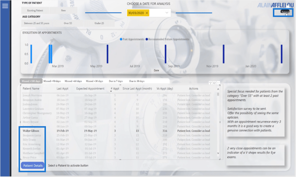
Let’s take a look at the report I created for Challenge #5 organized by Enterprise DNA. We have the metrics and a drill-down for a button.
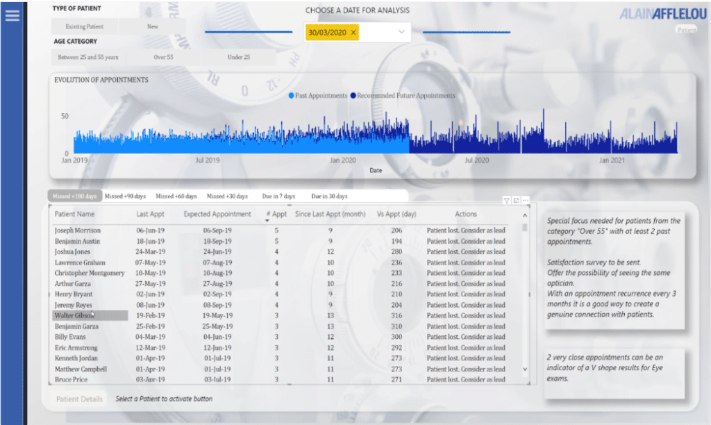
When you click on a patient’s name, a button will activate. This button is big enough to notice and click.
On the other hand, there’s another button that is activated on the far edge of the screen. However, it is much harder to click on because it’s very small and not noticeable since you will not look at that part of the screen when you select a patient’s name.
Therefore, we have to take into consideration the size of the button and the distance to the bottom.

Miller’s Law In UX Design
One of the interesting laws of UX is Miller’s law which says that the number of objects an average person can hold in working memory is about seven.
People can’t store a lot of items in their working memory, so you need to make it easier for them to scan through items. You need to use the principle of progressive disclosure and show only the information needed at the right moment.
Takeaways For Miller’s Law
Limit your design to a limited number of options. The working memory is limited, so you do not want to make users work hard to understand your analysis.
Organize your content into smaller categories to help users understand the process, and memorize easily if you have many options.

A simple example is the way we display the phone number. This principle applies to report design as well by adding secondary menus.
Short-term memory capacity varies between individuals based on their prior knowledge and the context. This is something valuable to remember in terms of cognitive load. Keep your report focused on the main idea and keep your design as cluttered as possible.

Pareto’s Law In UX Design
The last UX law is Pareto’s law or the 80/20 rule, which is also known in the laws of UX as the productivity principle. The general idea behind this is that roughly 80% of the effects come from 20% of the causes.
From the laws of UX point of view, you can understand it as 80% of the users use 20% of the features and 20% of the code causes 80% of the errors. The Pareto principle can help you when it comes to future prioritization, user feedback, and knowing where to focus on.
Takeaways From Pareto’s Laws of UX
The Pareto principle is the antidote to perfectionism.
We all know that famous saying, “Done is better than perfect.” This principle reaches the same conclusion. Instead of trying to do everything perfectly and spending a huge amount of time to achieve the result, you should focus on the most important features and do them right.
It is like when you have a huge apartment, but spend most of your time in just one room. You can drastically reduce your energy bill if you spend most of your time in that one single room. It will not be perfect, but it will be good enough.
UX designers use the same logic when crafting user experiences. An experience does not have to be perfect, but you should focus your efforts on the 20% of where it is not perfect.
Minimum Variable Product – The Pareto Principle In Action
The minimum variable product is the Pareto principle in action. It is an approach to software and product development. Based on the Pareto principle, we know that a small fraction of the functionality, like some of the report pages, will receive the majority of the user’s time.
This doesn’t mean that the rest of the content has no value, but it does mean that some functionality and content are more important to the majority of the users.
The approach can be summarized as identifying a critical business need for your audience and building it with the least amount of features to engage user adopters. Once you have those early adopters, you can start to learn from them and use this research to develop your report incrementally through iterations.
When building an MVP, you need to gather research on your target users, their needs, and their goals. You should focus on 20% of the critical and necessary features of the product to get 80% of user satisfaction.
Needless to say, this principle can help you prioritize what problems to solve because it will highlight the most pressing usability issues that are affecting the most significant number of people.
For this reason, agile methodologies are so often used when it comes to Power BI. It helps focus on what is important and adds value with every iteration.
As a takeaway, the Pareto principle will not solve every problem you encounter, but what it will do is focus your energy and efforts on the areas that will bring the largest benefits to the most users.
Also, it will help you gain clarity on what is relevant to your users and the business so you can set about prioritizing and solving the right decision problems.

***** Related Links *****
Best Practices For Power BI Report Development
Dashboard In Power BI: Best Design Practices
Effective Data Storytelling: Asking The Right Questions
Conclusion
In summary, we discussed the importance of the laws of UX principles that can be implemented for your Power BI projects. This will not only improve the design of your work but also help you to create a compelling story that can enhance the user experience.
All the best,
Alex Badiu


