This tutorial will show you how to create a donut chart visualization using Charticulator. It’s similar to a pie chart; the difference is that a donut chart presents categories as arcs instead of slices. You’ll learn how to design and create your own donut chart for your Power BI data report.
Launching Charticulator
First, create and export a dataset to Charticulator. For this example, the data used are the Region and No. Of Complaints.
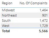
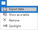
Next, click the ellipsis of the table and select Export Data.
After that, go to charticulator.com and click Launch Charticulator. Locate and open the exported dataset.

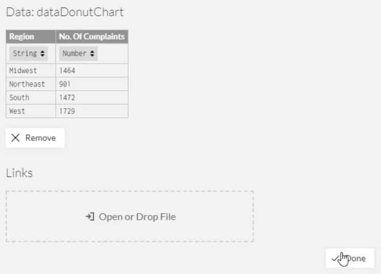
Once done, you’ll be directed to the Charticulator canvas.
Creating The Donut Chart
Place a rectangle from Marks to the Glyph canvas.
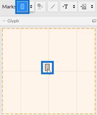
Then, change the stack order to Y.

Place No. Of Complaints in the width of the bar inside Glyph.
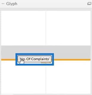
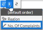
Change the sort order to descending by selecting the sort order to No. Of Complaints. You’ll then see a bar chart showing a descending order.
To create the donut shape, drag Polar from Scaffolds to the canvas. This changes the bar chart into polar coordinates.
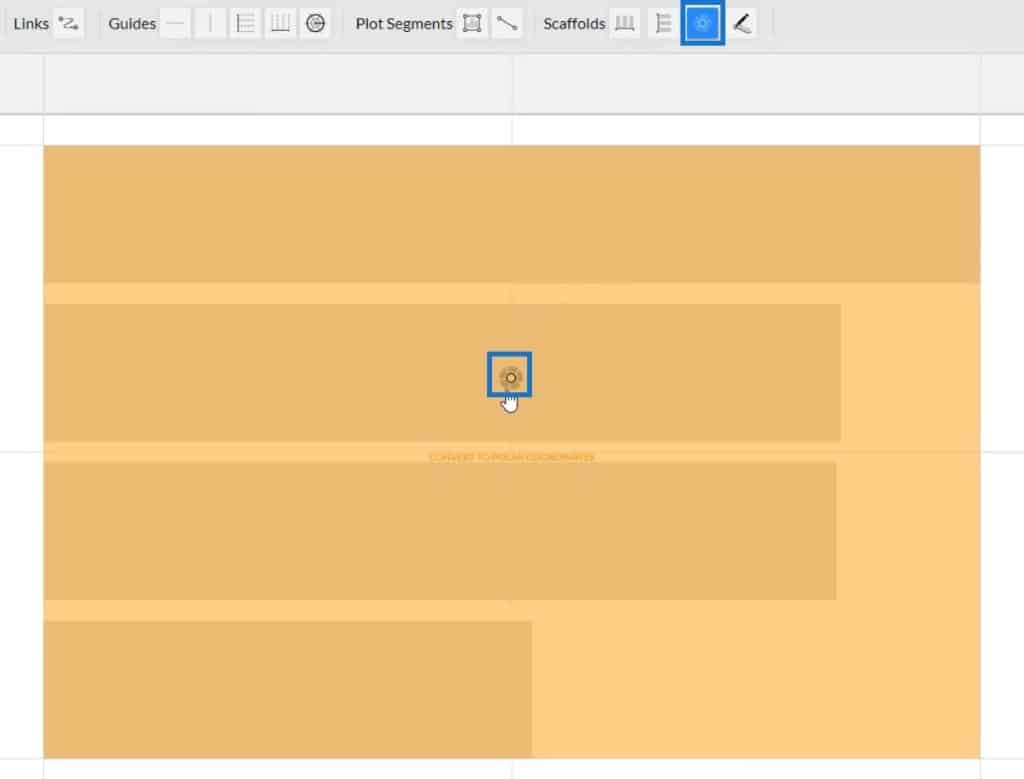
You’ll then see that the order starts with the highest value. This also has the biggest diameter.

You can customize the design of the chart by adjusting the circumference.

If you want to add colors to the donuts, open Shape1’s Attributes and place Region in the Fill section.
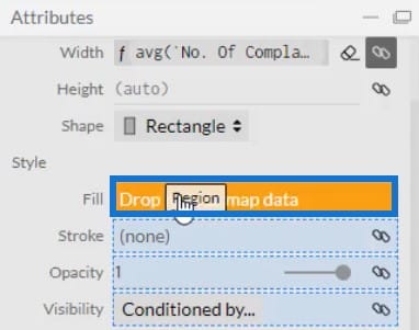
You can modify the color of each donut depending on what you prefer. After that, the donut chart will look like this.
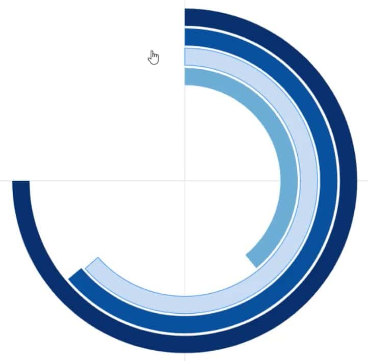
Next, add Text to the donuts to indicate which region it represents. Bring Text inside the Glyph canvas and place it at the left edge of the bar.
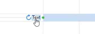
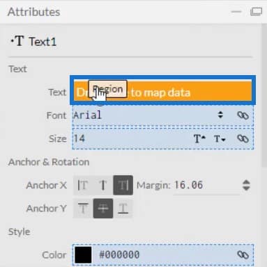
Then, open Text1’s Attributes and place Region in the Text section. You’ll then see the labels in the chart.
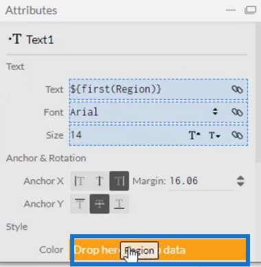
Match the colors of the labels to the colors of the chart by placing Region in the Color section of the same attributes.
Your donut chart will now look like this.
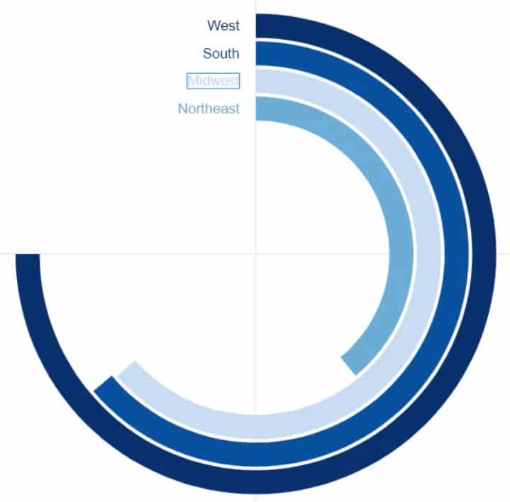
Create another Text to display the values in the donuts. Bring Text in the Glyph canvas and put it beside the region label. Then, open its attributes and place No. Of Complaints in the Text section.
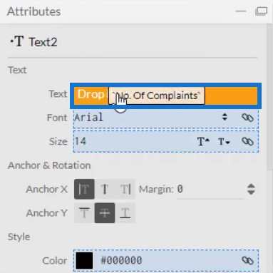
Remove the decimals in the values by changing the .1 to .0 in the Text section.
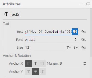
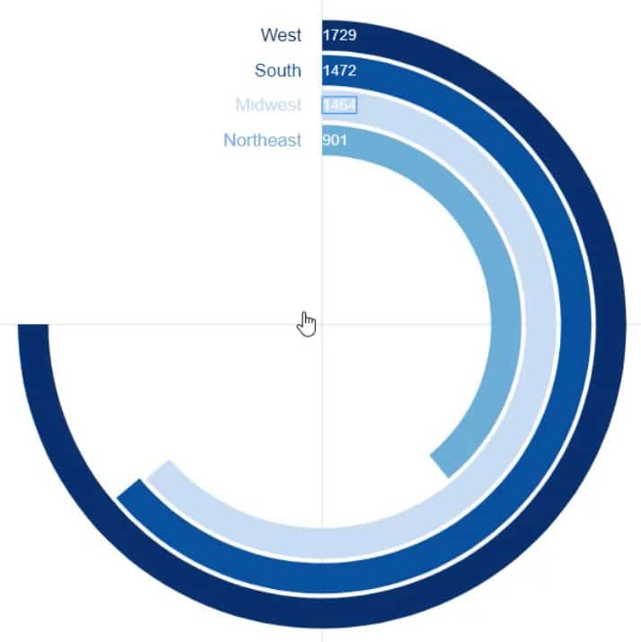
This is what the donut chart visual will look like.
Placing The Donut Chart In Power BI
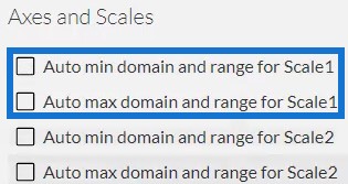
Save the file and export it to Power BI Custom Visual. Uncheck the auto axis options in the Axes and Scales settings to avoid any changes in the axes when a filter context transition is invoked. Then, input a visual name and export the file.
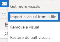
Open Power BI and import the chart file. Click the ellipsis below Visualizations and select Import a visual from a file.
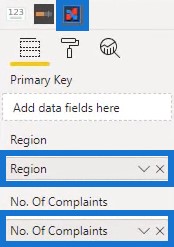
Click the Charticulator icon with the visual name of the donut chart and fill the Fields section with the corresponding data. Afterwards, you’ll see the donut chart in the dashboard.
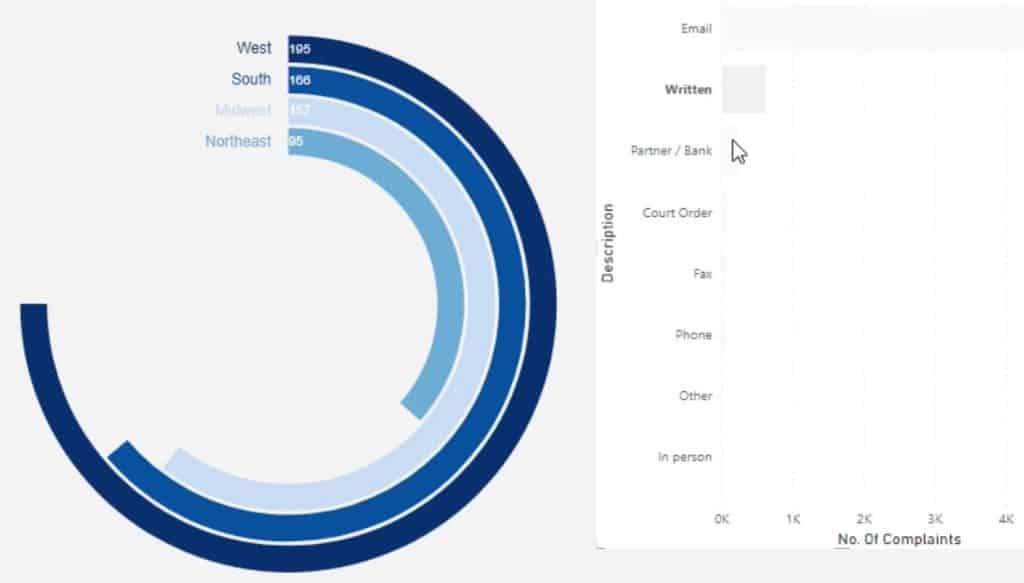
You can also create interactions with other charts. In this example, a bar chart is used to invoke filter context transitions. To create interactions, go to the Format tab and click Edit Interactions. Then, select the charts that you want to interact and click the interaction icon.
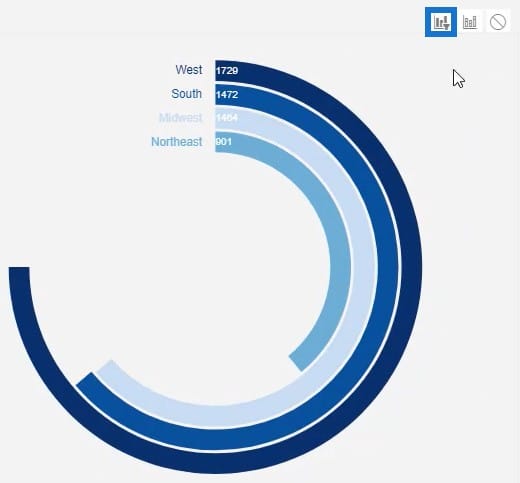
Now, when you try and click a bar, you can see that the donut chart changes along with the corresponding data in the bar chart.
***** Related Links *****
Power BI Donut Chart: Custom Visualization Tutorial
Best Practices For Power BI Report Development
Power BI Best Practice On Reports & Visualizations
Conclusion
Circular graphs like donut charts provide valuable data in an incredible way. They show information and help make your Power BI dashboard look better. They are similar to bar charts, but are rounded and won’t take too much space.
You’ll find how easy it is to create a donut chart in Charticulator. So if you want to improve your data reporting skills and learn more about creating stunning visualizations, maximize this tutorial and check out the rest of our data visualization modules.
Mudassir


