
I run through a lot of budgeting analysis because I think using Power BI for this type of analysis is extremely effective. You may watch the full video of this tutorial at the bottom of this blog.
Power BI as a tool covers a lot of the analytical components that need to be executed well to complete this analytical work, and then showcases it in an effective way.
In this tutorial, I’ve decided to show you how you can branch out from your initial budget calculations.

Sometimes just showing a budget and a result is not enough. Maybe you actually want to show the difference, and then somehow showcase it in a dynamic way who’s performed well versus budget, and who has performed poorly versus budget.
By doing this in Power BI, you give yourself the opportunity to showcase these insights in a really dynamic way.
This has not been really possible up until the features within Power BI have been developed to a point where you can successfully implement this.
So I’m going to go over how you can separate your best and worst performers versus budget, and then go about visualizing it. To achieve this, we have to have the proper data model and the correct DAX calculations.
The Logic Behind This Budgeting Analysis
In this example, I have some budgets for 2016, so this is a historic data set. But, I also have our Actuals, which is at a daily level, while the Budgets are at a yearly level.
I’ve gone through and applied the budgeting techniques and matched up data at different granularities.
The key thing to get these insights is to work out the Budget Allocation, which is working out some logic or allocation algorithm that allows us to allocate a yearly budget at a daily level, as in this example. It could also be a monthly budget with a daily level.

I’ve created a number of variables…
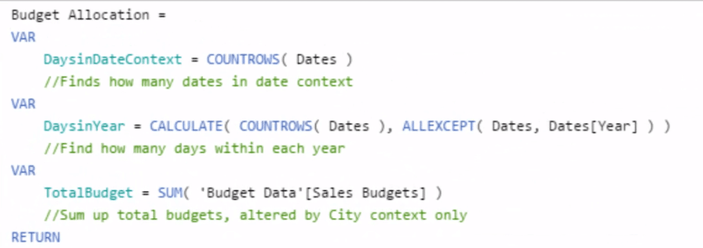
…that ultimately made this quite simple calculation below (which is part of the entire logic or formula for Budget Allocation) to allocate something that is a yearly number across every single day.

Since it is on a daily context, I divided 1 by 365 days times the Total Budget. And that’s how we can get the Budget Allocation.
With the Total Sales and Budget Allocation, I then work out the Results to Budget. By doing so, I was able to run another calculation or at least branch out into this calculation.

This is a pretty simple calculation, but you have to go through and sort out the Budget Allocation calculation first.
The Data Model Set Up
One crucial thing to all Power BI analysis is the data model. You have to make sure that you have everything properly set up.
For this demonstration, the key here is that our Budgets are at a City granularity, so to be able to filter both the Sales table and the Budget table exactly at the same you have to separate the Cities, which is what I’ve done here:
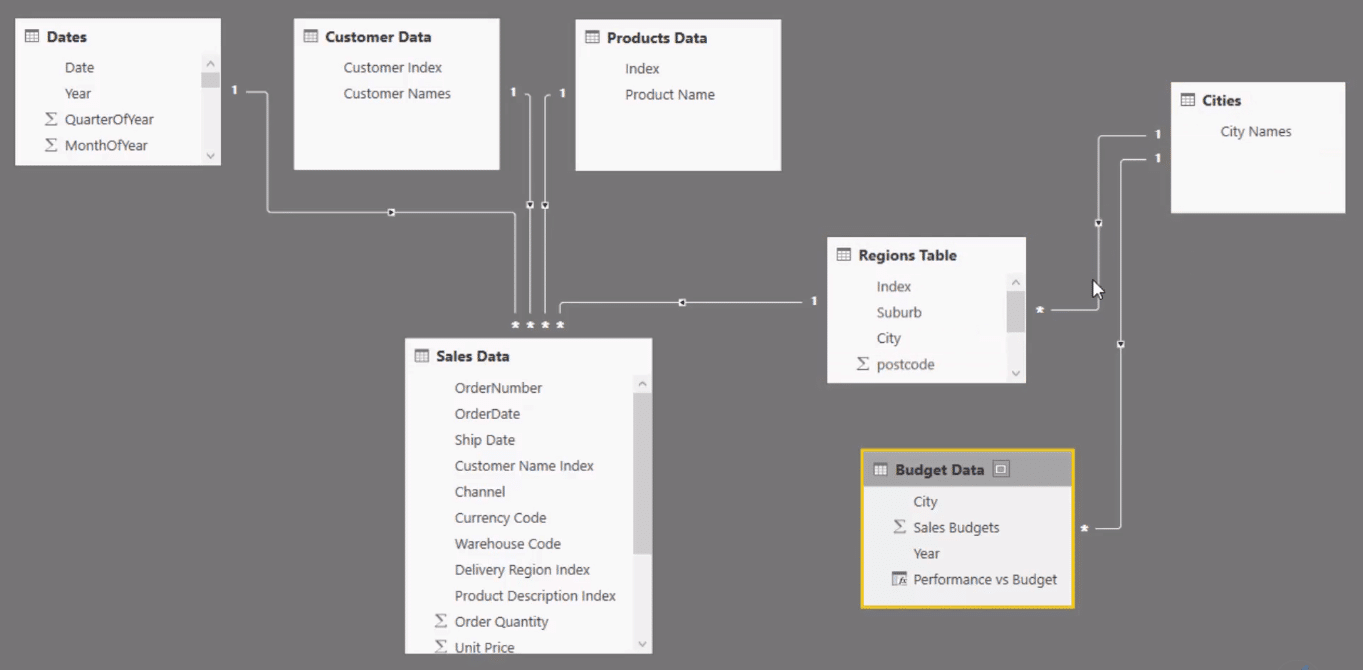
When we filter something here, it flows down through the Regions table and hits the Sales table, and then it filters the Budget Data table as well.
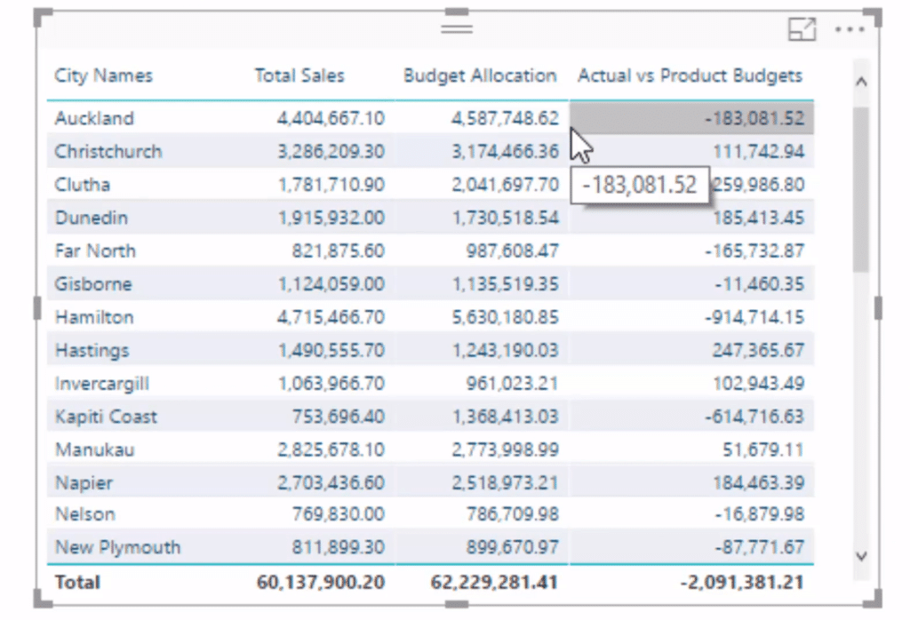
And so in this table, we can have the city names dimension, and that enables me to get Total Sales, Budget, and then find the Actual vs Product Budgets.
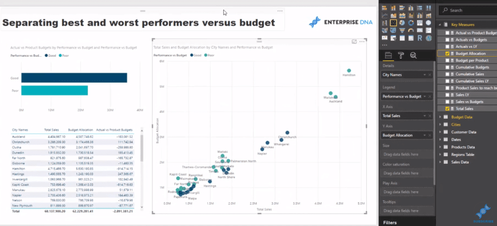
Separating Best And Worst Performers
In the visualization, I have Total Sales on the X axis, while Budget Allocation is on the Y axis. However, without the legend, it’s hard to see what’s good and bad.
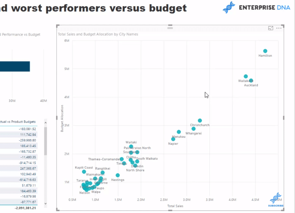
To be able to get significant insights, we have to make it really obvious and clear who our good performers are and who are the bad performers.
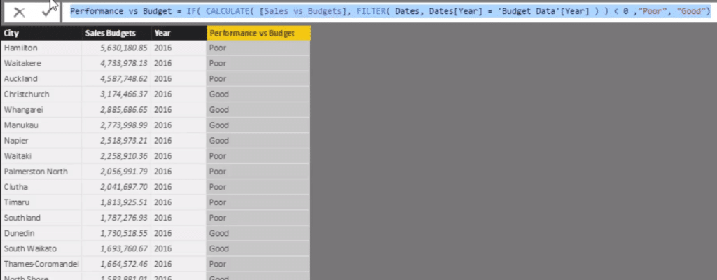
We can actually do it without having some additional work because that best and worst dimension doesn’t actually exist in our data model. There’s no way for us to place that filter on. We need to actually create this dimension.
So that’s exactly what I did. I created this dimension with a logic that enables us to work out which is above and below 0. I used the Calculate statements to work out which performance to budget above zero or below zero, and then I’ve classified them “Poor” or “Good”.
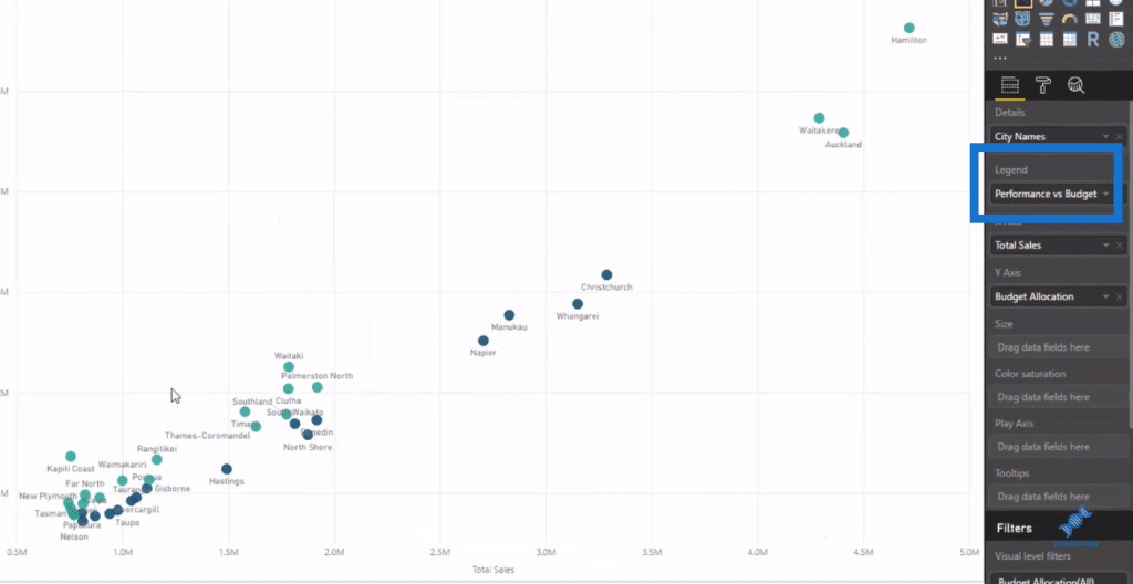
Once I have this dimension, I can then use it as a filter. All I need to do is drag it into the Legend and we can see how it actually separates these cities in terms of being good and bad.
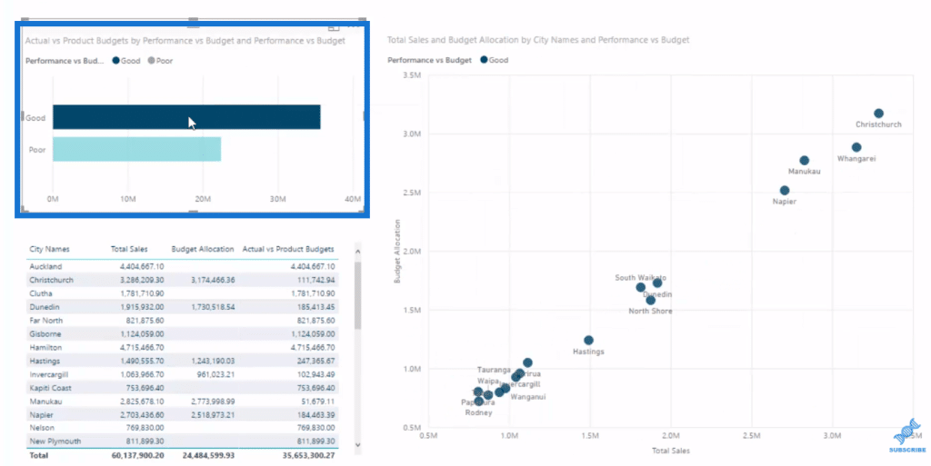
Moreover, I used this Performance versus Budget in visualization to drill very quickly to those top performers versus those bottom performers.

***** Related Links *****
How To Calculate Actual Results To Budgets Per Product – Power BI & DAX
Managing Seasonality In Your Budget Analytics – Advanced Power BI
Budgeting Performance Segmentation Using DAX In Power BI
Conclusion
The key points of this demonstration are the Budget Allocation calculation, which is essential to getting the data model right, and overlaying some of the additional dimensions or additional supporting columns to make your visualizations stand out or make them clearer.
Bringing all these techniques together make for a really effective budgeting analysis and report. This is a great example of how you can extract really valuable insights from your work in Power BI.
Being able to (in an almost real time basis) analyze who’s a good performer versus who’s a bad performer, and then see how that changes over time, is really powerful and can create a lot of value within organizations and also determine actions.
And that’s the important thing with the analysis we create in Power BI. We want to determine or create actionable insights that are going to make a difference, and I think through this example, you’ll certainly see that that’s very possible.
Cheers!
Sam


