
In today’s blog post, I’ll talk about the newly available Deneb Vega-Lite custom visual for Power BI. I used it exclusively in my partial submission for the Enterprise DNA Challenge #17 on environmental data reporting. You can watch the full video of this tutorial at the bottom of this blog.
This received some positive feedback, which is why I decided to make a tutorial on how I used Vega-Lite in my submission. My goal for this challenge was to gain experience using the Deneb custom visual, which is why I chose to use it solely, and not to use any standard Power BI visuals.
I didn’t spend much time at all with the data either, so I won’t spend any time on the development of the dataset other than to include the air toxins portion in my report.

An Overview Of The Report Page In Vega-Lite
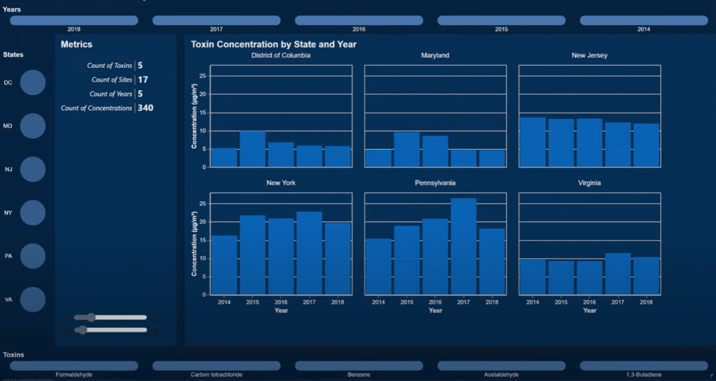
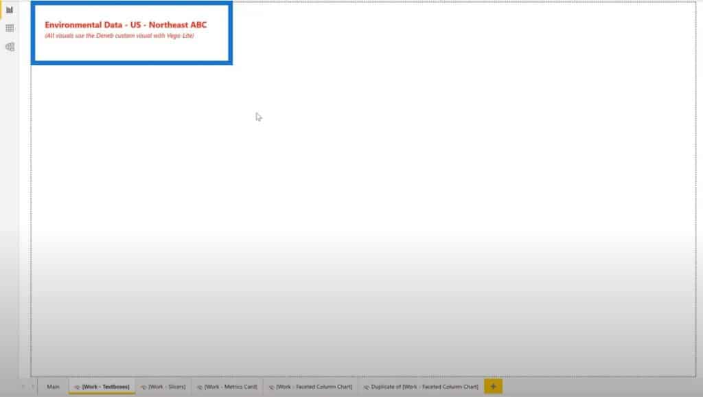
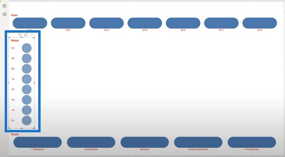
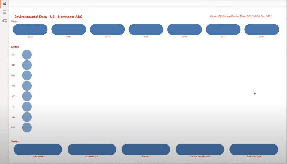
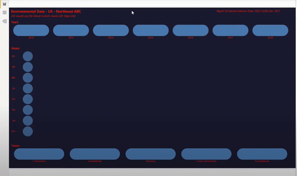
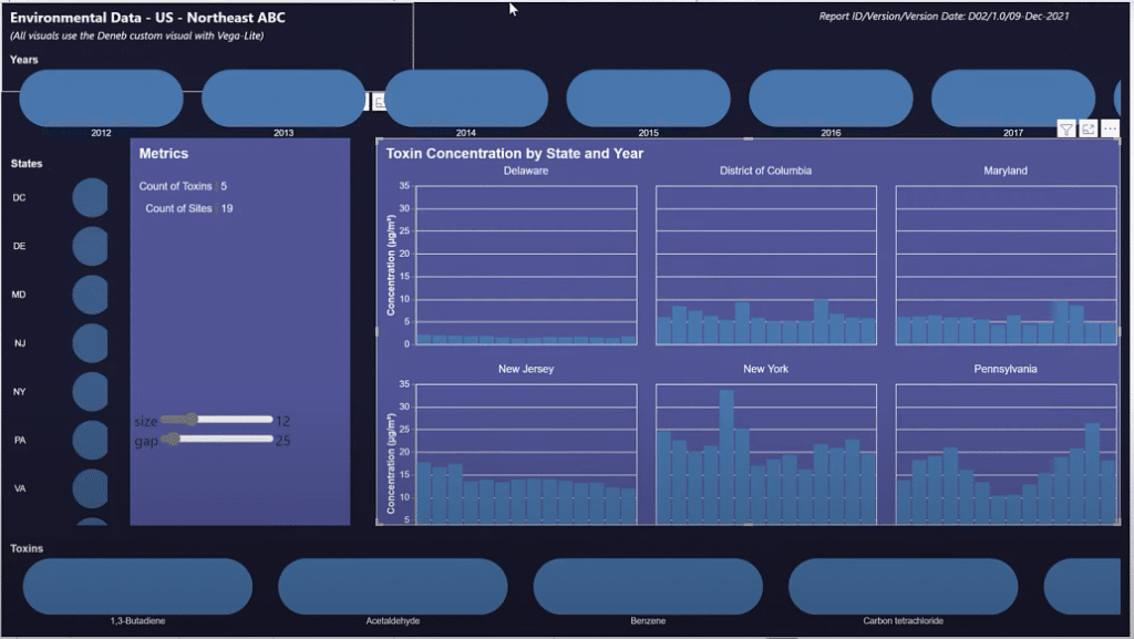
Let’s have a look at my submission. There are 7 different visuals and 2 text boxes at the top. We have a slicer for Years, a slicer for States, a slicer for Toxins, a metrics card, and a main visual displaying the Toxin Concentration that can be sorted by State and Year.
Now let’s take a look at each visual intern as we develop them from scratch. Before we begin, just a quick note on the development environment. To start, I took a copy of my Challenge #17 submission and deleted all the pages. So there were no remaining visuals; only the data, the data model, and the DAX calculations remained.
Creating The Title Text Box
I created a number of blank pages on to the title text box. Since Vega-Lite is a graphical language for visuals, there isn’t an obvious method to create a text box.
But since Vega-Lite visual is just a collection of marks, I thought I might be able to use only text marks to simulate a text box.
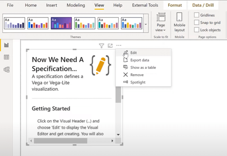
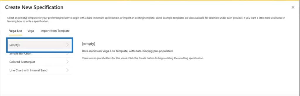
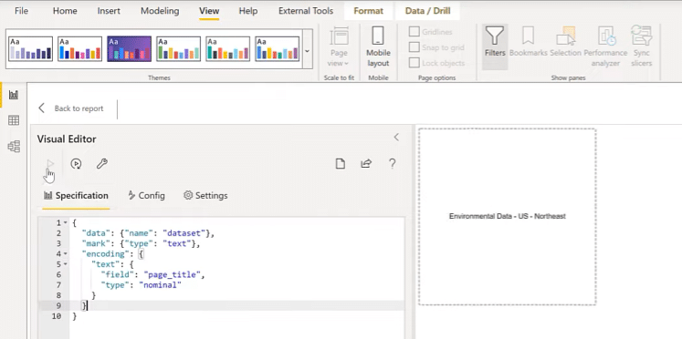
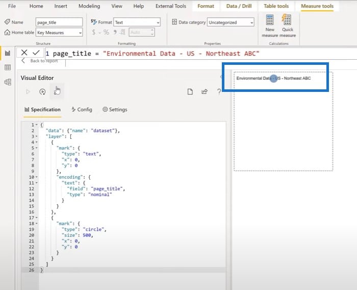
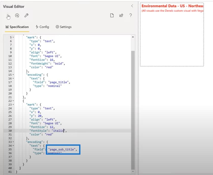
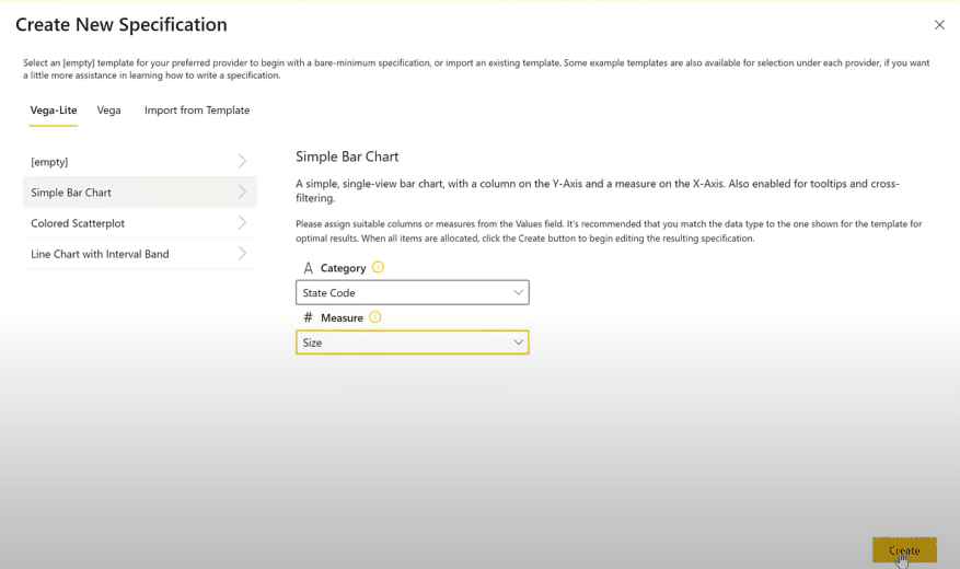
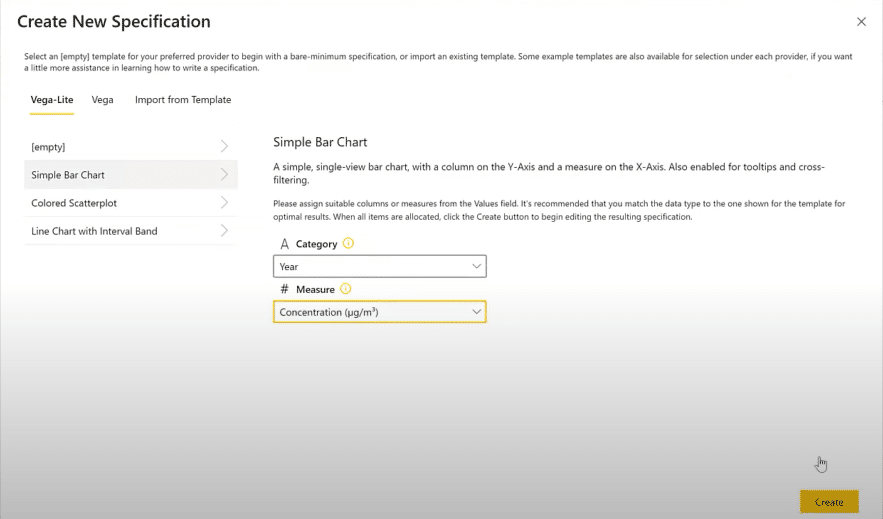
Let’s add a Deneb visual. The first thing to do is to add a measure with our values (page title and page subtitle), then choose an empty specification.
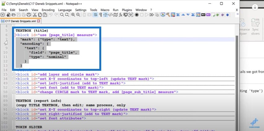
Then we go over to our snippets file and use the page title measure for our visual. We’ll copy the text block here…

…. and paste it in the Deneb visual editor.
We can use Control and the mouse wheel to make it bigger. Then we’ll look at the position to see if it is centered in the visual.
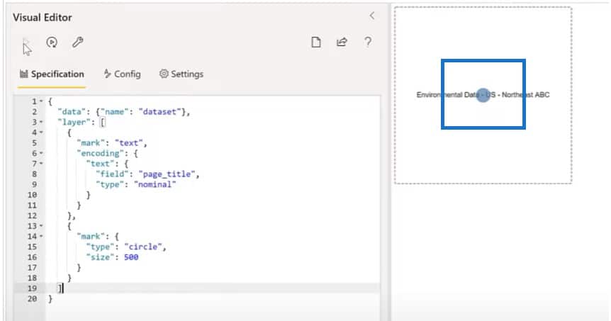
Let’s visualize it by adding a circle mark to show us where the origin is. Let’s make a layered visual with the text box and a circle mark.
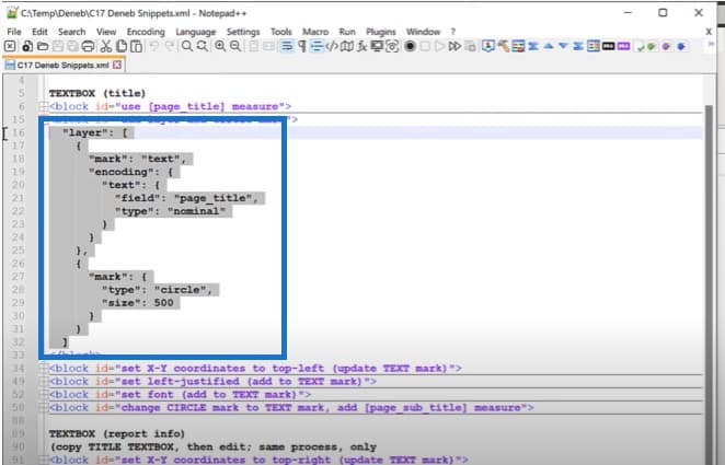
And we can now see a circle is located at the center of the entire visual.
Another thing we can do is change the position of the origin of the visual by setting the X and Y coordinates.
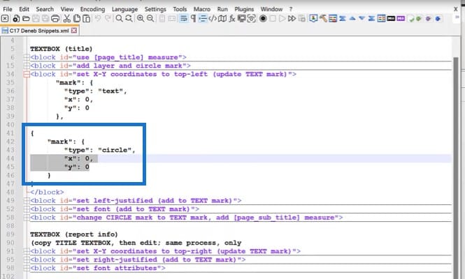
Now we can see that the text is coming in the top left.
The next step is to change the alignment of the text. We’ll grab a block from my snippets file and set the alignment in the editor to the left, then align the center mark to 0.
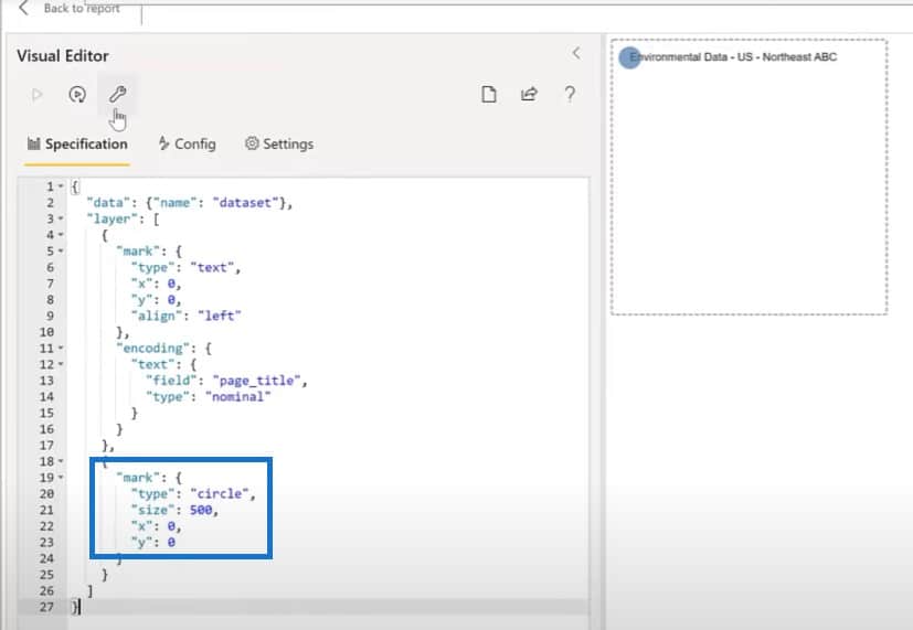
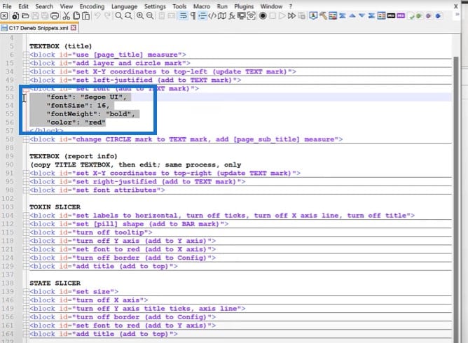
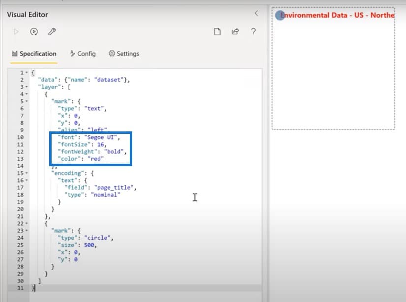
The next thing we’ll do is to copy some of the font attributes into the visual here. Let’s add a few characteristics for the visual to mark.
Let’s now change the circle mark into a text mark using our page subtitle, and then make the changes as needed.
Then we’ll go back and resize the visual just a little bit.
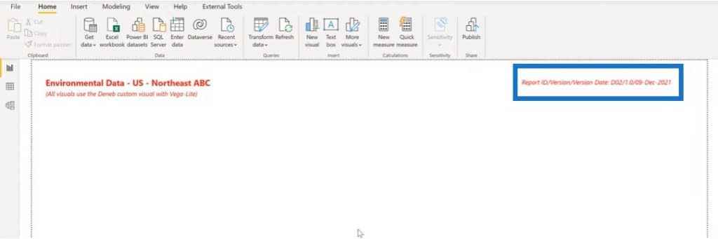
Making The Report Info Text Box
Let’s move on to the report info text box. We’ll add a new Deneb visual and place it on the top right corner and add our report info measure.
Let’s go back to the visual we just developed to copy the JSON code.
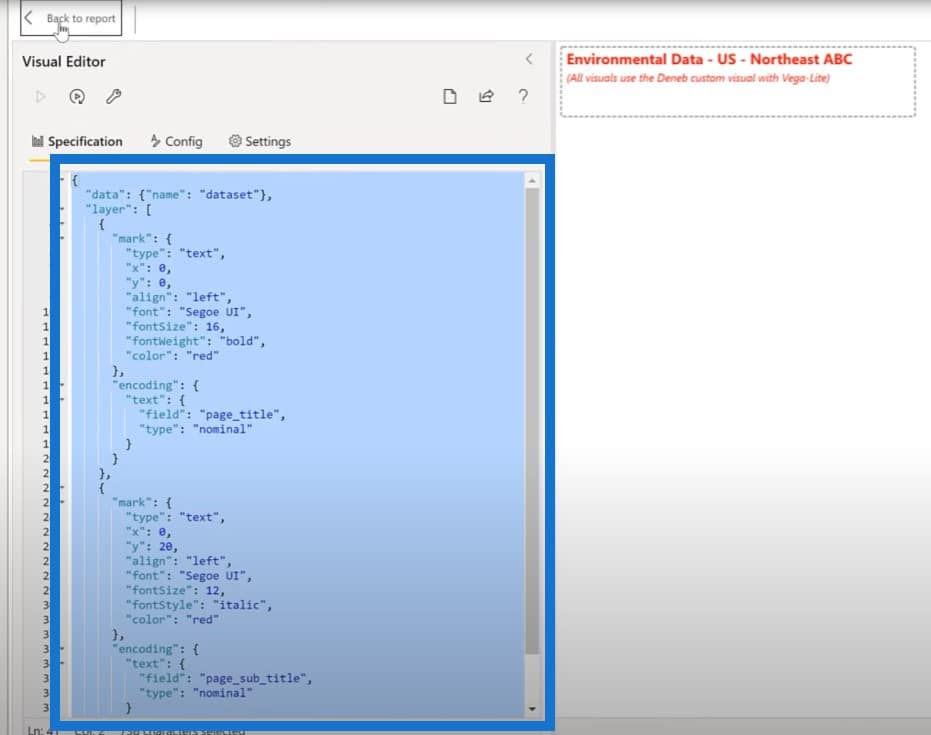
We can put that JSON code in this new visual and use the empty specification again.
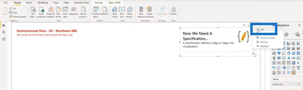
For this visual, we only have one mark to use. We don’t need a layer and a second mark so let’s get rid of those, and then change the name of the measure to report info.
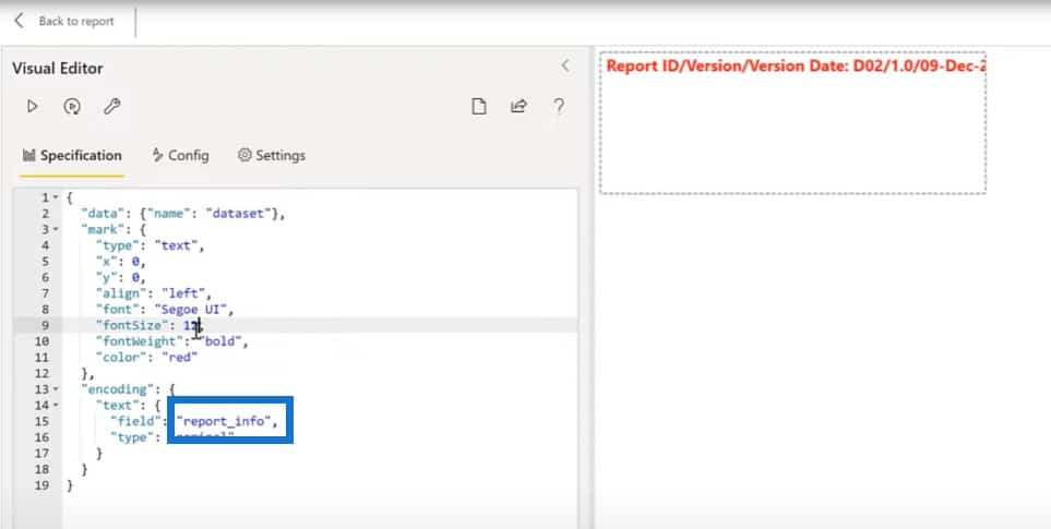
Let’s change the font size to 12, and the font style to italic. We’ll also change the alignment from left to right and change the X coordinate to 380. Then we’ll go back to the report and adjust the size a little bit.

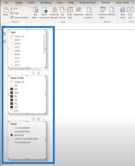
Creating The Toxin Slicers
Let’s move on to the slicers. Vega-Lite doesn’t have a specific graphic for a slicer, but you can use visuals instead of slicers.
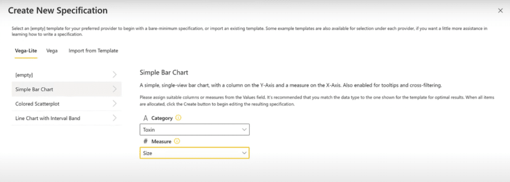
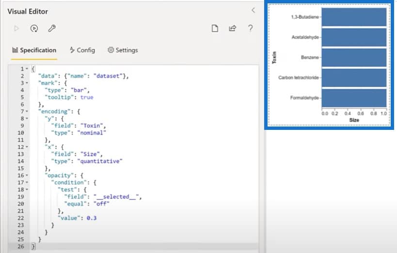
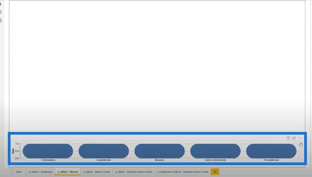
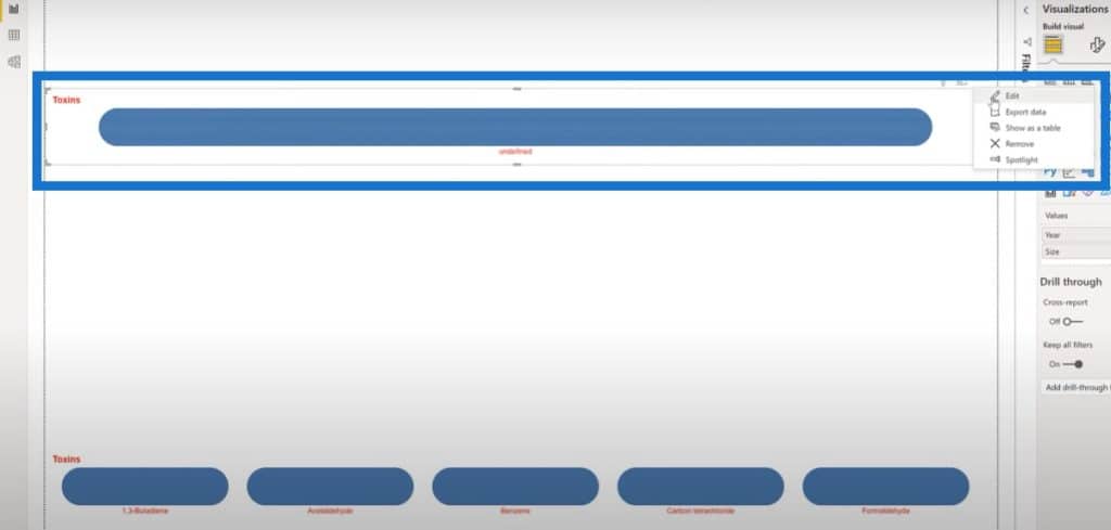
For the slicers, let’s try to use bar charts of a fixed size. We’ll add a slicer using our Deneb visual, and add in our Toxins as a value. We’ll add in our Size measure, which is a simple equal to one.

Once we have those locked in, we can use a simple bar chart specification, select Toxin for the category, and select Size for the measure.
And there we go. We now have a horizontal bar chart.
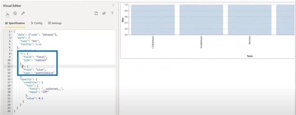
We’ll change this from a bar chart to a column chart by flipping the X and Y.
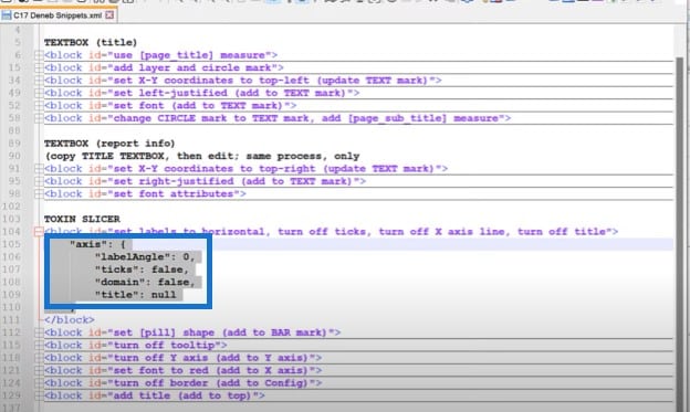
The next thing to do is to set the labels to horizontal and turn off the X axis. I’ll copy this text block here and paste it into the editor.
We can change the shape of our bar charts into a pill shape by setting the corner radius here.
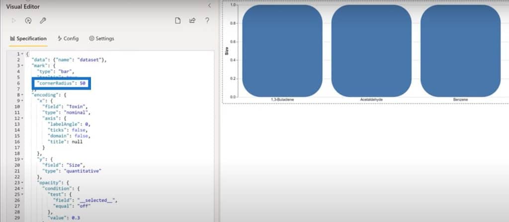
Let’s go back to the report to bring that size down until the chart looks more like a pill.
Let’s turn off the Y axis, and set the axis to null. Then turn off the tool tip and change it from true to false.
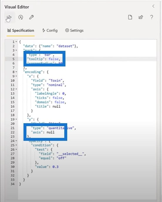
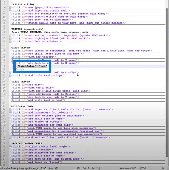
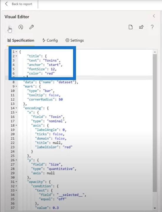
The next thing we want to do is set the font to red, so we’ll add this part into the X axis description.
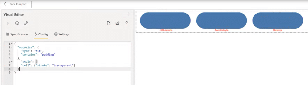
The next thing to do is to turn off the border. We’ll add a transparent stroke to the configuration for this visual. We’ll go into the Config section, add a comma, and a block. As you can see, the border has gone away.
Finally, the last thing we want to do for the toxin slicer is to add a title. We’ll copy the code from my snippets file and add a title.
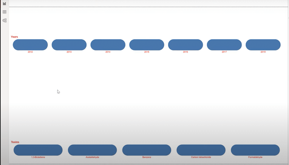
Making The Year Slicer
For the year slicer, let’s take advantage of the work that we’ve already done and copy paste the toxin slicer, then make some adjustments. We’ll move the duplicate a little bit higher, get rid of the toxin from the field value, and add in the year.
Then I’ll edit the Vega-Lite code and change the title from Toxins to Years.
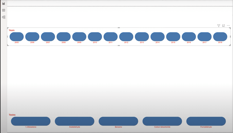
As you can see, there are way too many fields showing up here, so let’s just filter a couple of ones out and keep only the ones we want on the top.
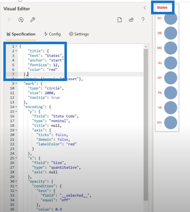
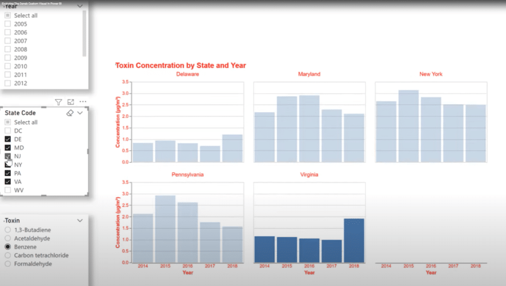
Creating The State Slicer
Let’s try an alternate shape for our state slicer and start with a bar chart. Let’s go to Power BI and add a new Deneb visual, then change the size and placement of the visual just a little bit.
We’ll add the States code and add the Size measure, then use a Simple Bar Chart specification. We’ll select state code for category and size for measure.
We have another bar chart, which I’ll change into a circle. Then I’m going to change the size of the circles to 2000.
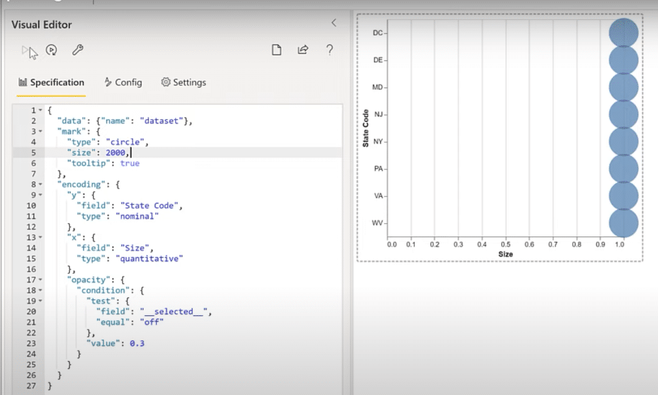
The next thing to do is to turn off the X axis, then set it to null. Then turn off the Y axis title, the texts, and the domain.
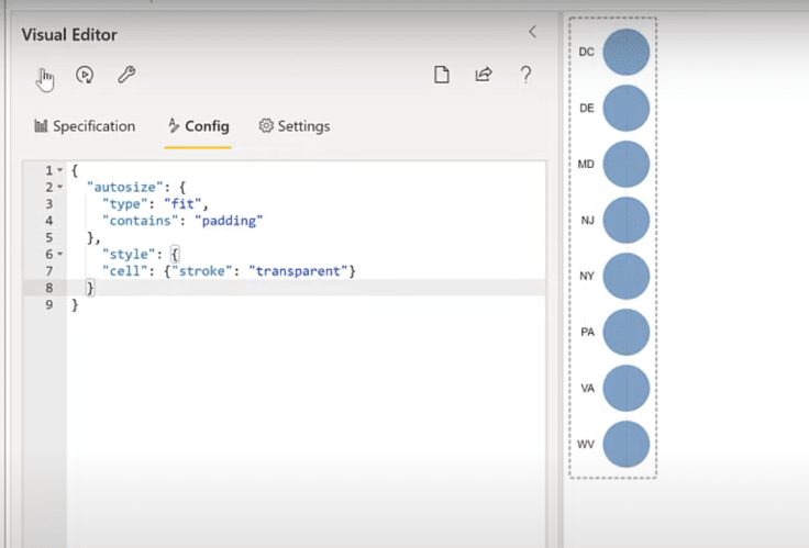
Like with the other slicer, we’ll turn off the border so we can set the stroke of the domain to transparent from the Config section.

The next thing to do is to set the font to red, which we’ll add to the Y axis.
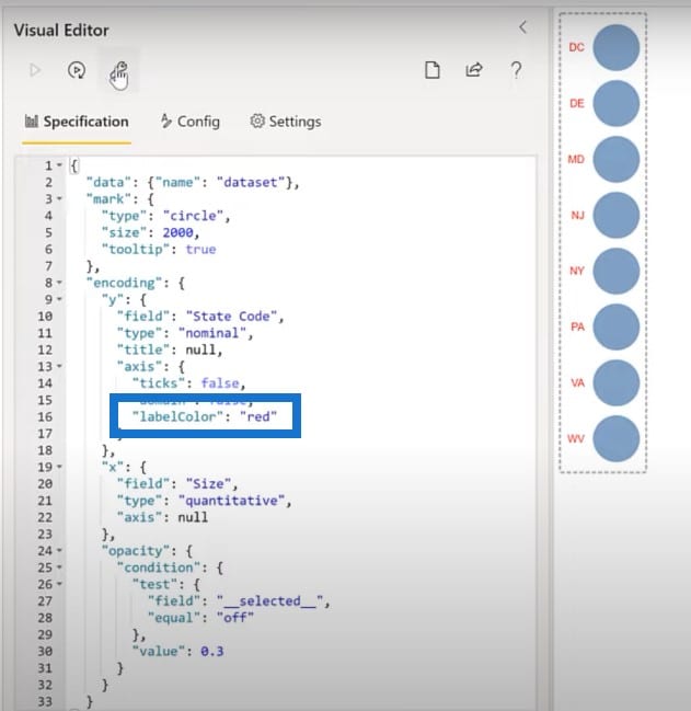
Next is to add a title into our slicer, which we’ll add as a block here at the top.
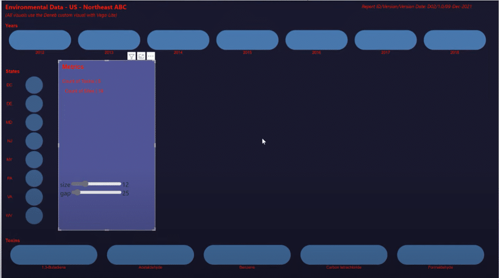
Making The Metrics Card In Vega-Lite
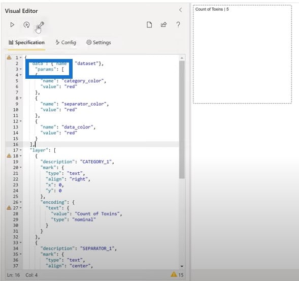
It seems to be all the rage these days to use vertical pipes as separator between text items. I wanted to see if I could do that in Deneb Vega-Lite. I found that if I created three text marks for each measure, I could set the name separator and value as I wished.
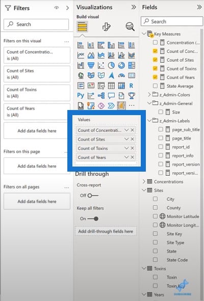
Let’s add a new Deneb visual, and we will add in our four count measures: Concentration, Stocks, Sites, and Years.
Then we’ll edit the visual and choose an empty specification. We’ll go over our text blocks snippets and copy the layer of three visuals and paste it in the visual editor. We currently have a layer of three text marks: the category, the separator, and the value.
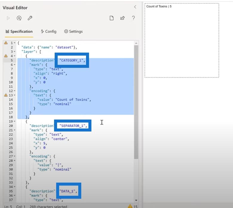
We have set the alignment of the separator to the center, and the alignment of the data to left. Before we copy and paste, we’ll make adjustments for the remaining three measures and use some parameters to make our setting of the colors easier.
Let’s add a parameter block for the colors. We’ll copy the block of text from our snippets file, and paste it to our code here. We now have our parameters available.
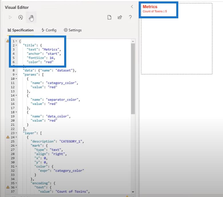
The next step is to update our text marks to use those parameters. We have three separate blocks we can add in: the category block, separator block, and the data block.
Then we’ll set the card title. We’ll copy the title block from the snippets file and put it on the top of our code. Now we have our title for our metrics card.
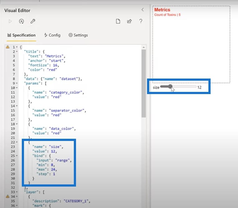
We’ll also use another feature that’s built into Vega-Lite, namely the bound widget. We’ll put in two: one for the font size and one for the vertical gap. First, we’ll add a parameter for the font size into our visual.
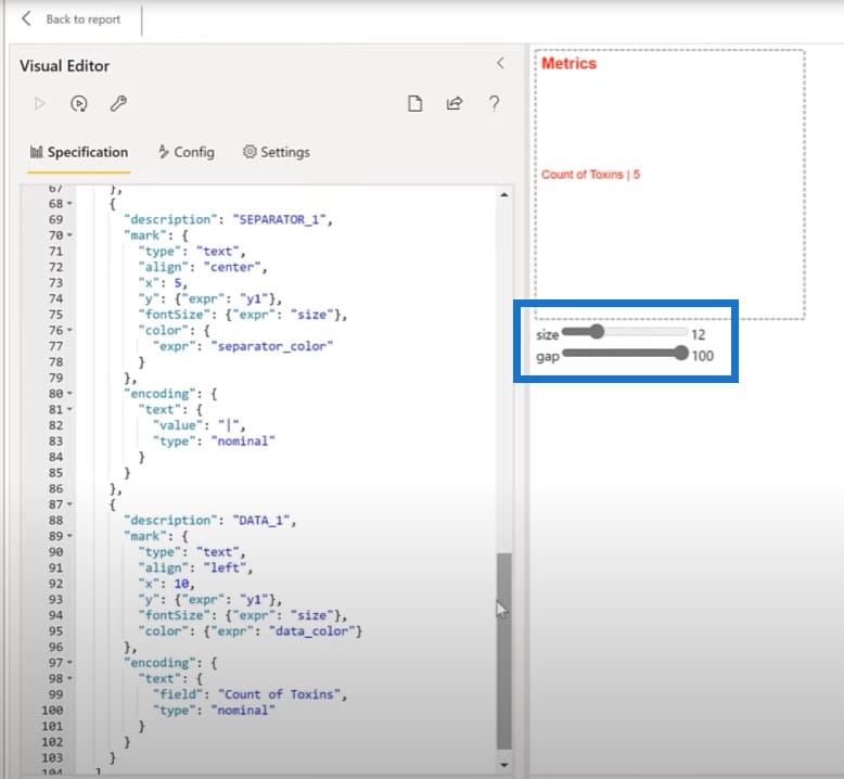
Then we will add parameters for the vertical gap and the vertical Y position. We’ll also edit the text marks to use those parameters. Instead of Y in a fixed value, I’m going to set a specific value to our Y1 one parameter. As you can see, we can change the gap as it moves around.
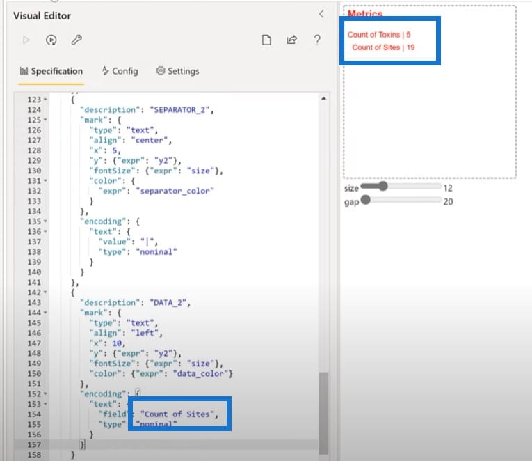
Let’s add another side of text marks. I’ll copy the category, separator and data code and paste them in the editor. Then I will change this into Data 2, Separator 2, and Category 2. We’ll also change our Y value from Y1 to Y2. Lastly, let’s change the measure that’s being shown here from Count of Toxins to Count of Sites.
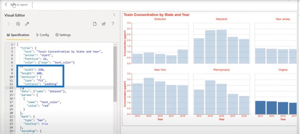
Creating The Main Visual Using Vega-Lite
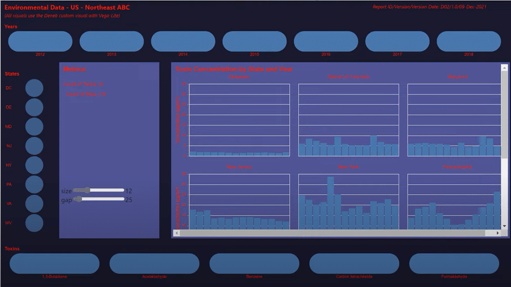
Since we now have all the setup visuals in place, we can move on to the main visual for the report, namely the faceted column chart of concentration by state and year.
To create the main visual for this report, let’s modify a simple bar chart. For this one, I have created a few quick slicers that will help us in our development effort. We’ll copy these slicers and then paste it into a blank page.
Then we’ll add a Deneb visual and make it bigger to fill a good part of the page.
We’ll also add our Concentration measure, State, Toxin, and Year.
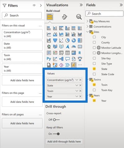
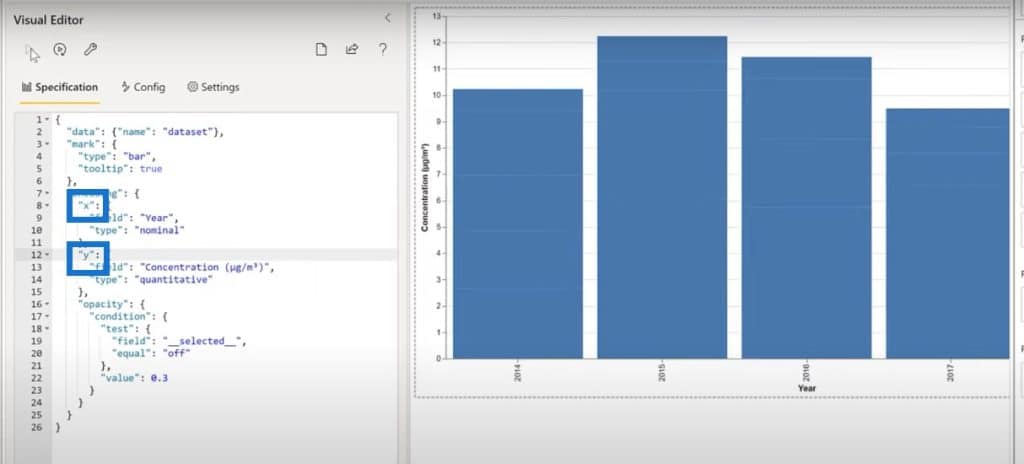
Let’s start by using a Simple Bar Chart specification. For category we’ll choose Year, and for measure we’ll choose Concentration.
We can see a bar chart displayed, but we want to turn that into a column chart. Let’s flip the X and Y axes to make it into a column chart.
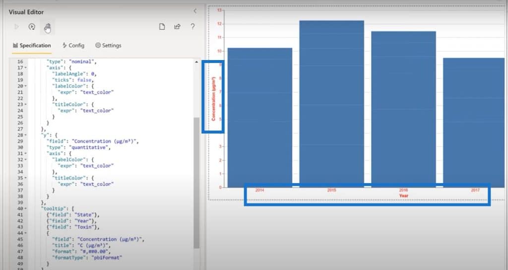
Next is to set the label axis to 0 and to turn off texts. As usual, we’ll copy the block from our snippets file to adjust the X axis label angle.
We’ll also adjust the tool tip by grabbing that block of code from the snippets file and pasting it in the code.
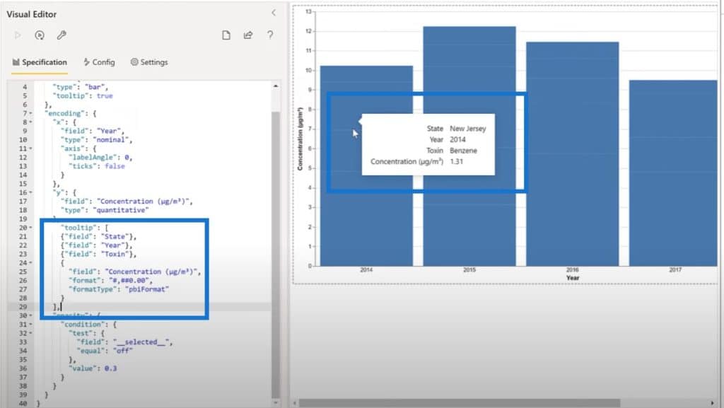
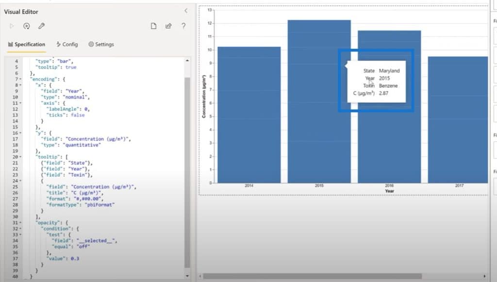
As we can see, there are lots of extra white space and a really long word for Concentration in our tool tip. Let’s add in a specific title using a C instead of Concentration.
We’ll also want to add a parameter for font color.
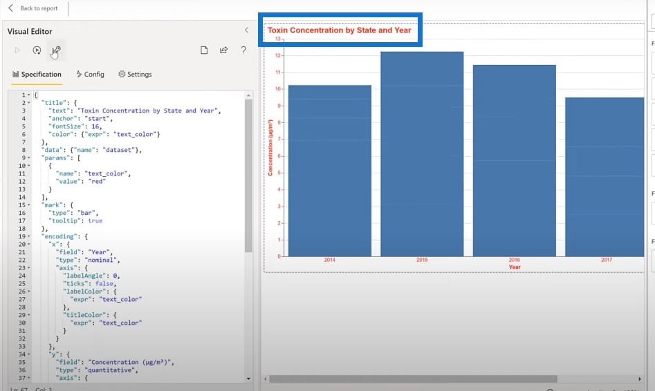
The last thing to do for this visual is to add a title. We’ll copy the block for the title, and paste it in the code.
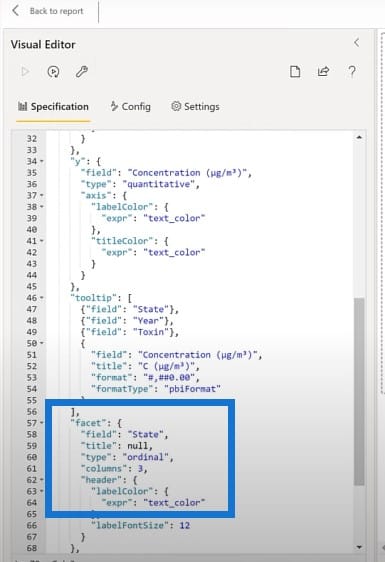
We want to make this bar chart specific to each state. It’s very easy to do this in Vega-Lite; we’ll just add a facet on State. We’ll copy the text block and paste that down here.
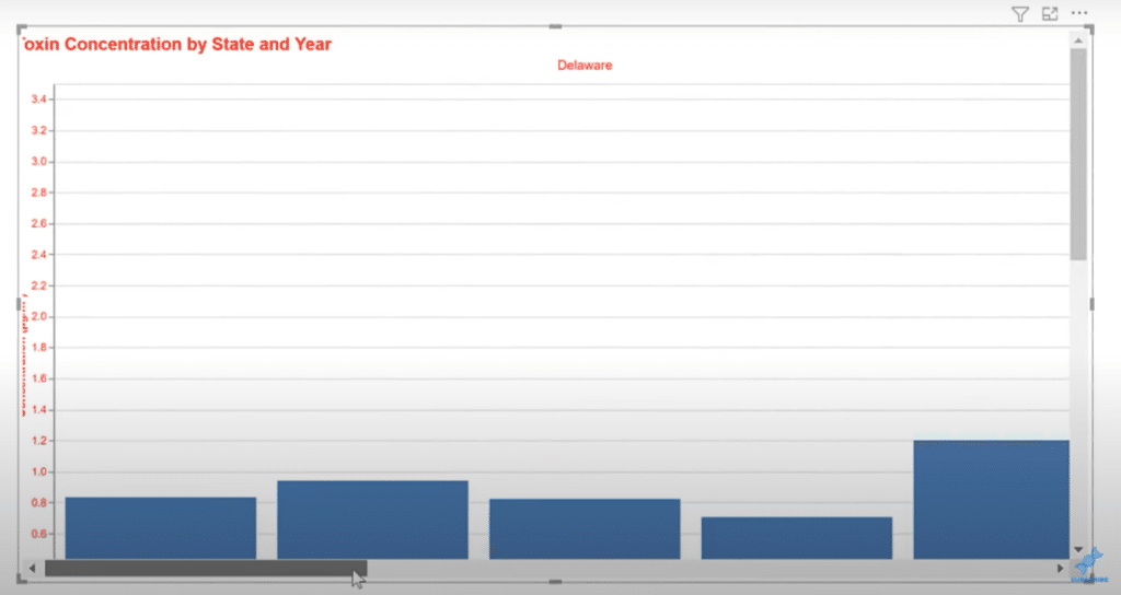
We can now see different graphs for each state here.
Let’s do one more thing and adjust the size of the chart. We’ll grab another small text block and paste it in the code.
When we go back to the report, we can see that it is responsive with whatever states we choose.
That’s it for the preparation phase. From here, it’s a simple matter of copying and pasting our development visuals to a common page and setting the colors.
Let’s go over to Power BI and grab our text boxes for both the title and for the report info and paste them into the main page. We’ll do the same for the years, states, and toxin slicers.
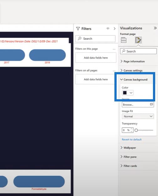
One of the things that we can do now is to adjust our colors a little. In this case, I have chosen Pantone’s Color of the Year for 2022, which is purple.
Let’s select the canvas background to be our darkest color and our color pallet.
Next, let’s grab our metrics card and paste it to our main page. We’ll choose a background color and adjust the size.
Then grab our fasted column chart, paste it in our main page, and resize it. Everything is on one page now. It’s just a matter of going through the visuals and changing our reds to whites to finish our work.
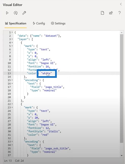
We’ll go through every visual to change red to white.
***** Related Links *****
Make A Custom Visual For Power BI Using Deneb
Custom Theming In Power BI
Power BI Custom Visuals – Build A Reporting Application
Conclusion
My takeaway from this tutorial is that you can do pretty much whatever you want in Vega-Lite. But like any other tool, it has its strengths and weaknesses. When viewed from the Power BI desktop point of view, a few insights emerge.
Text boxes are labor-intensive in Deneb Vega-Lite, so I’ll continue to use the dynamic text boxes in Power BI desktop at this time, unless there is a compelling reason to do them in Vega-Lite.
Slicers are specific rather than cascading in Deneb Vega-Lite so I’ll continue to use Power BI visuals for slicing for the time being. But I suspect greatly that either there are configurations I have not found yet, or that the Deneb custom visual will be enhanced with extended capabilities in the near future.
Cards require increased development effort in Vega-Lite compared with the standard ones available in Power BI desktop, but Deneb Vega-Lite provides enhanced customizations that are not available in the standard cards of Power BI desktop.
Visuals are where the Deneb Vega-Lite really shines. The flexibility is outstanding and customization is practically unlimited. One can also leverage the examples of others’ work in implementing Vega-Lite in other environments since the JSON code is standard and can easily be customized to suit the implementation of Power BI.
A downside to Vega-Lite is that it does have a learning curve, but on the upside, a JSON syntax is legible and is easy to understand. A technique developed for one visual can often be copied as a JSON text block and pasted as is into another visual. With this tool, I see a very bright future, not only for the Deneb custom visual, but for the Power BI community.
Greg


