
In this tutorial, I’ll demonstrate how you can create 2 split percentages in a donut chart using DAX calculation groups while avoiding having to unpivot data in Power Query. You can watch the full video of this tutorial at the bottom of this blog.
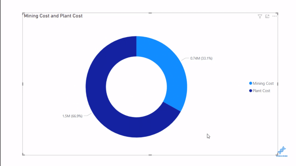
This actually came from a question raised by one of our members from the Enterprise DNA forum. The member was trying to achieve a donut chart visualization where he wanted to split plant and mining costs as shown below.
We can easily achieve this by creating a measure for plant costs and another for mining costs. The measures will have the SUM function, which is literally just adding up the plant costs for the Plant Cost measure and the mining costs for the Mining Cost measure. Then, we can bring these measures into the values section of the visualization.

We can also have these measures in a slicer by creating a calculated column or a custom column in Power Query.
With this, we can have different category columns that we can use in a donut chart and on a slicer.
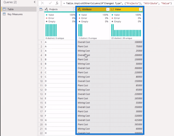
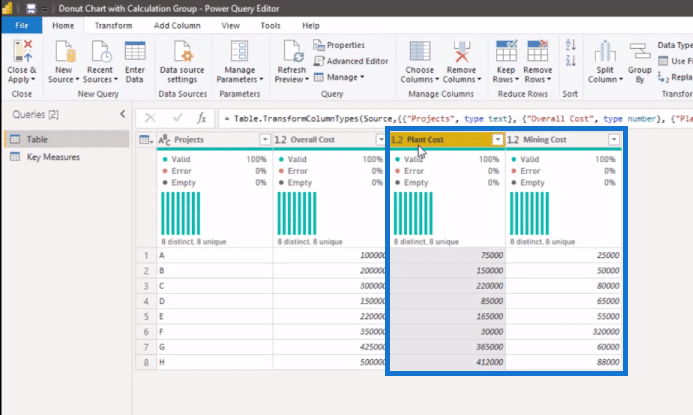
However, in this particular case, the member was not looking to unpivot the data because of a substantial back-end of data. So he was looking for some alternative solution to get a slicer on the page along with the donut chart. To do this without unpivoting the data, we are going to utilize DAX calculation groups.
Creating DAX Calculation Groups
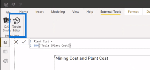
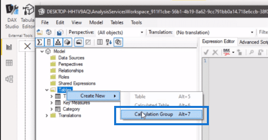
To create calculation groups, we go to External Tools, then click on Tabular Editor.
Inside the Tabular Editor, we right-click on Tables, then select Create New, Calculation Groups.
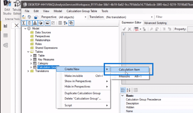
We can then name our calculation group. In this case, we’ve called it Calculation Group. We need to create two calculation items within this. And so, we right-click on Calculation Group then click Create New, Calculation Item.

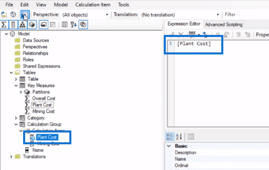
We’ll call the first one as Plant Cost. And then, we’ll bring in our Plant Cost measure into the Expression Editor.
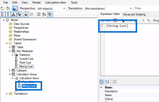
We’ll call the second calculation item Mining Cost. Then we’ll bring in the Mining Cost measure as well. After that’s done, we click save and refresh our Power BI desktop.
DAX Calculation Groups In A Donut Chart And Slicer
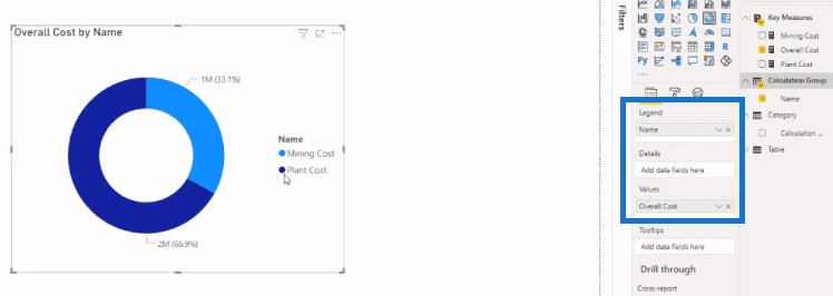
We can now create our donut chart. We bring in our Overall Cost into the Values section and then our calculation groups into the Legend section. Now we can see that the plant cost is 66.9% of the overall cost and the mining cost is 33.1%.
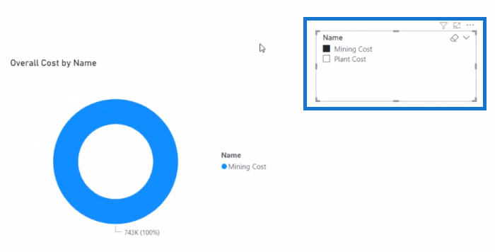
We can also have our calculation groups in a slicer on the same report page. This is useful when you have multiple visualizations within your report and you want to dive into particular data to get specific results.
***** Related Links *****
Small Multiples With Calculation Groups In Power BI
Conditional Formatting In Calculation Groups – Power BI
Introduction To Calculation Groups In Power BI
Conclusion
Using calculation groups is a simple and easy technique that you can use if you want to avoid unpivoting data. You can quickly create visualizations and slicers using calculation groups.
I hope you’ve found this tutorial helpful and that you’re able to apply it within your own reports. Check out the links below for more related content.
Cheers!
Mudassir


