For today’s blog post, I want to talk about data driven storytelling and design in action. I was one of the speakers in the recently concluded Data Visualization 2022 Summit presented by Enterprise DNA last May.
For my topic, I wanted to find something interesting enough for the people who followed my course at Enterprise DNA’s learning platform, but at the same time create something valuable for people who did not enroll in my course or who are not members of Enterprise DNA.

So how did I find the story I wanted to tell for my session? Well, I looked at it from the perspective of the audience, speakers, and organizers. I was thinking that it would be really cool if I could have more information about this summit. I needed to know more about the other people presenting, and to find a way to follow along.
This is how I found the story. I wanted to create something where I can showcase the summit from the perspective of the audience, speaker, and organizer.
Business Needs Before, During, And After The Summit
If you are a speaker, you are interested to know about audience feedback. If you are the organizers of the event, you want to know how many people are coming to the summit and what presentations are the most valuable for them.
There is a lot of value that we can get from feedback. The more the organizer will know what the audience wants, the more the audience will get from the summit. For me, this was the perfect theme to tackle and present today.
I summarized the participants’ needs and the organizers’ needs, and also took note of the different moments that an audience will need for the summit.
I thought that it will be very valuable for an audience to have an application or a report that will be used at three different moments: before the summit, during the summit, and after the summit.

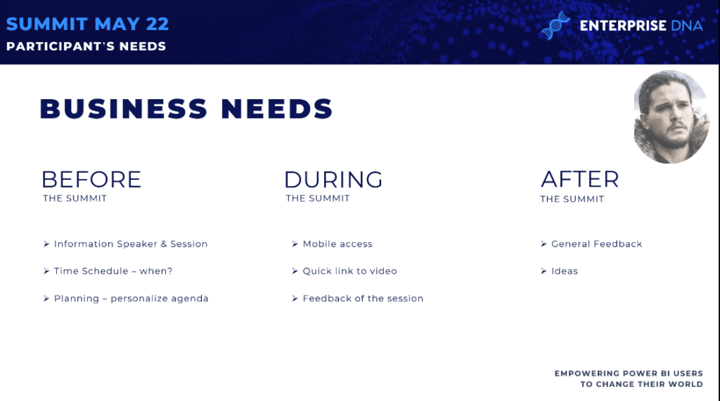
Before the Summit
Before the summit, it’s very important for the audience to have information about the speakers and sessions. You need to know when it will be presented and by whom it will be presented. You also want to find more information about the speaker. The schedule is also very important. You want to know when the sessions will be in your local time.
During the summit
Then you need to prepare and plan your agenda. That means that during the summit, you’ll check all the sessions and see which ones you want to participate.
You’ll want to give feedback right away after each session, and give recommendations for the next sessions. You can also choose to connect with the speaker on LinkedIn or Twitter.
After the summit
After the summit, you’ll want to provide a general feedback about the full summit, and tell the organizers if your expectations were met or not. And if not, you’ll want to let them know why they were not met. You can also propose ideas for their future summits.
From the organizers’ point of view, you are interested on the general feedback after the summit and recommendations for future topics. You want to identify new speakers and calculate the impact of the summit on the participants.
You’ll probably want to create a report that can be shared on your teams, and based on the data on the report, you can have discussions on how to organize an event that is better than the one that just finished.
We need to create something that can answer this needs during the summit. What you need is to have something on mobile, and something that is easy to access so participants can find the link to the session right away.
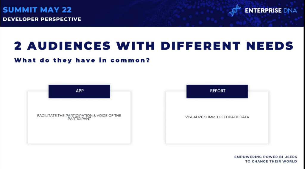
Based on these needs, how can you create the story? We’re not just talking about a Power BI report or a Power Apps report. We are talking about an ecosystem. These ecosystems have different needs at different moments, but they’re also related. This is the story I want to tell today.
Building An Ecosystem
First, we need to plan. We need to know exactly what we want to create, and to create it in such a way that it can be leveraged by other things.
So in order to answer the needs that I discussed earlier, we need to create a Power Apps application that will become a data entry point that will help the summit participants and give them a voice.
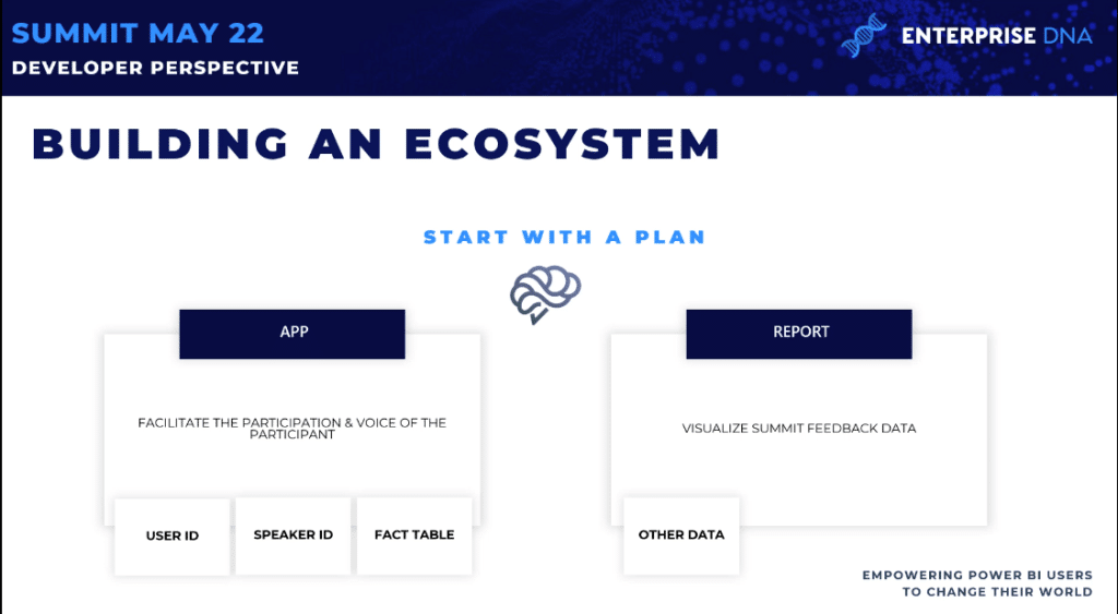
Our Dimension Tables: User ID And Speaker ID
Based on this application, we will create reports to visualize the summit feedback data. This means that the Power BI report will need to connect to the data that is created by the application.
This is where you can have a great impact as a designer—you need to create the application in a way that the data is structured and facilitates the creation of the report in Power BI.
We start in the middle, and think about the data that will be generated by the app. We’ll need to create an easy data model and create an app to answer the specific needs identified. We’re not talking about creating one report; we are talking about a full ecosystem.
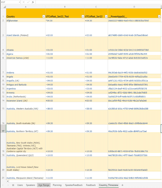
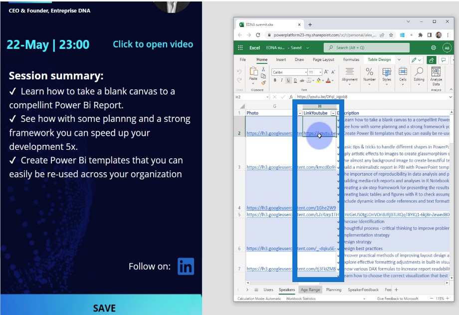
I wrote down my ideas in an Excel file and started to put my ideas in practice. I created different tabs and different tables that need to be used by the Power Apps.
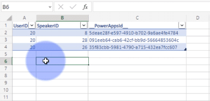
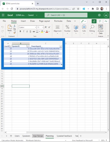
To create an application using before, during, and after, I need the history of the users. So I created a table for the User ID and started with the user ID, username, password, age, country, and level of Power BI experience.

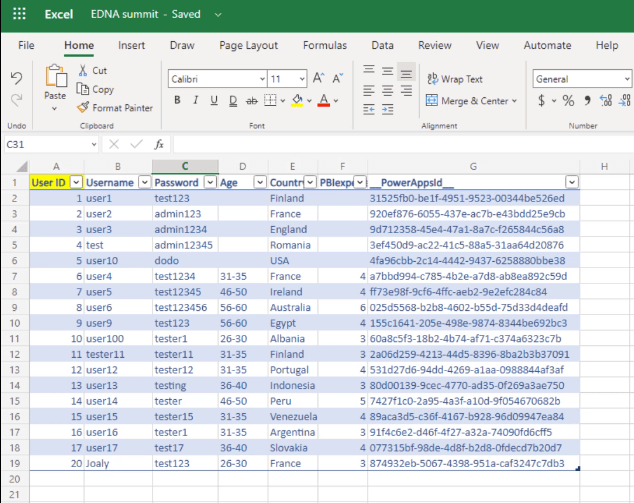
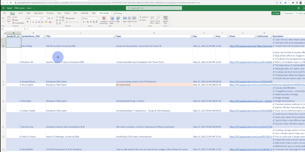
Of course, I also need another table for the Speaker ID with the information of the speakers, their title, topic, day, hour, photo, YouTube link, LinkedIn address, and Power BI IDs.
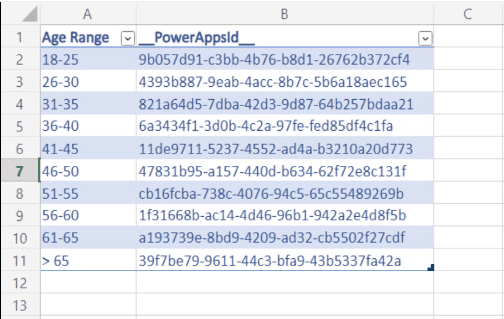
I didn’t want to ask people for their exact age because it’s not the most important thing in this application and also to keep the confidentiality of their information.
Instead, I asked for an age range to get an idea of how old the participants are in these sessions.
The User ID and Speaker ID are the dimensions I’ll need inside Power BI later. I also need a fact table where I will connect the User ID to the Speaker ID to create my Planning and Feedback pages about the sessions.
What’s nice about this file is that I have real data. I have all the speakers for the summit in the right order, with the right topics and the right description.
This is just to showcase a prototype of how an application like this would look like for Enterprise DNA. This is why I wanted to go as far as I can.
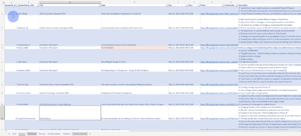
We have here the Planning, which is the fact table in Power BI where I can create relationships and have information about the User ID and Speaker ID.
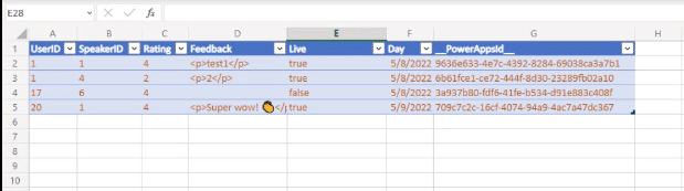
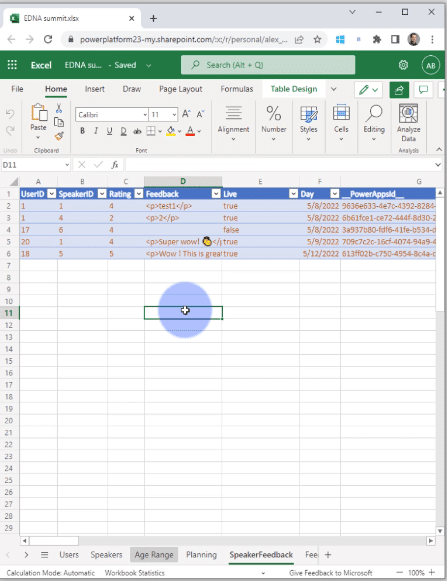
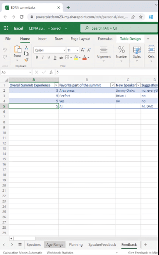
Then we have the Speaker Feedback, which is the second fact table with the User ID, Speaker ID, the rating for the session, the feedback that the person will give to the session, the users looking at this session live or not, and the data they are looking at.
These are something that you can easily manage inside Power BI by having only one big fact table.
It’s pretty easy to imagine the data model in Power BI when you have the dimensions and the fact table.
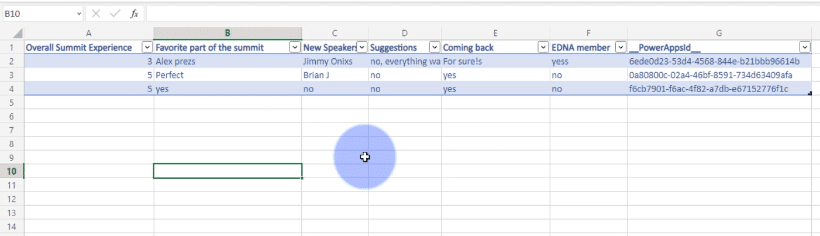
The feedback page is the general feedback of the summit where there is no relationship between the User ID and Speaker ID.
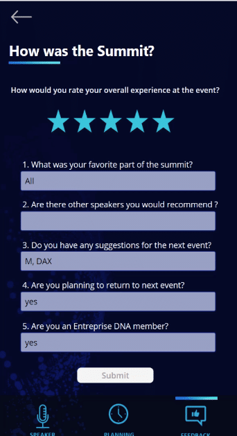
We have here information like the overall summit experience, favorite part of the summit, suggestions for improvement, option to come back, and many more.
And then the last thing is the country time zone. If you go to the Enterprise DNA summit page, you will see information about the session times in Los Angeles, New York, London, Sydney, and Oakland.
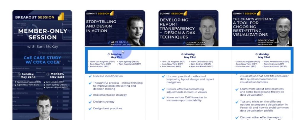
I wanted to go one step further by calculating the exact time of a session in your local time by connecting to the application.
This is the structure of the applications that I wanted to create, which can be leveraged inside the Power BI and Power Apps reports.
I also need to make sure that we won’t have duplicates. At this point, data quality is important.
If you don’t have data quality in the data source, then you’ll encounter problems in the visualizations in later.
Building An App For The EDNA Summit
This is the overall application. I will show you each page, how it works, and how it is dynamically working. I will also show the interesting design tips that I added in the app.
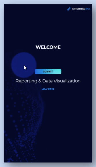
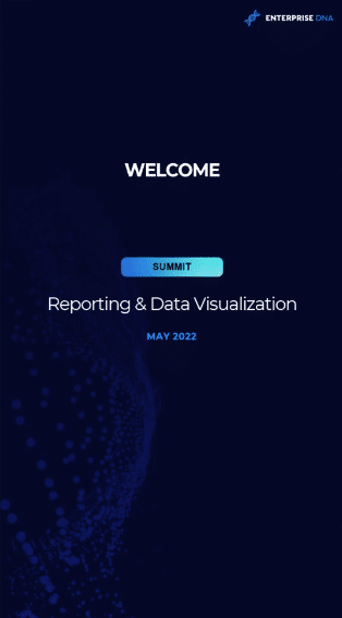
I started with a welcome page. As you can see, I followed the same structure, theme, and colors of Enterprise DNA.
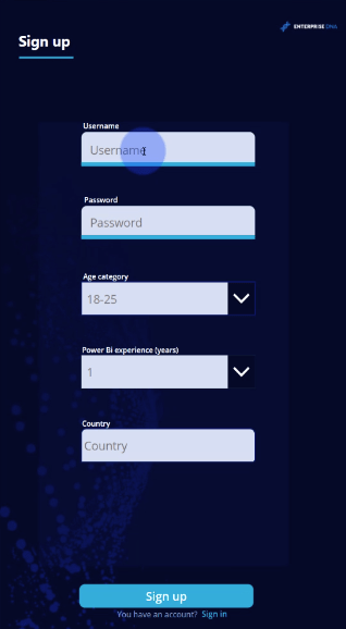
This temporary screen is the first experience. When you connect to this application, you’ll have this for a couple of seconds, and then it will change to a sign-in page.
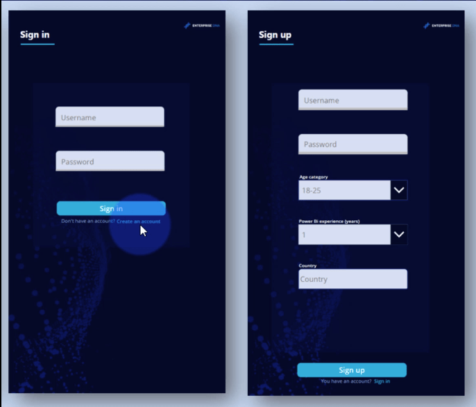
For the sign-in experience, you have to put the username and the password, or create an account. When you create an account and sign up, this information will be added to the data inside our Excel file.
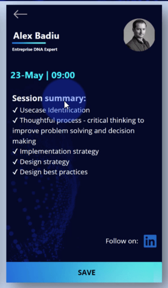
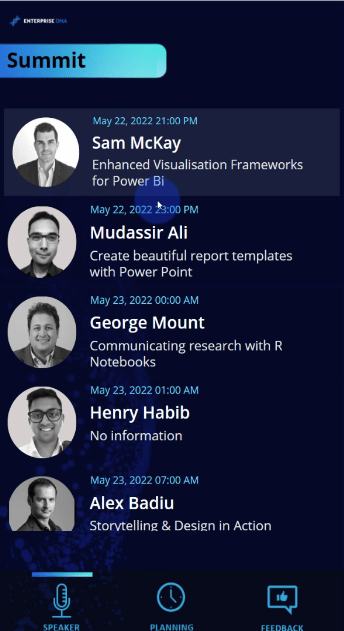
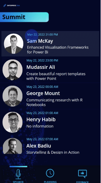
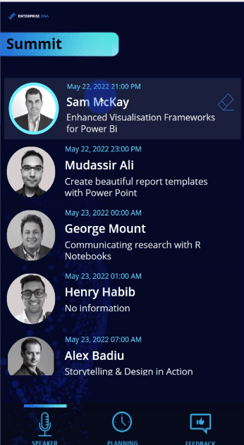
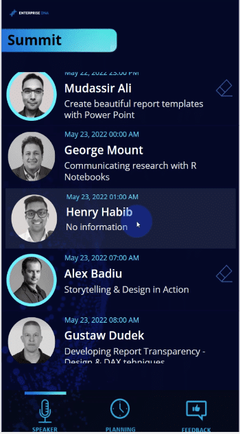
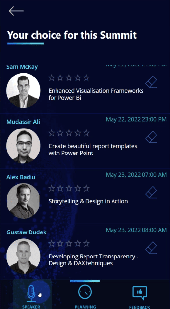
Once we sign up, we go to the main part of the application, which is composed of a gallery with all the session speakers. For each session, the date, hour, and time is presented in local time. The name and topic are also presented.

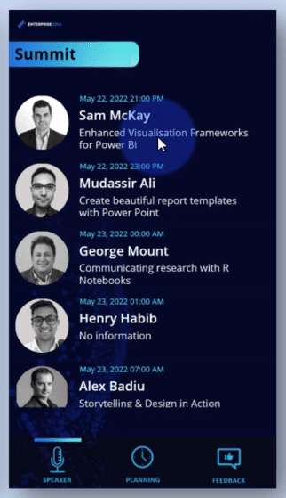
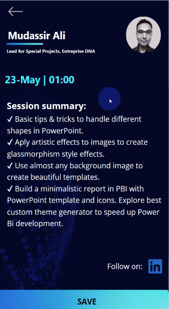
If you want to go into more detail, you can click on a session to have more information, such as the title, time, date, and session summary. If you find this interesting, you can click on Save to save this session for later.
When you go to the Planning page, you can see all the sessions that you have saved.
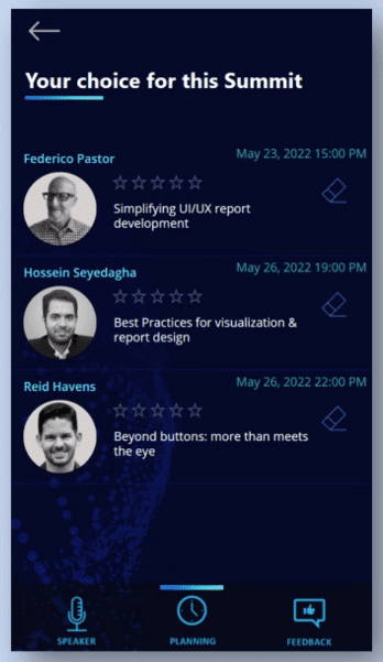
You can remove the session from here, or give a feedback. You can choose to give rating or write feedback. When you click on Submit, this information will be written on the data source, which in our case is our Excel file.
As you can see, the overall experience for the user is very nice. It creates value to the user, and at the same time, it also provides value to the organizers who will use this data inside Power BI.
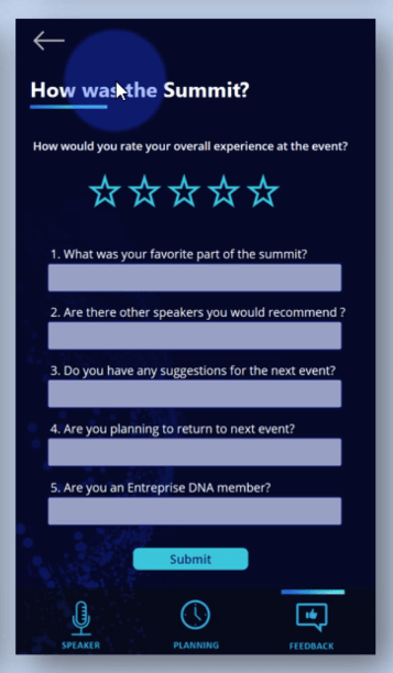
It also generates general feedback for the summit. Here’s the page where you can tell your overall experience, favorite part, suggestions, et cetera.
Layout Hierarchy: Making Your Navigation Easy To Use
Creating applications on mobile is different than the ones that you create inside a Power BI report. It is different because you are not using them in the same way.
The layout inside the application is different because when using a computer or tablet, people have the tendency to scan the page from top left to right, and then follow a sort of Z pattern or H pattern. The first thing they will see is the top left and the last part is the bottom right.
It’s not the same for a phone application, as you can see from this image below. The green part is where the thumb will have an easy flow, the orange part has a bit of stretch, while the red part is the most difficult to reach.
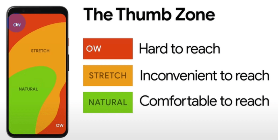
You will create the layout of the application based on this. What is good about the application is that you have a lot of examples and based on those examples, you can create something similar.
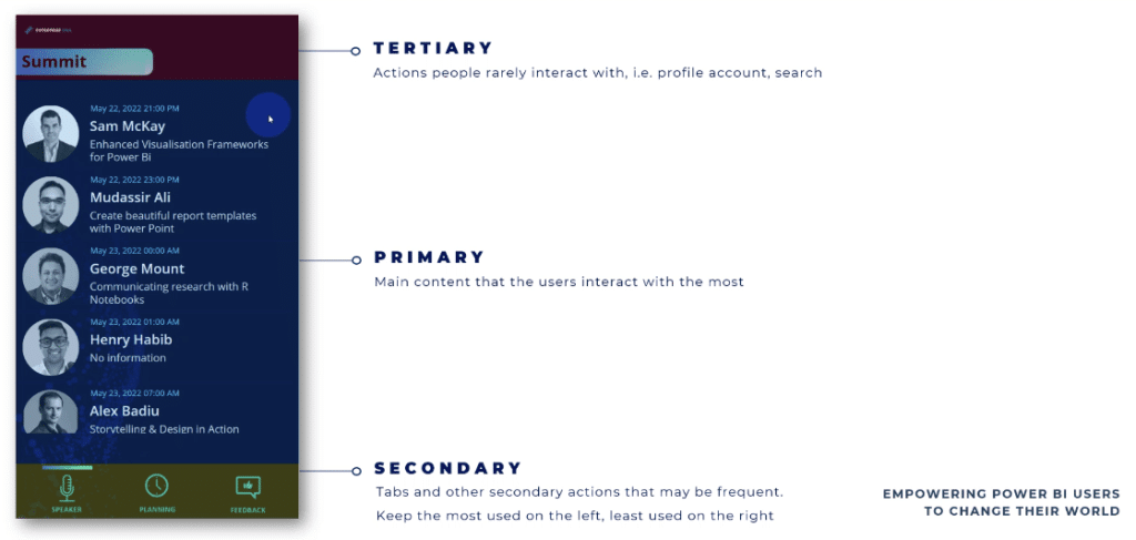
Three Parts Of The Application
So basically you have three parts in the application. The primary part is the gallery that you can scroll with your thumb and select the information.
The secondary part is the tabs. These are the buttons you use to navigate throughout the application.
The tertiary part – which you will interact with the least – is the title of the summit, profile account, or search functionality.
When creating a phone application, there are some design best practices that can also be used in both Power BI and Power Apps. Once you have a good level of understanding in Power BI and Power Apps, you’ll find that good UX and UI are more important when you work on a small screen.
Design Best Practices
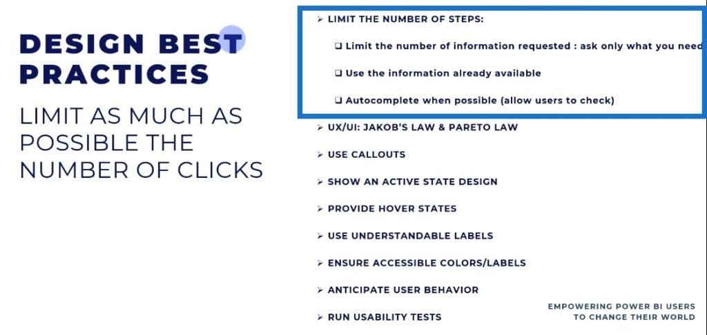
Limit the number of clicks
You need to limit the number of steps or the number of clicks on Power BI. Limit the number of information that you request, or ask for only the information that you need at the moment, when you need it.
You need to use the information that is already available so you can leverage the answers that the users gave you.
Last but not least, when you create applications (we are talking about data entry here), you need to check the information that was written.
Auto complete when it’s possible and make sure that the user doesn’t do extra clicks, so ensure that the information they entered is correct.
Follow Jakob’s Law and Pareto Law
Jakob’s Law says that users will prefer your app to work the same way that their other apps are working. Below is an example of the applications that are most used in the world: WhatsApp, Messenger, and Contacts.
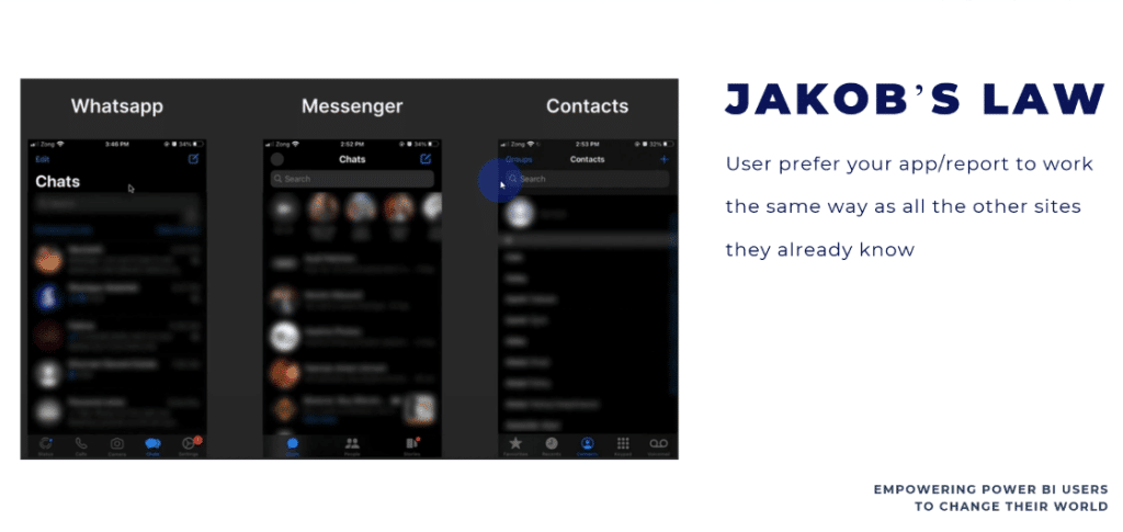
We have a similar experience in the applications that I created. We have the gallery in the middle, the buttons on the bottom, and the search functionality or contacts on top.
Pareto Law states that 80% of outcomes results from 20% of causes. The same principle works in UX and UI in the sense that you need to put the effort on features that are most valuable for the user.
You don’t have to create all the features in an application, but the features that you do need to create need to be really well implemented and well-tested.
At the end of the day, you don’t want too many options in an application, because if it becomes complicated, it will not be used.
Use callouts
Use callouts to indicate to the user what to do next. For example, if you want to buy something, you see the buy button in a different color just to catch your attention. This is an indicator of the next step you need to do.
Show an active state design
When it comes to navigation, you need to indicate where the user is in a specific page. If they don’t know where they are in the app, it’s not a good user experience.
Provide hover states
This is used for buttons. When you hover over a button, you will see that it is active. A hover effect gives users a clear signal to see what’s clickable and tells them what to click.
Use understandable labels
Labels make the design more accessible, and will make your information tangible and actionable for your users. The words you’ll use need to be clear to the user so they’ll know what you want them to do.
Ensure accessible colors/labels
You need to use colors and labels that are accessible in terms of size, contrast, and portion.
Anticipate user behavior
In an app, you need to anticipate the user behavior. You need to anticipate every click and every question that the user will have.
Run usability tests
You need to test what you implement, and take the time to do all the tests needed. Sometimes, you’ll need to involve other users that do not know your application to look at how they are using it.
So these are the best practices in designing an app. Let’s now go to the application and see these best practices in action.
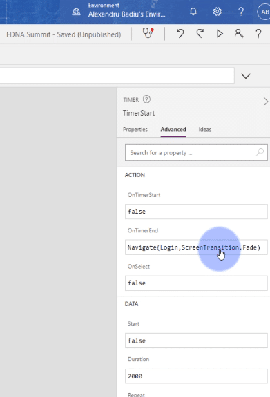
I’m now in the application and I will just press Start. The first page takes only a couple of seconds to run. This is because I have a timer on for two seconds.
When the timer reaches two seconds, it will navigate to my other screen and create the transition.
We are in the sign-in page.
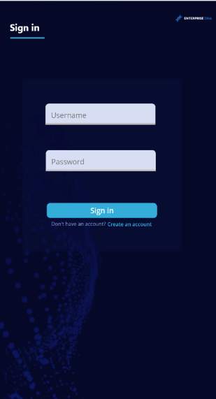
We will enter the username and password to connect to this application. At this moment, the application behind the scenes will retain the information of your User ID.
This information is already from the existing User ID table, but what happens if we add a new user? Let’s find out by going back to the login page and creating an account.
I’ll enter Alex B as my username and test123 as my password and then sign up. You can see that the user ID was created automatically.
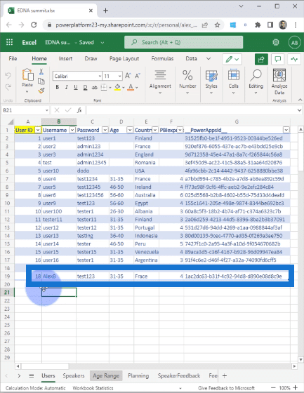
You need to pay attention to all problems when it comes to data entry. It’s up to you as the app creator to anticipate these problems and to create solutions to avoid this.
Going back to the application, I have a list of all the session speakers and I can see that the hours are calculated in my local time.
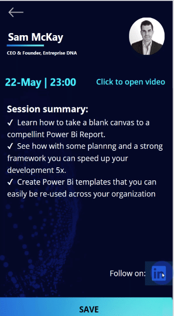
Let’s say we want to participate in Sam McKay’s session. When we click on the link, we see that there’s a Click to open video link right below his photo.
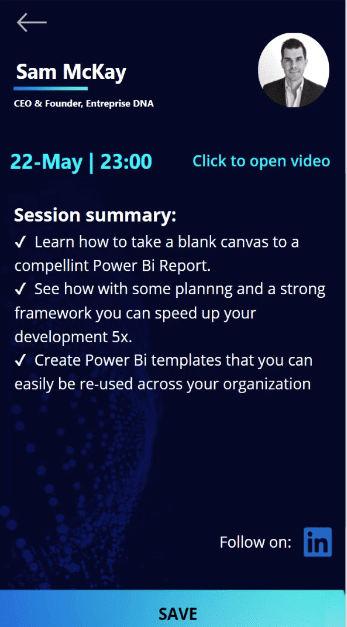
If the user clicks on this link, they will be directed to the YouTube video that I put in the file.
But when we go to Mudassir Ali’s profile, we cannot interact with the Click to open video button. This is an example of showing the information only if it is available to show.
In this case, I don’t have the video for Mudassir Ali’s session, which is why I don’t show the Click to open video link.
Let’s say we want to participate in Sam McKay’s session, and we click on the Save button. Once we save, we can see that the page has an Unsave button, and that the speaker Sam McKay is highlighted.
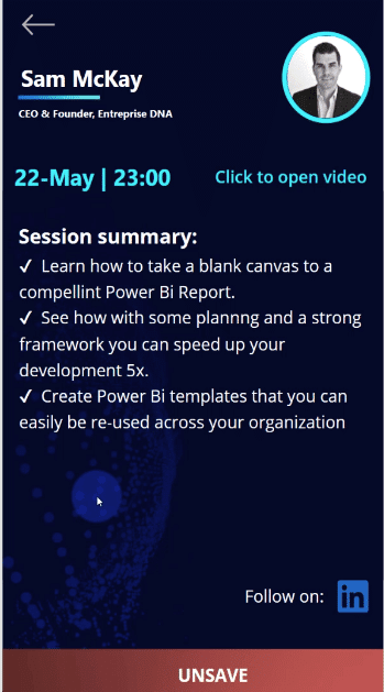
This is to provide context because we want to know that the user has selected Sam’s session. You can see right away that this session is live and that there’s an option to remove. If you want to remove, you can do so from here – you don’t have to do an extra click to unsave.
Another functionality is the ability to connect with the speaker through a LinkedIn button. This button below will direct me to Sam McKay’s LinkedIn account.
Now that we have a couple of sessions from the list saved, we go to Planning.
When we go to Planning, what happens behind the scenes is that all this information will be collected in a temporary collection and will be written to the data source.
If we go back to our Excel file and go to our Planning tab, we can see all these SpeakerIDs, which means everything is working as we expected.
Let’s say we cannot participate in Gustaw Dudek’s session. We can click this Remove button. If we look at my Excel file, we can see that Gustaw Dudek’s information disappeared.
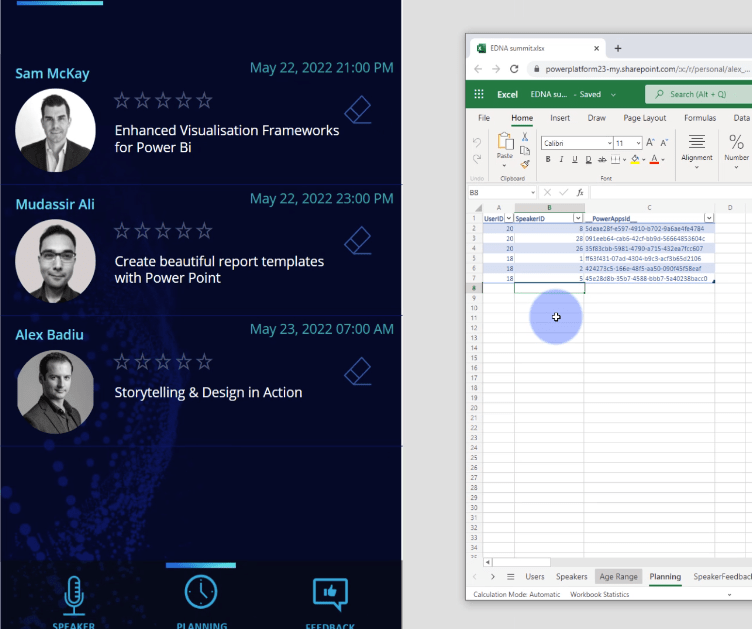
As I have said earlier, it’s good to have a state where it shows where you are in the navigation. As you can very well see from the bottom icons, we are on the Planning page.
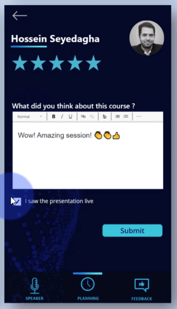
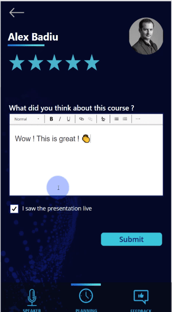
Let’s say we participated in a session and rated it four stars out of six. This information is pre-saved so if we change our mind, we can go back to it later to change our rating.
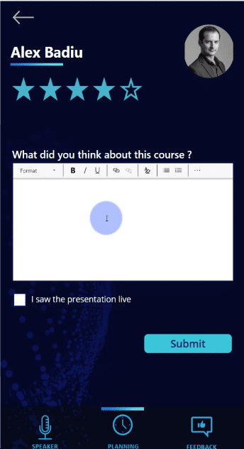
After we saw a presentation live, we can provide feedback and add an emoji as well, then click on Submit.
When we check on the Speaker Feedback on my Excel file, you will see how this information appears in HTML format.
For the feedback page, we can even make some answers mandatory as the report designer, but this is not the case here.
When we go to our Excel file, we can see all this information written in the Feedback tab.
***** Related Links *****
Data Storytelling: Thoughtful Planning & Creation Process
The Art Of Storytelling In Data Analytics with Alex Badiu
Create Power BI Reports With These Techniques & Examples
Conclusion
I’ve put in the hover state of the buttons, minimized the number of clicks, and put in information that is interesting in this session app. Hopefully, you can take this further through storytelling and technical knowledge using different tools.
You can create an ecosystem, and then tackle the needs of different audiences. To get value out of the Power Platform ecosystem, you need to know how to use Power BI, Power Apps, and Power Automate. You can work in a collaborative environment, and improve the things you are doing in a very fun way.
Please note that this application doesn’t exist. It exists only in my mind and is just a prototype. But who knows, maybe in the future, we can have this type of application for Enterprise DNA.
All the best,
Alex Badiu