Today, we are starting a series on the practical steps that we can do to improve report design, report transparency, and the end user experience. For the first part of this series on developing report transparency, I will be focusing on basic but effective techniques on dashboard layout design that can be easily implemented in your Power BI reports.
In addition, I will share some of my thoughts on the report development process. We will go through the more technical component of developing BI reports but at the same time, we will also address the general approach and intentions behind each aspect of report design.
First, let me give you a high-level view of what will be discussed during this series on report transparency.
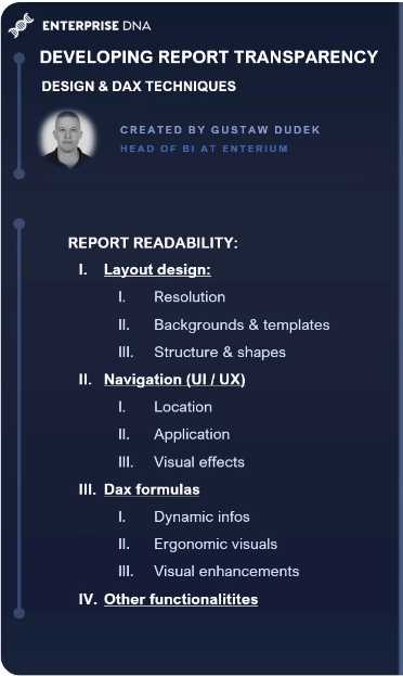
When I think about general report design and report transparency, I try to separate it into four relevant pillars: layout design, navigation, DAX formulas, and other functionalities.
Layout design includes aspects like choosing a suitable report size or resolution, applying additional backgrounds or templates, and shaping a report structure by separating different areas like the KPI section, the main visuals, and the navigation filter panes.
Creating a user-friendly navigation requires such steps like choosing a suitable location for buttons, rethinking the application of the said buttons, and applying different visual effects to make the navigation look more interactive and vibrant.
Then we have DAX formulas that help BI developers create transparent and insightful reports. There are many DAX techniques that can help us save great amount of space, highlight specific elements of given visuals, and introduce dynamic information.
Last but not least, we also have other functionalities that can bring the report design to the next level, such as custom tooltips.
When all of these factors add up, it can substantially impact the report readability. Now, we’ll go through each of following pillars by highlighting some specific examples. The first one we’ll discuss is layout design, while the other topics will be discussed in future blog posts.
Dashboard Layout Design
The first important element to consider is the page size or the resolution. The standard default page resolution is set on 1280 by 720, which is 16:9 in terms of width and height of the report.
This resolution works perfectly fine in many scenarios, but I find it personally useful to increase the resolution to any point ranging from the default size of the resolution to somewhere around 1900 x 1100 while keeping the ratio at the same level of 16:9.
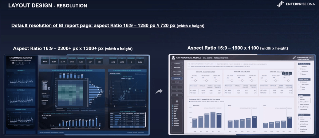
From my perspective, that end value is optimal when creating reports that are meant to be read and analyzed on laptops or PC monitor screens. The main benefit of higher resolution is to increase the amount of space for visuals and additional elements.
However, increasing resolution to overly high levels may lead to decreased report readability. That’s why I recommend this resolution, while keeping in mind that reports shown on phone sizes should be adjusted around the minimum of 11 to 12 pixels.
Another important consideration is to keep the page resolution consistent across each page if the report context does not require variety.
Customize Report Page Resolution
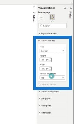
Now let’s dive into the PBX file. I will show you how you can easily customize the report page resolution. First, create a new page, go to the visualization pane, choose Format page, then Canvas settings. From the dropdown list, you can choose your preferred format from 16:9 ratio to custom.
Once we have defined the page resolution, we can create and design backgrounds or templates for our Power BI report.
Here are examples of self-made layouts. The upper two layouts appear to have greater amount of solid space in the main section, while the bottom two present a more fixed structure with greater amount of shapes and sections.
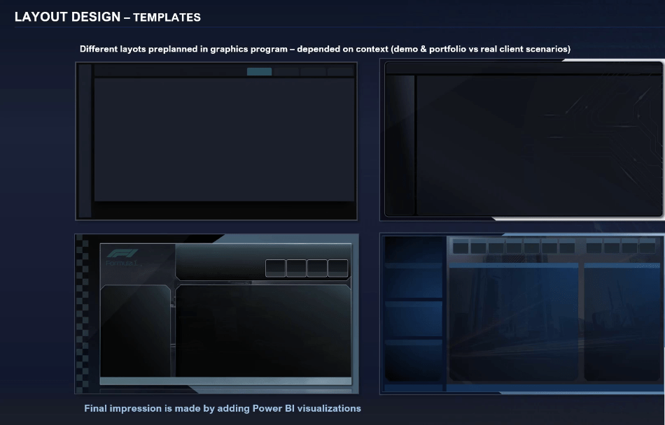
How we design and build our layouts depend on a few things, but the main one is the report application. For example, if it’s going to be used either as a portfolio or a demo, or if it will be used by end users and clients.
We can create more fancy and more complex reports for personal or commercial use, like portfolios and demos. For professional, operational, or financial reports with real-life scenarios, we can take a more simplistic approach.
Two Approaches For Designing Pre-Planned Layouts
When designing pre-planned layouts, I have two approaches using Microsoft PowerPoint. The first approach is to build a layout with fixed structure and all the objects and shapes included right away.
The second approach, which is my go-to, is to build structural layers while simultaneously keeping the walls of space solid.
In this scenario, the structure is built directly in Power BI by adding shapes like rectangles. This way, we can easily modify and adjust our structure to the visuals we will implement in our report.
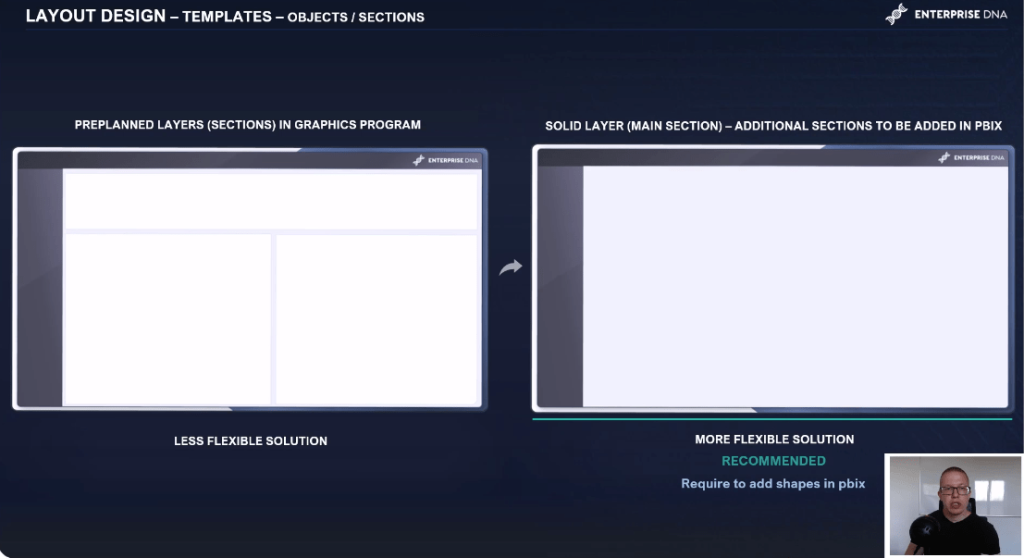
The size of visuals vary a lot and will be dependent on many things, like the number of categories we want to display on a given visual.
It’s better to have a flexible approach instead of creating many similar layouts, going back and forth from the PBX file to the graphic program, and adjusting every layout page.
Here is another example of how easily you can design just by adding different shapes and different colors. In this particular case, several rectangles have been added at the top of the pre-planned layout to create a simple grid structure for the different visuals.
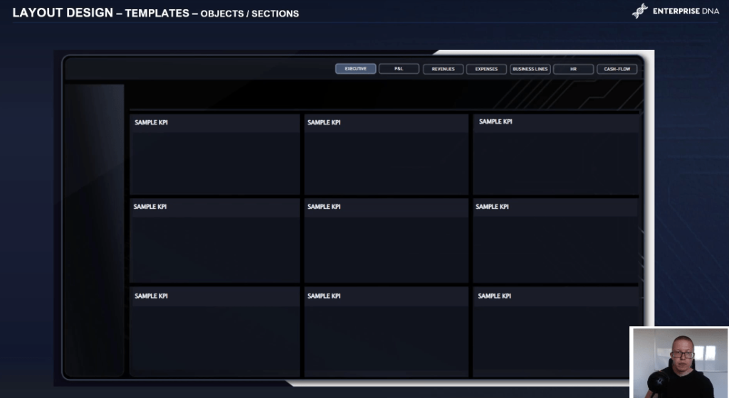
Create Report Structure By Adding Shapes
Let’s dive into the PBX file and add additional shapes to our report layout, which we will later fill with visualizations. We can go to Insert Shapes, make a couple of rectangles with darker colors than the actual page layout, and turn the borders off. Then we’ll copy and paste, and put them in different places.

Now we are ready to implement some visualizations. For this example, we have a lighter layout on a different page. We’ll add rectangles with white fill and gray borders. This way, we can easily modify the structure by adding additional wide shapes like rectangles.
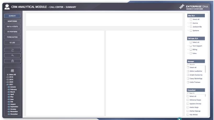
How To Structure Report Pages In Your Dashboard Layout Design
Structuring a report page depends on the report type and the end users.
My general rule of thumb is to place the KPI sections on the upper central section or left upper section. The visuals, which drive the most impactful insights, are placed on the top left, while the right side is used for company logo, titles, navigations, and slicers.
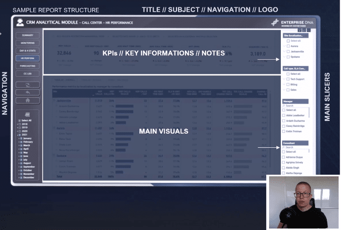
After you add some striking backgrounds and create the initial structure of the report, you can proceed to design your navigation pane.
***** Related Links *****
Report Layouts: Designing With Native Visuals
Power BI Report Designs: How to Get Inspiration Through Enterprise DNA
Tips For Power BI Report Design – Best Practices
Conclusion
In this post, we’ve discussed how to optimize the dashboard layout design of your Power BI report. When it comes to the design aspect, having a clear, concise layout with a balanced mix of visuals is the way forward.
If you’ve enjoyed this tutorial, watch this space for the continuation of this series on report transparency. We’ll be diving in on navigation, DAX formulas, and other functionalities on future blog posts.
All the best,
Gustaw Dudek


