There have been some relatively recent updates when it comes to creating custom conditional formatting inside your Power BI tables. For this tutorial, I want to highlight the various things you can do with this new feature. You may watch the full video of this tutorial at the bottom of this blog.
The conditional formatting in Power BI allows users to specify customized cell colors based on cell values, other values or fields by using gradient colors.
Since this is one of the most requested features in Power BI, I’ll teach you some great and useful insights that you can easily apply to your own models and reports.
Conditional Formatting In Power BI Inside A Table
Before anything else, I need to specify the rules that I want to achieve in my results based on the data that I have inside of the tables. For this example, I’ll demonstrate a really simple rule to implement.
First of all, click the drop-down arrow on a particular measure, it can be within the table or any calculation. Next, select Conditional formatting, and then work out the background color.

I could just do ordinary formatting using the color scale. But I want to show you how great it is to use the custom conditional formatting feature of Power BI.
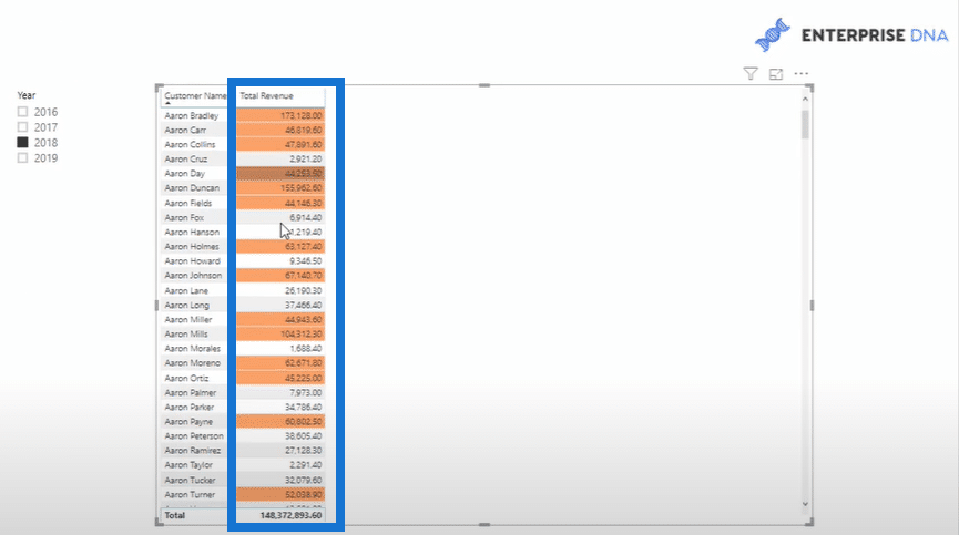
To start formatting, select the Rules option from the Format By drop-down list. After that, select the applicable measure to use within the table. In this case, I’m using Total Revenue.

For the value, select “is greater than or equal to”. I can enter any number, for instance 40,000. When it comes to the second value, select “is less than” and enter 200, 000. Lastly, set the specific color for the values that will meet this condition.
After setting up the conditional formatting in Power BI, click OK and check out how it looks in the table. As reflected in the report, there are now unique colors based on the rule that I have entered.

Custom Formatting Within The Same Measure
Now I want to show you another technique using another measure in the table. This goes to prove that I can actually use other measures within the conditional formatting.
This time, I calculated a simple formula for the Total Quantity measure. I want to get some custom conditional formatting in the Total Revenue 2 column of my Power BI. I want it to be based on the results of the Total Quantity column.

Now, I’m going to click the drop-down again and select Conditional formatting so I can work out the background color. Once again, I’m going to select Rules. But this time, I’m going to select Total Quantity for the field measure.
The rule includes greater than or equal to 25 and less than 100 and also the color purple.

After clicking OK, this is what the table will look like.

I can easily determine the conditional formatting that I’ll have in my Power BI based on any measure or results. It can be anything I want. This type of customization wasn’t possible before, but this big change in Power BI is really an avenue for immense flexibility.
Conditional Formatting In Power BI Based On Ranking
The third example that I want to show you is about creating some conditional formatting in my Power BI based on ranking. To make it even more complicated, I want to rank my customers based on the transactions that they have.

For this example, I created the formula below for ranking my customers.

With this formula, I’ll rank all of the customers based on their transactions in a descending order. Thus, the people at the top of the list will have a higher ranking and vice versa.
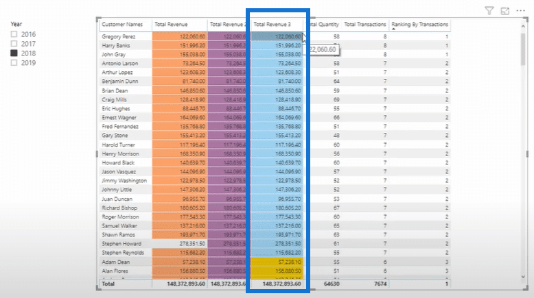
For example, in the list of customers under the Customer Names column, the first three customers have the same ranking as 1. That is because they all have the most transactions.

Now that I already have the customer ranking, I can then do the conditional formatting.
I’m still going to select Rules from the Format by drop-down list. Under the Based on field options, select Ranking By Transactions. For this rule, it’s going to be greater than 0 and less than or equal to 2, and then the background color should be blue.

To take things even further, I’ll add another conditional formatting. I want it to have a yellow background color if it’s greater than 2 and less than or equal to 4.
If that’s not enough, I can still add another one. For instance, if it’s greater than 4 and less than or equal to 6, I’m going to format it into a light gray color. For the last example, it’s going to be orange if it’s greater than 6 and less than or equal to 50. Now I have a total of 4 custom format rules.

After I click OK and go back to the table, the different colors that were determined by the ranking measures that I generated are now reflected.


This example can really get complicated in terms of the logic and that’s what I’m trying to demonstrate. It shows how flexible the conditional is as a formatting feature in Power BI. Just like my examples, you can explore the unlimited potential of this technique based on your own needs.
***** Related Links *****
How To Add Custom Icons Into Your Power BI Reports
Data Visualization Technique in Power BI – Multi Measure Dynamic Visuals
Find Top Customers Using RANKX In Power BI
Conclusion
Hopefully, I showed you enough techniques in terms of utilizing the conditional formatting features of Power BI. It can be inside the tables, within the same measures, or use it based on some rankings. After learning this one, you can also apply other visualization techniques like the bar charts, stacked columns, and more.
This new development of formatting has been requested by many users for a very long time. I hope that you’ve found this both useful and inspirational.
Enjoy learning!
Sam


