
In this tutorial, I’ll show you how a powerful data outlier and anomaly type analysis using dynamic outlier trigger points. You may watch the full video of this tutorial at the bottom of this blog.

What’s the importance of dynamic outliers?
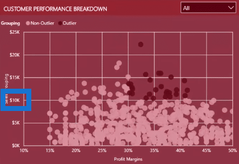
Well, look at this example.

Look at the number 10,000 in the scatter chart. In any particular quarter or quarterly selection, if Sales were above 10,000 or more than 30%, it would be considered as an outlier.
This insight is especially relevant to banks or insurance companies that have credit controls, or for factories that want to know the number of defective versus non-defective goods that they produce. However, these data outliers are usually static numbers.
There are occasions where the outliers will be more useful if they were dynamic, or that they can be changed automatically with a simple use of a slicer and even when changing from one time frame to another.
Here’s how to do it.
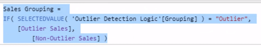
Reviewing the Static Formulas
The goal is to make the 10,000 and 30% outliers dynamic. This will enable you to determine which customers are outliers in any particular quarter.
You want to be able to select within a slicer to know the trigger points.

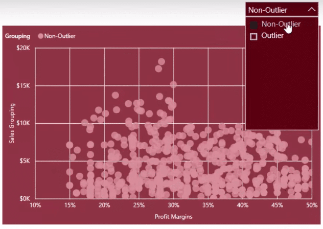
In this scatter chart, you can drill into non-outliers and outliers because it is a dynamic calculation.
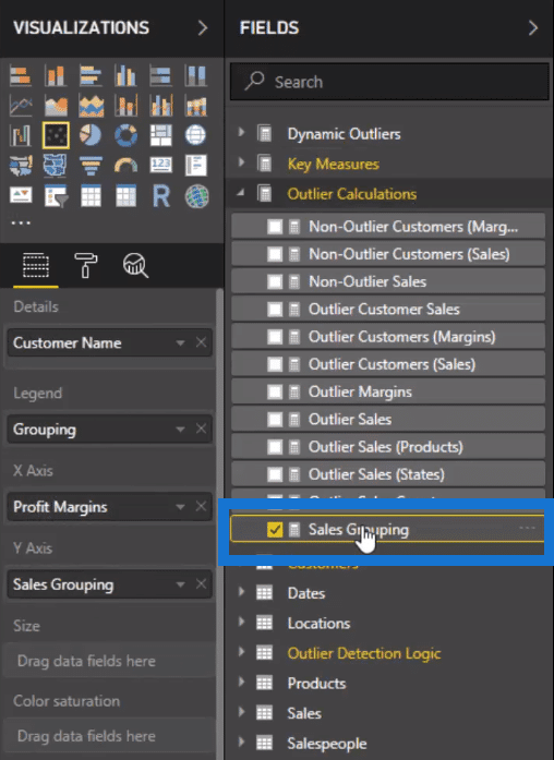
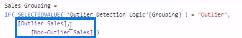
For this example, the Sales Grouping measure is the key.
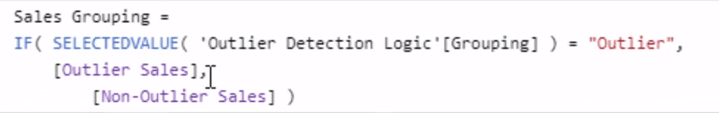
Now, you need to create another measure similar to this. And the two things to look out for and adjust are the Outlier Sales and Non-Outlier Sales.
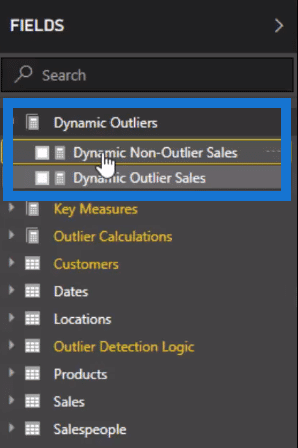
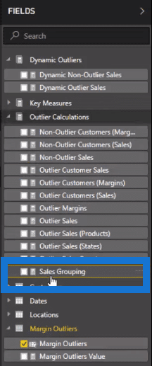
I’ve set up a brand-new measure group containing new formulas, one of which I’ve named Dynamic Non-Outlier Sales.

You need to sub in different amounts and measures inside the formula to make this work in a dynamic way.
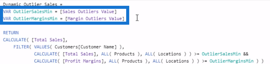
This is the key part of the formula:

In every single one of these formulas, there’s an OutlierSalesMin and OutlierMarginsMin. These are the 10,000 and the 30%, respectively. I’m going to use a working parameter and sub it into this part of the formula.
This is going to be a dynamic number based on its selection. And then, you’ll be able to see the chart move dynamically based on a slicer selection.
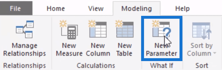
Creating New Dynamic Parameters
Let’s go to the modelling area and click New Parameter.
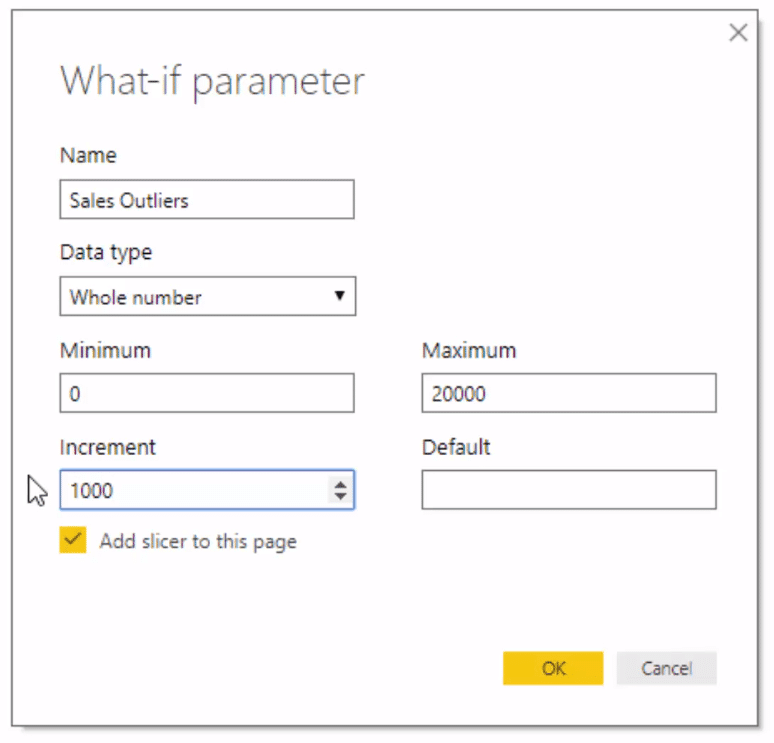
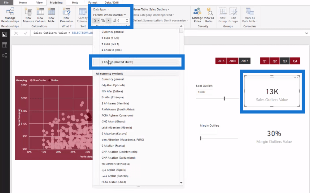
Name the new parameter Sales Outliers. Change the Max to 20,0000 and the Increment to 1,000 so that it can be adjusted in a granular way. Make sure the Add slicer on the page’s checkbox is selected and then click OK.
Looking at the page, you’ll see that the slicer is now dynamic.
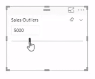
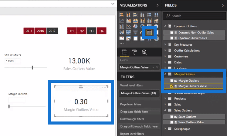
Now, look into the newly created table called Sales Outliers. Drag the Sales Outliers Value to the page and change it to a different visualization.

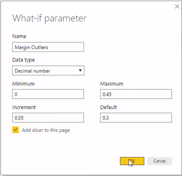
I’m going to create another parameter called Margin Outliers. Change the Data type to Decimal number. The Max is 0.45 or 45%, and the increment will be 0.05 or 5%. Change the Default to 0.3 or 30%.
You can see that the Margin Outliers now appear in the Fields pane on the right-hand side. Again, drag the Margin Outliers Value onto the page and change it to a different visualization.
Before proceeding, let’s first fix the formatting.

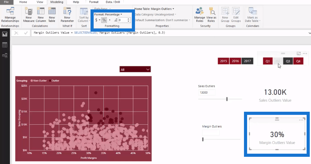
Change the Margin Outliers Value into a Percentage.
Change the Sales Outliers Value into Dollars.
Now, there are two measures. The Sales Outliers Value and the Margin Outliers Value.
Changing the Static Formulas to Dynamic
The next thing to do is to sub in the new values to the correct place inside the formulas.

Now, these variables lay things out in a far more effective way compared to blasting everything into the formula.
For the Dynamic Outlier Sales formula, type in Sales Outliers Value.
Do the same for Margins, and type in Margin Outliers Value.
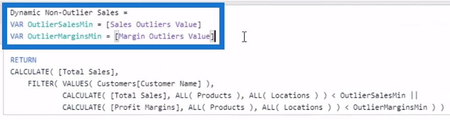
Then, copy this edited part of the formula and sub it in the Dynamic Non-Outlier Sales formula.
Then, push enter. This number is now reevaluating to the slicers.
Making The Chart Display Dynamic Outliers
The last thing to do is to copy the formula of Sales Grouping, select New Measure to create a new formula and paste it there. This new formula is called Dynamic Outliers. Now, replace its content with the new dynamic formulas, Dynamic Outliers Sales and Dynamic Non-Outlier Sales.

Select the chart. Now, instead of Sales Grouping, replace it with Dynamic Outliers.

Now, look at the chart. You can see that it can now be dynamically changed based on what is selected using the slicer.

It’s now easier to know which points are Outliers and which ones are Non-outliers.
You can also change the time frame and trigger points. You can change it over the summer and winter period, or in cases where there might be some downtime with your equipment.
***** Related Links *****
Detecting & Showcasing Outlier Results In Power BI
Showcasing And Understanding Anomalies In Power BI
How To Use The Built-in Analytics For Power BI Scatter Charts
Conclusion
There are so many ways you can use this technique.
I hope this tutorial has cleared up your questions concerning dynamic outliers.
With a bit of practice, you’ll be able to easily utilize these techniques inside your own models and analysis.
Talk to you soon.
Sam


