In this tutorial, I’ll show you the step-by-step development of a consumer goods sales report in Power BI.
Let’s start off with a blank canvas and this data model.
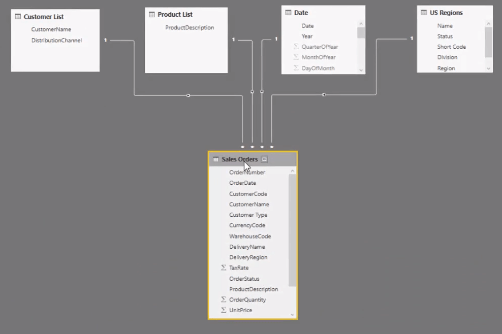
This is a straightforward data model. But in a lot of cases, this is all you need. You don’t need to be complex especially for a simple sales report in Power BI.
When you’re starting out with Power BI, especially with dashboarding, try and make this area as intuitive as possible so that you know what’s happening.
The top of the data model are the Lookup tables. This is my best practice recommendation for setting up data models. Lookup tables are the filters in a report such as Customers, Products, Dates, and Regions.
Then, there’s the Fact table, Sales Orders table at the bottom. This is going to be the table with every transaction and iteration of what you’re trying to analyze. In this case, you’re analyzing sales so that information is going to be in our Sales table.
Creating The Visualizations
In the blank canvas, let’s start with creating a title. I’m going to call this US Sales Summary so that you’ll know that this report is focused on analyzing sales made in the United States.

Building The Measures
The next thing you need to do is calculate simple measures to start analyzing this information in the report.
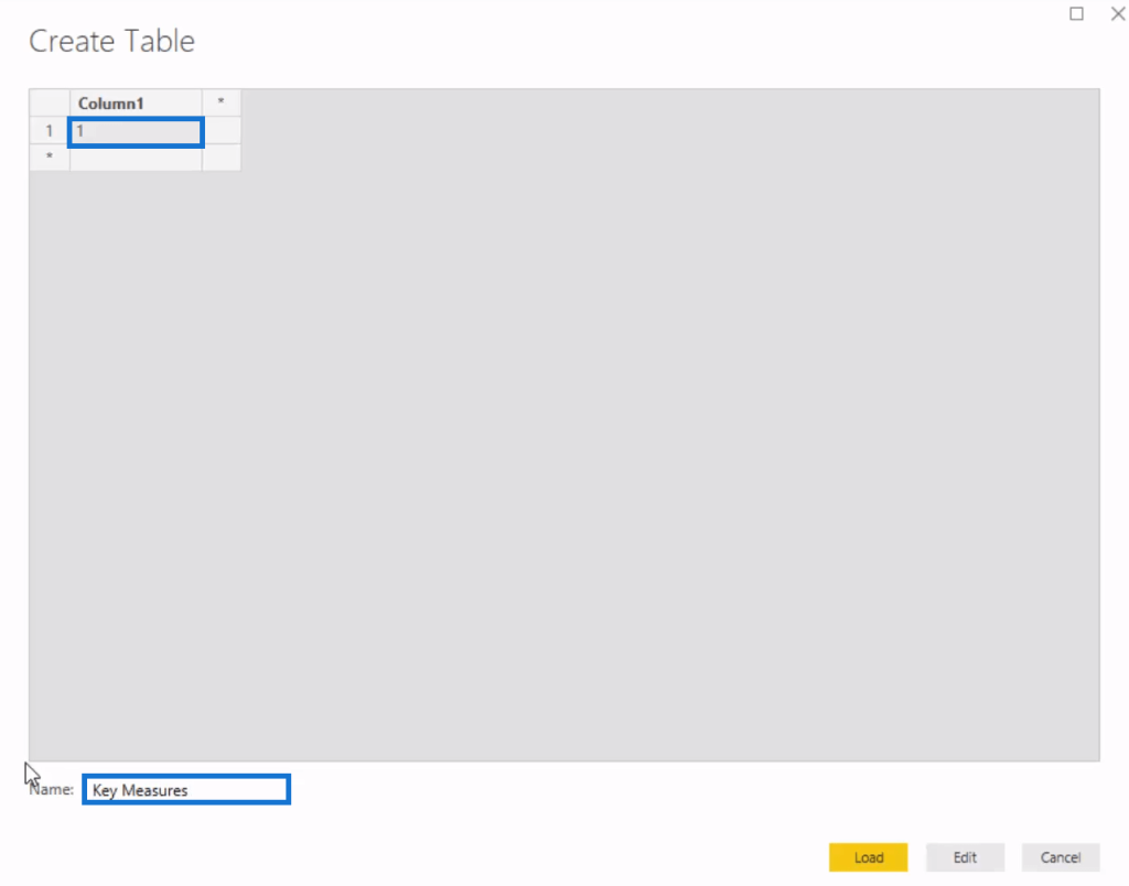
Let’s create a measure table. First, go to Enter Data and then input 1. Call this Key Measures. The best way to organize your models is to become familiar with this step because you’re going to have to do it repeatedly.
Within the Key Measure, I’m going to create the first measure with this formula.

If you recall in the previous chapter, the Line Total holds the Total Revenue for every single transaction. After that, press enter and delete the column. You now have a measure table.
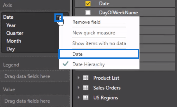
Through this measure, let’s start creating visualizations and making the dashboard. Just drag and drop data into the working space. I dragged Date which has a hierarchy that needs to be removed by clicking the drop-down button and then selecting Date.
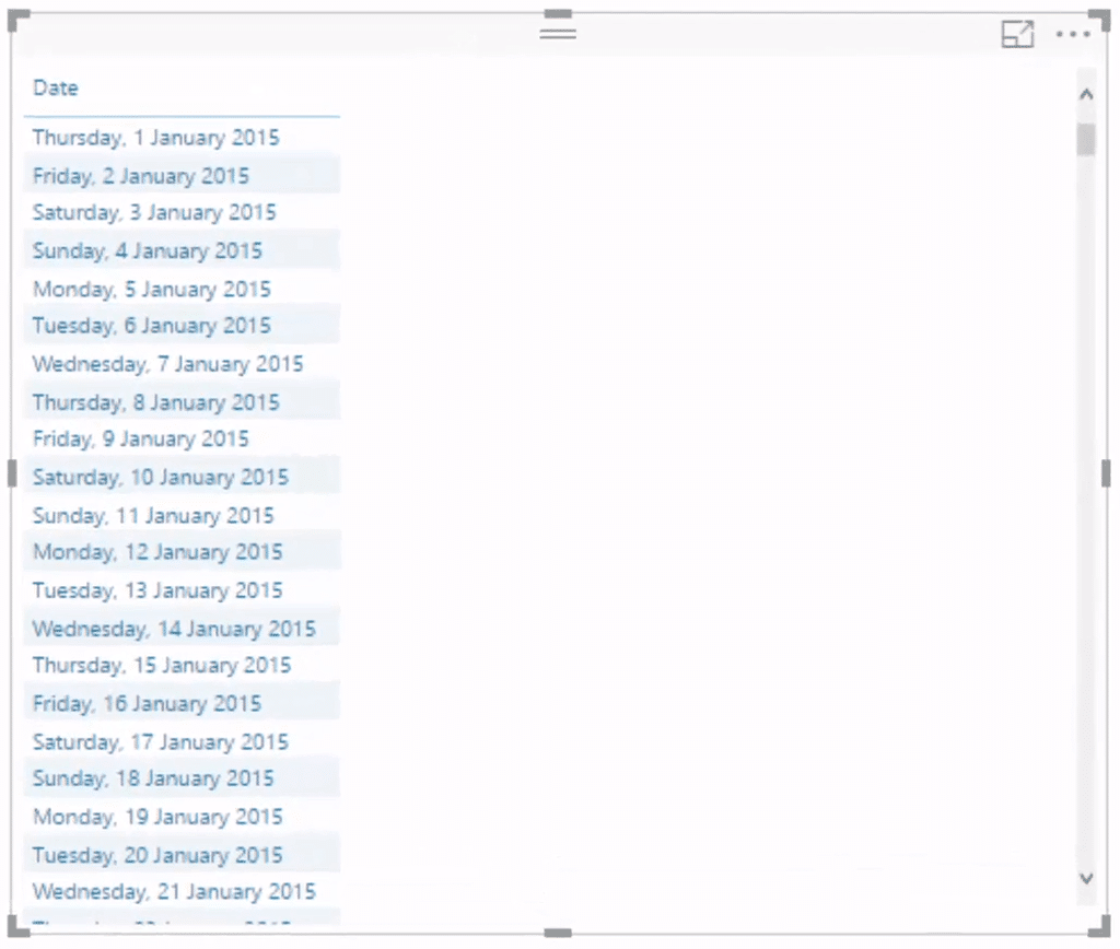
If you turn that to a table, you’ll see that every single date has this format which can be changed by going to the date table and then Modelling.
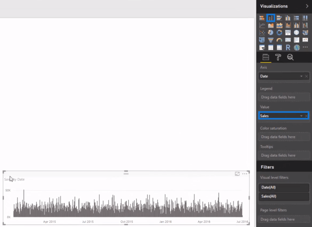
By dragging Sales under the Values tab and turning it into a stick bar, you’ll see its trends over time. You can also see that a lot can be done even with one measure because the data model gives power to the analysis.
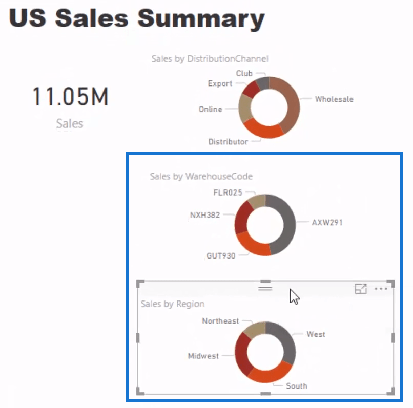
Let’s also analyze the sales number and create a key metric out of that. First, I’ll drag Sales and turn it into a card.

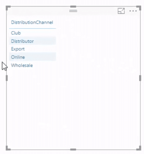
I’ll then analyze the Sales per distribution channel that the organization is selling through. Find it inside the Customer List table and grab it from there. After that, you’ll see all the channels that the customers purchase from.
Making Multiple Charts
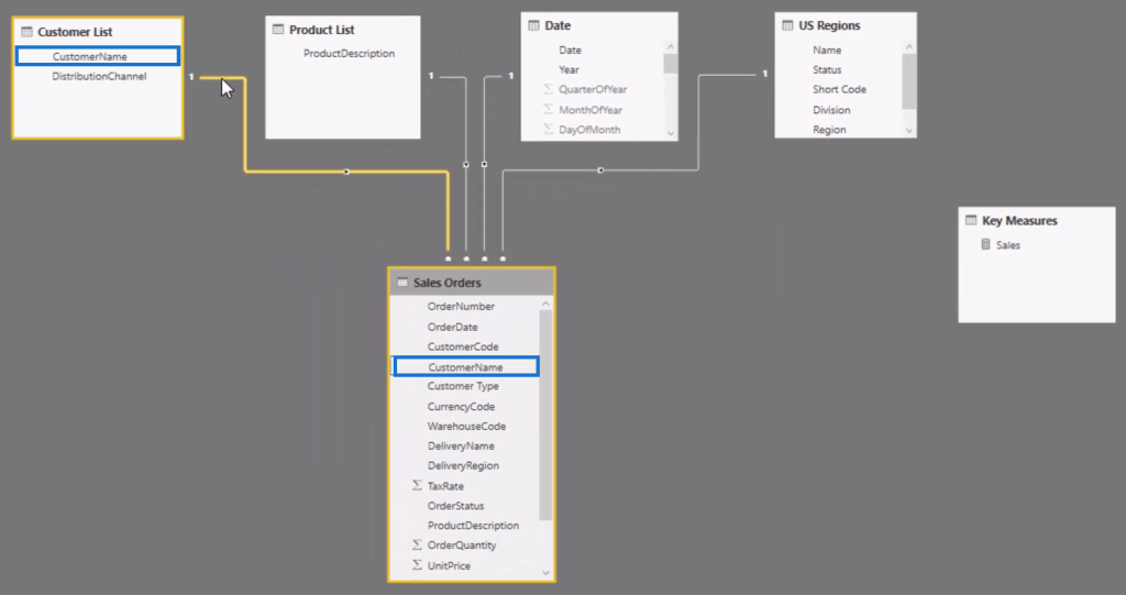
The great thing about the data model is that even though the Customer List dimension is linked up to the Customer Name dimension in the Sales Orders table, you can grab the distribution channel and filter this table as well.
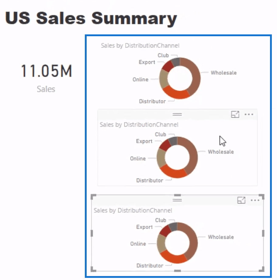
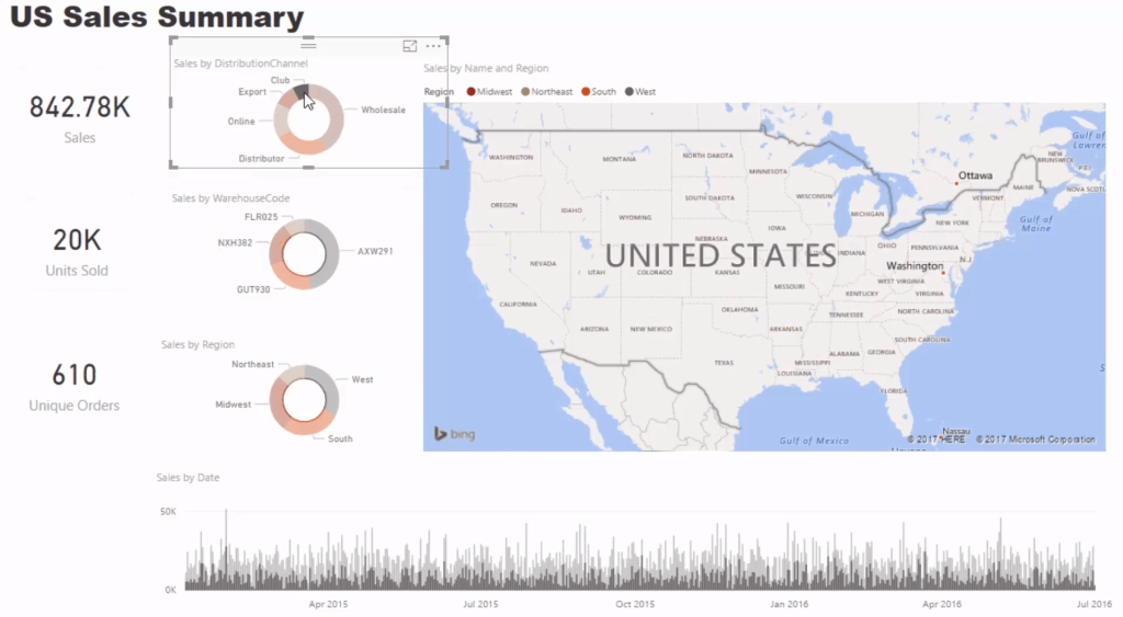
When you bring in and drag the Sales under the Values tab, it can turn into a visualization that allows you to change the sort order. You can also quickly create other insights by copying and pasting the visualization. This hastens the development of your sales report in Power BI especially if you’re doing similar visualizations like the donut charts in this dashboarding example.
Let’s now move onto the other dimensions that need to be analyzed in this report. For instance, let’s add the Warehouse Code and Region by dragging them in the Legend tab to have their own visualizations.
Creating The Map Visualization
Next, create a map using the standard map visualization. However, there isn’t data on the latitude and longitude in the Locations table. If I jump back into my regions table, you can see that all I have is the name to work off.
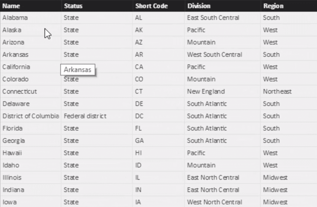
Adding the Name in the Locations tab worked okay in this example but in some cases, it won’t. There may be additional steps that you need to do. You might need to write the full name or secure data on the latitude and longitude.
With the map visualization set up, you can now bring in the Total Sales and break it up by region.
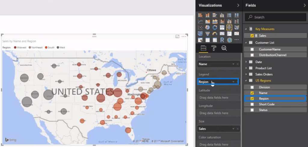
You’re already getting compelling visuals even with just these two types of charts. But let’s continue to add more insights to the report.
Adding Summary Cards
Let’s include three other metrics down the side of the dashboard. To do this, you have to write more formulas.
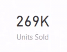
The first one is Total Units Sold so that it’ll be easy to know the quantity being sold in a specific time frame. Create another measure and call it Units Sold. To show this value, get the total of the Order Quantity using the SUM function and turn it into a card visualization.

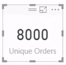
The next measure is Unique Orders. This shows the actual number of orders that went through. It’s an important insight since you might sell two or more items per order. Use the COUNTROWS function for this measure. This DAX function will count the number of rows that are left after every filter has been put in place.

After creating the measure, turn it into a visualization similar to the first one.
If you change the filter sign, you’ll see how all the other visualizations change with the filter.
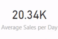
Lastly, let’s put one more measure that calculates the Average Sales per Day. It’ll be using the iterating function, AVERAGEX. Another option is to use the VALUES function then the date. But it’s better to use the iterating function. It’s showing how much is being sold per day on average for the time frame selected.

Adding Functionality To The Report
Now that you’ve generated the insights, it’s time to make this dashboard look compelling.
To add functionality, let’s create the date slicer.
Drag and bring Year in the canvas and turn it into a slicer. Next, go to General and flip it to horizontal to make it fit. Let’s also get rid of the header because it’s unnecessary.
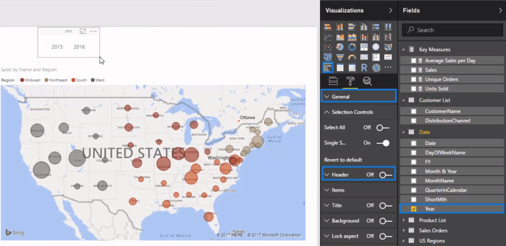
Copy and paste that slicer and change the visualization’s field to Short Month. This allows you to filter by any month now as well.
However, you can only select one month at a time. Change that so you can select multiple months. Each selection will then change what appears in the visualizations.

***** Related Links *****
Creating Compelling Power BI Dashboards With High Quality Insights
Update Your Power BI Dashboard – Power BI Online Service
Power BI Conditional Formatting For Chart Visuals – What’s Possible?
Conclusion
In this tutorial, you learned how to build the visualizations and functionality of this consumer goods sales report in Power BI.
This report is a great start for new Power BI users to learn how to create dashboards because of its simplicity. You didn’t need to implement complex DAX formulas. The techniques used were simple yet effective.
All the best,
Sam


