For today’s blog post, we are continuing our series on creating Power BI report templates. Let’s keep in mind that we are not designing anything in Power BI, but we are using PowerPoint to make our reports look better. You can check out the first part of our series here.
The next part of this tutorial is to see how we can create glassmorphism style in our reports. After this, we will go on to create an actual template for our Power BI report.
Create A Glassmorphism Effect For Your Power BI Report Templates
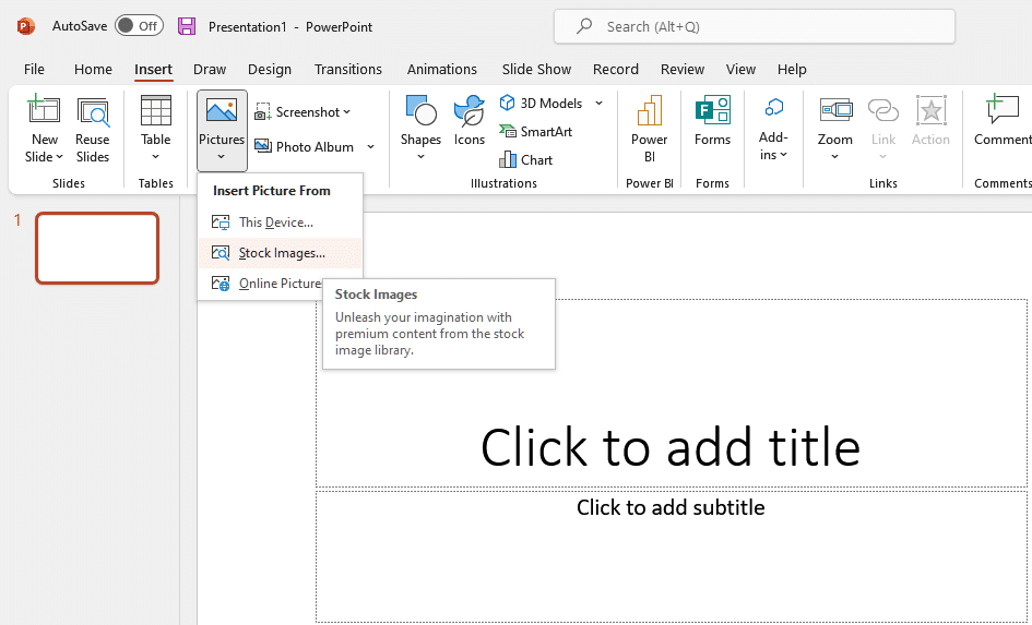
PowerPoint has many good stock images and icons. Just go to Insert tab, go to Pictures, then Stock Images.
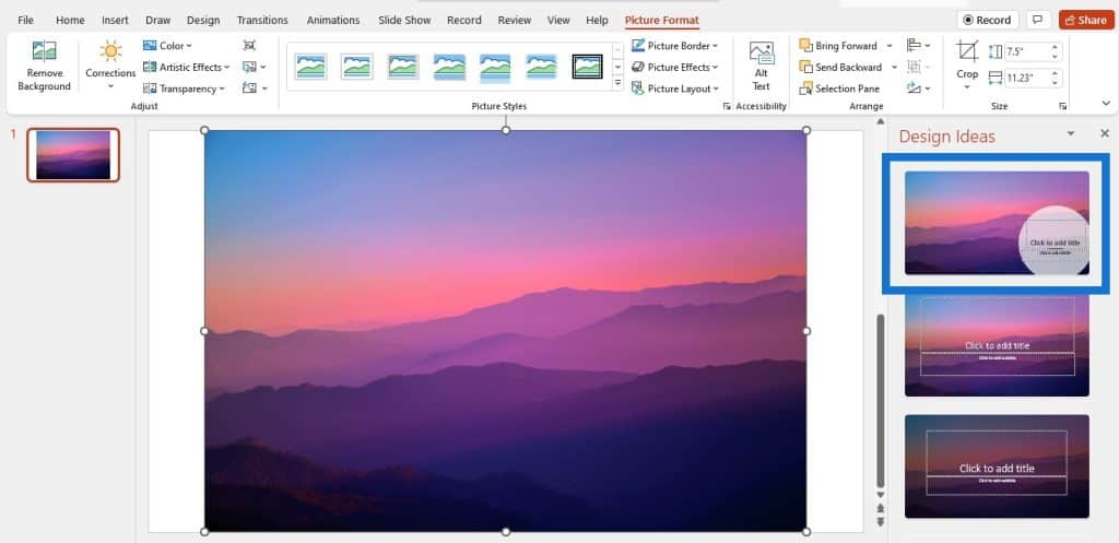
Then scroll down and browse through the images to see what we can use. Once you have chosen one, you can click on the first design idea so that it will take up your whole canvas automatically. Now we have our background image.
Now we will go to Insert Shapes and use the rounded rectangle. We will draw one rounded rectangle like this, then play with the borders and increase or decrease the radius of the borders.

To have a glassmorphism effect, go to Fill, then Gradient fill. Keep only two gradient stops. Bring the dark stop to the right hand side, and the light stop to the left side.
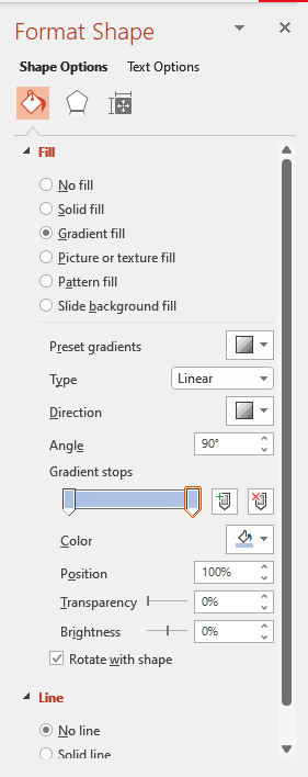
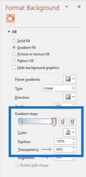
Set the Direction to diagonal from top left to bottom. Then change the Color to white and set the Transparency to 80%.
We can see some glass-like effect on our shape already.

We’ll do the same thing to the second gradient stop. You can play with the colors and transparency until you are happy with the result.
The next step is to set a very subtle line of color. Bring in icons from PowerPoint.
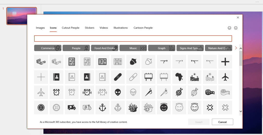
Once we have chosen an icon, we can decrease the size a bit and change the color. We can write some text below the icon and then align it properly so we have the same distance from top, bottom, and middle.

We can build our cards with this glassmorphism effect in our Power BI report. This effect works on any background image, even if the said image has a lot of colors, like our example.
Use Almost Any Background Image For Power BI Report Templates
You can use almost any background image to create a report for your organization. I’ll show you what I used for a real-life company.
We’ll create a new blank slide then use this image. Note that if the image you will use aligns with your corporate theme, then you can actually use it.
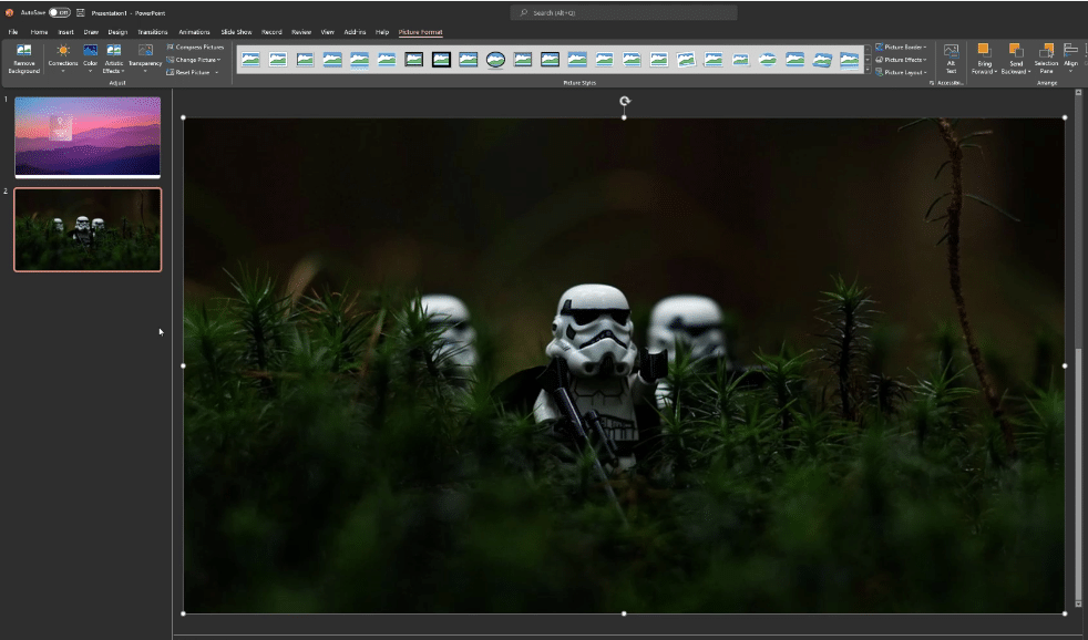
We’ll click on it so it actually takes the whole space of the canvas. We’ll duplicate this image using Control + D, then align the image with the previous one.
We want to have a rounded shape for this one, so click on Crop, then Crop to Shape, then choose rounded rectangle.
Click on Crop again and resize it so there are equal distances from all sides.
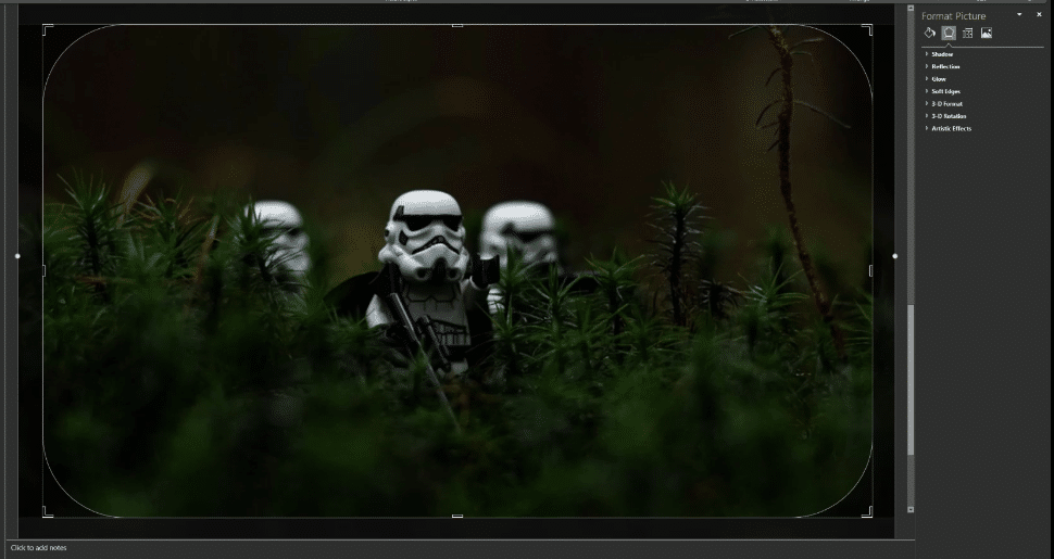
To have a glass-like effect on a picture, go to Picture Format, click on Artistic Effects, and choose Blur. Now that we have blurred this item, we can resize it again and play with the border radius. These aliens are now 20% hidden, but we want to hide them even more.
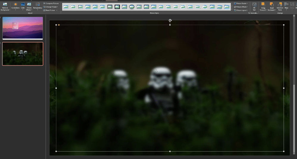
We can increase the radius to whatever looks good for you. This one is fine, but the problem is we cannot see the glass effect clearly.
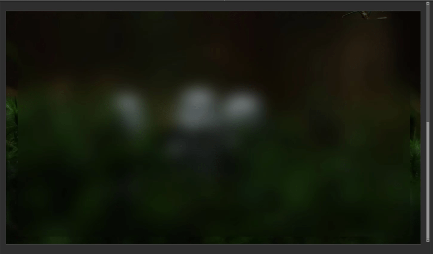
We can go to Insert Shapes and create one rectangle, give it a black color and no line, set the transparency, then send it to back. This will make the glassmorphism object to pop up even more.
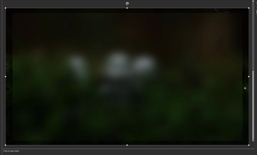
Create A Navigation Pane Inside PowerPoint
Now that our report background is ready for use, the next thing to do is to design a navigation pane inside PowerPoint.
So for the purpose of this report, we will create a navigation in center. This is great technique if your report does not have real estate in the left and right.
We’ll go to Insert Shapes again, then choose Rounded Shapes.
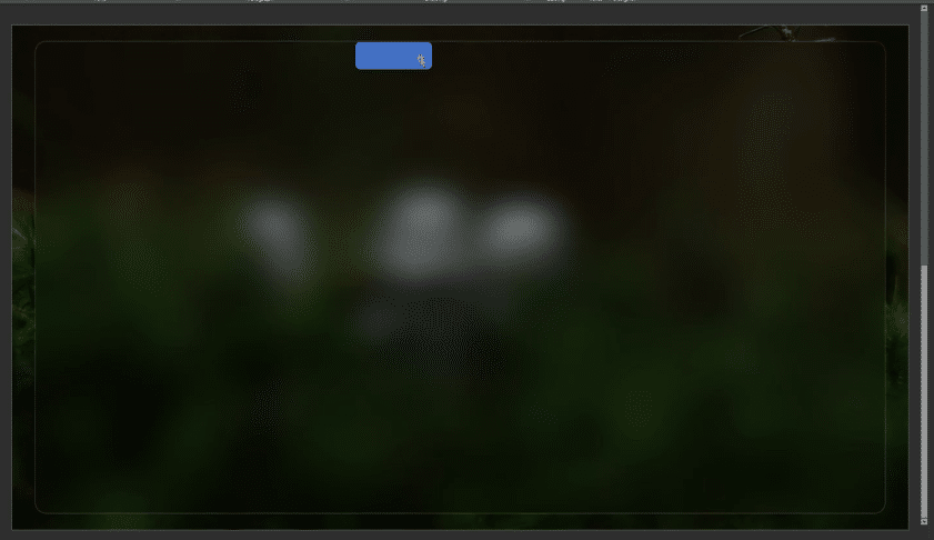
The problem is it doesn’t fit properly with the above line, right?
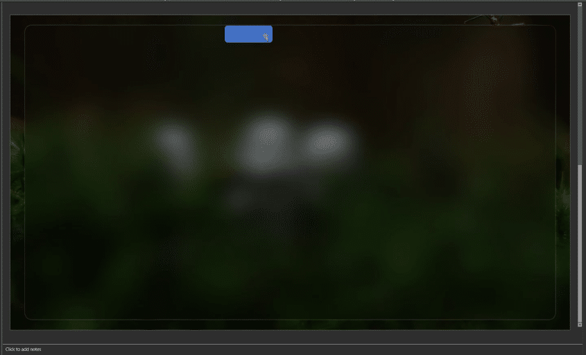
So we have go to Insert Shapes and choose a Rectangle. Then go to Shape Format, Manage Shapes, then Subtract.
Now it sits perfectly on top of our frame.
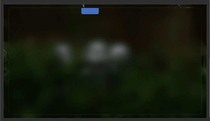
We can insert a text box, which will serve as our homepage. We can also change the size and the color if you want.
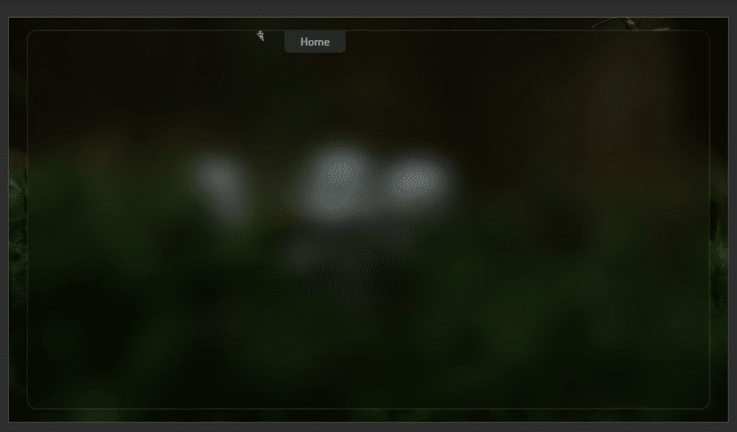
Now that we have the Home button, we can also have other options for navigations. If you are using this type of navigation at the center of the report page, don’t go for more than three.
We will copy this text box, then change the name from Home to Insights.
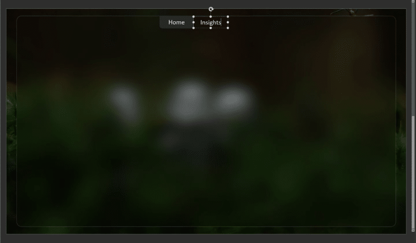
Then we will change the text color to some dark color just so we’ll know which activity screen we’re on.
Naming The Title Of The Report
Now we can copy the Home button and paste it on the left side just below our home navigation icon, and then name this as our Sales Analysis Summary. We can increase the size, align it to the left, make it bold, and then tone down the color a bit.
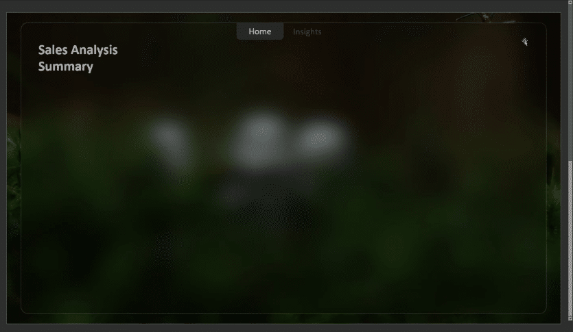
Next is to bring in our menu icon in here too. We want to bring in as much objects as we want inside PowerPoint rather than in Power BI. So click on Icons, type Menu in the search box, and choose the Hamburger menu icon.
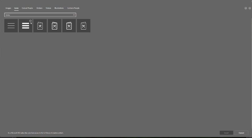
Place the menu icon on the right side, then resize and change the color. We’ll make sure it has the same color and same alignment as our title.
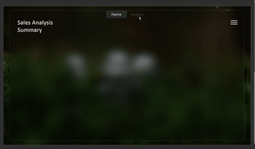
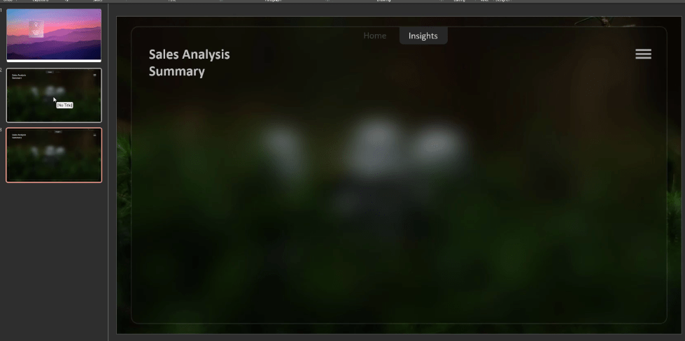
The next step is to create a separate page for Insights. Let’s duplicate the previous slide and then change the text Insights to white.
The next step is to create some grids or containers where we can place our visuals. Go to Insert Shapes, select a rounded rectangle, choose white, then set the transparency.
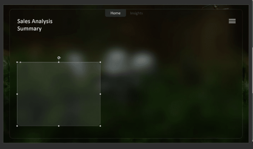
We are not exporting the containers with this page; we are exporting it as a separate object. So let’s insert a new blank slide, then paste the grid there.
We will export the Home page and save it as a PNG file, then do the same thing for the Insights page.
At this point, we are now done with PowerPoint so we can move on to Power BI. Let’s open the Power BI report we have been working on.
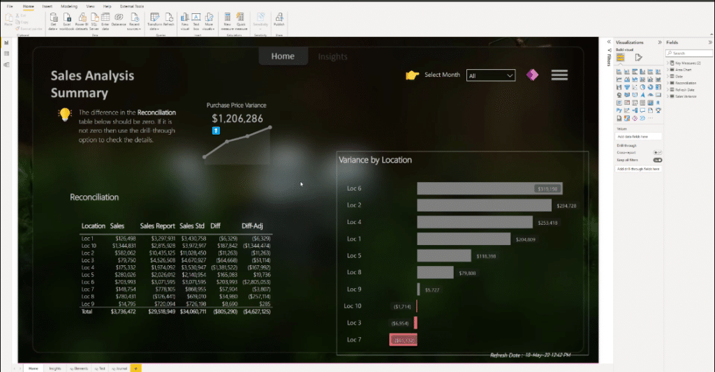
Now let’s bring in the shape that we designed for these visuals.
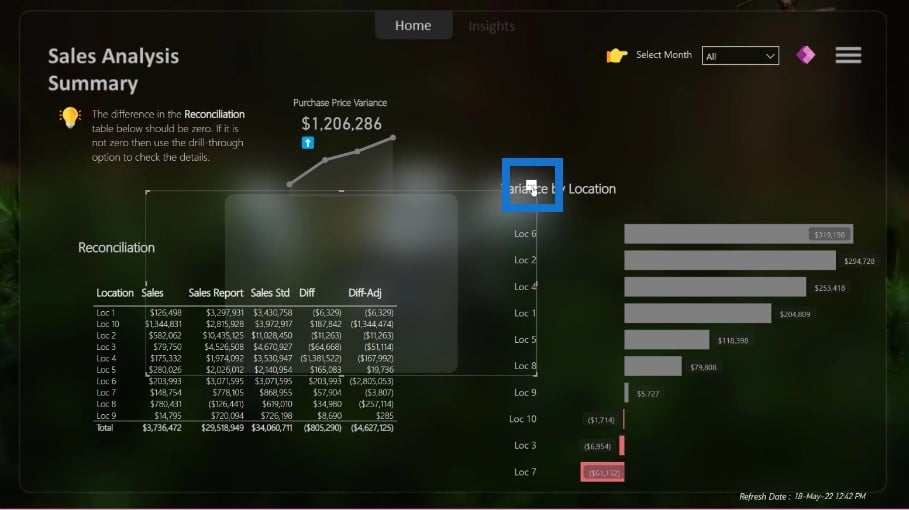
We really don’t want this ellipses, so we’ll go to General settings to turn it off. Then go to Properties, then Style, then choose Fit. We’ll place our bar chart on the left hand side and align this visual perfectly with our heading.
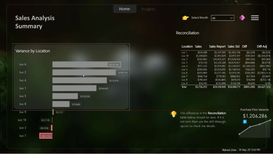
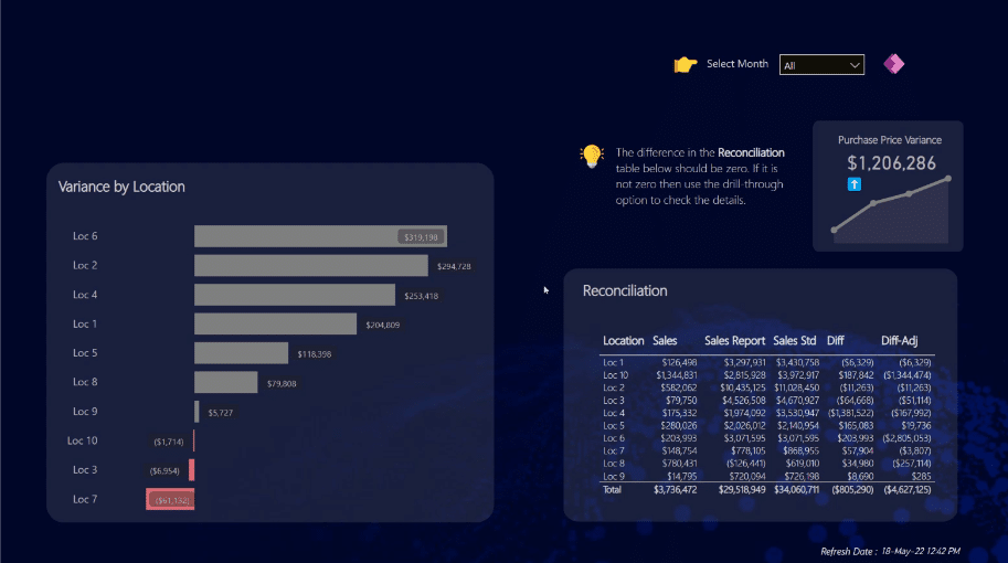
As you can see in this dashboard, we don’t have many visualizations on this page. Look at how easily we have arranged our visuals in a container-like format.
Don’t put a lot of visuals in your dashboards, reports, or SQL database.
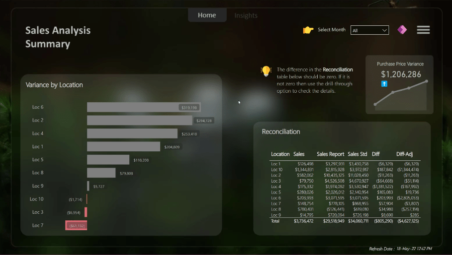
Earlier, I told you that you can create good-looking Power BI reports with any background image. And I really mean it. Let’s copy this report page. Instead of the alien background, this time around we’re going to use the Enterprise DNA background.
Because of the glass-like effect of these containers, we don’t have to change any colors on these visuals. You can see how easily you can reuse this template over and over again, even with different colors.
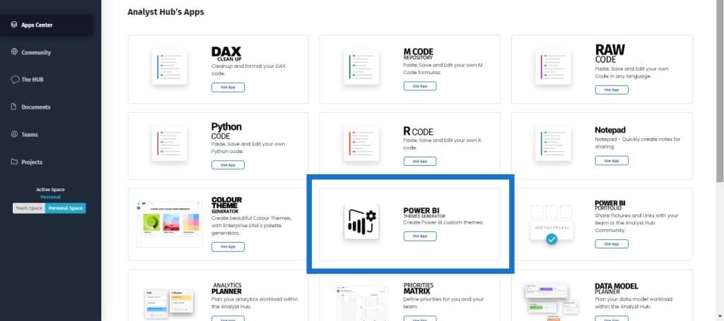
But if you want to change the theme of your visualizations, the best way is to go to the Analyst Hub and find the Power BI Themes Generator. This is what I always use for my reports.
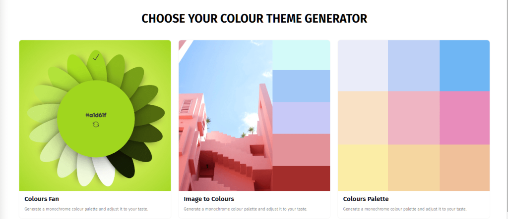
If you want colors for your background, you can use the Colour Theme Generator, then click on Image to Colours, then upload your image.
There are a lot of apps in the Analyst Hub that can speed up your report development. There’s a repository of DAX measures where you can reuse the many templates from the people who have participated in our Power BI Challenges. We also have a Planner where you can collaborate with your team and plan your analysis on the Analyst Hub.
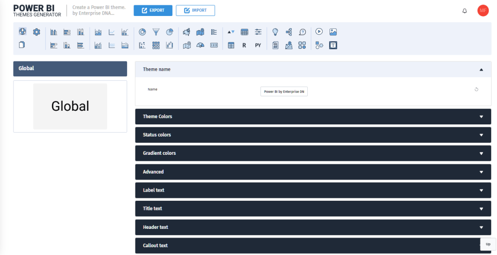
Once you have colors, you can go to the Power BI Theme Generator and either start from scratch or import your theme, edit it, and then export it to Power BI. It’s easy to use, interactive, and intuitive.
The same properties and fields that are shown in a Power BI report are also shown here, so you don’t have any confusion at all.
***** Related Links *****
Power BI Design – Best Practice Tips For Dashboards
Power BI Report Examples And Best Practices
Small Multiples Chart In Power BI: An Overview
Conclusion
PowerPoint has proven to be an invaluable tool that you can use to create Power BI report templates and make good-looking reports for your organization. The Analyst Hub is also another indispensable tool for you to leverage when making reports.
Mudassir


