
For this series, I will walk you through on how you can create a beautiful data visualization report template with the help of PowerPoint. The process I will discuss here will speed up your own Power BI development.
Let’s be honest. Many people struggle with creating templates for their Power BI reports inside their organization. We are not designers, but Power BI requires you to have some skills in designing.

I will be showing you basic tips and tricks on how you can use PowerPoint in your Power BI reports. You don’t have to have advanced skills to create beautiful reports for your organizations.
Let’s look at the points that we will be discussing in today’s post and in my succeeding posts as well:
- apply artistic effects to different images
- create Glassmorphism style effects
- use almost any background image to create beautiful templates
- build a minimalistic report in Power BI
- explore the best custom theme generators to speed up Power BI development.
Starting With A Blank Canvas
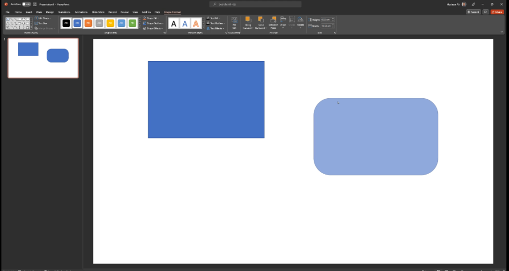
Let’s open PowerPoint and start with a blank canvas. First of all, I am going to show you two very important shapes in PowerPoints: rectangle and rounded rectangle. If you are using rectangle, you cannot change the borders of this rectangle shape.
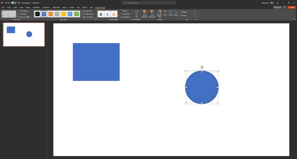
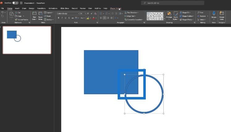
For our first example, we can make our cards in Power BI. Let’s first select the oval shape to draw a circle. To copy the circle, click Control + D to duplicate the circle. Then place it on top of our previous circle.
We want to cut this inner circle and take it out from our outer circle. To do this, we can click on the inner circle, then outer circle. Then go to Merge Shapes, where we can see options like Combine, Fragment, and Intersect.
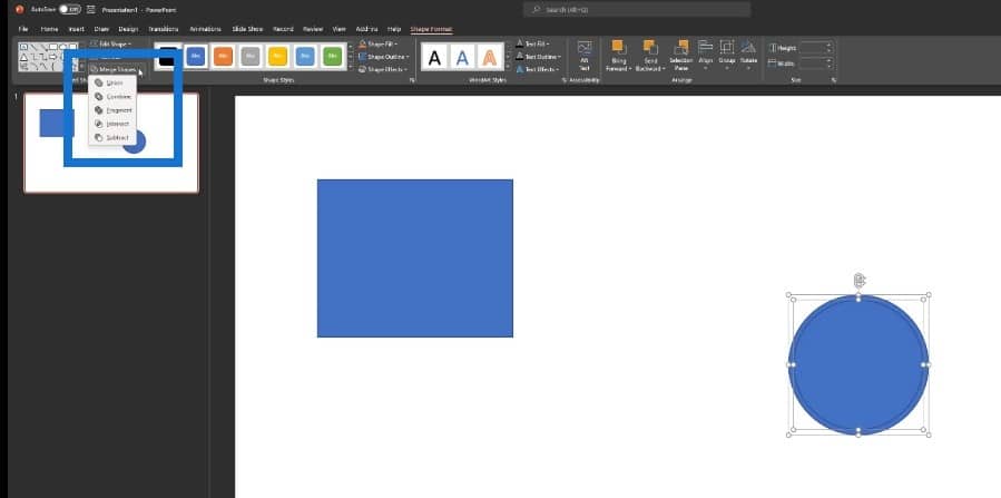
When we click on Fragment, it will break the shape down in two: one inner circle and one outer circle. We’ll click on the inner circle, take it out, then delete it.

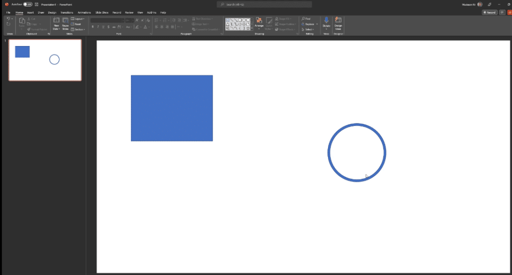
The next step is to remove this particular line in the circle.
We want to delete the circle outside of this square or rectangle. We’ll go to Insert Shapes, then bring one rectangle like this.
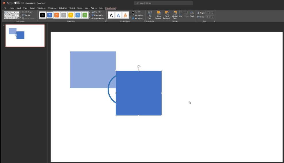
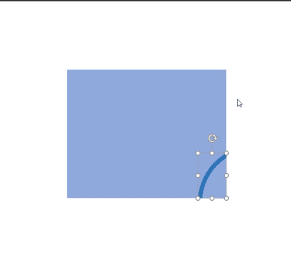
We can hide the other parts of the circle by clicking on Shape Format, Merge Shapes, then Subtract. We will subtract the other parts as well until we achieve this design. We’ll also decrease the transparency of this circle so that it looks like it is embedded into this square shape.
Just a quick note that this doesn’t have to be a circle. It is totally up to you what type of design you want.
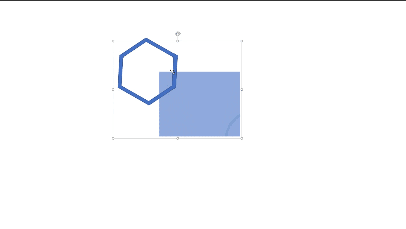
We can bring in another shape, like hexagon, and do the exact same thing we did with the previous shape of circle. We’ll duplicate this one with Control + D, then place the duplicate on top, then reduce the size. We’ll click on Shape Format, Merge Shapes, then Combine.

Let’s rotate the pentagon shape then place it on top of our card. Then we’ll click on Control + G to group all these items.
Now we have a design on our card.

It’s really up to you what type of design you want to have on your card. The purpose of this was to show you how you can play with different types of shapes in PowerPoint.
Creating A Navigation Pane For A Data Visualization Report Template
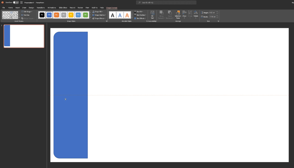
There are many built-in default shapes in PowerPoint which you can use to create a template in minutes. Let’s go to Insert Shapes, then click on top corner rounded. We can draw this shape in the canvas and rotate it.
We now have a navigation pane ready.
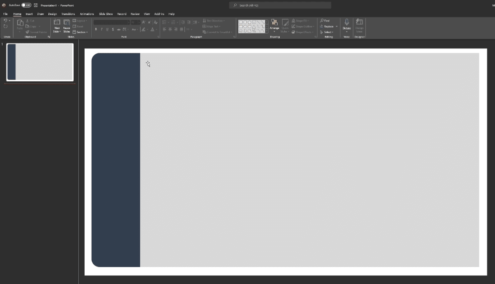
Creating The Main Visualization Area
For our report page, we can click Insert Shapes and choose rectangle. Then draw the rectangle in the canvas, place it beside the navigation pane, and make sure it is aligned properly.
Now the main area for our visualization is ready.
But if we want to have a rounded shape for the main area, we can do that too. Just click on Insert Shapes, select Rounded Rectangle, then click Send to Back.

Now we have the same border pattern in our shapes. We can select both with Control + G, export this picture and bring it into Power BI, then we’re ready to go and use this in our report.
Creating The Buttons For A Data Visualization Report Template
Another example is the diagonal corner rounded rectangle, which we can use as a button in our Power BI report. We can use gradient fill to create good looking buttons. There are multiple options to choose from: linear, radial, and rectangular. We’re using the linear option for this one.

We also have to choose which gradient stop to use. Most of the time, we use 2-3 stops. We can also change the color of the gradient.

Now we have this beautiful looking button for our Power BI report. You can play around with this and come up with whatever feels good for you, then import this object in Power BI.
***** Related Links *****
Power BI Design – Best Practice Tips For Dashboards
Power BI Report Examples And Best Practices
Power BI Background Image For Reports Using PPT
Conclusion
Using PowerPoint’s features to design your data visualization report template is a quick and easy way to standardize, simplify, and speed up your report development.
Tune in for part two of this series where I show you how to use PowerPoint to create Power BI report templates.
Mudassir


