In this particular example, I’m going to show you how you can discover profit insights quickly with Power BI. You may watch the full video of this tutorial at the bottom of this blog.
Profits are key for any business, right? You want to understand how your profits are being derived, where they’re coming from, and why you’re getting the results that you are.
With Power BI, using intuitive techniques, we can extract a lot of information.
What it comes down to is that you need to utilize the data model really effectively.
First of all, you have to build your data model effectively, but then you also have to create the correct relationships and overlay on top of that the correct DAX measures.
I’m going to show you how you can do all of that. If you can implement those techniques, you’ll be able to discover some really great insights and be able to dynamically drill into your information very fast.
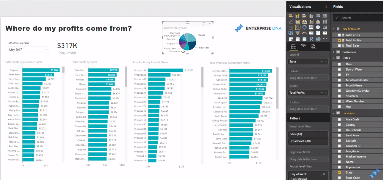
If you are using Excel, it could take you ages, creating formulas and using a lot of columns, to come up with insights like this for your financial report.
With Power BI, on the other hand, it will only take you 5 minutes to do so with the use of your data model and DAX formulas.
Power BI Data Model and Tables
You can start at a summary layer, but then also investigate at a much more granular level of detail as well.
Setting it all up does not take much time if you understand all these different areas and features of Power BI.
In this example, we have a simple data model with a range of different dimensions. We have our customers, salespeople, products, locations, and dates. Nothing complex.
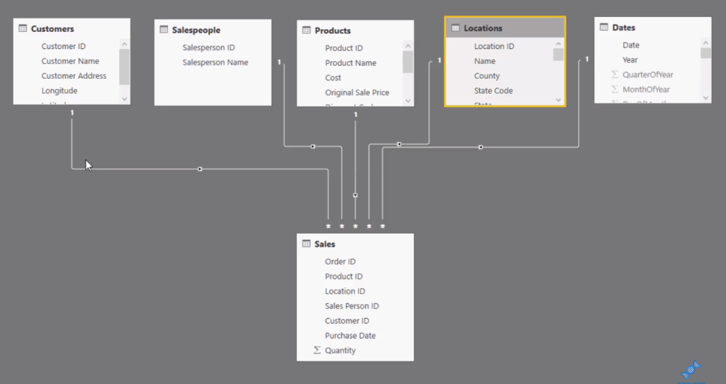
All of our information of the sales is in the Sales table, so we’ll just jump quickly to it.
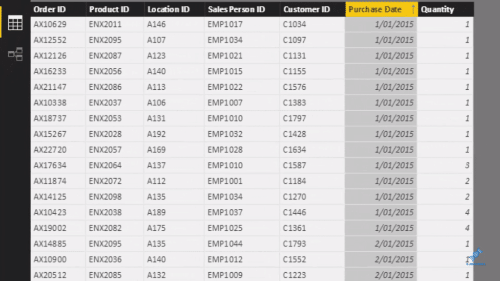
We can see here that on every single day, we sold a product with a location associated with it, sales person who sold it, the purchase date, a customer who bought it, and the quantity they sold.
What’s amazing about Power BI is how little information you need in your fact table to be able to achieve such good insights.
There’s no pricing and revenue information here, but we’re going to create them all dynamically inside of DAX formulas.
Now that information does exist; it just doesn’t exist in the fact table. This table is only 7 columns long, but all the other information actually hangs out in our Lookup table.
In our Products table, we have the Sales Price, the Current Price, the Original Sales Price, and the Costs.
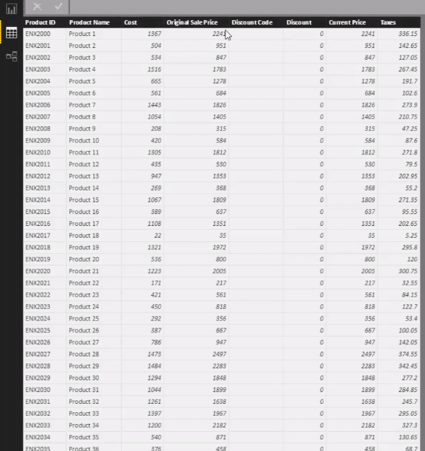
So in that sense, we can just go and grab our profit information just like that.
Creating The Formulas
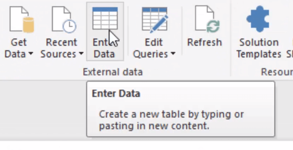
The first thing we do is create a measure table. To do this, we go Enter Data.
We put a placeholder here and let’s call this Key Measures. once we click load or enter, it’s going to create a table that’s going to come up here at the right side.
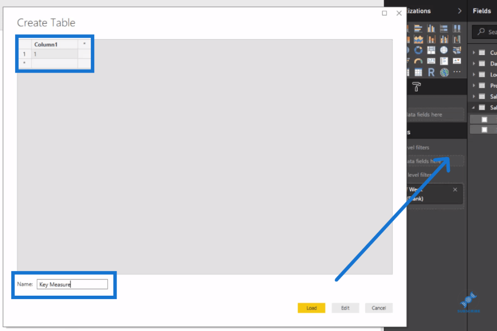
It’s also going to sit in our model, but we’ll just leave it there because it has no connection to anything.
Now, we create our first measure. We click on our Key Measures table, then go New Measure and we can then write our formula.
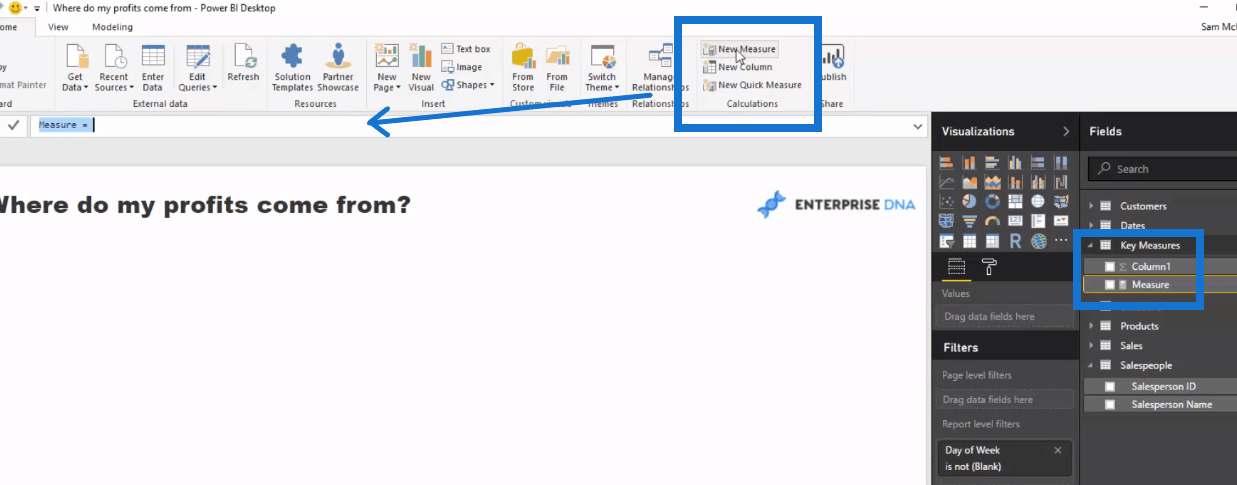
Let’s call this measure, Total Sales and we weill use SUMX here. We say, go to the Sales table and for every single row of the Sales table, we go Quantity times by the Related.
Related can reach back up to our Lookup table (Products table) by the related Current Price. And now we got our Total Sales.

Next, we’ll create our Total Cost. We simply copy and paste to New Measure and just change some portions of the formula.
We replace Sales to Costs, and instead of Current Price, we change it to Cost.

Once we got Total Sales and Total Costs, we can then have our Total Profits.
Again, we go click New Measure and simply have Total Sales minus Total Costs for our Total Profits. You see how quickly you can create this.

In just about a few minutes, we have our Total Profits. See how quickly we can get all the insights of understanding where our profits come from with the use of our data model.
More Profit Insights
Now let’s have a look at our customers. We may ask, which customers are generating most of our profits?
We can look at our customer performance here. We can rank it or sort it.
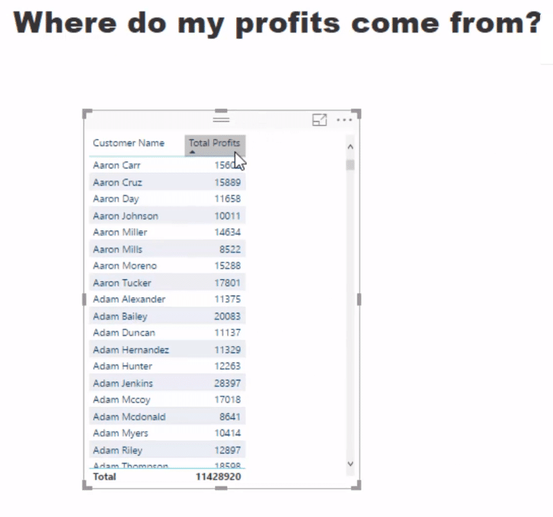
And say we want to change this to Locations. We just copy and paste this and bring in the Name of the location that we’re selling to.
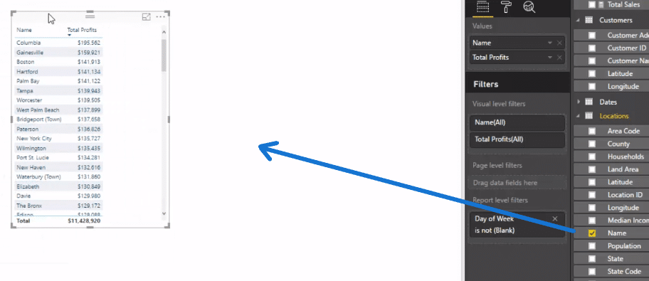
We can also check out what Products are generating most of our profits. We got Salespeople as well, so we could also bring it in.
Now we have the key dimensions from all of our Lookup tables. Then we’ll change all of these tables into visualizations.
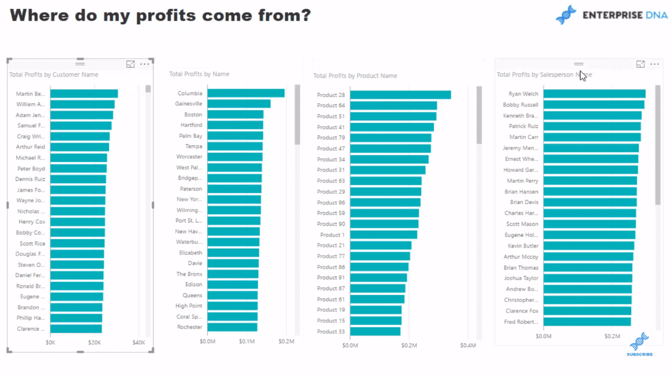
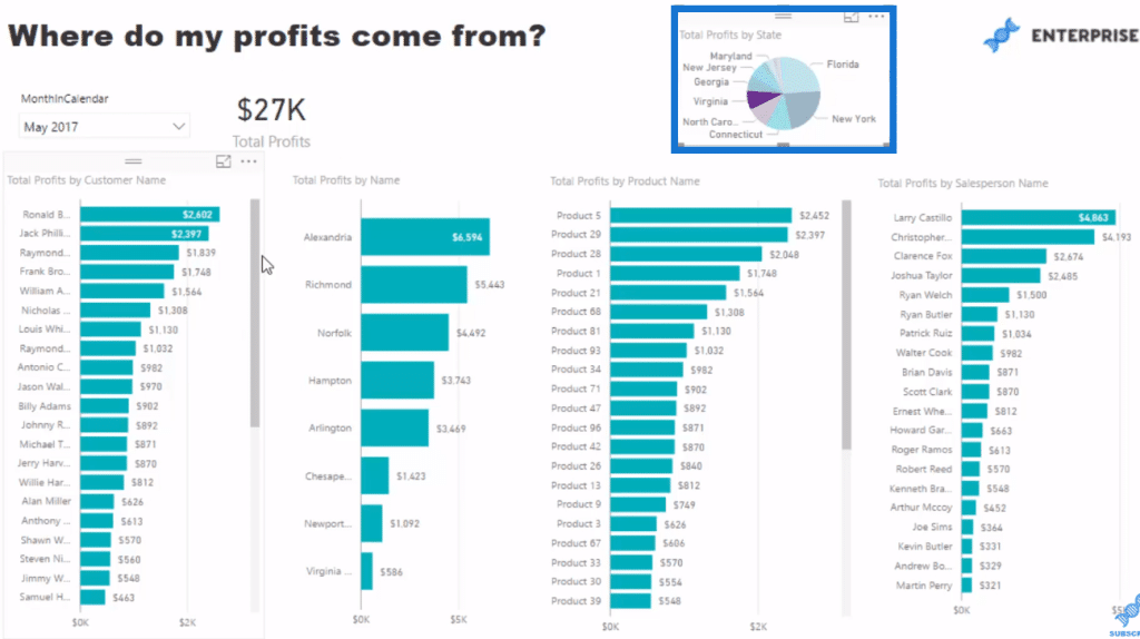
In less than 5 minutes, we can view our profits by customer, location, product, and salesperson.
Another cool thing we can do is look at the results by the Month and Year. So we drag that in and turn it into a slicer, into a drop down.
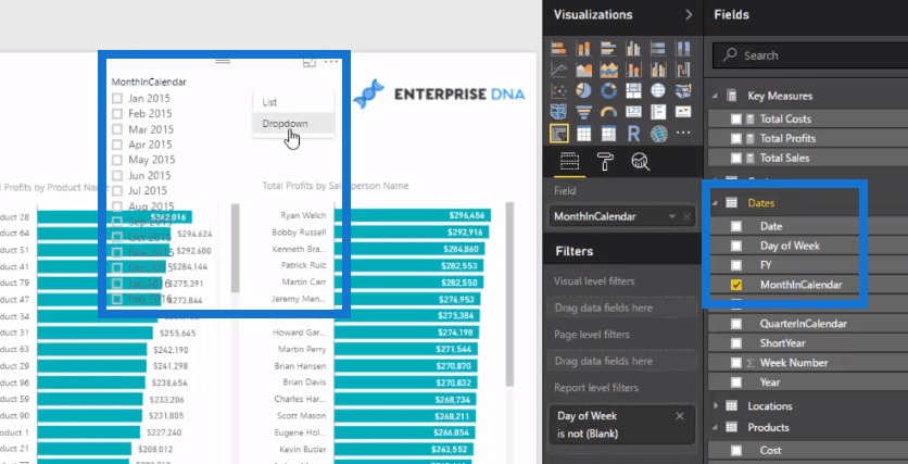
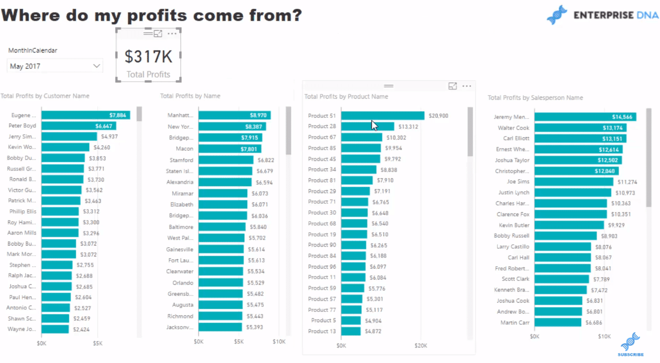
Not only we can see profits through time, we can also view profits through a specific time frame. For instance, we want to look at May 2017 and we probably want to compare it with our Total.
So here in May 2017, we made 317 thousand dollars and we can very quickly see here that these top 10 customers equated to around 20% of our profits.
With the power of the data model, we can take this further quickly. Say for instance, we want to jump into our States and see our profits by state.
We could then create a visualization, perhaps a pie chart like so, and sort this by profits.
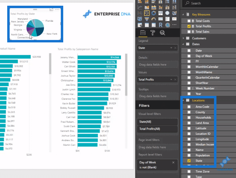
This will enable us to see where our profits are coming from, say in New York for May 2017. It also changes dynamically per selections, for example, Virginia.
Conclusion
The main thing I want to highlight here is how quickly you can get to these insights by utilising the data model and some DAX formulas in Power BI.
There’s so much that you can do here. This is just a preliminary example.
In less than 5 minutes, you can see all these information.
Back to my Excel days, it took me to create so many formulas and data to actually get to this point. It was an absolute nightmare!
If you can replicate insights like this yourself inside of Power BI, you’re well on your way to developing really compelling reports.
If you’re looking to learn how to develop a variety of Power BI reports, end to end, then check out the Dashboarding & Data Visualization Intensive course at Enterprise DNA Online.
In this one course, there are over 7 hours of videos covering 8 different data scenarios end to end. This is a one-of-a-kind course for those really looking to take their Power BI skills to the next level.
All the best implementing all the techniques I run through in this tutorial.
Sam
***** Related Links *****
Calculating Percent Profit Margins Using DAX In Power BI
Calculating How Much Profit We May Be Losing Out On – Power BI Analytics
Predict Future Profitability within Power BI DAX Functions
***** Related Course Modules *****
Business Analytics Series
Mastering DAX Calculations
Financial Reporting w/Power BI
***** Related Support Forums *****
Customer ABC Analysis
Formatting Issue When Combining Dynamic Grouping
Understanding DAX Formula
For more financial report queries to review see here…..


