In this tutorial, we are going to dive into how to utilize ranking techniques effectively in Power BI. You may watch the full video of this tutorial at the bottom of this blog.
Sometimes you don’t want to show all the results from your data in your visualization. Sometimes you only want to see the top or the bottom results, for example the top five or the bottom seven.
To be able to do this in Power BI, you need to utilize the RANKX function and use it in a certain pattern, so that in a dynamic way your results will always only show exactly what you want from a top or bottom ranking perspective.
We’re going to dive into some ranking techniques and how you can, in a real-world situation, utilize these techniques to create some effective dynamic visuals within a compelling dashboard.
I’ve done lots of tutorials and techniques in and around budgeting. But the strength of Power BI comes from the combination of different methods.
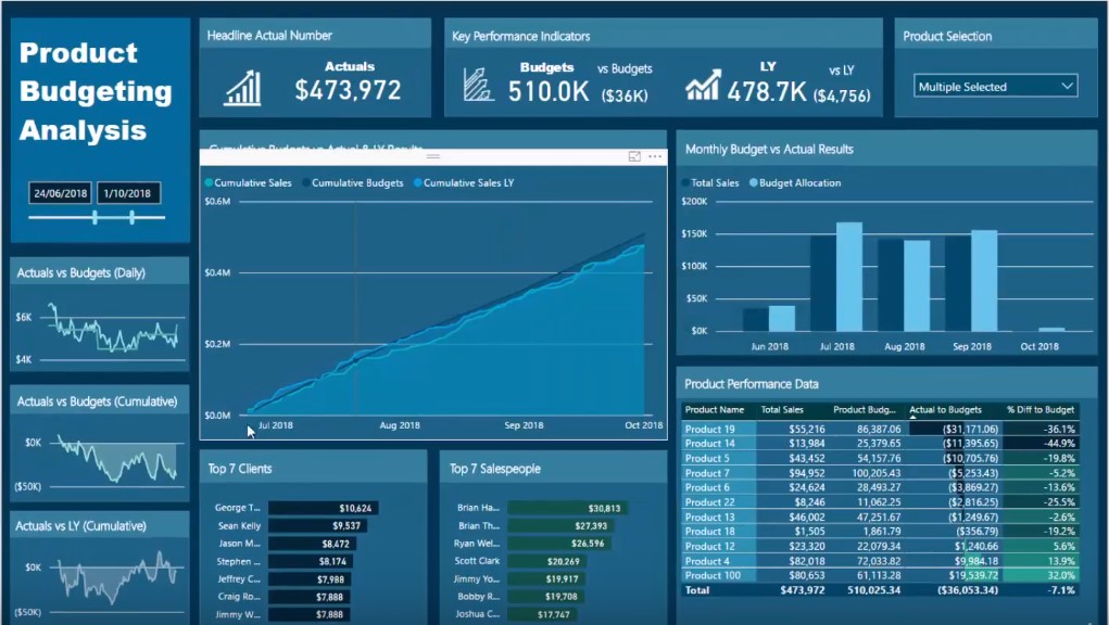
And so, what I’ve demonstrated here is a Product Budgeting Analysis where I’ve utilized ranking techniques within the budgeting dashboard to isolate top or bottom elements.

Showing the Top End Of The Client Base
For this example, I’ve really simplified the formula.
I’m going to show you exactly how I wrote it. But first, you’ll see that you can create the formula and use it across many different elements or dimensions. It’s basically reusable.
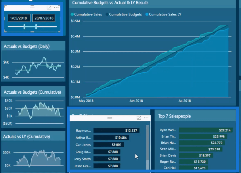
But looking here, you can see that I’ve got the top clients. Depending on whatever context, time frame, or product, I can even select what can appear in the dashboard as well.

This is automatically going to filter the top seven clients and salespeople.
This will always dynamically change and only shows the top seven.

So, it’s a really effective thing to do. For instance, if we just change the time frame here, you’ll see that it actually changes the results.

It may change all the results in the report but it still effectively shows the top clients or sales people.
It also adds a bit more color to the other insights you’re showing in your report.
Divergence Within Budgets
We’ll adjust the time frame and select a few products.

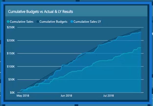
So, I’ve selected the grouping of the products. Within that grouping selection, we see some divergence and then find out why this divergence is happening.

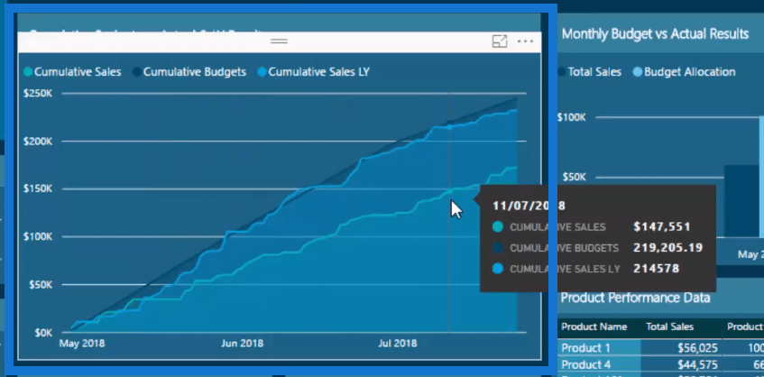
This particular chart is showing performance versus budget. You can see that there’s the cumulative budget, and the current and last year’s sales performance.
There’s a big divergence. However, we can further narrow that down and isolate it so we’ll know why it’s occurring; this will provide a really good insight.

But there is a way to improve this. We could get insights on the differences between what we made from a particular person last year and the years before that.
We can go into it further, but utilizing ranking techniques in Power BI will enable us to create dynamic visuals which can show a certain top or bottom end of our client base.
Here’s how to do it. I jumped over to my model and showed the customers table first.

Now, I’ve got a ranking branch of measures here and I’m going to bring it to the table which will give me the top seven customers and their corresponding sales and it’ll be called the Top 7 Customers By Sales.

Now, you’ll see the difference if I bring in Total Sales to the table.

We see Total Sales is actually bringing up every single iteration and result. But the Top 7 Customers By Sales is only going to bring up the top 7, which is exactly what I want to show in the table.
Using The RANKX And IF Formula
Now, let’s have a look at the formula.
If we look at it, it’s not that hard. It’s relatively straightforward. Especially when you use variables, it really simplifies the formula that you put into your models. We’re just utilizing RANKX and then we’re wrapping that inside an IF statement.

So, for every single customer, we’re ranking them by sales. And if we’re in the customer context, what we need to do is get rid of that context so that we can evaluate every single customer. If we do not put the formula ALL, it would give everyone the same ranking.
Within a customer context, we need to forget about any filters on context and look at all the customers and then evaluate their ranking by this particular measure. In this case, we’ve used sales, and arranged sales in a descending order. So, we’re going from the highest to the lowest.
By doing that, we wrap this particular variable that we have created inside the IF logic.
So, if the customer rank is less than or equal to, as in this case, seven, it will return either their Total Sales or blank.
That’s the pattern of how you do it.
Showing The Bottom End Of The Client Base
We can create another measure that can look at our bottom seven clients.
So in this case, if we jump back to the model and you wanted to look at other forms on the sales performance, you would see why there was a divergence.

You would know that it could be because the top clients have done well. But another reason could be because some clients are really dragging us down so, we’d want to look at the bottom clients instead.
That’s where this technique can really come in handy. And it can really extract some effective insights from your data.
Now what I’ve done for the salesperson example is exactly the same and that’s why this technique is really great.
In this case, using the salesperson context, what I have to do is get rid of that context by removing any filters by utilizing ALL. Then we evaluate what the ranking is on Total Sales for all salespeople and put it inside the IF logic.

That’s how we get the dynamic visual for the salespeople.
***** Related Links *****
Advanced DAX For Power BI: Implementing Ranking Logic Across Unique Insights
Extracting Unique Insights In Power BI Using Ranking DAX Measures
Group Customers Dynamically By Their Ranking With RANKX In Power BI
Conclusion
Ranking techniques are really effective in bringing additional insights to your reports in Power BI.
You need to spend some time thinking deeply about how this might apply to your own data and reports.
The technique will be similar but there might be some small adjustments that you need to make based on your own environment and your own data that you’re working on.
Overall, this is a really powerful visualization technique and all it takes is a little bit of DAX knowledge and correct implementation of formulas in your reports.
And if you want to watch the entire workshop that was part of the Enterprise DNA webinar series revolving around this topic, I highly recommend it. The series went over some really advanced budgeting like forecasting a benchmark analysis.
When you can get your head around how to implement a lot of these budgeting techniques, you’ll see how you can start bringing these elements together inside Power BI.
All the best,
Sam
***** Learning Power BI? *****
FREE COURSE – Ultimate Beginners Guide To Power BI
FREE COURSE – Ultimate Beginners Guide To DAX
FREE – 60 Page DAX Reference Guide Download
FREE – Power BI Resources
Enterprise DNA Membership
Enterprise DNA Online
Enterprise DNA Events


