
In this blog I’ll show you how you can compare data from different timeframes within the same visualization. You can get amazing Power BI insights using this great technique with time-related DAX. You may watch the full video of this tutorial at the bottom of this blog.
I discovered this approach from the Enterprise DNA Forum. One of the members actually suggested this technique as a solution to a question on how to deal with a certain stock report and compare data. Let’s look at the sample data given in the forum.

Two Different Timeframes For The Same Date
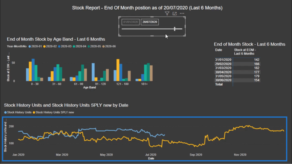
The stock report in question was designed to show the stock position at the end of the month for the last 6 months based on a Stock History table.
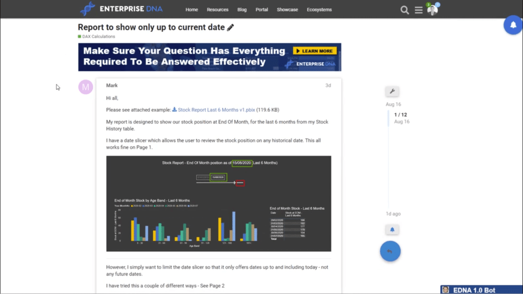
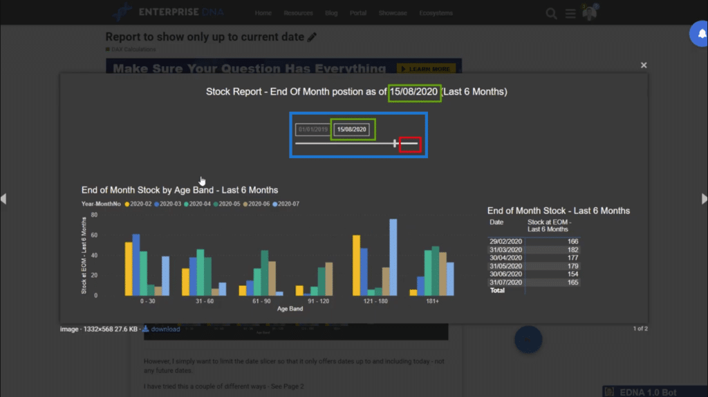
The report allows you to look at data within a certain timeframe using a date slicer. Basically, you can see everything prior to the date on the slicer.
The user wants to maximize the amount of Power BI insights he can get by looking at the results from the current date and comparing it to a different timeframe. But he also wants to see an extended time period for that 2nd timeframe.
Here’s the problem. There is a natural context occurring within the report page, making it difficult to do that. There has to be a different solution other than just using the Power BI page-level filters.
Let’s look at the problem using a line graph.
With the usual filters, the two different timeframes will look like the visualization below. The blue and yellow lines each represent the same dates, but from different timeframes.
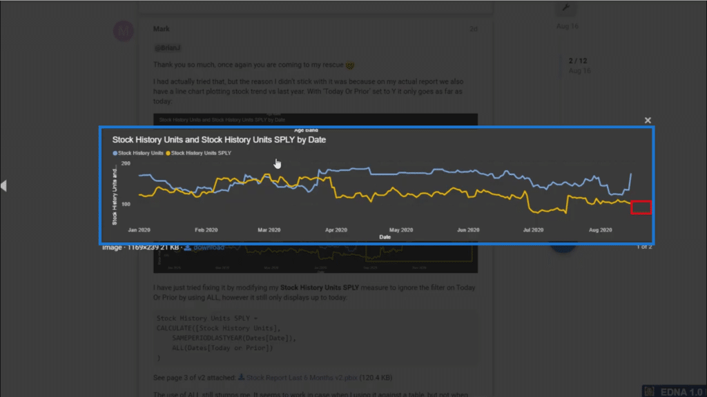
Our user only wants to show the 1st set of data points up to a certain point, while also showing a 2nd set of data points over an extended timeframe. This means that the blue line will have to be much shorter than the yellow line. The blue line basically stops showing data at a certain point.

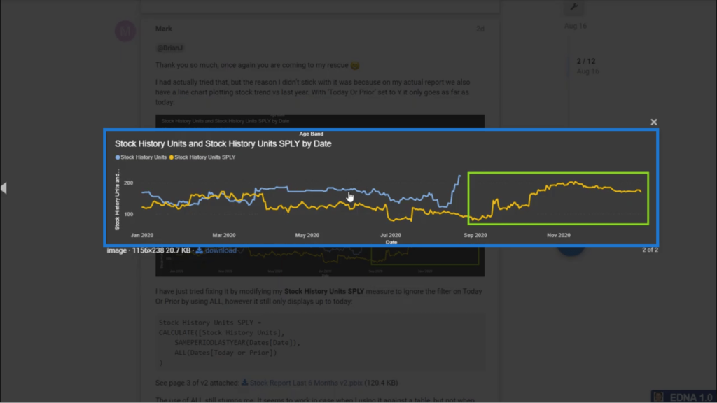
In a way, this could be seen in terms of a forecast. It’s like projecting data into the future for the 2nd timeframe but only seeing data up to a certain point in the current timeframe.
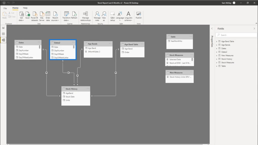
Using Two Date Tables
The strategy suggested in the forum involves using two date tables. The 1st date table will represent the blue line, while the 2nd one will represent the yellow line in the visualization.
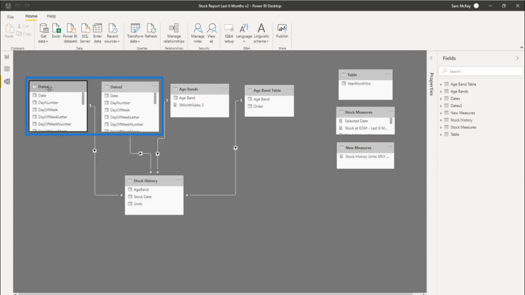
The Stock History table is the fact table in this model. The 1st Dates table has an active relationship with Stock History.
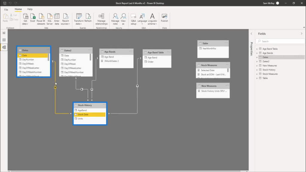
But the Dates2 table also has an active relationship with the fact table. This means that the natural context will be coming from these two places. This is the key to this solution.
You have to remember that the timeframe depends on the slicer. This means that the slicer determines the data shown by the lines.
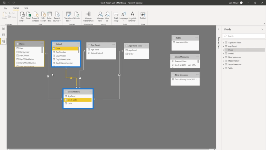
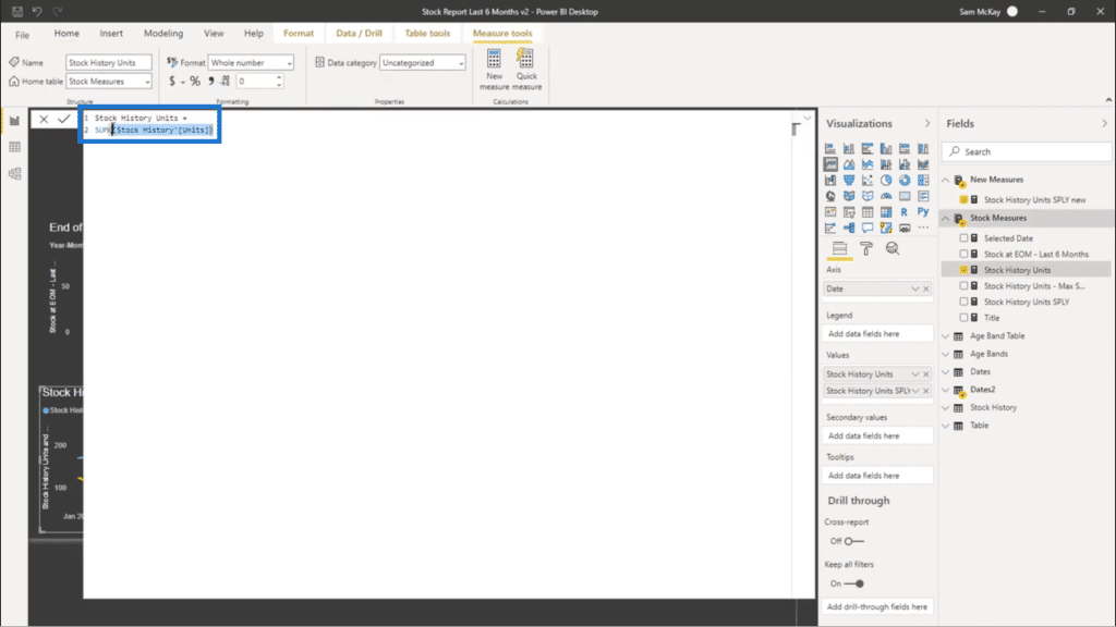
Looking at what’s going on behind the 1st line, you’ll see a simple SUM function applied to the Stock History.
As for the 2nd line, a time intelligence function is applied.
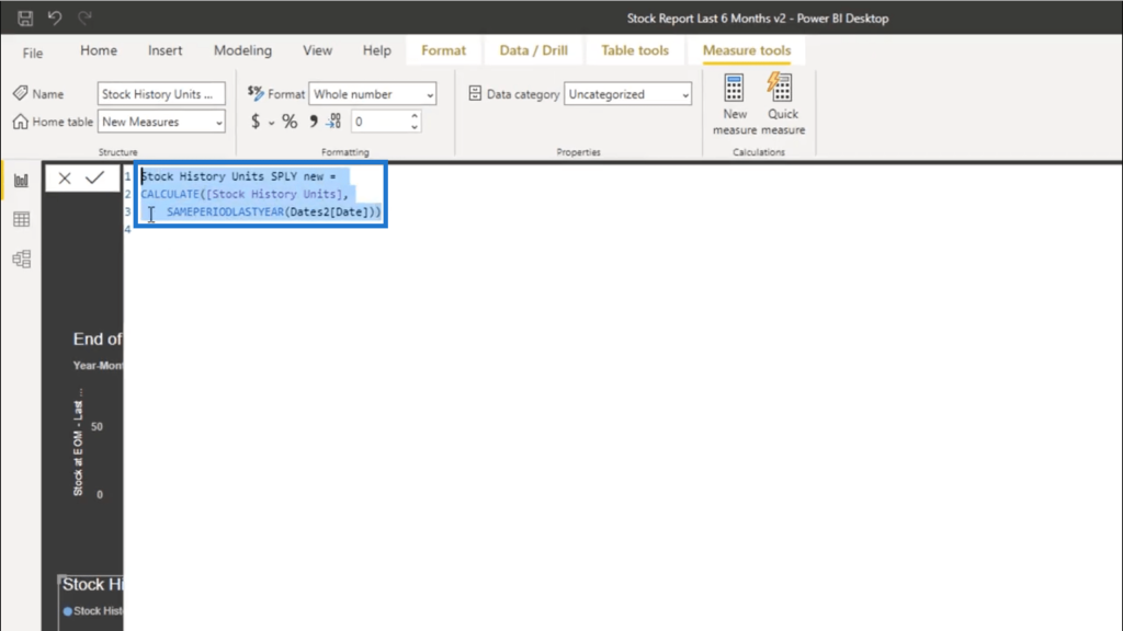
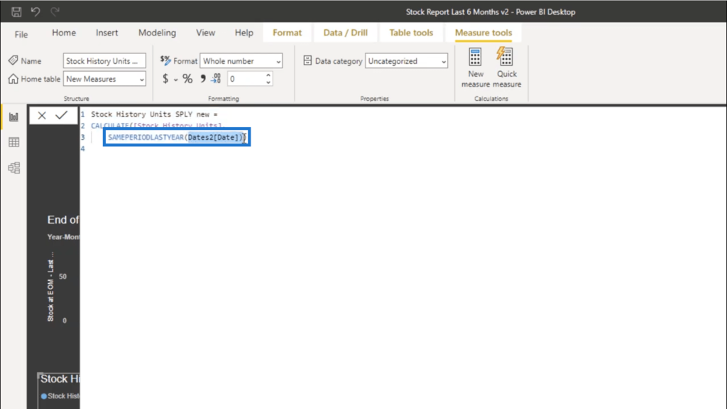
It’s a basic time intelligence pattern that uses the CALCULATE function on the Stock History table. Then, it uses SAMEPERIODLASTYEAR referencing the Dates2 table.
Though we’re not using the 1st Dates table and are only using the 2nd one, both of them will still show up in the visualization. That’s because again, both of them have active relationships with the fact table. Any time a filter is applied, both date tables will be filtered as well.
Now, you can also simplify things within your model. For example, you can choose to take just the Date column and get rid of the others.
***** Related Links *****
How To Work With Multiple Dates In Power BI
Counting Customers Over Time Using DISTINCTCOUNT In Power BI
How To Harvest Power BI Slicer Selections To Use Within Other Measures
Conclusion
That was a unique way to compare data from two different timeframes. It opens up other possibilities in getting as many Power BI insights as possible.
You can use this approach when working with budgeting or scenario analysis, for example. You can run different scenarios across different timeframes and try to see the expected returns. This shows how much you can do with Power BI if you add some creativity to your approach.
All the best,
Sam

***** Learning Power BI? *****
FREE COURSE – Ultimate Beginners Guide To Power BI
FREE COURSE – Ultimate Beginners Guide To DAX
FREE – 60 Page DAX Reference Guide Download
FREE – Power BI Resources
Enterprise DNA Membership
Enterprise DNA Online
Enterprise DNA Events


