For this tutorial, I’ll be showing you how to combine multiple DAX patterns in Power BI. This strategy is one of the many applications of measure branching and is an effective way of producing high-quality reports. You may watch the full video of this tutorial at the bottom of this blog.
When your goal is to analyze trends over time, sticking to basic formulas may not always give you valuable insights.
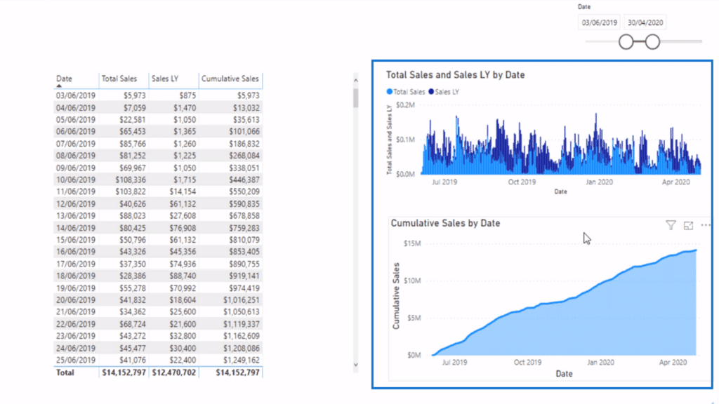
For example, if you want to compare the Total Sales of this year versus the previous year, plotting values as-is will look something like this:
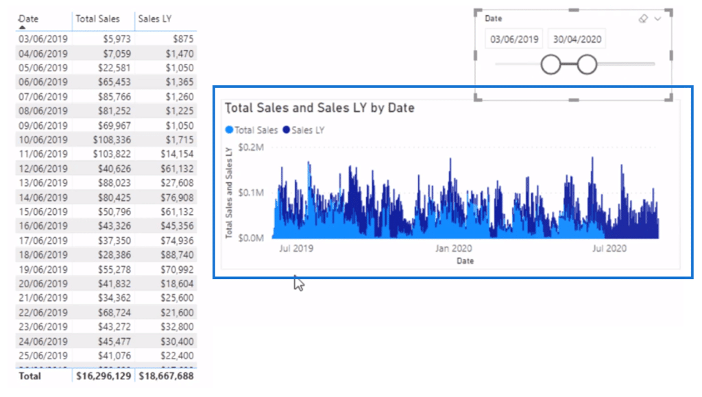
As you can see, the graph is a little busy. It doesn’t really showcase the information we want.
This is when combining patterns of DAX formulas come in.
What DAX patterns do is they shape data in a way that yields meaningful data models and visualizations. When you combine multiple patterns of DAX formulas, you can present your data better and gain useful insights.
I’ll be demonstrating this by improving the graph above by combining patterns of DAX formulas.
The Cumulative Total DAX Pattern
I decided to go with finding the Cumulative Total Sales by Date.
First. I’m going to create a new measure and use the CALCULATE function for Total Sales.
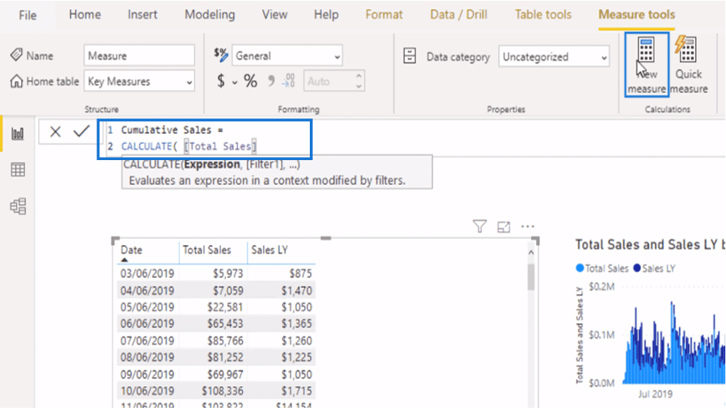
Next, I’m going to write an additional layer of formula. In this case, I need the FILTER function inside of CALCULATE and I’ll be pairing this with the ALLSELECTED function.
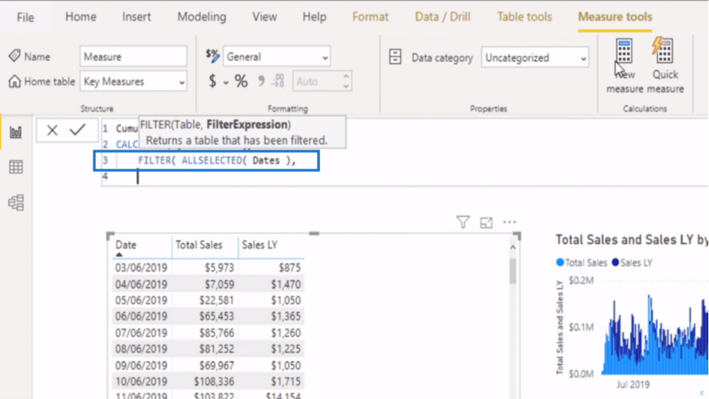
The FILTER function sorts data to identify from which fields I want my values returned.
Meanwhile, the ALLSELECTED function tells Power BI to only include data that is within a set time frame. That is, whatever specific range of dates I enter.
The most important part of the formula is defining how the FILTER function works. For Cumulative Sales, the goal is to show the partial sum of Total Sales as of date.
To do this, I specified that Total Sales should be calculated from dates that are less than or equal to the MAX date.
As a result, the FILTER function enables you to look at the current date as well as the dates prior, then evaluate if the current date is less than or equal to the MAX date.
This entire formula is the Cumulative Total DAX Pattern.
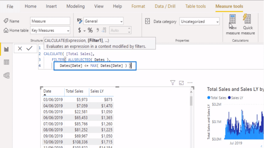
Once everything is set, hit enter and drag the measure into your table.
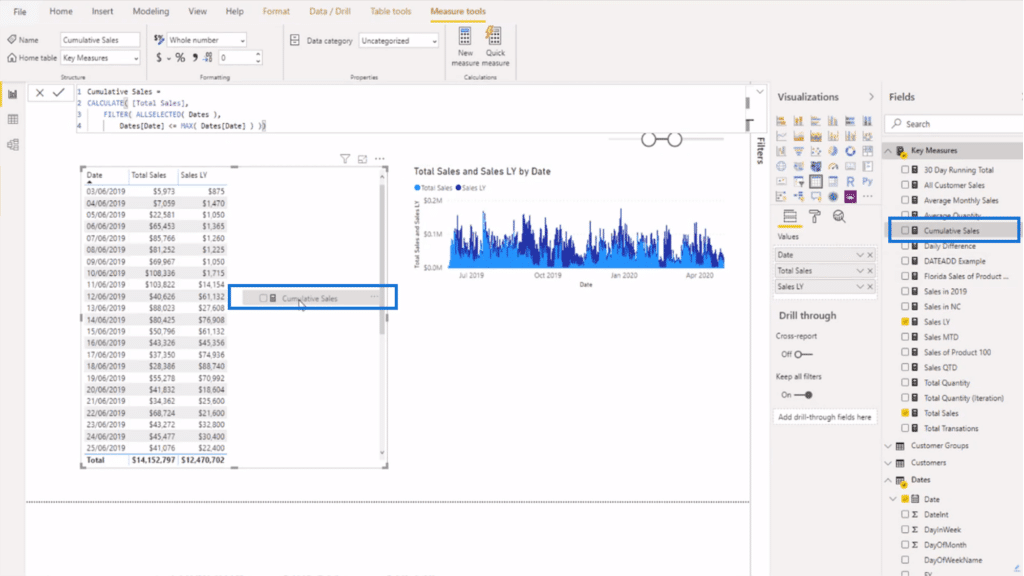
I like to fix my formatting before proceeding just so everything is uniform and logical. Here, I tweaked the format to make the values appear as currency.
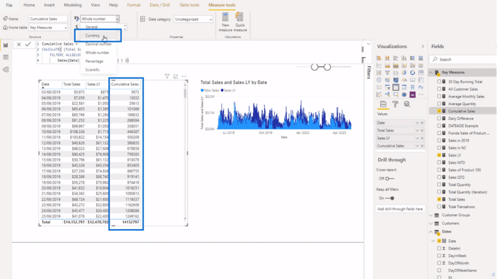
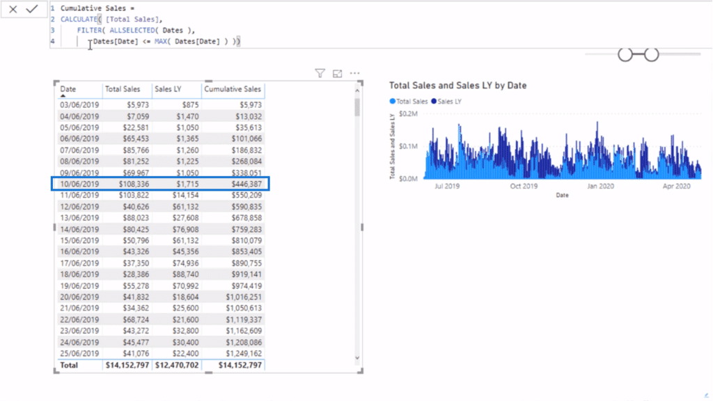
What I have here now is the Cumulative Sales column. You can see that every value reflects the running total up to a certain date.
So if I were to manually add up the total sales from June 3 to June 10, 2019, I would get $446,387, which is exactly what it says on the Cumulative Sales column.
At this point, I can already show you how much better this data will look visually compared to the earlier graph.
Copy the Cumulative Sales column and make it into an area chart.
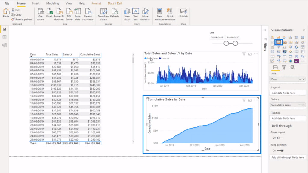
Right away, you see there is a massive difference between the two visualizations. The Cumulative Sales area chart provides a clearer understanding of how things have gone over time.
Comparing Trends Using Combined Patterns of DAX Formulas
Of course, to compare trends you need at least two sets of values.
To get the Cumulative Sales of last year, I’m just going to copy the first Cumulative Total DAX Pattern and create a new measure.
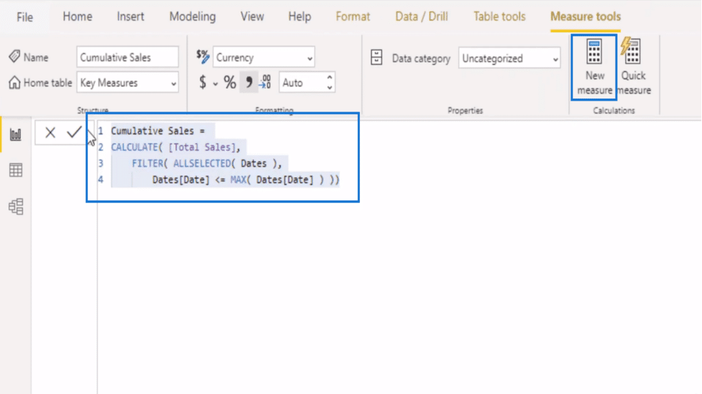
Then, I’m going to paste the formula and rename the measure to Cumulative Sales Last Year.
Because this is a DAX pattern, there’s no need to change anything within the formula combination itself. All I have to do is modify the input around the measure.
In this case, I’m just going to replace Total Sales to Sales Last Year.
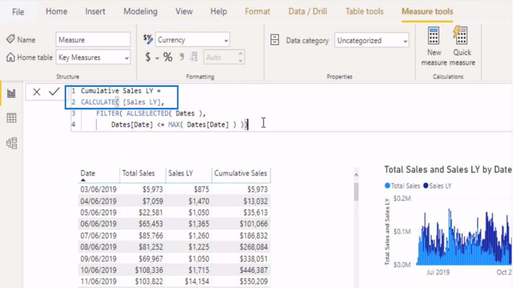
Again, hit enter and drag the measure to your table. You should end up with a column of Cumulative Sales Last Year.
This follows the same logic of the previous formula, wherein the values shown are the running totals up to the current date.
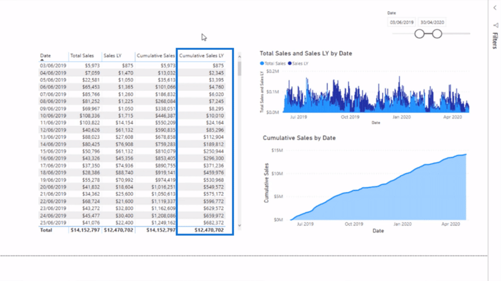
Finally, you can overlay this measure’s visualization onto the Cumulative Sales area chart.
Just select the previous chart and drag and drop and data field into the Values tab.
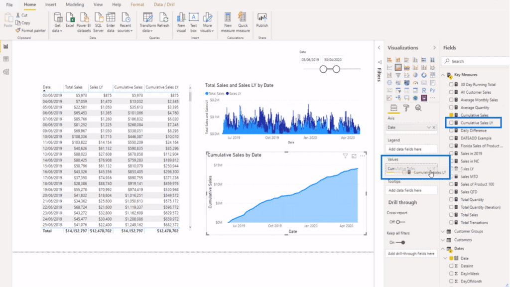
The result is an excellent visualization comparing trends from different time periods.
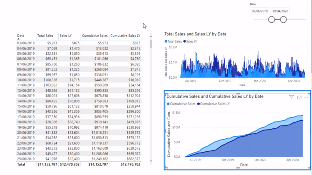
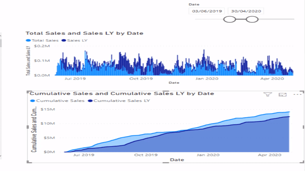
Before I wrap this up, I want to show you again how the first graph looked with just the daily sales versus what I have now.
Combining patterns of DAX formulas gave me richer insights. It also made it easier to see trends and compare them from what was seen at a different time.
***** Related Links*****
Common Time Intelligence DAX Patterns Used In Power BI
Calculating Reverse Cumulative Or Reverse Running Total In Power BI
Manage Multiple Date Calculations In Your Fact Table
Conclusion
Combining patterns of DAX formulas is the best way to analyze and compare trends when dealing with time-related information. It makes use of DAX patterns, which are a big part of scaling up your analytical work because of their re-usability.
What I did here is just a basic example of how you can leverage measure branching and combining patterns of DAX formulas. Obviously, this technique is not limited to Cumulative Totals.
More complicated calculations start simple and you can slowly build and branch out from those basic formulas to do more exciting analyses.
I hope this tutorial has given you a good idea of how to do that and inspired you to explore its potential.
All the best!
Sam


