
In this blog, you will learn how to do clustering in Power BI and Python and discover some of the advantages of using Python for clustering. You can watch the full video of this tutorial at the bottom of this blog.
You can cluster data if it’s extensively unstructured and impossible to segregate manually into groups. Clustering identifies the natural grouping within the dataset, and you will learn more about this process in our discussions below.

Clustering in Power BI
Below are two visuals with clusters created in Power BI. The one on the left is a table and the other on the right is a scatter plot.
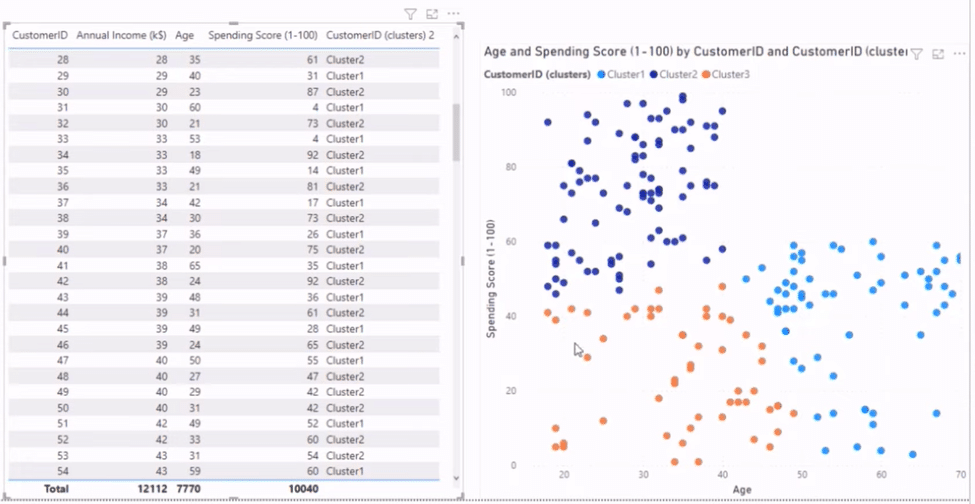
Our scatter plot has two-dimensional clustering, using two data sets to create clusters. The first is the shopping data set, consisting of customer ID, annual income, and age, and the other is the spending score. Meanwhile, our table uses multi-dimensional clustering, which uses all the data sets.
To demonstrate how it works, I will need to eliminate the clusters so we can start with each visual from scratch. Once you create these clusters in Power BI, they become available as little parameters or dimensions in your data set.
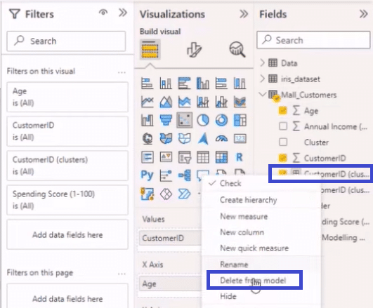
As shown above, if we go to Mall_Customers from the Fields section, right-click on a cluster like Customer ID, and select delete from model, Power BI will remove it from the data set.
We’ll delete the multi-dimensional clusters using this process and then get our table and scatter plot back, starting with the latter.
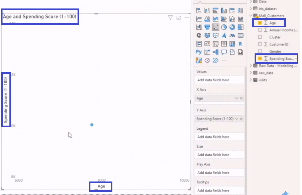
Scatter Plot Clustering in Power BI
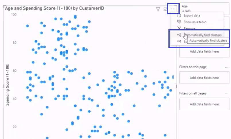
If we choose Age and Spending Score from our data set, Power BI will automatically summarize them into two dimensions inside our scatter plot.
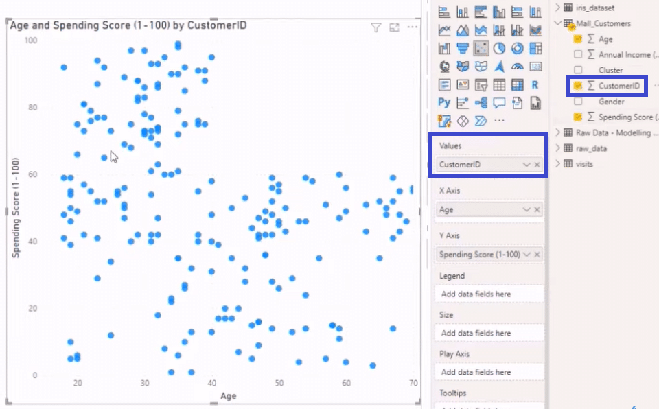
If we add our Customer ID to our Values by dragging it from the Fields section to the Values section, we will get that scatter plot back, just like in the image below.

Then we click on the ellipses at the top right and select Automatically find clusters to open the Clusters window.
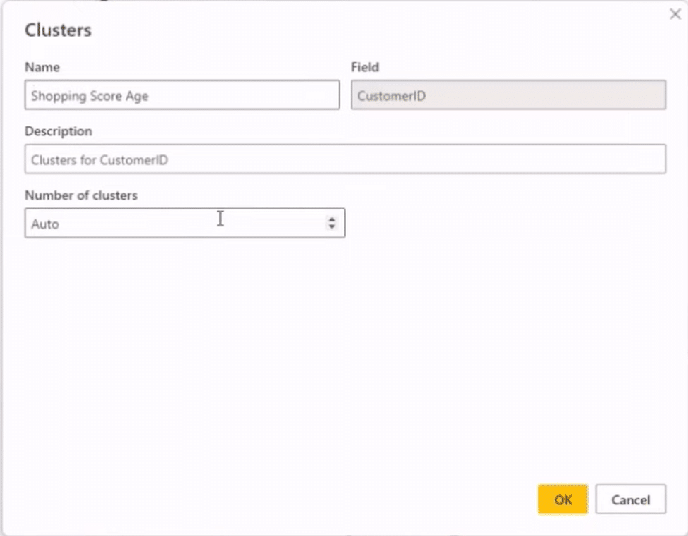
In the Clusters window, we can enter a Name for our clusters, select a Field, write a Description, and choose the Number of Clusters.
We will name our clusters Shopping Score Age, select CustomerID for the field, and input Clusters for CustomerID as a description. We’ll then set the number of clusters to Auto.
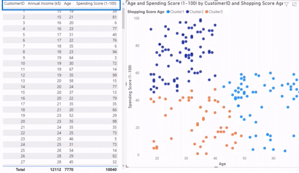
After we click on the OK button in the Clusters window, the result is the image below. As you can see, we now have three clusters that noticeably look like blobs. The reason for this appearance is that there’s a Center Point in each cluster that determines the creation of the blobs and how far their position will be from the center point.
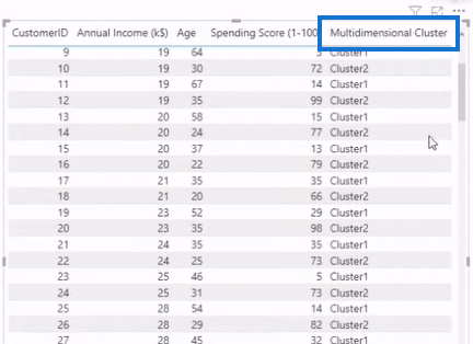
The current dimensions in our table, which you can find in the column headers, are Customer ID, Annual Income, Age, and Spending Score. A dimension we didn’t bring in is Gender.
Let’s bring this dimension into our table and scatter plot by dragging it from the Fields section to the Values section, as we did when we added our Customer ID.
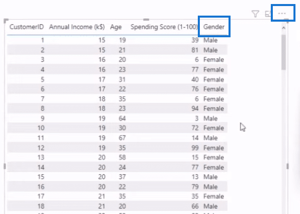
As you can see above, we now have a Gender dimension that indicates whether the person is Male or Female. However, if we go to Automatically find clusters to create a cluster for this dimension, it will result in a “Number of fields exceeded” response.
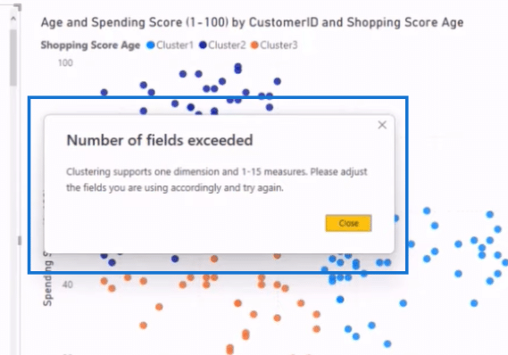
There are two things we can do to go around this roadblock. We can turn the variables, Male and Female, into 0 and 1, giving them numerical values, or we can remove them. However, removing them means that this dimension will no longer be part of our clustering consideration.
Let’s try the second method and remove Gender by unselecting or unchecking it in the Fields section. We then go to our ellipses and select Automatically find clusters.
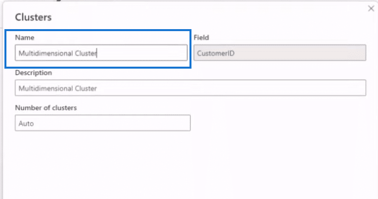
In the clusters window, we enter Multidimensional Cluster as the Name and Description, select CustomerID as the Field, and set Auto for the Number of Clusters. After we click on the OK button, Power BI will create a cluster for this dimension, as shown below.
The advantage of this method of clustering in Power BI is that once we run the table and scatter plot, we gain access to certain parameters or dimensions that we can use in our data. We can then segment things from these parameters and dimensions, like bringing in a filter and using those clusters.
The disadvantage of this method is that it uses an algorithm in the Report Pane. That means if you get data in and connect it to a live source, you won’t be able to update it and you might get holes in your data.
Using Python for clustering
Now let’s proceed on how to cluster using Python, where we’ll run across the data and create a new data set. We’ll be using an unsupervised machine-learning model that will give you similar results for your multidimensional clustering. I will also show you how to put different algorithms and tweak them along the way.
Importing a Python Package
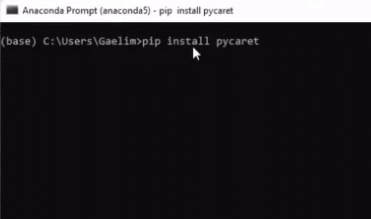
We first need to run a Command Prompt, like Anaconda Prompt that we’ll be using in this example, and install a package called PyCaret here. After opening the Anaconda prompt, we enter pip install pycaret to install the package.
Running Python
Now that we have our package, we’ll go back to our visuals and click on Transform Data.

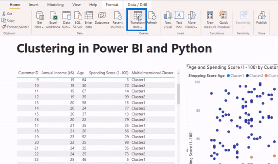
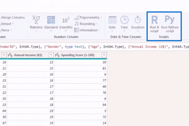
Next, we click on Run Python Script from the Transform Tab.
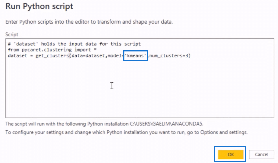
We’ll put that machine learning algorithm into our Python Script using a simple code. We start by entering from pycaret.clustering import * to import our package. We then type in dataset = get_clusters() in the next line to replace the data set and bring in the function called get_clusters.
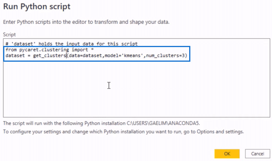
We want our function to get our data set, so we’ll assign it with a variable by entering data set = inside the open and close parenthesis. Next, we add our model called K-Means and assign the number of clusters for our model.
Before we run our Python script, first let me show you the different models we use in PyCaret. As you can see below, we’re using K-Means, which follows the same logic as having that Center Point. Aside from that, we also have kmodes, a similar type of clustering.
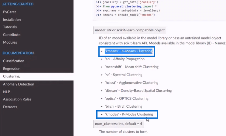
These other clustering models above will work based on your needs and are much more flexible and not blob-based. If you have a different data set and feel like your Power BI model isn’t working, you can use all of these models. You can go to the Python script section highlighted below and specify the one you want.
Now we can run our Python script using the K-means unsupervised machine learning algorithm. As you get new data, K-means will learn and alter those Center Points and give you better clustering.
We also went with three clusters and used the data set. With everything in order, let’s start running the script by clicking on the OK button.
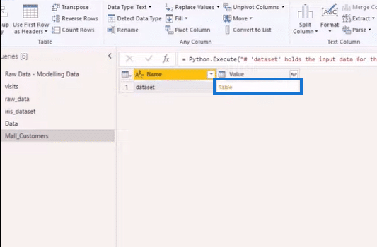
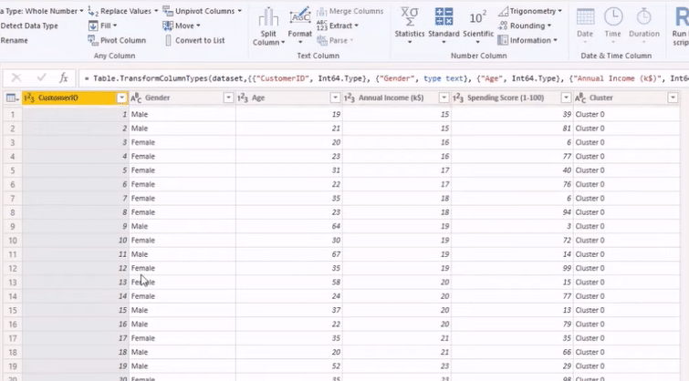
After running our script, we will get the image above. Next, we’ll click on Table in the Value column to get our new data set below, as shown below.
Advantages of Using Clustering in Python
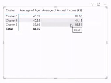
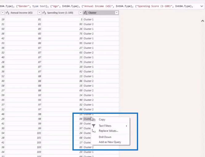
One of the advantages of clustering in Python is that you can put different names on your clusters. Let’s get our clusters, Age and Annual Income, from the Fields section to demonstrate this advantage. We then turn it into a pivot table from the Visualizations section, giving us the table below.
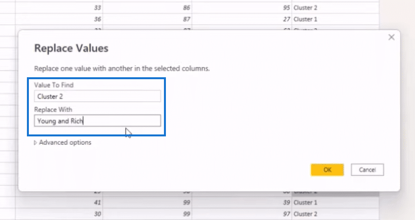
Let’s say we want to rename Cluster 2 “Young and Rich.” To do that, we look for Cluster 2 in the Cluster column of our main table, right-click on it, and select Replace Values.
In the Replace Values window, we’ll go to the Replace With field section, enter Young and Rich, and click on the OK button to complete the change.
Python allows you to assign better names for your clusters to make them more digestible to your users, a feature absent when clustering in Power BI.
***** Related Links *****
How To Evaluate Clusters In Your Data Using DAX Technique In Power BI
How To Use The Built-in Analytics For Power BI Scatter Charts
Python Correlation: Guide In Creating Visuals
Conclusion
Now you know how clustering in Power BI and Python works. The biggest advantage of Power BI is that creating and customizing clusters is easy once you have the table and scatter plot in place. The disadvantage is that you’ll have problems updating your data if you connect it to a live source.
With Python, you can use an unsupervised, machine-learning model that delivers the same results for your multi-clustering. With this approach, you can put better names on your cluster and make them more digestible to your users. The disadvantage is that you need to know how to use Python script and write codes.


