In this tutorial, you’ll learn how to create a Bullet Chart using Charticulator. It’s a variety of bar charts that display data in a qualitative range of values or performances. The ranges are designed to have colors that vary depending on the intensity of a value. You’ll also learn and understand how each entity in the Bullet Chart works and provides information.
Export A Dataset To Charticulator
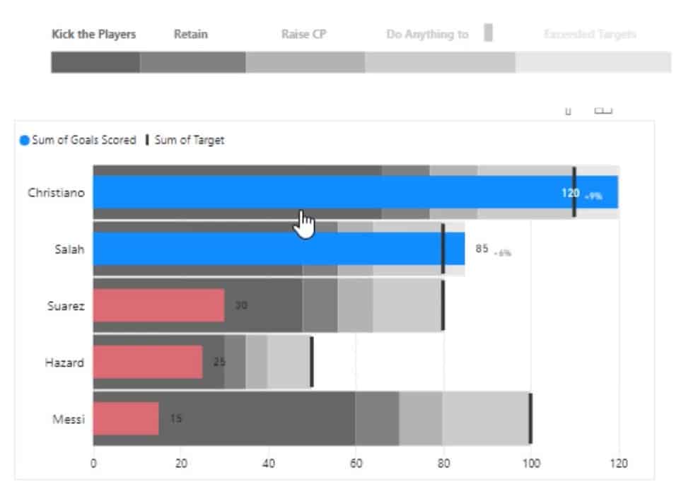
This is the Bullet Chart that you’ll be recreating.
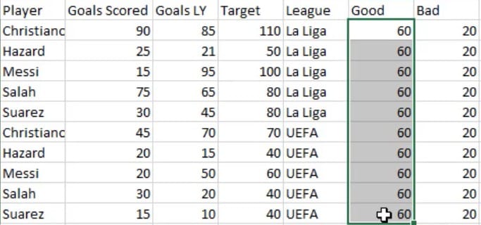
First, you need to create and export a dataset in the Charticulator. This is the dataset that will be used in this example.
Next, go to charticulator.com and click Launch Charticulator.

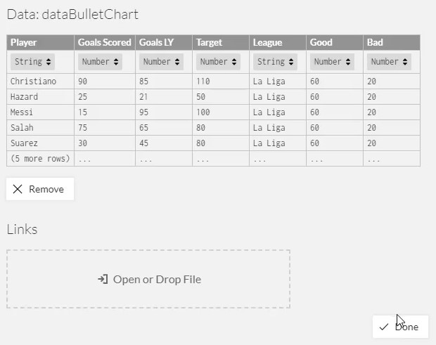
Locate and open the dataset and click Done. After that, you can start creating the chart in the Charticulator canvas.
Set Up The Canvas For The Bullet Chart
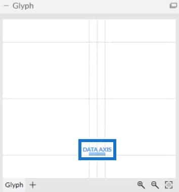
Inside the Glyph canvas, place Data Axis on the X-Axis to allow it to have multiple measures.

Put Player in the Y-Axis and League in the X-Axis of the actual canvas.


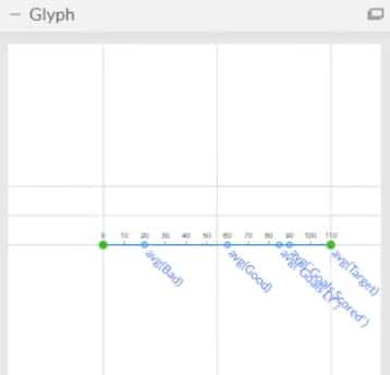
Then, bring all the measures in the Glyph canvas. Drag Goals Scored, Goals LY, Target, Good and Bad and place them in the Data Axis.
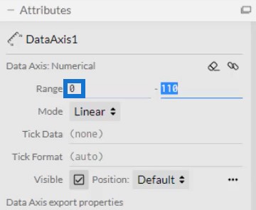
In the DataAxis1’s Attributes, set the Range to 0 so that the values in the Data Axis will start at 0.
Create Bars For Each Measure
Now, create a bar for each measure by bringing rectangles from Marks. The bars should be placed along the range of the measures. The bar for the Bad measure must start from 0 up to the avg(Bad) point. For the Good measure, start the bar from the avg(Bad) point to the avg(Good) point. Lastly, create a single bar for Goals Scored, Goals LY,and Target and place this bar from the avg(Good) point up to the end of the Data Axis.
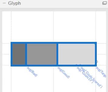
Then, modify the colors of the bars to make each of them standout. Your Bullet Chart visualization will now look like this.
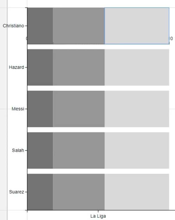
Next, place a bar from 0 to the avg(Goals Scored) point to emphasize the average goals scored.
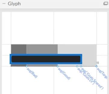
Create a line from 0 to the avg(Goals LY) point and place it in the middle of the Goals bar to also emphasize the average goals last year. Adjust the width and the color of the line to your preferred style.
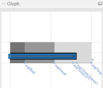
This is what the result will look like.
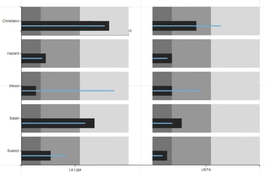
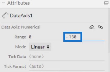
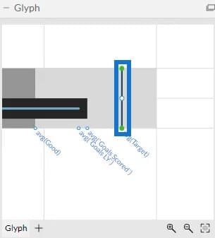
The next thing to do is to mark the average targets. Adjust the Range on the right side of the bar in the DataAxis1’ Attributes to create a space for the targets. Then, define the target by putting a line on the avg(Target). You can adjust the width and height of the line to what you prefer.
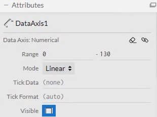
After that, open DataAxis1’s Attributes and uncheck the Visible box to remove the Data Axis labels in the canvas.
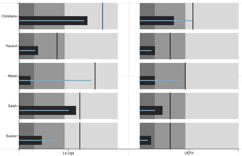
Once done, the visualization will look like this.
Import The Bullet Chart File In Power BI
Save the file and export it to Power BI Custom Visual.
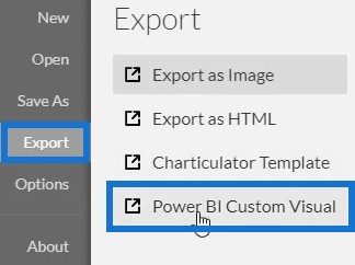
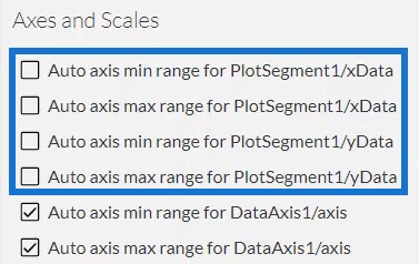
Uncheck the auto axis options to avoid changes in the axes when a filter context transition is invoked. Then, input a visual name and export it to Power BI.
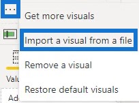
Open Power BI and import the Bullet Chart file. Click the ellipsis below Visualization and select Import a visual from a file.
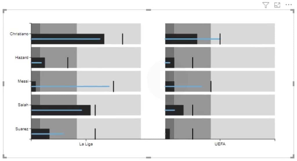
Click the Charticulator link with the visual name of the chart and fill the Fields section with the corresponding data.

You’ll then see the Bullet Chart visualization in the Power BI dashboard.
***** Related Links *****
Bullet Charts: Advanced Custom Visuals for Power BI
Simple Visualization Techniques For Your Power BI Reports
Utilizing Measures And Visualizations In Power BI
Conclusion
You can obtain and show a lot of data using Bullet Charts. They are a combination of different measures shown through bars and lines that provide information about the categories used. They are mainly used to monitor progress, performances, and targets of a subject in data reports.
Mudassir


