In this tutorial, I’ll show you what type of Power BI visual filter to use in your reports. I’m going to talk about the types of interactions that visuals and other objects in a Power BI report page can have between each other and the ways that they can cross-filter each other. I’ll also share some use cases as to why you might want to apply one type versus another, or even disable it entirely. You can watch the full video of this tutorial at the bottom of this blog.
Let’s go ahead and hop into the Power BI Desktop and get started.
What Type Of Power BI Visual Filter To Use?
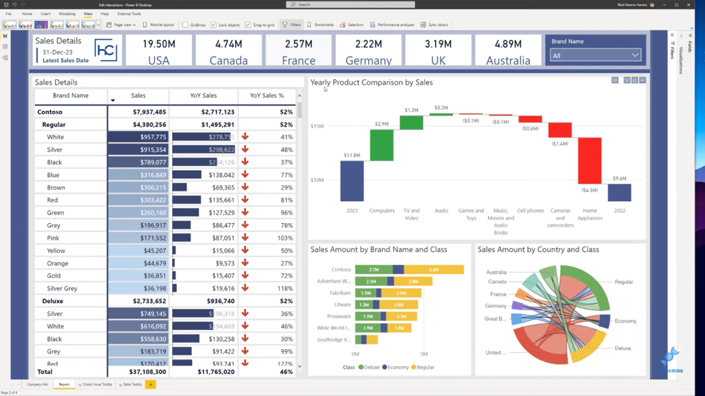
This is our sample report below. By default, the types of interactions that most visuals have are something like this. For instance, we’re going to select Computers on the Yearly Product Comparison by Sales visual. This is what happens.
Notice how we get a cross filter and a highlight over the top of this. We have the original data, and then we have a highlighted amount that is showing here as well. You can see both parts and a grand total in that case. And sometimes you might not want this.
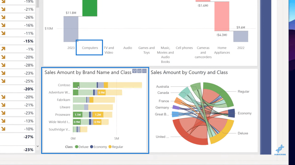
Depending on how the data looks, in this case, the data is kind of scattered around since we have something on the legend. But let’s go to the Format ribbon up here and go over to Edit Interactions.
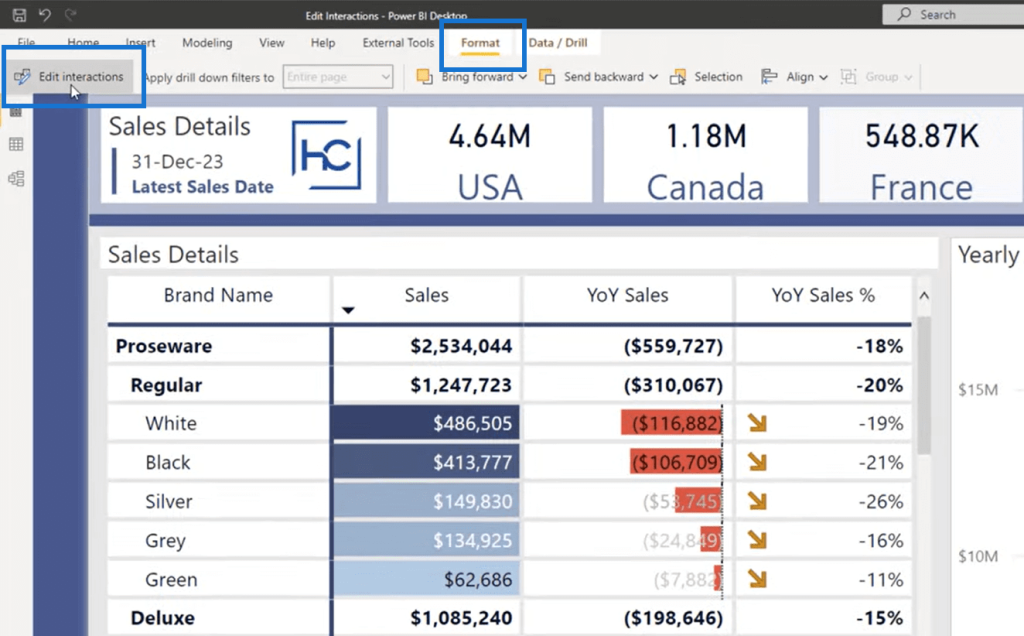
Now, look at the symbols that are appearing above any of these. We first need to start by selecting the visual itself that is filtering the other visuals. So, in this case, the visual that is filtering the other visuals is my waterfall chart.
Currently, what we have selected here is the Highlight option. I can also choose to change this to Filter. So now, instead of showing both the grand total and the subtotals from that filter, it’s just showing the lower subtotal section. I think this is a cleaner look, so I’m going to change the setting between these two visuals to this one.
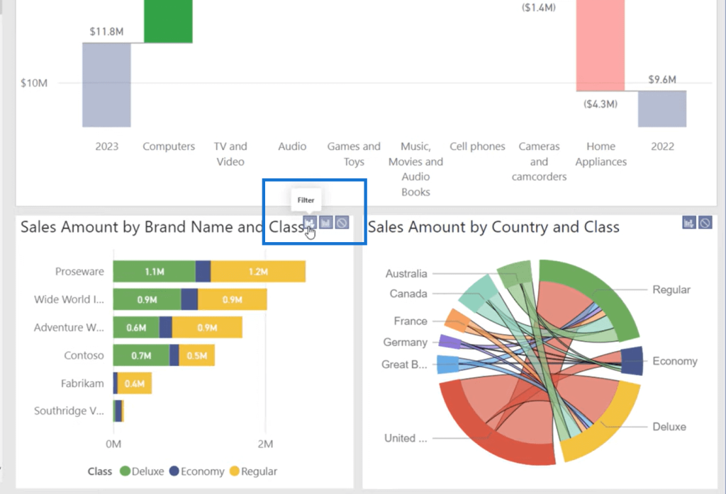
Some visuals have the Highlight option while others don’t, like the chord visual, which is a custom visual. They’re either filtering or another option is to disable that entirely. If I turn that off, this visual, will not filter it at all as I click around.
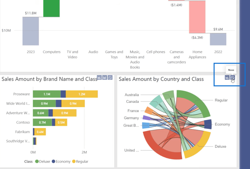
There might be times where you have a grand total card or something else that you do want to ignore, but just be careful of turning that on or off, unless you absolutely want to make sure, and it is very clear and indicated to the users that this needs to be disabled.
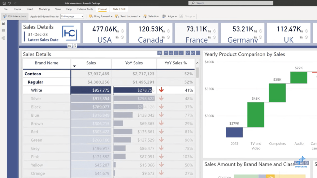
For every visual that you select, you can choose the type of interaction that the visual does with others. The table can have an option to do a cross filter as an example right here. If I select Contoso as a filter range, or maybe let’s go ahead and select a Regular, we can see that it is highlighting Contoso and Regular here.
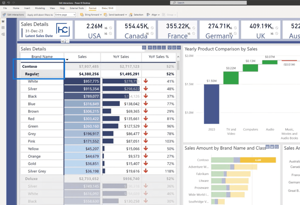
An important thing to note here as well is that this is a toggle that is enabled, so you want to make sure you don’t accidentally click any of these as you’re developing. When you’re done, make sure to go and click on the ribbon at the top and turn back off the Edit Interactions options.
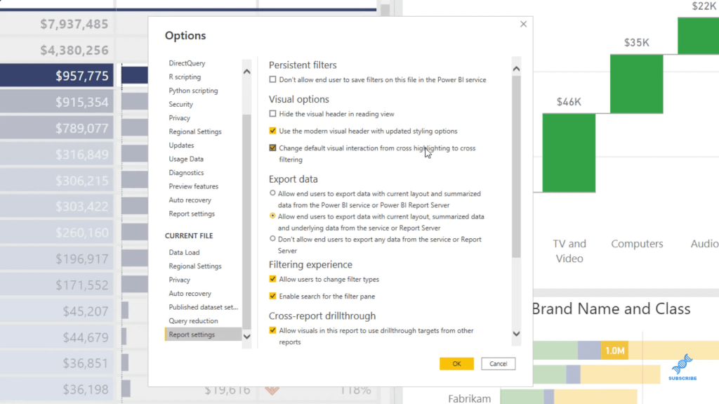
The last thing that we want to do is come up to File. We’re going to go to Options and Settings, open the Options menu, and then go to Report settings on your current file. Notice that there’s an option that says, Change default visual interaction from cross highlighting to cross-filtering. So, for any new visual, you can choose to change the default action from cross highlighting to cross filtering if desired for that report.
***** Related Links *****
Using Filter Fields & Visual Interactions To Create Compelling Visualizations In Power BI
How to Control The Interactions Of Your Visuals In Power BI
Power BI Best Practice On Reports & Visualizations
Conclusion
We’ve managed to explore all the options for how to change interactions. We’ve seen the default for cross highlighting. We’ve also seen cross-filtering as well. And then, last but not least, we’ve seen how to disable it and change the default behavior for the entire report.
Hopefully, you’ve found this useful, and this has helped you to find more of what you can do in a Power BI report.
All the best!
Reid


