For today, we’ll be continuing the discussion on our enhanced visualization frameworks for Power BI. Previously, we’ve discussed about the importance of using grid formats in our reports. This time around, we’ll discuss the following items: colors, navigation, and labeling on your data visualization report.
Implementing Colors In Your Data Visualization Report
Colors is the next point in our framework. Use simple colors with as little variation as possible. Let’s go and have a look at my theme.
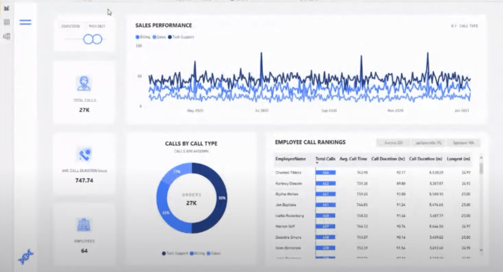
Let’s have another look at other reports. The reports below showcase a very simple use of colors.
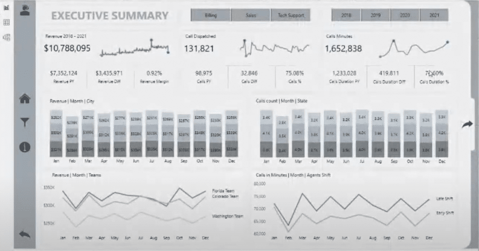
The vast majority of really high quality submissions shows the consistent use of colors.
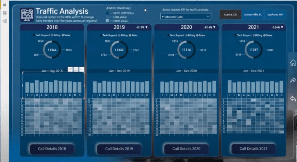
If we use more color variation, it won’t be as consumable as before and it won’t look as tidy compared to sticking to one shade of color. For example, this report is actually fantastic in terms of information, but there are just way too many colors.
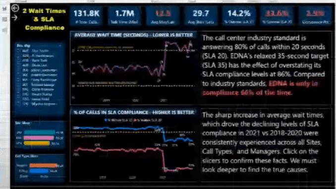
We need to be more careful around how we use colors to represent our high quality insights. Too much variation in colors never makes for a quality experience.
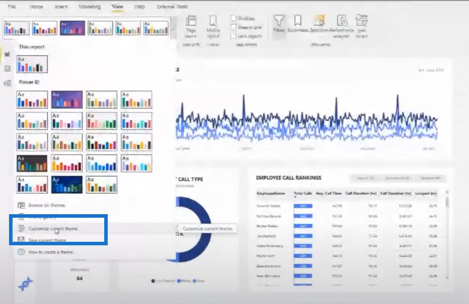
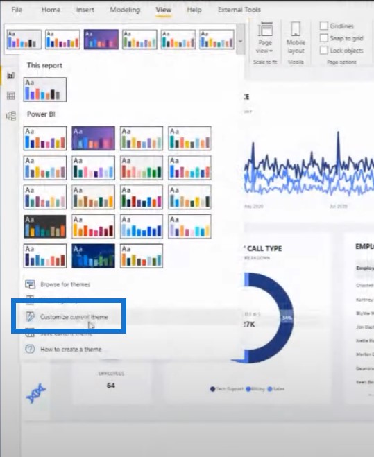
Now if you find a good report, you can actually download or save the theme that was used. You can save it as a JSON file, and then re-upload it into your own report.
You can go for lighter themes or darker themes. It is just a matter of using these colors in an effective way.
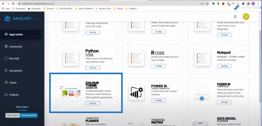
You can also use the Analyst Hub to help with your color themes. You can download other people’s color themes and that’s very helpful, but we also have some awesome ways to generate themes and generate colors inside of the Analyst Hub, which comes free with an Enterprise DNA membership.
The one feature I love using a lot is the Colours Fan, because it gives me a whole lot of variations of the same color.
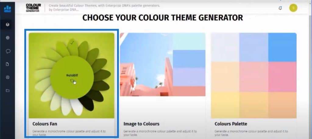
You can click through here and get a lot of variations of the same color. You can also change the amount of colors you get.
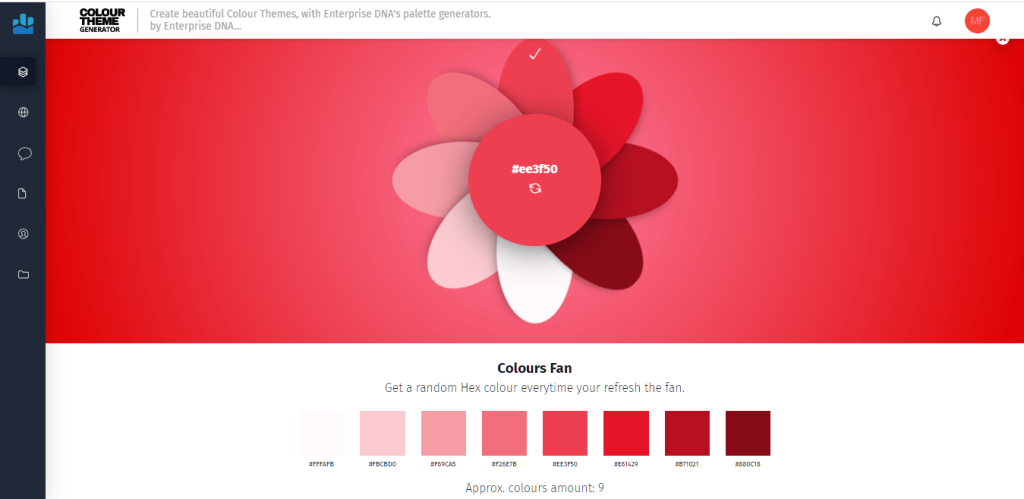
Once I find a theme that I like, I’ll go back to my report and then copy these into my current theme. I’ll get an entire palette around the same colors.
Another awesome tool we’re continuing to develop is our theme generator. This is probably one of the best – if not the best – way to comprehensively build your entire theme in your Power BI reports.
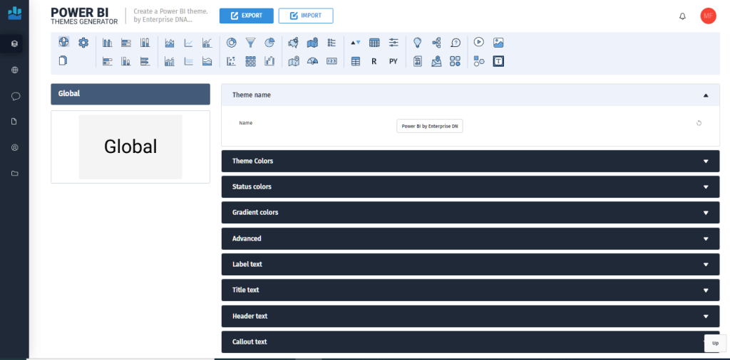
The idea behind this is we want to change not just the colors, but the theme. We want to be able to manipulate everything inside of our Power BI report from showing a legend or axis to customizing how a table looks like within this new theme generator.
With this app, you can you limit the amount of clicks you have to do inside of Power BI. The goal is to build a comprehensive theme that has everything set up exactly how you want it to be set up. The productivity gains that you can achieve by using the theme that will be generated by this app are off the charts.
Navigating Your Data Visualization Report
When someone is experiencing the report inside of the Power BI experience, we want them to navigate within the page itself.
We’re currently in the Power BI desktop here, and you’ll notice that at the bottom every single page is actually hidden and there’s only one page showing, which is the homepage.
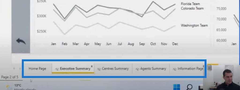
So even though we can see the pages in the Power BI experience, when you upload this online, no one can see these pages. The only way that they can click through the different pages is to click on the navigation experiences inside of the report.
Every report should have this. You want to direct the user through your story rather than them randomly selecting pages and not getting the the story in the sequential way that you want them to view it. There are a number of ways that you can create this navigation experience.
In this example, you can go to the next pages of the report by clicking on this arrow.
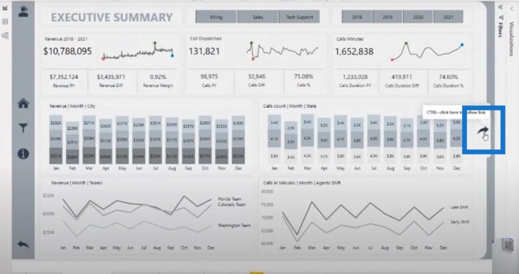
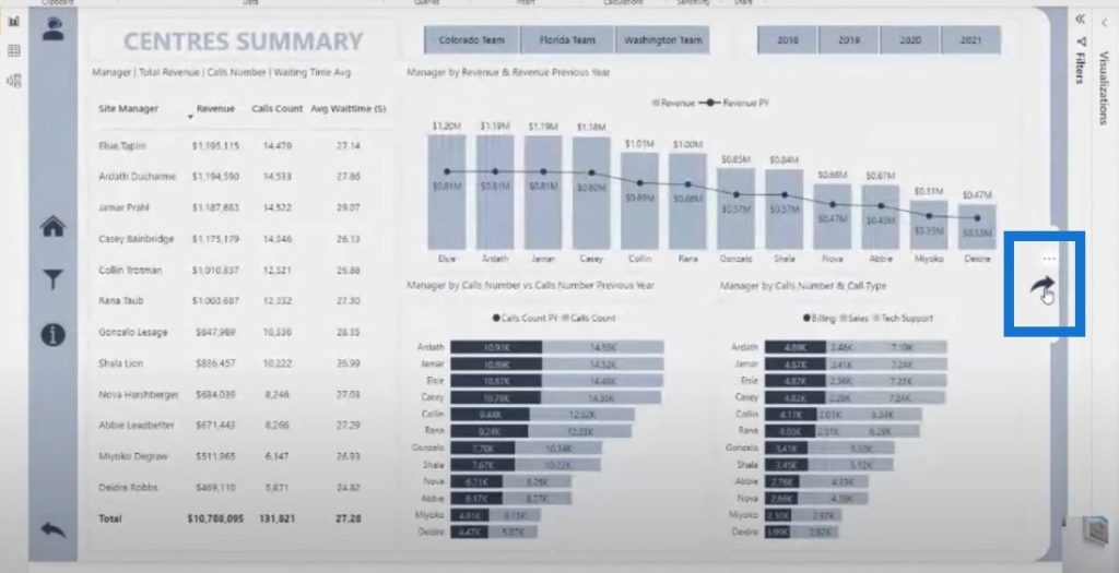
A home navigation page like this example is also a nice idea as well.
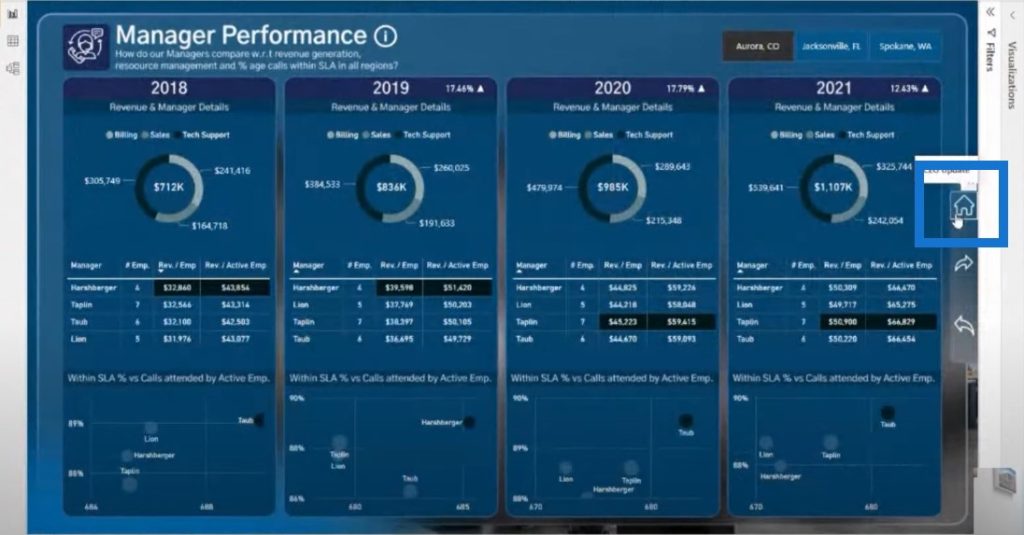
All of these examples are actually very easy to set up. There are a ton of examples like these on the Enterprise DNA Showcase.
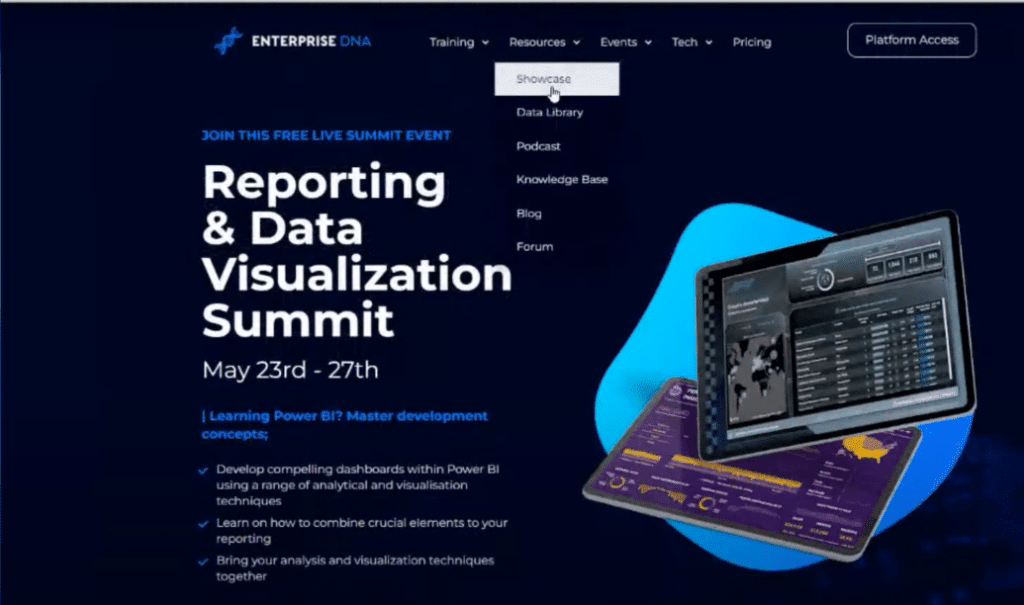
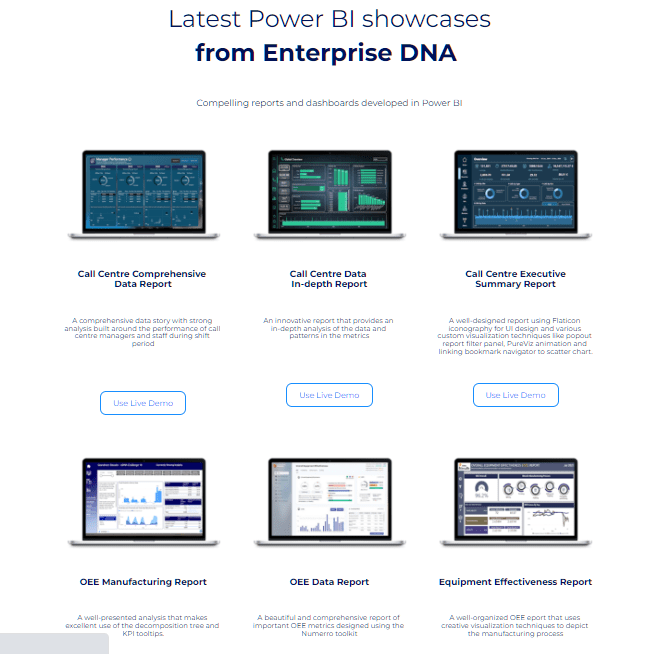
By clicking through a lot of the reports in the Showcase gallery, you can see that all the quality reports have a similar navigation experience.
Let’s have a look at this example which shows the variety of ways that you can build navigation experiences and make your report look like a web-based application.
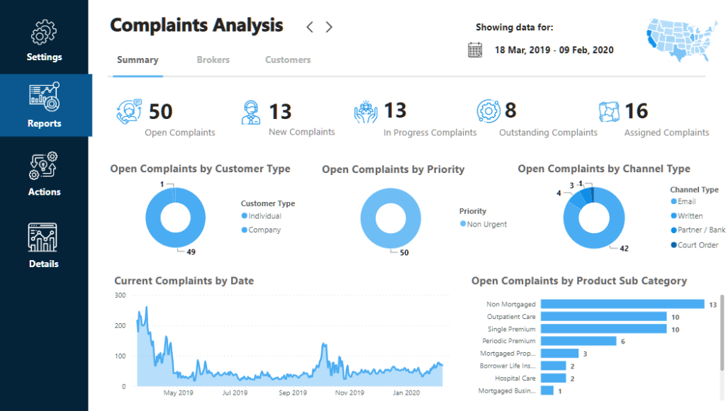
On the left hand side, there are some images that tell us where we are located in the report. There are also sections at the top that look like a menu bar of a website.
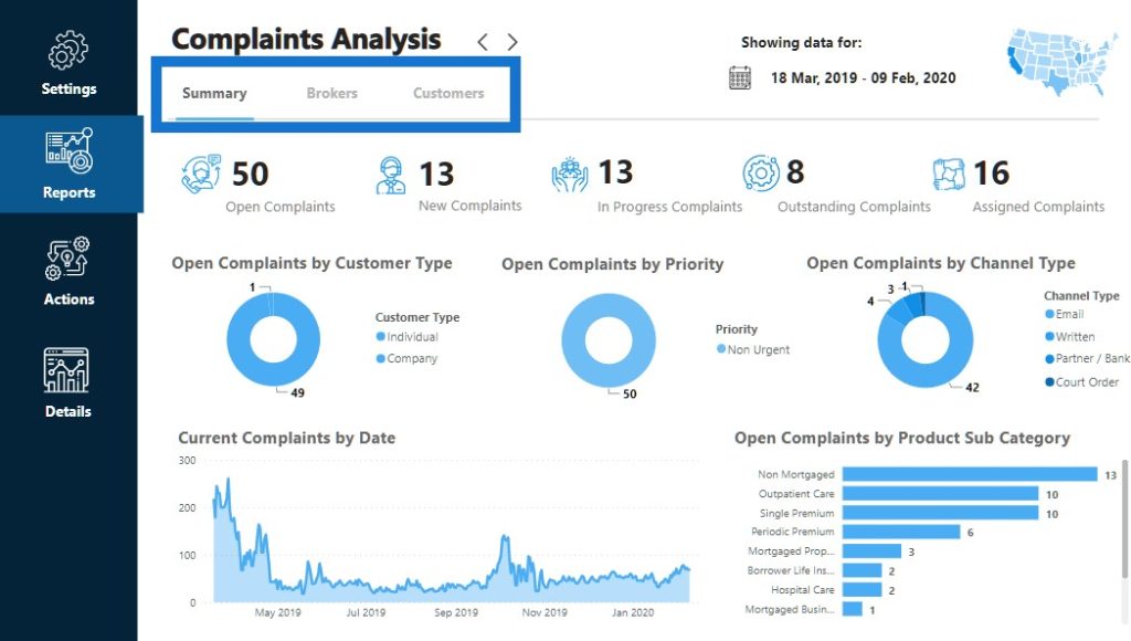
These are different pages in Power BI desktop, but it feels like a web-based experience, which is what we want to aim for. This is how to really elevate what we’re doing inside of Power BI.
If you find a nice navigation, just download that PBIX file and copy it from one report to another. Just highlight the navigation you want, then copy and paste it into another Power BI report to get that same look and same navigation experience.
Obviously, you’ll need to link things up and build actions into your icons and text boxes, which is easy to do inside of Power BI.
Labeling Your Data Visualization Report
This item is pretty self-explanatory but is forgotten quite often. Make sure that you are very clearly labeling what someone is looking at. This is a perfect example of great labeling. There’s a good title on the page, as well as some details below it.
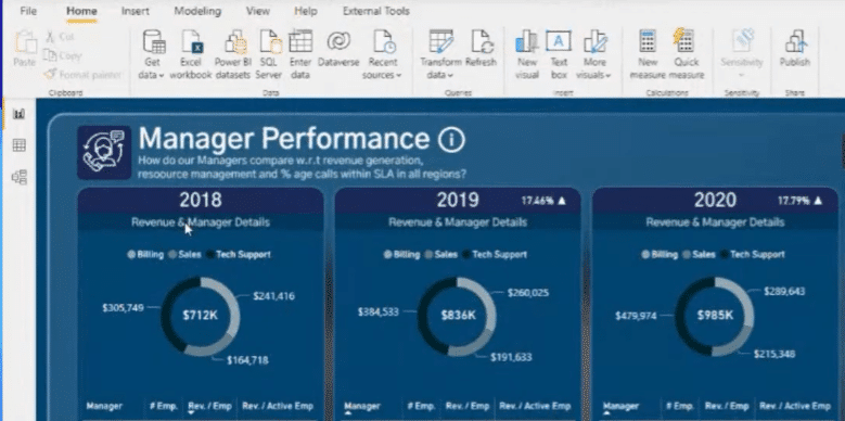
There’s a lot of text here in this example. But to improve this report, it needs to have better labeling and a larger font on the actual visualizations itself.
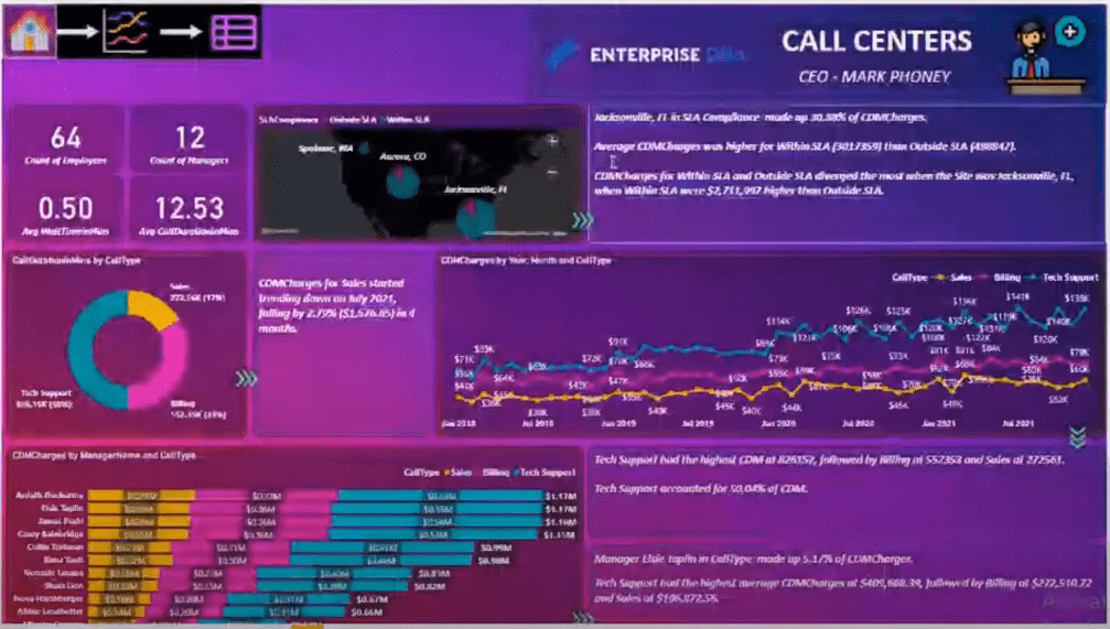
You’ll see that the title name is not in a proper text format. The title is all in one word, which needs to be properly spaced out. We want these titles and labels to be read easily by the consumer.
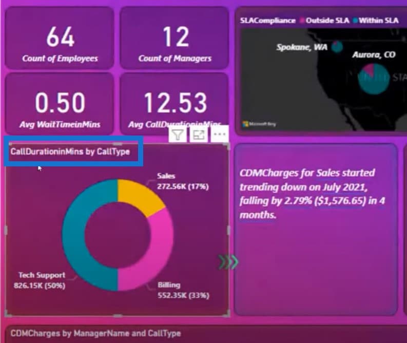
A lot of this comes down to getting the correct format in your column names, table names, key measures, and measure names. All of these things are quite simple to do, but when they’re not done at the early stages of development, it can really detract from the quality of the report.
Another example is the CDM mentioned in the text box. If I was someone who wasn’t familiar with this, I wouldn’t know what CDM actually means.
This is why your labeling should be as simple and effective as possible, while also really detailing everything that is being described on the page.
***** Related Links *****
Power BI Design – Best Practice Tips For Dashboards
Power BI Report Examples And Best Practices
Small Multiples Chart In Power BI: An Overview
Conclusion
Implementing a consistent color theme, using a navigation system within the report, and simple labeling will bring your data to life and allow you to tell more meaningful stories.
Watch out this space for part 3 of our series on enhanced visualization frameworks for Power BI.
Sam

[youtube https://www.youtube.com/watch?v=oXs1Mo-SoHc?rel=0&w=784&h=441]


