I want to show you a really compelling COVID-19 pandemic report and dashboard. This is probably the best that I have seen by far anywhere over the past 12 months. You can watch the full video of this tutorial at the bottom of this blog.
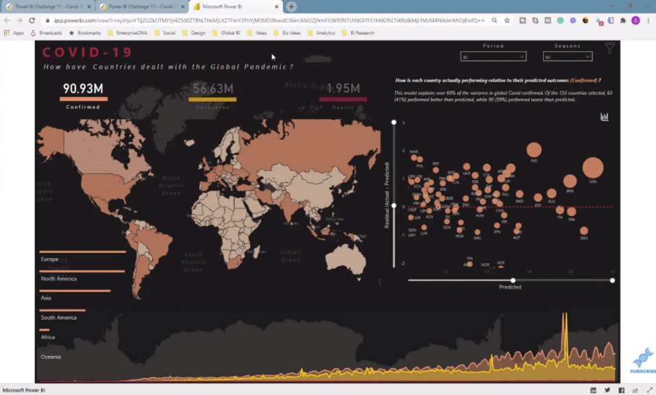
This is a published-to-web link (above), and this particular report was created for one of the Power BI challenges that we have run at Enterprise DNA. This is a collaborative effort of our Enterprise DNA experts, Greg, Brian, Jarrett, and Mudassir.
I make sure that we give as much visibility as we possibly can to all the fantastic submissions that are going on in the Power BI challenges. This is by far some of the best Power BI work going on in the world.
In this blog, I want to show you all the incredible features that have been built into this report to generate enormous insights about what is actually going on globally with COVID.
But I’m not going to be able to show you every technique yet. This is just an overview of how you can create a pandemic report like this.
Pandemic Report Features & Functionality
This is the COVID-19 pandemic report with real-world insights. This is not a dummy data set. This is a real-world Power BI report that is full of information.
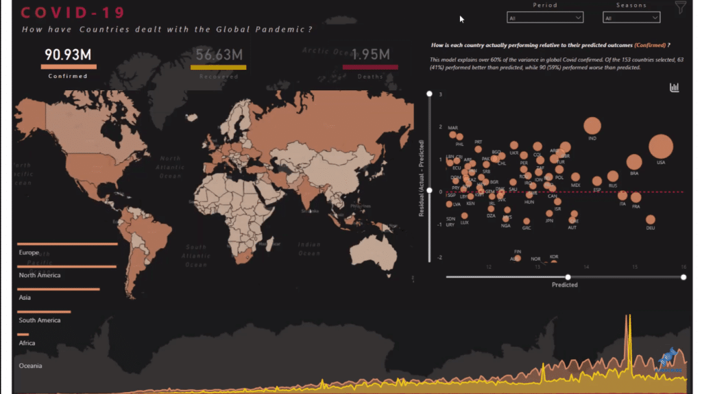
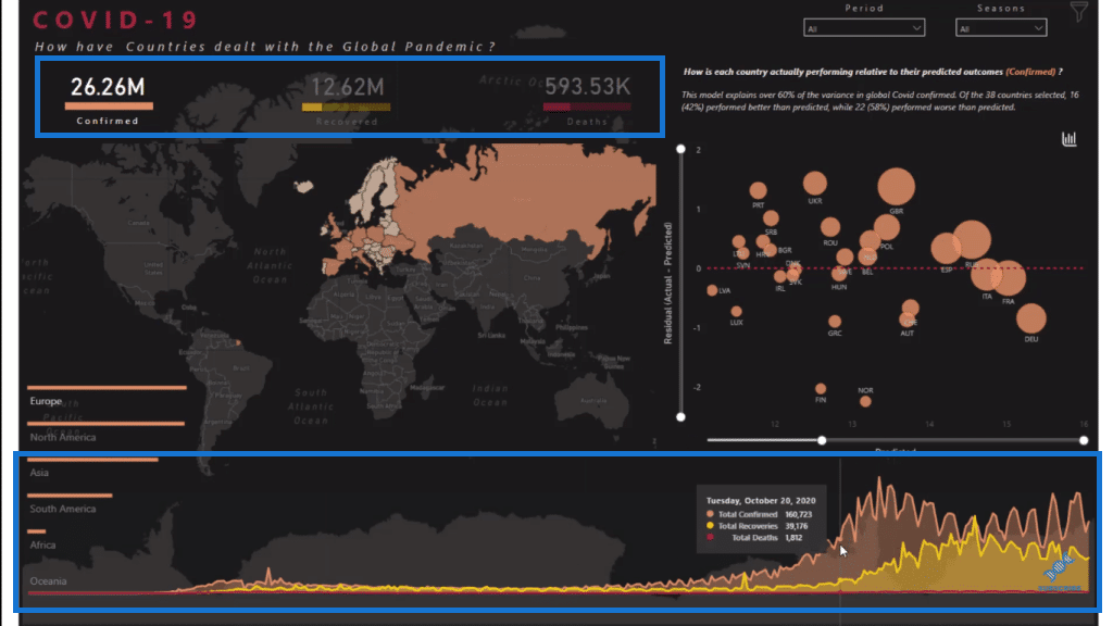
There are so many great things about this report. First, it is visually compelling. If you look at the visualizations here, you’ll see that we’ve got a world map, which really looks like it’s embedded into the report. It doesn’t have odd colors. It looks like it’s part of the report background.
Another thing to note about this report is that it is literally just one page, but there is a huge amount of information embedded into it in various different ways.
The entire premise of the challenge was to evaluate COVID-19 data. And so, the team have gone about it and answered the question, how have countries dealt with the global pandemic?
We can see a range of information geographically around how particular areas have performed. Notice that these are tooltips embedded in the visualizations, which look seriously compelling. We can click on the countries and see their status in terms of the pandemic.
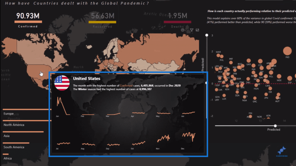
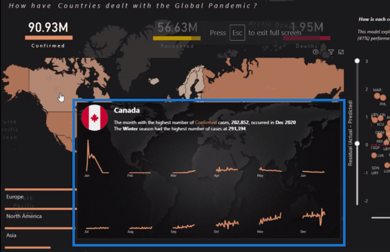
The entire tooltip is dynamic. We can see the flag of the country within the tooltip and we have the numbers and details about what’s going on in that country. In this case, we’re looking at Canada. The tooltip is also showing a breakdown of months with the use of small multiples.
The team have also embedded this visualization down here. We can’t see any axis on this visualization, but it’s so obvious what this visualization is because of the colors used, which correspond to the upper area (numbers) of the report. I think it’s very creative and well-thought-out.
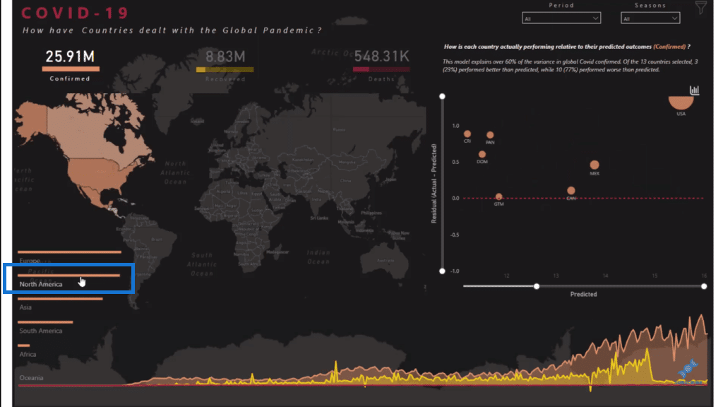
If we click on a specific region here, say North America, we can see that all the visualizations on the report update and change. They are now showing data of the North American countries.
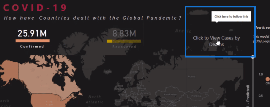
Furthermore, if we hover over the numbers (confirmed, recovered, deaths cases) here in the report, we can see that we have the option to dive deep into the numbers and get more insights.
So for example, if we click on the Death Cases here, all the visualizations on the report change, showing only the information around death cases. As you can see, all the visualizations show only the maroon color, which represents the death cases.
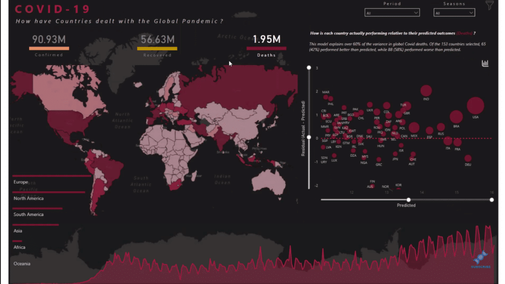
We also have some high-level statistical analysis here on a scatter chart visualization, which evaluates how the countries or regions performed. The team also embedded the sliders in this visualization. These sliders (Y-axis and X-axis) enable us to change what we’re looking at on the visualization.
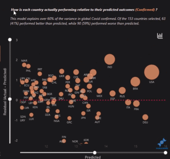
There are also tooltips embedded in this scatter chart. So when we hover over each country, we get more information and specific data.
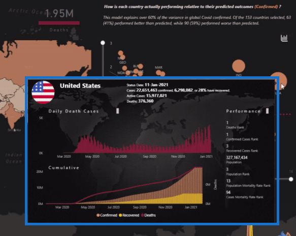
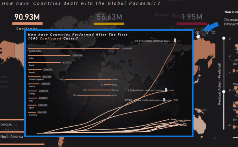
Moreover, we can drill into the world map visualization. We just click on this question mark icon and it will show more information.
***** Related Links *****
Interactive Reports In Power BI | Enterprise DNA Tutorial
Power BI Small Multiples Visual – New Feature
Power BI Custom Visuals – Build A Reporting Application
Conclusion
This report is very useful in terms of decision-making, such as what you’re doing as a country or as a geographic area, etc.
This is really the best COVID-19 pandemic report that I have seen created in Power BI. I hope that this will inspire you to see what is actually possible with Power BI.
Check out the links below and our website as well for more content around data visualization and reporting in Power BI.
Cheers!
Sam


