This blog tutorial showcases a really interesting example around Pareto analysis. I’m going to teach you how to create a Pareto chart using advanced DAX formulas. You may watch the full video of this tutorial at the bottom of this blog.
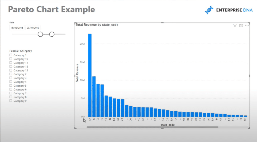
I’ll show you how to use a combination of formulas to be able to generate a visualization like this one.

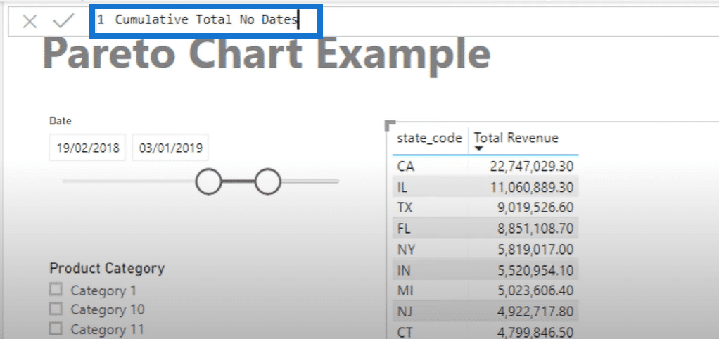
The first thing that I always recommend when working on something similar with this analysis is to turn the visualization into a table. This way, you can really examine the numbers that are needed to generate the said visualization.
For this scenario, you first need to create a cumulative total to get the Total Revenue amount. As you can see, there are no dates and numbers. Therefore, it will be challenging to generate a cumulative total that’s based on text value instead of numbers. I’ll teach you how to do this step by step.
Calculating The Cumulative Total
The first thing that I’m going to show you is the calculation for cumulative total without dates.

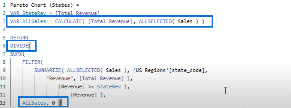
The technique here is to use the SUMX function as well as an iterator like the FILTER function. The FILTER function goes inside the SUMX. After that, you need to create a virtual table using the SUMMARIZE function.

The virtual table needs to look at all the sales inside the selected date context. After that, it should go through the specific state codes inside the table.
The said part of the formula will create a table exactly like the sample table. The only difference is it’s creating the table virtually for now.

The next part of the formula will create another virtual table for the revenue. But because this logic is inside a filter, it manipulates the table virtually to create a cumulative total. The formula should iterate through every row and part of the total revenue table.
If the revenue of the specific row is greater than or equal to the state revenue, it calculates the revenue amount and brings it into the table.

After that, you need to add the variable, VAR StateRev, so that it’s going to evaluate the Total Revenue.

That’s how you create a cumulative total even though there’s no ranking based on dates or numbers. The cumulative totals that were created are only based on a text column.
All the cumulative totals in the table are calculated because they all evaluated to true, and then the total revenues are aggregated to the cumulative total.
Creating The All Sales Table
The next part that I’d like to demonstrate is the creation of the sales table for the pareto chart.
First, click New Measure, and then type in the name of the measure. In this case, it’s All Sales. Then, start the formula with the CALCULATE function to work out the Total Revenue. And then, go ALLSELECTED (Sales).

Click enter, and drag the completed measure into the table to see the corresponding data.

In addition to this, you can create a Pareto chart based on any selection through the Product Category selector.

Combining DAX Formulas To Create Pareto Chart
The next thing that I want to show you is how to combine the previous formulas into another one by simply adding some DAX functions.
To do that, just create a new measure or copy an existing (similar) one, then rename it accordingly. For this example, the new measure is named as Pareto Chart (States).
As you can see, there’s already an existing formula in the copied measure so you only need to add some DAX formulas. In this case, you need to add some variables using the VARIABLE function, which simplifies calculations.
The first variable (VAR StateRey) simply equals to Total Revenue, while the second one (VAR AllSales) uses the CALCULATE and ALLSELECTED functions.
For the logic, add the DIVIDE function before the SUMX, and then add the variable, AllSales on the bottom part. It’s important to have a constant value for the results to return. Thus, you should put zero as the alternative result.

There are times when the results appear in a number format, but the Pareto Chart (States) column should show in percentage like this one below.

Thus, you need to go to Measure tools, and then change the format into a percentage.

Once you go back to the table, you can see the exact results in the table transform into a Pareto chart. That’s the reason why I always recommend having it inside a table first before creating the chart.
You can experiment around the chart and select dynamic data in the Product Category selector. As you can see, the Pareto chart also changes dynamically as per your product categories.
You can also add some colors to your Pareto chart using some data labels to make it more compelling. Just take time to play around the formatting area and set up your Pareto chart accordingly. For instance, you can change the visualization and enable the Line Values like this one below.

There’s so much you can do inside Power BI to make your data stand out and your report more effective and visually appealing.
***** Related Links *****
Implementing The Pareto (80/20) Principle in Your Power BI Analysis
Pareto Analysis: Who Are The Top Customers
Showcasing Budgets In Power BI – DAX Cumulative Totals
Conclusion
I hope you like this example of formula combinations. It can get way too advanced, but it’s all doable in Power BI. I’d also like to mention that the VAR (variable) function really helped us in this example.
The key is understanding the right time to use variables in the evaluation. It could either be used at the start of the formula or as an iterating function.
I hope that you got something out of this tutorial and hopefully you can find a way to utilize the sample formula pattern into your own models.
All the best!
Sam


