
I want to show you a cool technique, bringing together DAX measures and some visualization ideas. You may watch the full video of this tutorial at the bottom of this blog.
In this tutorial, I’ll show you how to highlight the trajectory of a client performance through time. I’ll visualize it in a way that you can easily see how a client or customer moved from one group to another through time.
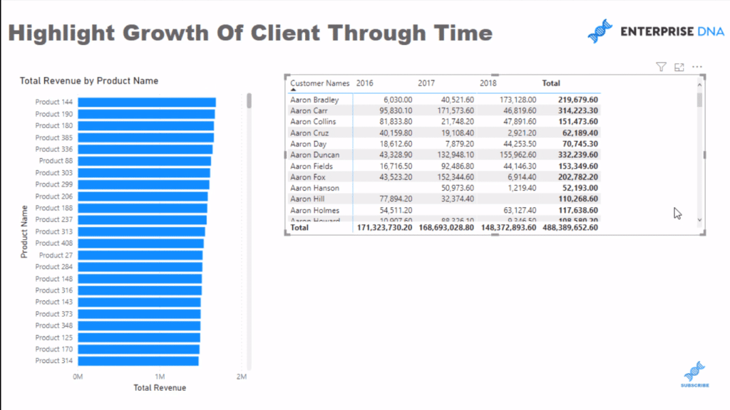
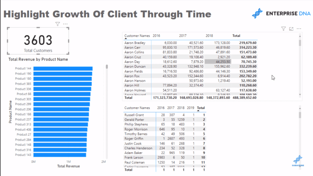
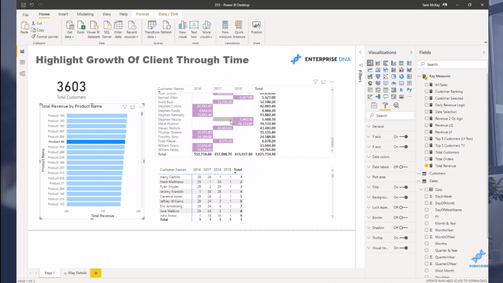
I’m going to do this by creating a ranking calculation. We have some numbers and list of clients here, but when we can’t tell whether these clients are our top clients or our bottom ones – it’s not easy to see that visually.

DAX Measures To Rank Customers
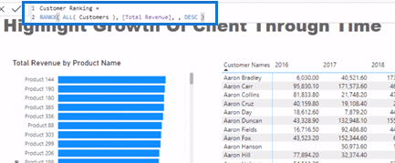
So, I’m going to create a new measure that is going to rank our customers each year. It’s a simple ranking formula and I’ll just call it Customer Ranking. I’ll use RANKX, then go ALL Customers, and then go Total Revenue, and lastly, I’ll place descending (DESC).
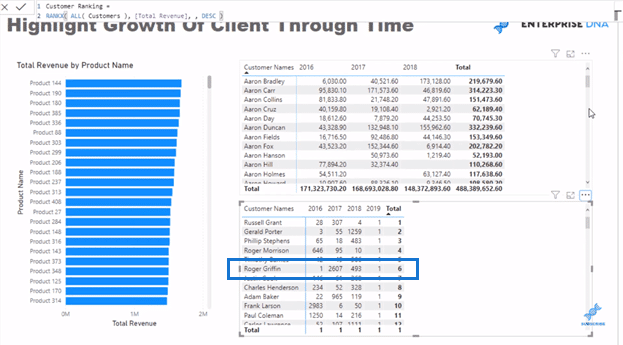
So now you can see in the visualization below that some customers ranked highly all the time, but Roger Griffin ranked high one year but low another year, and then ranked a little bit high in another.
For this type of analysis, it would be great to know how many customers we actually have, right? So I’ll create another measure for Total Customers. I’ll use the function called COUNTROWS for our Customer Table
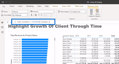
I’ll put this in a card visualization, and we can see that we have more than 3,000 customers.
Visualization Ideas Using Conditional Formatting
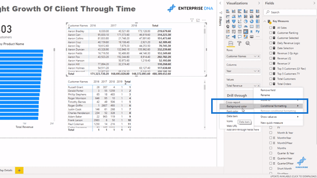
We can say, 1,000 is one group or 1,000 to 2,000 as a group, and then 2,000 and above as another group. But I want to show it in the visualization. I don’t want to have the ranking formula here.
So, I’m going to go to the Conditional Formatting and then to the Background Color.

I’m going to format by Rules. I’ll select my Customer Ranking measure (for the Based on fields) and then input the rules. If the value is greater than zero and less than 1,000, I want the background to be the lighter purple color. If it’s greater than 1,000 and less than or equal to 2,000, then I’m going to use the darker shade of purple. If it’s greater than 2,000 number and less than or equal to say 20,000, then it will be the darkest purple color.
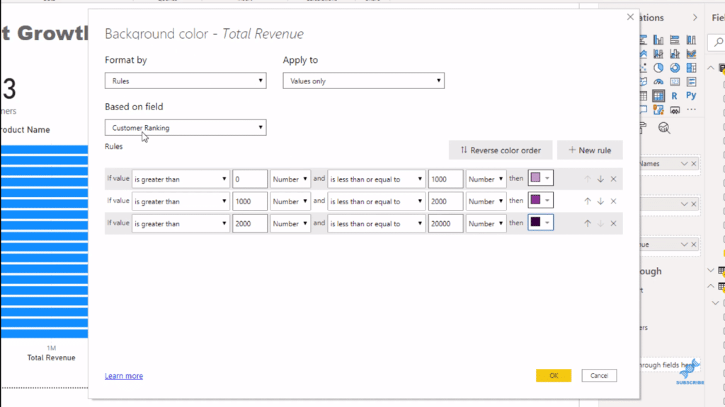
These rules are being determined by the Customer Ranking formula. Then, I click OK. And now, with a little bit of additional labelling, we can see, through time, how these customers have jumped or performed.
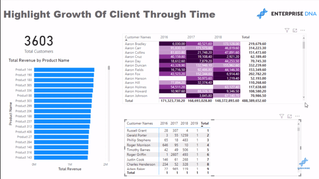
Remember that the lighter shade was our top-ranking customers. That ranking is nowhere in this visualization, but we can see our top-ranking customer; then it looks like they dropped in their rank the following year.
***** Related Links *****
Power BI Visual – Showcase Customer Purchase Dates
Custom Conditional Formatting Techniques In Power BI
Analysing Customer Trend Using DAX In Power BI
Conclusion
These are great visualization ideas to showcase or highlight how a customer is travelling through time.
You can use different techniques here to showcase them in your own way. Here, I’m using years. You can use any number or timeframe. You can adjust the colors and also the rules as you like to match your report.
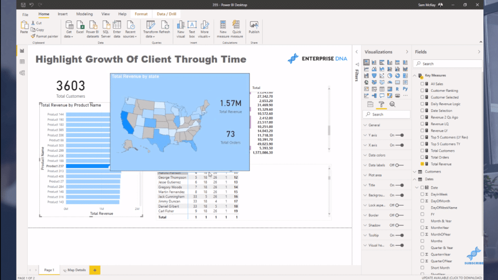
You can also add this tooltip for additional information. If you want to create something like this, check out my video tutorial about placing dynamic map visualizations in a tooltip.
I hope that this tutorial gives you some unique visualization ideas to showcase your report analysis in an interesting and more compelling way.
All the best!
Sam


