In this tutorial, we’re really going to use Power BI as an analytical tool to analyse customer trend. We’re going to work out how we can find our customers that are purchasing behind trend. You may watch the full video of this tutorial at the bottom of this blog.
We want to know this so we can keep a really close eye on how our customers’ purchases are going. We know that our top customers are going to bring the most of our profits, so we need to make sure that they are purchasing as they should be, based on historical trends.
We can analyse these insights really effectively in Power BI. I’m going to show you how you can do it by combining many techniques, not only with the data model, but more specifically with DAX formula.
Drilling Into Customer Trend
In this demonstration, we’re analyzing trends by using a rolling total, so we’re going into how to calculate rolling sales over 90 days.
What’s cool about this is that we can look at any time frame, go back historically, and see the trends in our sales and make some analysis.
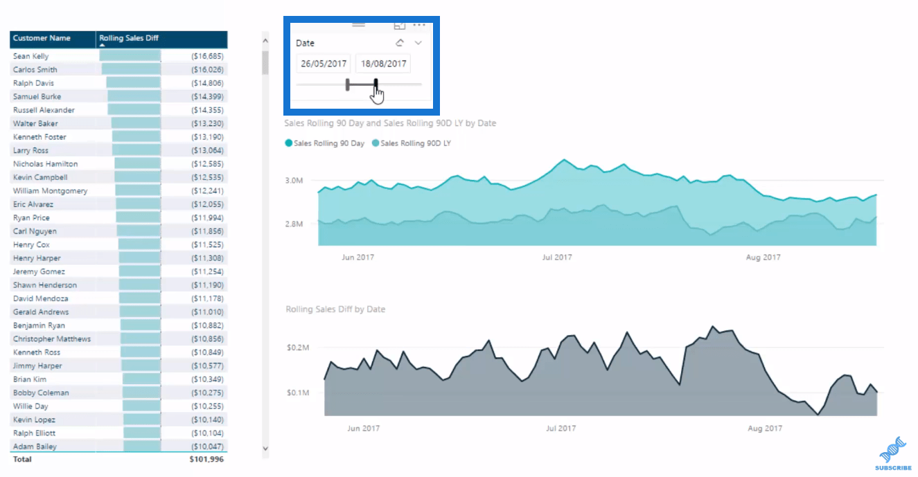
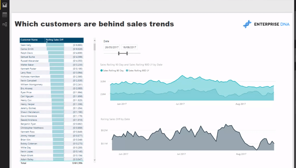
Here we’re comparing sales rolling this year versus last year. This is a great way to compare trends over different time periods, and so we use some time intelligence functions.

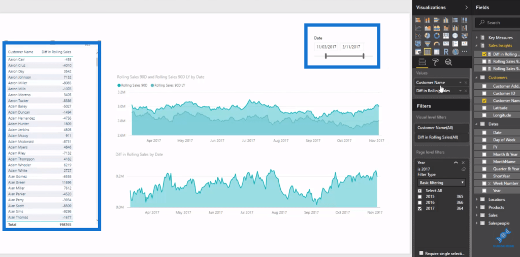
Down this table below, we look at the difference, which showcases the divergence and trends.
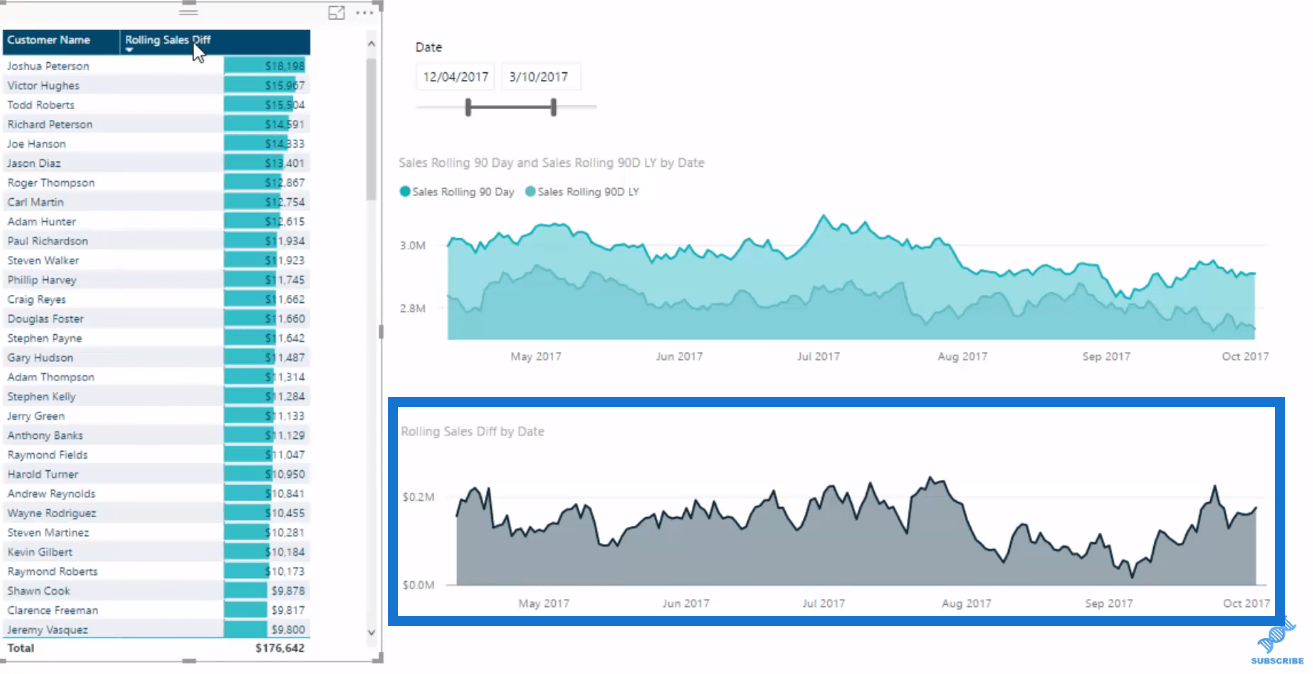
Another great thing about this is that we can actually drill down into every single customer.
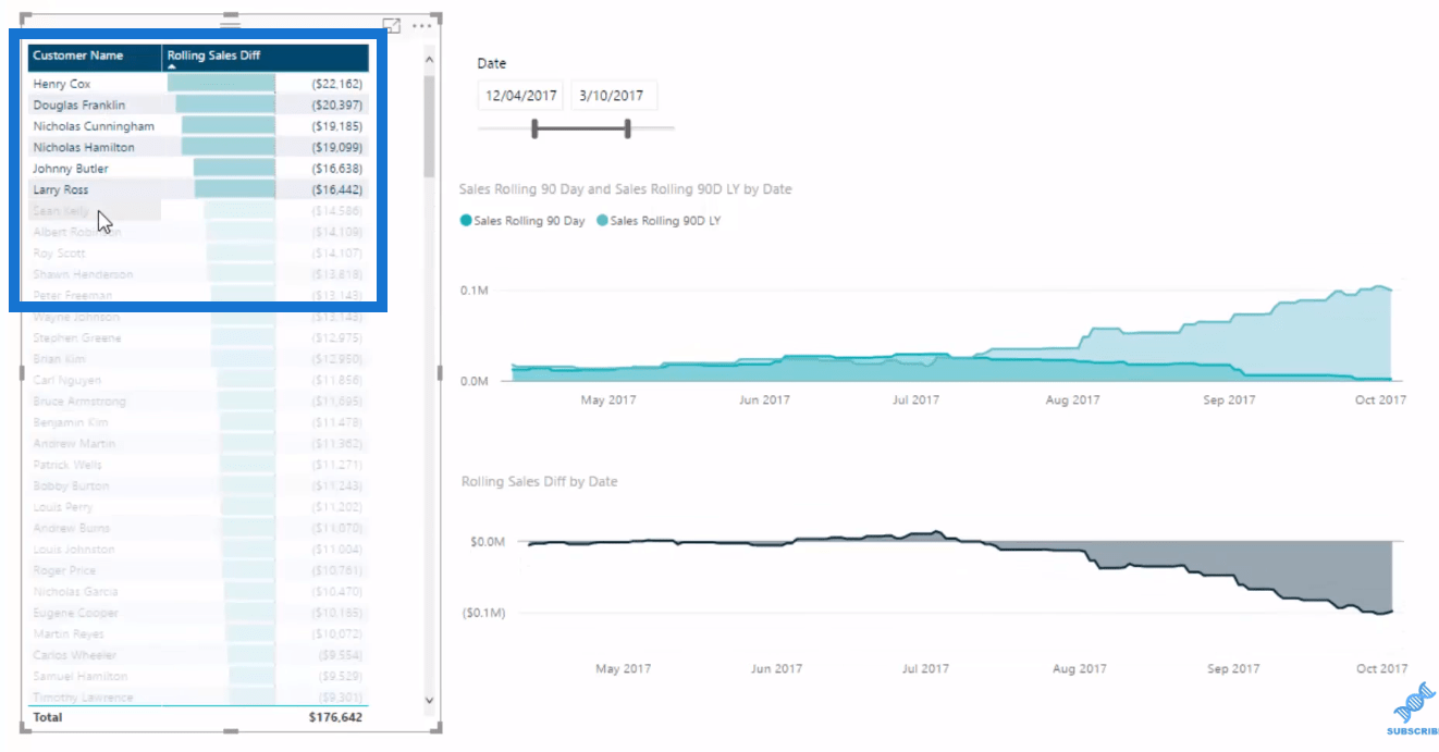
The other two charts on the right side are looking at our entire portfolio of customers, while here we can see our customers, and really drill and see what they are buying or what they aren’t buying, so on and so forth. This will provide us some insights whether they’re way behind trend or way above trend.
If we drill into some very specific customers here, we can see where the trend change is, and we can really get some great insights from this.

This is what’s amazing about the new tables in Power BI. You can multi-select customers, and then utilise the power of the DAX formula and get significant insights.
Creating The Measures
Now I’m going to show you how to do this starting from scratch.
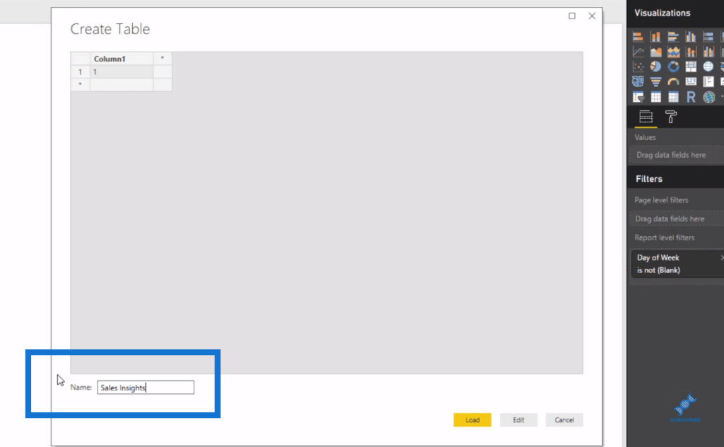
So, first we create a new measure table. We go Enter Data, and name it Sales Insights.
Then, we can create our Rolling Total. I’ve showcased the Rolling Total in another tutorial, but here I want to show you how to create this with the DATESBETWEEN, which is a really cool time intelligence function.
We’ll call this measure, Rolling Sales 90D. Then, we’ll use CALCULATE Total Sales, and DATESBETWEEN on the next line.
What DATESBETWEEN does is that it allows us to put a start date and an end date, and then calculate up between those dates.
Next, we put on our Dates and create a dynamic 90 days back. We go MAX Date here, will which return the current days in the context. We put – 90, and then go MAX Dates again on the next row.

We push enter, and then put it inside our table. We’ll be drilling into 2017, so we create a filter for that.
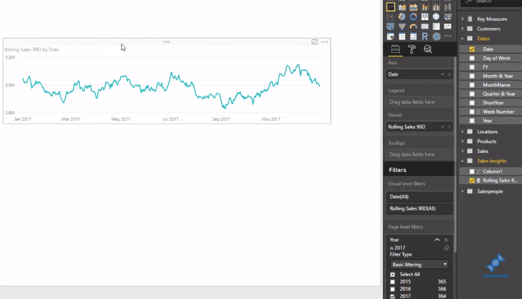
Since we want to see the trends, we look at the rolling 90 days, but not this year. We will look at last year. This is where we can branch out into some further time intelligence.
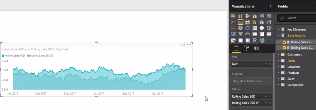
So we create a new measure, and call it Rolling Sales 90D LY (for last year). We use CALCULATE function, then our Rolling Sales 90D, and SAMEPERIODLASTYEAR with our Dates column.

We’re doing exactly the same calculation, but we’re doing it one year with the SAMEPERIODLASTYEAR function, which allows us to jump back in time.
As we put this into our visualization, we can see the rolling sales this year versus last year in 90 days.
Moreover, we can branch out further to see the Difference in Rolling Sales. To create the measure, we simply minus rolling sales last year from this year.

We put it into our visualization, then add our Dates slicer so we can look at any time frame. Then, we utilise our data model and create another table for our Customers. We add our Difference in Rolling Sales as well.
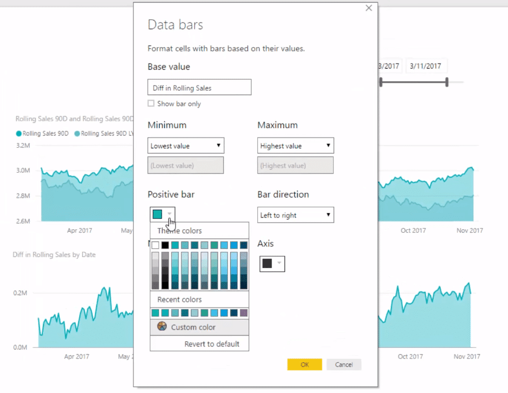
Furthermore, we use these Data Bars to make this table really pop out. To do this, we simply go Conditional Formatting. We just change a few of the colors, sort it, and change the format to dollars.
And now we have an amazing dashboard with lots of great insights to extract.
***** Related Links *****
Running Totals in Power BI: How To Calculate Using DAX Formula
Calculate Rolling Totals Using DATESBETWEEN In Power BI
How To Track Sales Trends Through Time In Power BI Using DAX
Conclusion
By combining techniques, you should be able to work out which customers are purchasing behind trend – in real-time or for any time frame you specify.
Think about the follow-up actions that could occur from diving into this insight. We could inform the sales representative or regional manager that we should be going out and meeting these clients, we should be communicating with them, and we should be offering them promotions.
By doing so, we will be managing the effectiveness of our sales cycle and our selling strategies out there in the market.
Power BI is an incredible analytics tool that enables you to put some great analysis like this together in a relatively efficient way.
Dive in and have a look at how you can do this, and then try and visualize how you can actually implement this with your own data, in your own models. This will add a lot of value to your organization.
All the best!
Sam


