In this tutorial, you’ll learn about the essential things that need to be prepared in making a dashboard. You’ll learn how to catalog and apply your measures, and make compelling visualizations in Power BI.
Your visualizations will show data based on the measures you created. Thus, it’s important to properly set them up.
Cataloging Your Measures
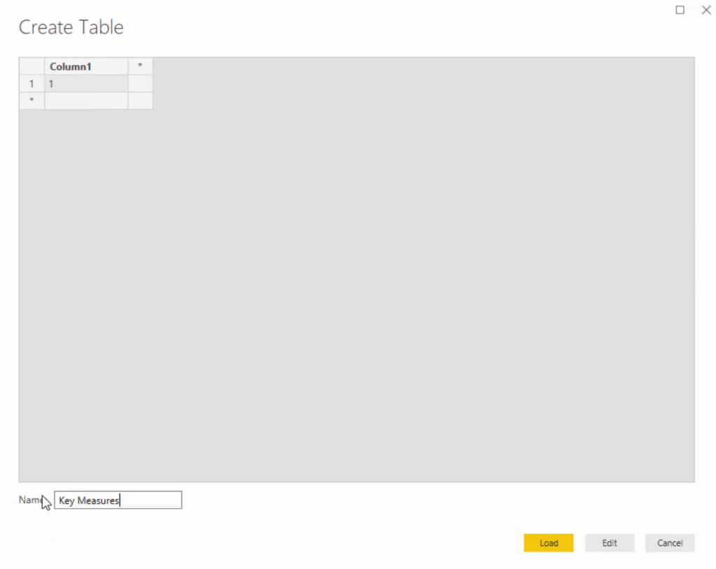
The first thing you need to do is create a measure table. Measure tables sort and catalog your measures for easier access and prevent them from being scattered in your tables.
Go to Enter Data and input 1. Name it Key Measures.
Creating The Visualizations And Measures
Next, create a measure and call it Total Revenue. Then, use the iterating function SUMX to iterate through the Sales table. For every single row in the Sales table, multiply the quantity to the price. Since the price is in the Products table, use the RELATED function and then find the Products Current Price.

The RELATED function can reach up the relationship with the Lookup tables. It will reach the Products table that has the current price of the items.
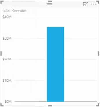
If you drag this measure into the canvas, you’ll get a result along with a decent insight. Also, don’t forget to change the format to U.S. dollars.
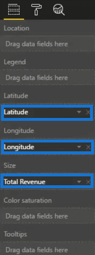
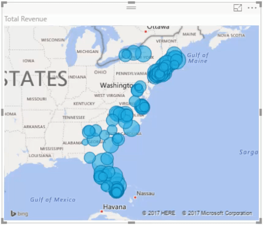
Next, project information based on location and retail sites by creating a map visualization and adding Latitude and Longitude from the Location table. Place the Total Revenue measure under this visualization’s Size.
Doing this will give you this result:
For the next measure, you need to calculate Total Costs. Create a new measure and copy and paste the Total Revenue formula. Inside the Product table, change Current Price to Costs.

To calculate Total Profits, create another new measure and subtract Total Costs from Total Revenue.

Make sure that all the measures’ format and units are correct and the same.
From there, turn the total revenue visualization into a table and then bring in the Date from the Dates table to get information on a daily level.
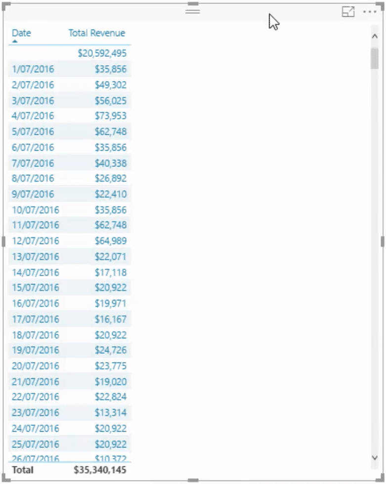
On the first row, you can see a revenue worth 20 million dollars that doesn’t have a date. This means that your date table doesn’t cover the entire range that you placed inside your data set.
Correcting Erroneous Results
The formulas you made won’t work for the uncovered dates so you have to make your Dates table bigger.
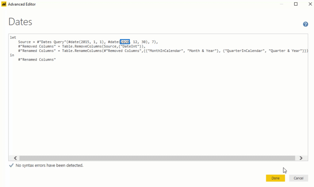
To do that, go to Home and then to Edit Queries. Click your Dates table and then go to Advanced Editor. When you get there, change the date to 2020 and then click Close & Apply.
If you go back, you can see that the table now starts with July 1, 2016 and ends on the last day of 2019.
The visualizations in Power BI show results based on the syntax made in the queries and measures.
The next thing to do is grab a dynamic time frame. In this example, I’m using the data from the Excel file as part of the resources pack included in the course. After this, go find Date_Ranges and bring that into your model.
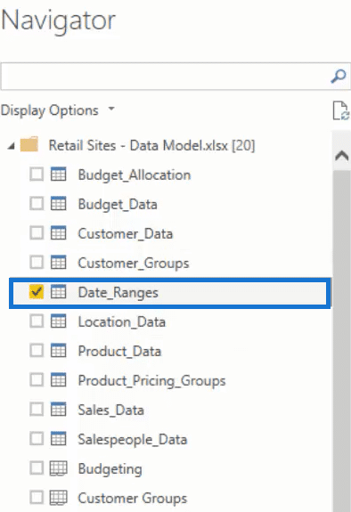
You can now see all the information that you need to run your analysis. After that, click Close & Apply.
Adding More Calculations
Change the sort order by the Index.
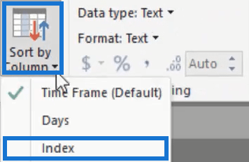
If you bring that in the canvas, you’ll see the sort order. Turn it into a horizontal slicer, get rid of the header, and place it at the top of the dashboard. To make it pop out, add a background.

For the slicer, make a formula that will show information and visuals based on the time frame selected. But before that, you have to figure out what day time frame occurs from a selection.
Create a new measure, call it Time Frame Selected, and then use the SELECTEDVALUE function. Inside that function, add Days as the ColumnName and 360 as the AlternativeResult.

If you bring it into the canvas and turn it into a card, you’ll get a number that represents the selection made.
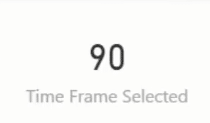
Using SELECTEDVALUE allows you to quickly pick out the selection you want.
Next, you need to feed that into a DAX measure that will showcase only the revenue or the metric for that specific time frame.
So, create a measure and call it Revenue within Time Frame. In the next line, use CALCULATE to calculate the Total Revenue for a certain time frame. To create that timeframe, use FILTER to filter Dates. Input Date is less than or equal to TODAY and Date is greater than or equal to TODAY and subtract the Time Frame Selected.

Removing Unnecessary Data
For the map visualization, change the Size to the newly created measure.
If you drag that into the table, you’ll see that everything is blanked out except the days selected in the time frame you’re showcasing. Don’t forget to change the format to U.S. dollars.
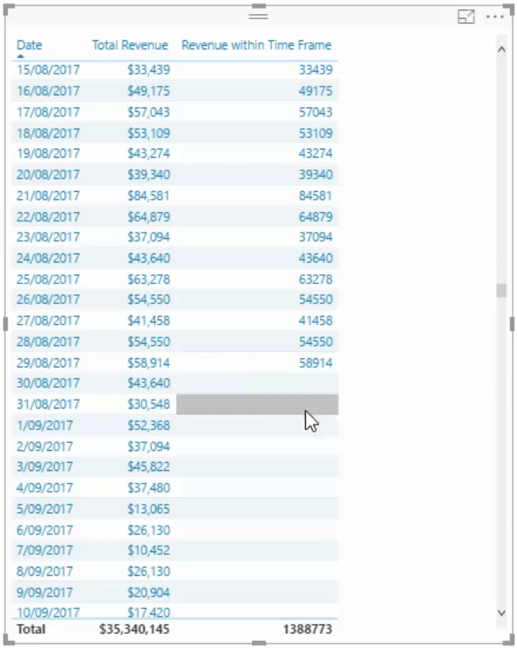
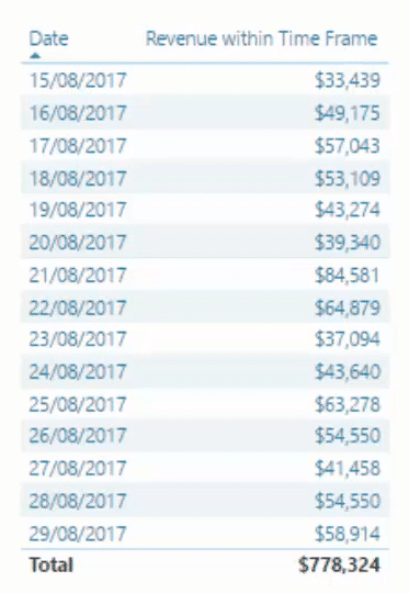
When a blank value occurs in Power BI, it means it doesn’t return anything. To fix that, get rid of Total Revenue in the table. You’ll now get a smaller table that expands and contracts based on the selection you choose.
***** Related Links *****
Quick Measures – How To Use Them In Power BI Models
How To Use The Built-in Analytics For Power BI Scatter Charts
Sorting Dates By Financial Year In Power BI
Conclusion
The relationship of each element greatly affects your entire work. Every calculation inside the visualizations in Power BI will help you obtain valuable and insightful data.
Measures and visualizations work together to help create a compelling dashboard in Power BI.
All the best,
Sam


