In this tutorial, we’re going to talk about how to use the Remove function to create a delete button in PowerApps. We’ll also cover how to set a confirmation popup for the delete button.
The delete button might seem like a minor function in any app, but it still plays a critical role in making any app efficient and convenient to use. If you’re dealing with records that might need to be updated every so often, having a delete button would make it easier to remove any outdated items.
Adding A Delete Button Using The Remove Function
Let’s start by adding a button here through the Insert ribbon.
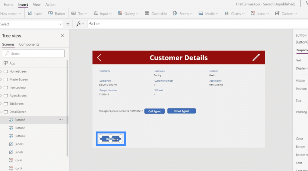
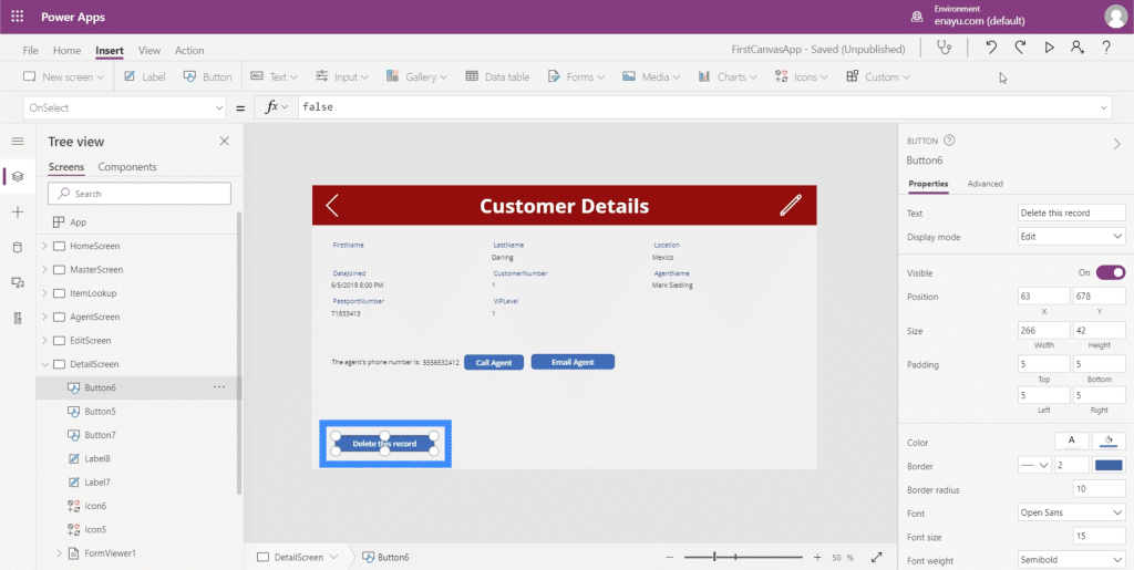
Then, let’s change the text on this button. We’ll call it “Delete this record”.
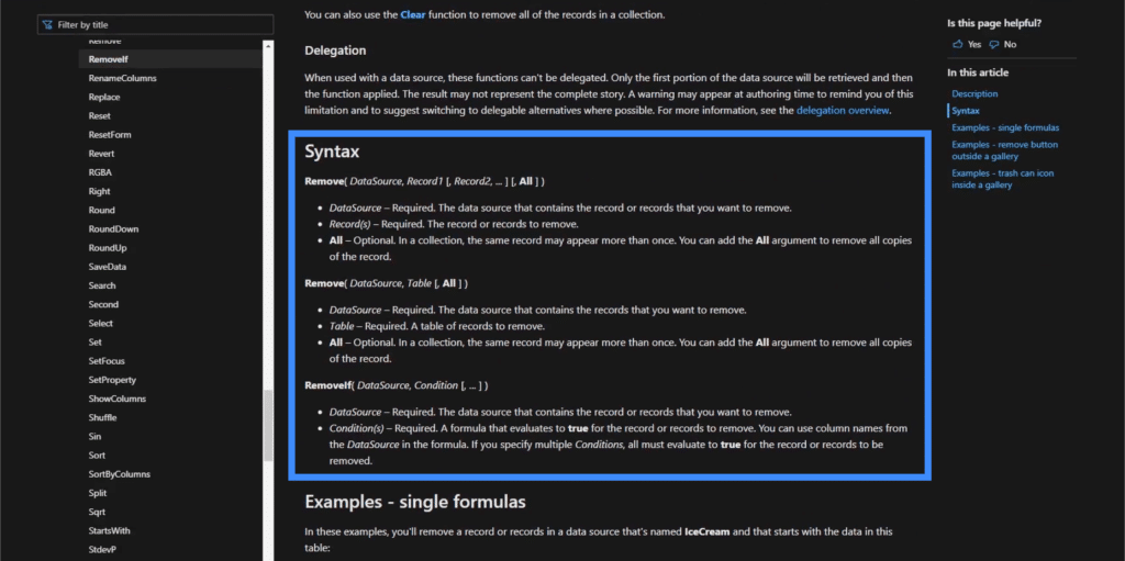
In a past tutorial, we emphasized how useful Microsoft docs are in figuring out the syntax for the functions we use on Power Apps. If we check out what it says about the Remove function, it says that Remove takes a data source and a record to remove.
Let’s apply that to our button. We’re going to start off with the Remove function, then reference Table1 since that’s where the record will be coming from.
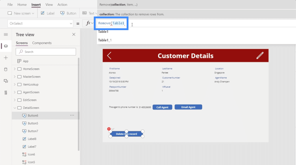
Then, it needs a specific item. Going back to our goal, we’re aiming to delete whatever item is showing up in this form on our Customer Details screen.
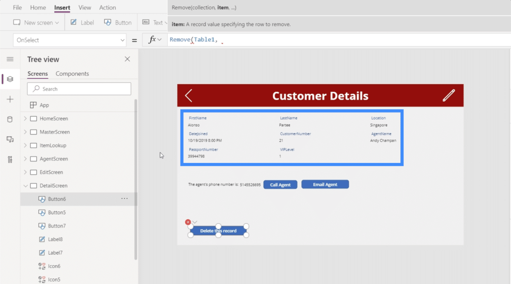
If we go back to our form viewer and look at that particular item, it shows that this element is equivalent to Gallery2.Selected.
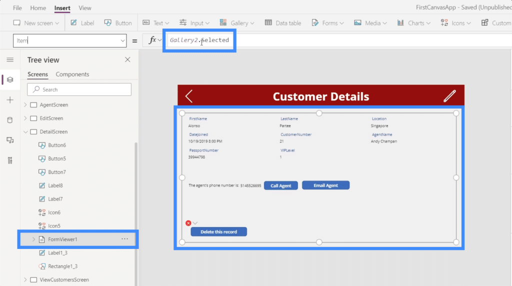
So let’s copy that, go back to the delete button we’re working on, and paste that in our formula.
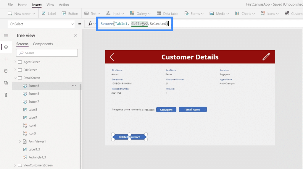
Now, our completed formula shows Remove(Table1, Galler2.Selected). It’s basically saying that whatever record is selected and showing up on the gallery, that’s the record we want to remove.
Let’s check if it works. Currently, the record showing up in the gallery is for Alonso Partee. Let’s click the delete button.
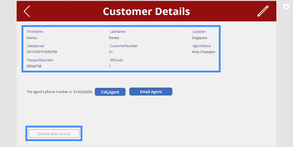
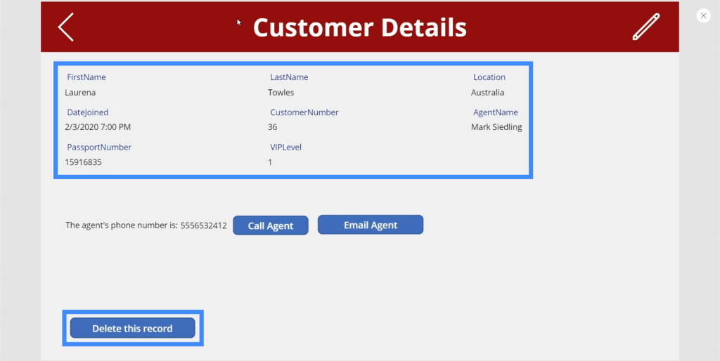
Once the record is successfully deleted, it disappears from the gallery and the next record will show up. In this case, we now see Laurena Towles because the record for Alonso Partee has been deleted.
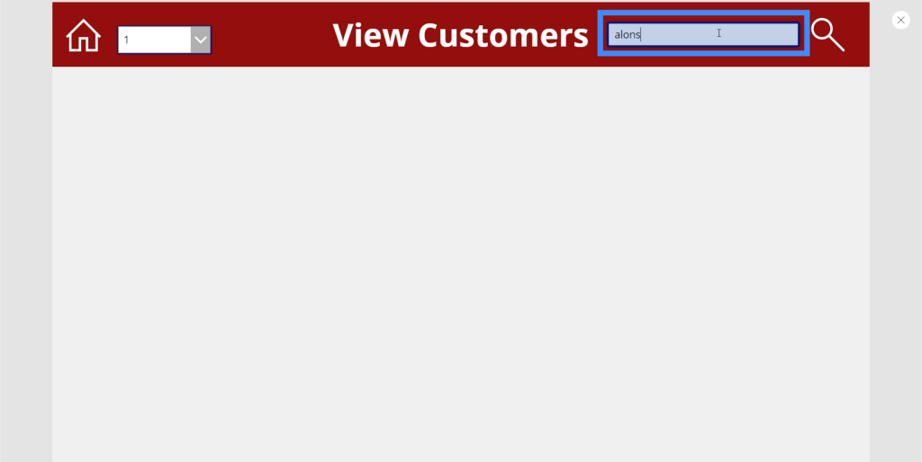
Just to confirm that the record really is gone, we can use the search bar here in the View Customers screen. As you can see, no records are showing up when we try to search for Alonso’s record.
Adding Navigation After Deleting A Record
To make it more convenient for end users, let’s add some navigation so that the user is automatically led back to the View Customers screen after the record is deleted. To do that, we’re going to use a semicolon. Adding a semicolon to a formula allows you to use more than one function.
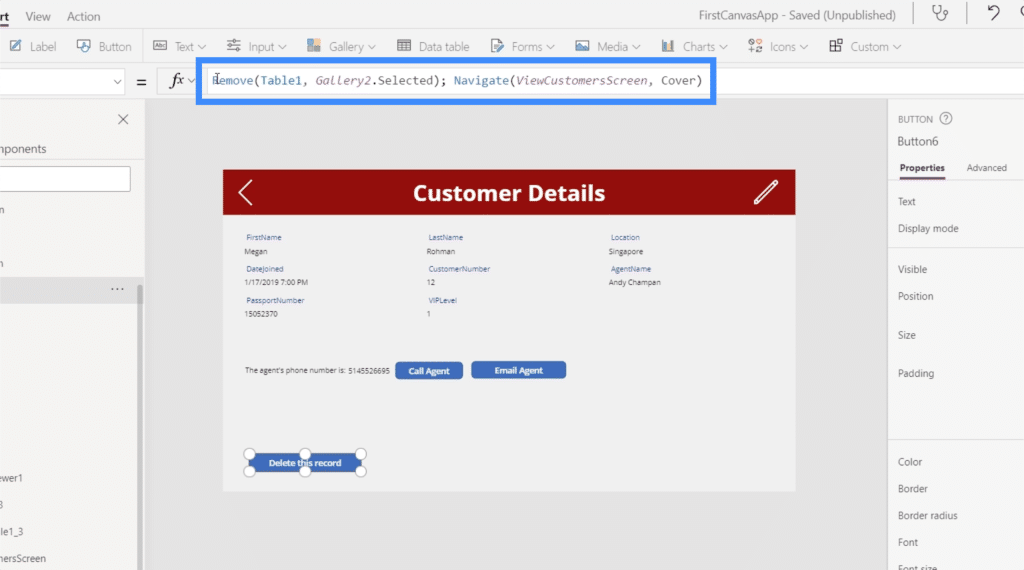
So we’ll use the Navigate function and reference the ViewCustomersScreen. Let’s also add a screen transition so that the flow from one screen to the next is smoother.
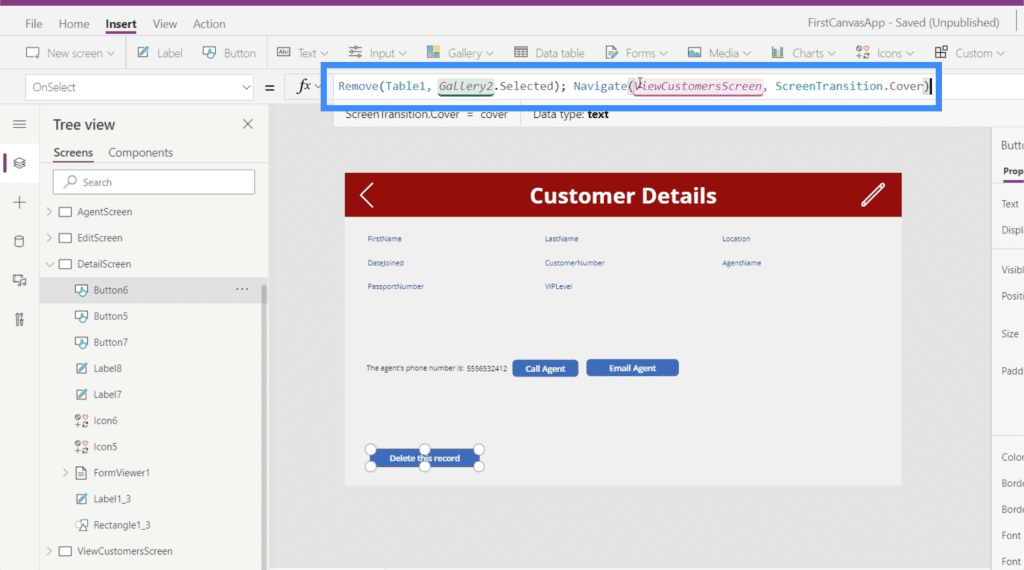
With a semicolon in the middle, it also adds an order to the way the functions work. Looking at our formula, the semicolon tells the system to apply the Remove function first before doing the Navigate function.
With this formula in place, instead of staying on the same screen and seeing the next record, the end user will then go back to the main gallery in the View Customers screen.
Adding Confirmation Popups
Although our delete button is now fully functional, one issue is that there’s no confirmation at all whether the user really wants to delete the record or not. So if someone’s fingers slip across the delete button, for example, some records might accidentally get deleted. That’s why it’s important to have a popup screen that confirms whether the user really wants to delete the record or not.
Not that confirmation popups can be used for various purposes, and not just to avoid accidental deletion of records. But for the sake of this example, we’ll focus on the delete function.
The first thing we need to do is go back to the formula attached to the OnSelect property of our delete button. Since we want a popup screen to come up first before anything gets removed, we’re going to remove this formula here and paste it on a notepad because we’re still going to use that later on.
Then, we’re going to replace it with the UpdateContext function, since we want to update a variable when we click on the delete button.
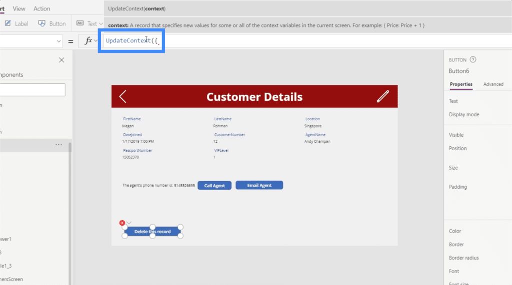
Let’s call the variable Confirmation. So if the user clicks on the button, we want the user to confirm first before actually deleting the record.
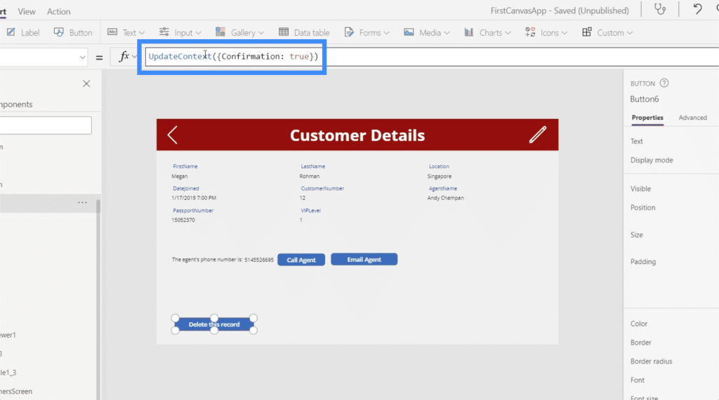
Now, let’s create our popup. We’ll add a rectangle icon and resize it so that it covers the entire screen. This will serve as the background of our confirmation message.
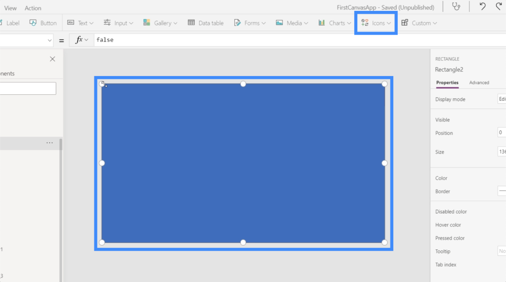
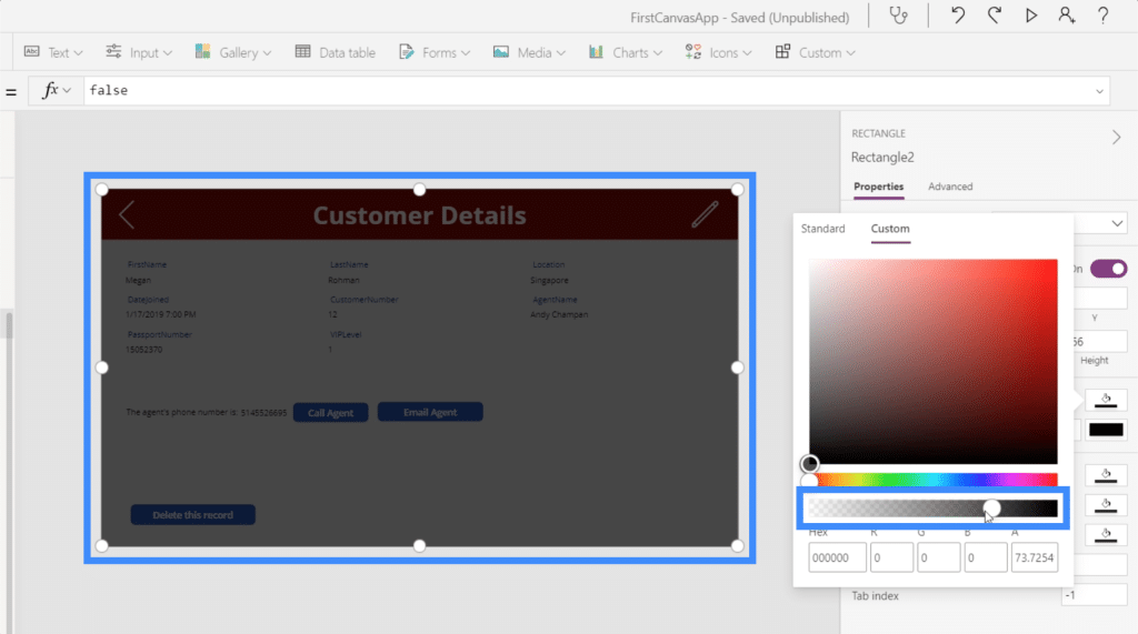
We’re going to edit the color and make it black.
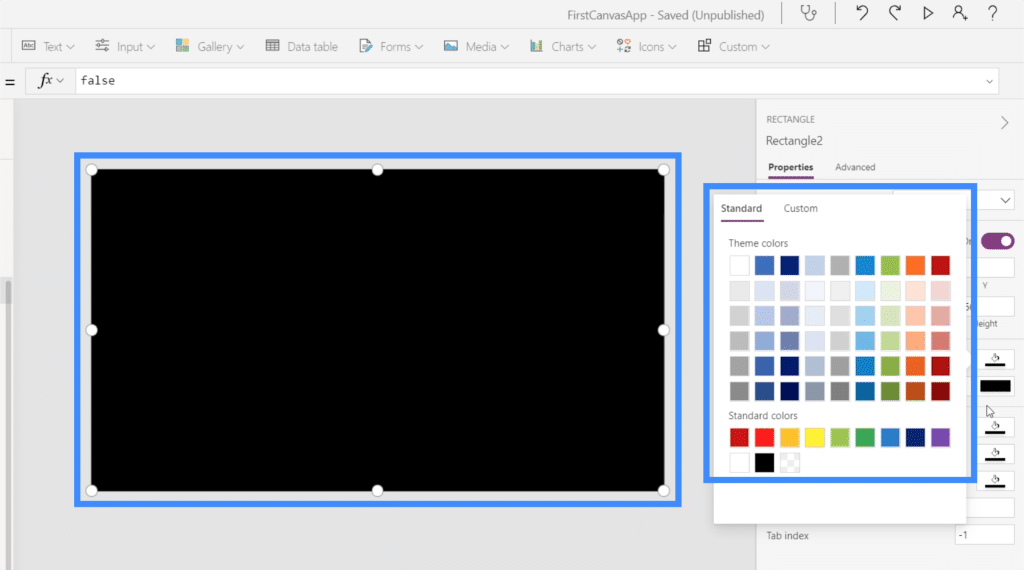
Then, let’s also change the transparency so that you can still see a little bit of the background, but darker.
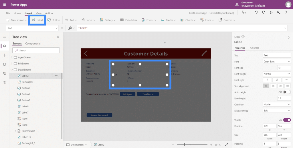
Next, let’s add a label, which will contain the confirmation message.
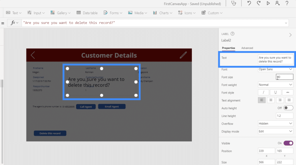
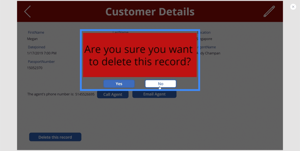
Let’s make our confirmation message, “Are you sure you want to delete this record?”
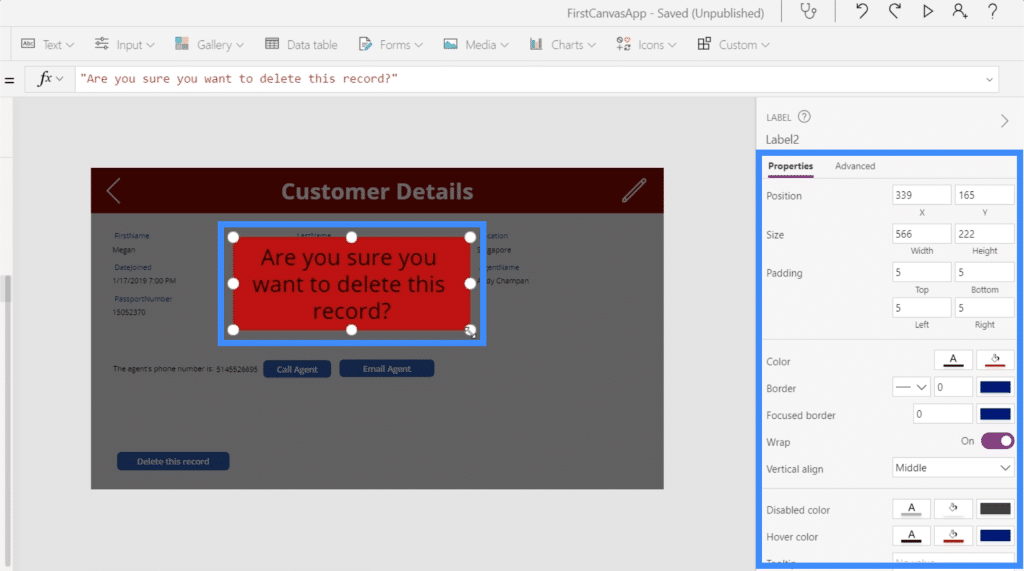
It’s important that this message is clearly seen, so let’s make the background red. We’ll make the font bigger and put everything at the center. You can find all these customization options on the right pane.
We’ll also need “Yes” and “No” buttons, so we’ll add two buttons here and change the text for each button.
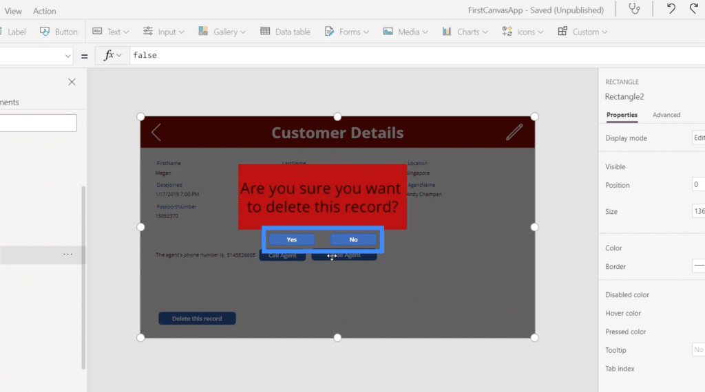
So when someone clicks the delete button, these elements will show up. Then, the app will wait for the user to click on either Yes or No before anything happens.
Let’s start working on the Yes button first. We’ll highlight it and choose the OnSelect property, then we’re going back to the formula we saved earlier using the Remove function and copy it here.
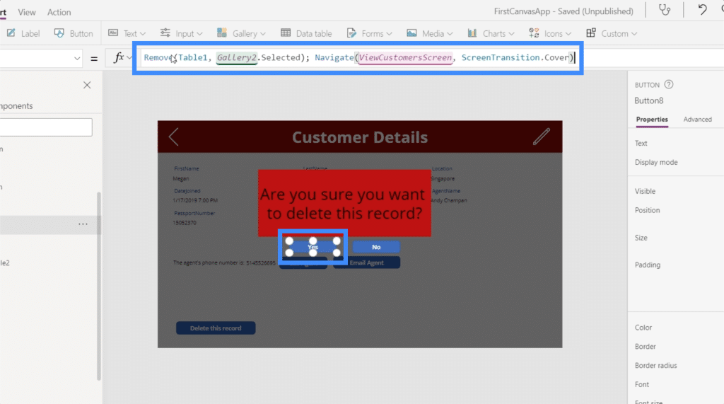
Again, this formula prompts the system to remove the selected record first, then navigates to the View Customers screen.
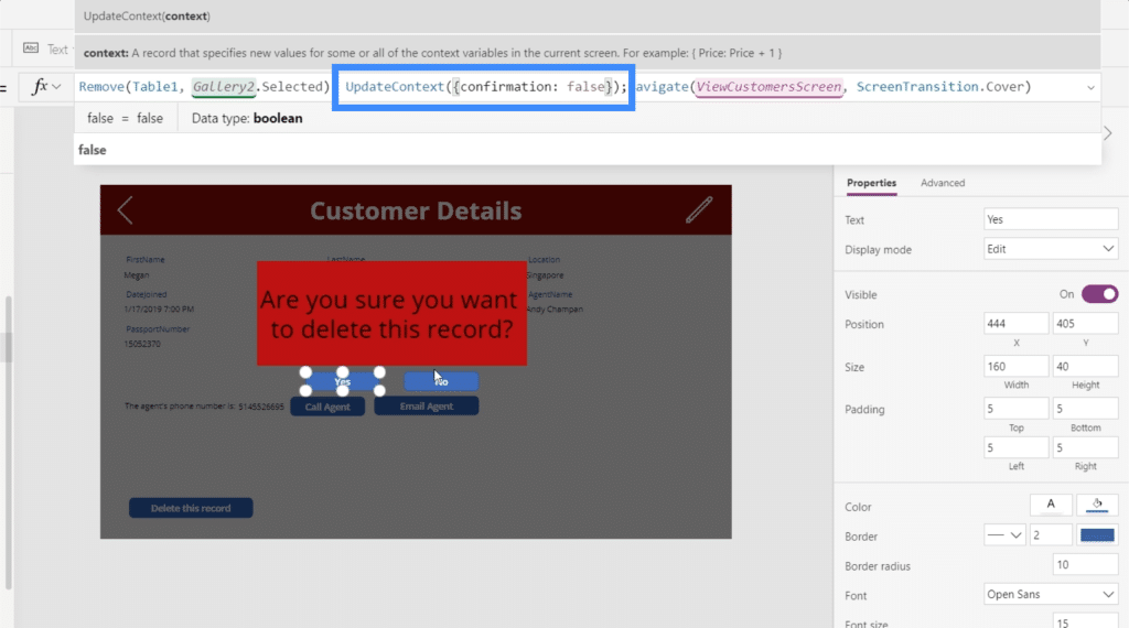
However, we also want to update the context of the confirmation variable back to false because technically, the user has already confirmed their decision to delete the entry by now.
That’s why we’re going to add the UpdateContext function here. We’ll use the variable confirmation, and will set that to false.
Next, let’s work on the No button. This is going to be easier since we just need this confirmation screen to go away and not do anything else when the user clicks No. So we’ll use the UpdateContext function again and reference the variable confirmation and set that to false.
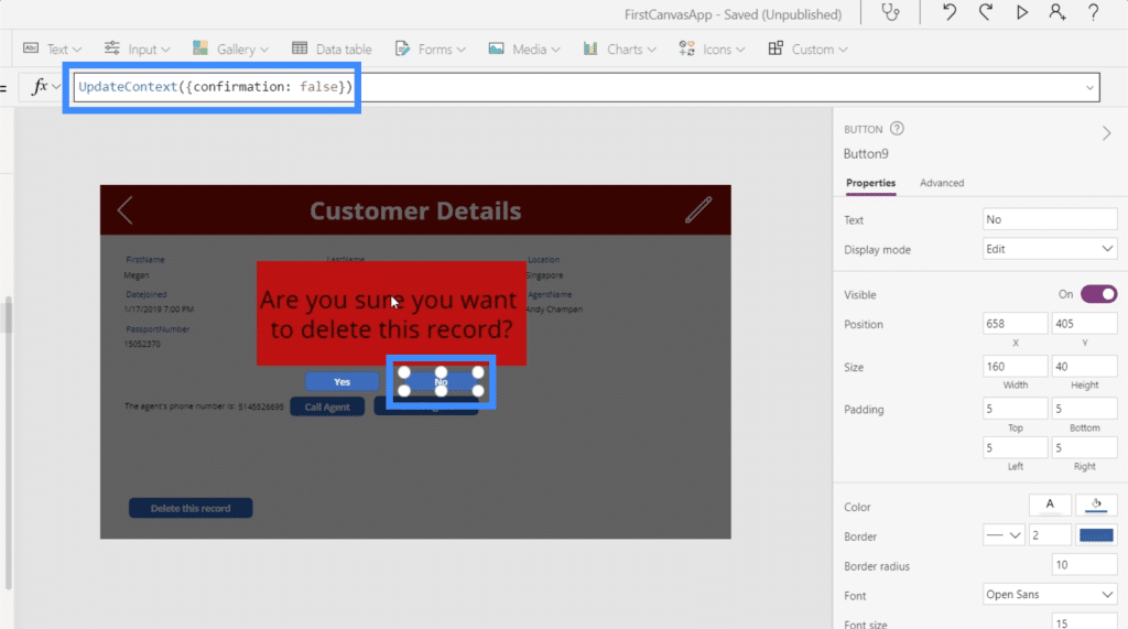
So when the user chooses No, ideally, the entire confirmation popup will just disappear.
Grouping The Confirmation Popup Elements Together
At the moment, the Yes and No buttons will not work just yet. That’s because the confirmation popup is not just about the button. It’s about a group of elements that include the black background, the label, and the two buttons.
We want to group them together and change the visibility based on the confirmation variable. We talked about grouping elements together in a previous tutorial.
Let’s click on each of the four elements here while holding the Ctrl button to highlight them all.
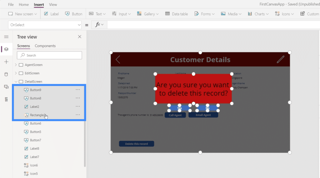
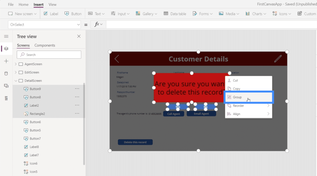
Then, we’ll group them together by doing a right click and choosing Group.
Now, they’re all part of the same group, which is Group1.
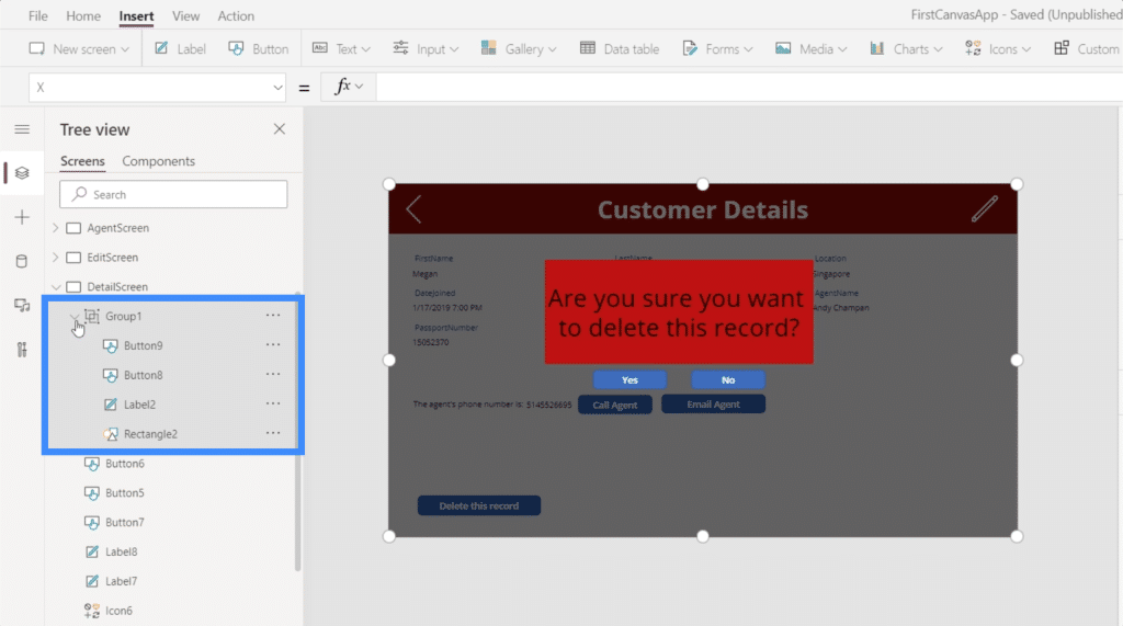
Since we want to modify the visibility of Group1 to only show up if the confirmation variable is true, we simply set that to confirmation.
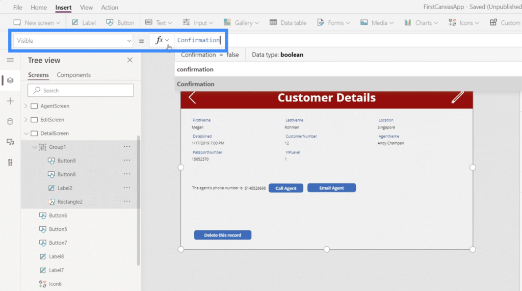
Now, the popup will only come out if someone clicks the delete button. This will then update the context of the confirmation variable to be true, which means that the visibility property of Group1 will also be true. From there, the end user can choose Yes or No.
***** Related Links *****
Power Apps Introduction: Definition, Features, Functions And Importance
Power Apps Environments: Setting Up The App Elements Properly
PowerApps Functions and Formulas | An Introduction
Conclusion
Truly, Power Apps is such a powerful platform especially if you want to let other people see and engage with your data through an app.
Even the smallest functionalities can completely enhance the user experience. The great thing about all these is the fact that you can create your own app from scratch even if you have zero background on app development.
Adding the confirmation popup and creating a delete button are just the tip of the iceberg. There are so many other functionalities that you can add to make your app as intuitive and functional as possible.
All the best,
Henry


