In this blog, I showcase ranking DAX measures to analyse something really practical and get amazing insights inside Power BI. It’s to work out the total sales of my top 3 salespeople based in any region. You may watch the full video of this tutorial at the bottom of this blog.
A really interesting insight, right? It might seem relatively intuitive, but actually implementing this inside of Power BI is not that easy.
You need to understand how to write a DAX formula that achieves this particular insight based on the context that we place it into.
The context is going to be the particular region, and then for any of those regions, we’re going to analyse all of the salespeople, understand if they’re in the top 3, and then count up the sales that they actually contribute.
When would you need to look at this sort of information?
From a risk mitigation perspective, it’s worth finding out if all of your revenue is clustered around a small number of people.
If those particular people left their sales regions, then all of a sudden your business in that particular region would contract significantly. I dive much deeper into how you’ll actually implement this during the tutorial.
I also show you how you could visualize this in a compelling way. Combined with the DAX measures, you’ll be able to see that Power BI can extract these high-quality insights effectively and dynamically.
If you can understand this formula and how to implement it, many things open up for you analytically in Power BI. Dive into the tutorial and try and learn as much as you can.
Walk Through Of The Data Set
This sample data set is a very generic one. We have our small and big regions here, wherein the bigger regions have more salespeople that are far more distributed than the smaller regions, obviously.
What’s cool is that we can dive into this information dynamically. With the new table features and the data bars that are created, we can look into this visualization and drill deeper, extracting more significant insights.
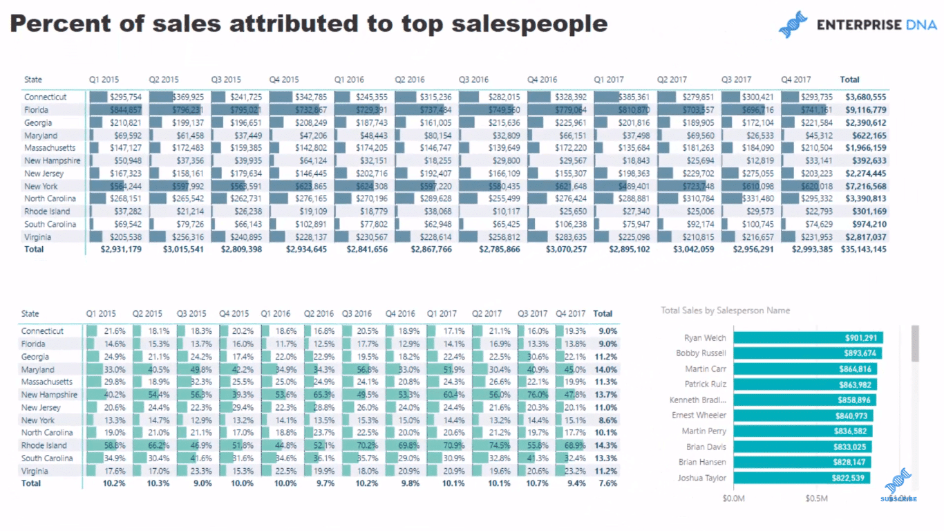
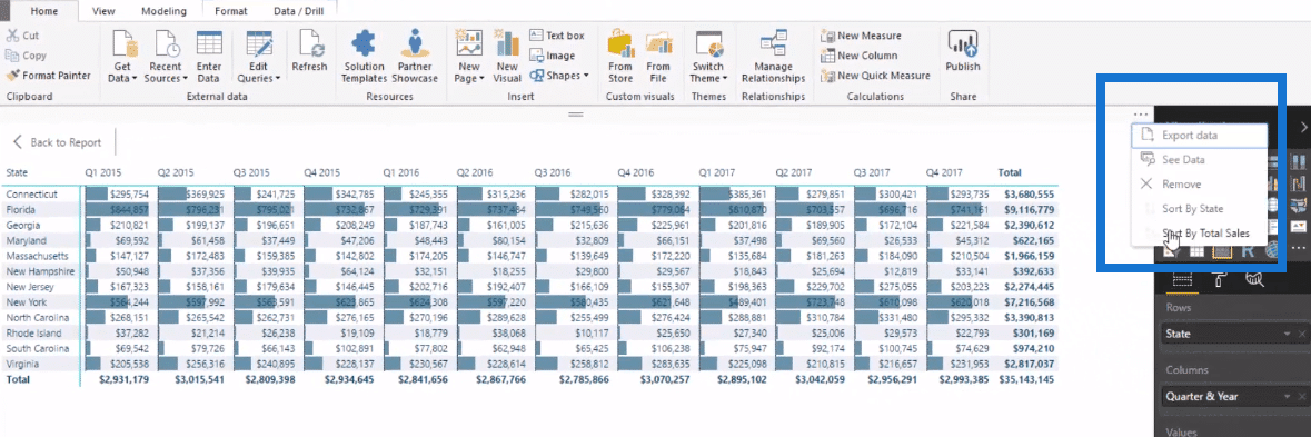
Here we can see that Florida is one of our biggest sellers. We could rank this, or Sort by Total Sales to see clearly our top sales down to our bottom sales.
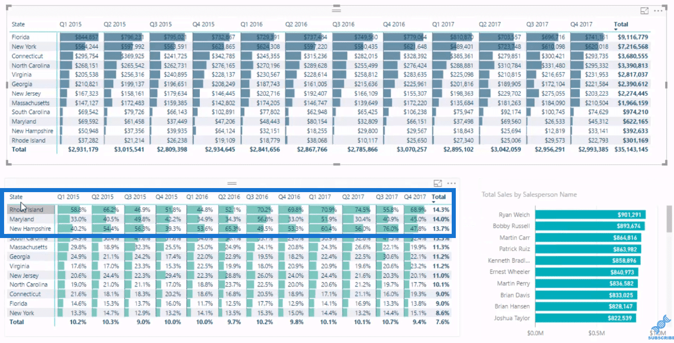
Through the data bars, we can see where our biggest risks are, showing Rhode Island as one of them.
We can select a state, and it will give us the information on how much we actually made in each of these quarters. And by that selection, we could see all of the salespeople in that region as well.
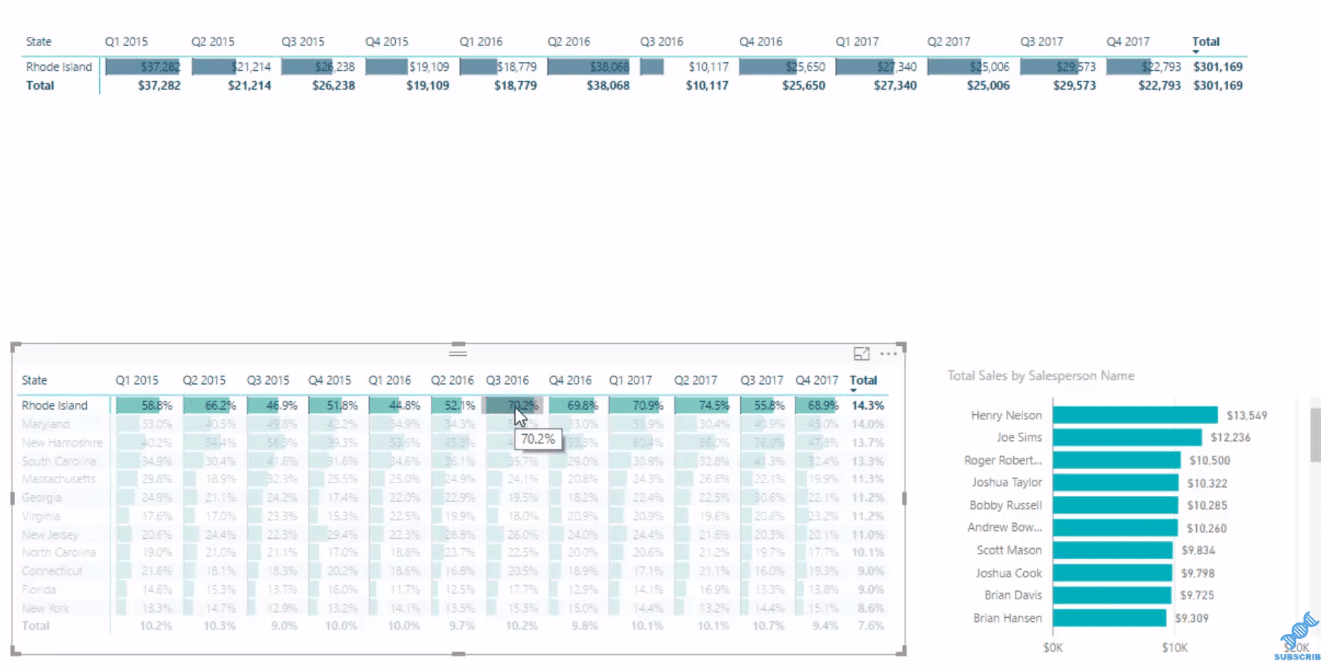
So if there is an outlier, we could actually select the particular quarter and the number with the data.
For instance we choose Quarter 3 in 2016, we could see we have more than $10,000 sales and 70% went to our top 3 salespeople, as I set in it top 3.
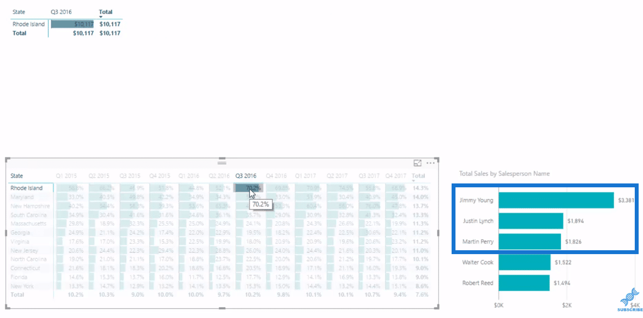
We can also drill into our salespeople and see how much they sell and why this is 70%. How far you could dive into this information to extract the insight is just incredible.
You could identify any outliers so quickly and be able to see why it’s an outlier. We can click to any time frame on any state and see each sales per salesperson.
Working Out The DAX Formula
Let me walk you through how to create the formulas that you’re required to create this visualization.
These are not easy formulas. There are few steps that you have to go through to actually make it work, and the biggest is actually calculating how much of our sales is attributed to our top 3 salespeople.
Now we already have our Total Sales, which I demonstrate in a lot of my other tutorials.

So we go to New Measure and create our Top Sales People Sales formula.
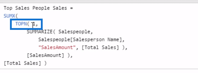
We will use SUMX, and then go down to another line, where we’ll put a virtual table using the TOPN function. We’ll put 3 here because we are looking for our top 3 salespeople.
On the next row, we go SUMMARIZE Salespeople, which is another virtual table. So we’re creating a virtual table within a virtual table here.
Next we go Salespeople, then SalesAmount on the next row, and we’ll use our Total Sales measure. We then filter the TOPN by the SalesAmount.

We’re actually referencing now from a measure in the column “SalesAmount”. We can make a column of information, and reference it inside another table function to create a filter.
It seems complex, but it’s seriously amazing what you can achieve when you start doing these sort of things.
Lastly, we’re going to put the expression in the SUMX, which is our Total Sales.
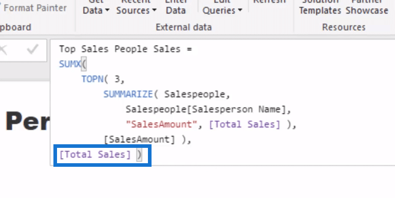
This is a reusable formula, so you could implement it in a number of different ways.
Now we also want to know the Percent of Sales that go to our Top 3 salespeople in regard to all sales.
So once again, we go to New Measure, and we’ll call this % of Sales to Top Salespeople. We’ll just go DIVIDE because we already have the measures. We don’t need to do anything too different from what we already have.
So we divide our Top Salespeople by the Total Sales and add our alternative result, which is 0.

With our formulas ready, we can now do our visualization.
Creating The Visualization
I’ll show you how you can create this visualization using the data bars.
For our first table, we grab our Quarter & Year from our Dates, and go to our Location and find our State. We put Quarter & Year in the columns and our State in the rows. Then, we put our Total Sales in the values.
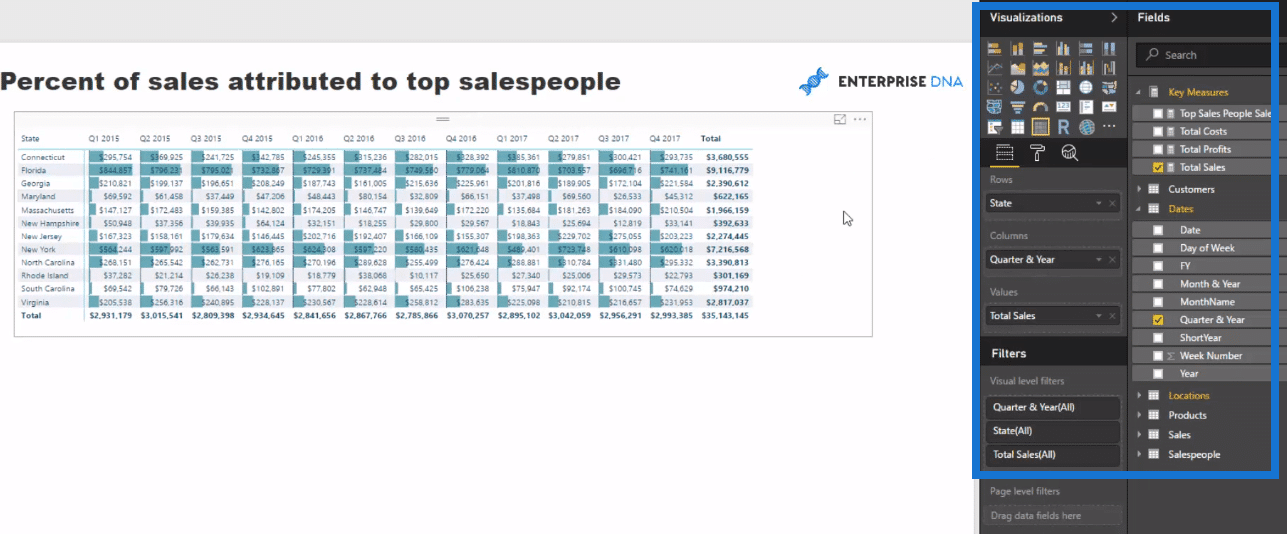
To create the Data Bars, we click this value section here, which is a drop-down arrow, and go Conditional Formatting and click on Data Bars.
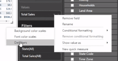
We simply choose the theme color that we want for our data bars here, and click OK.
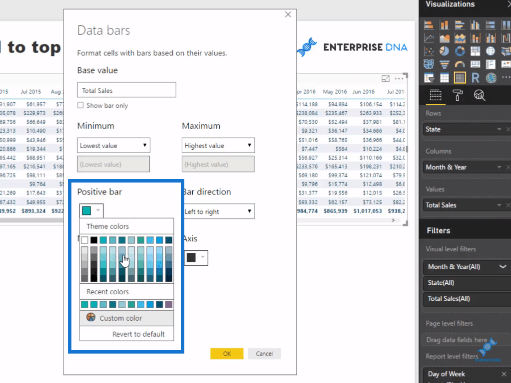
With the data bars, we can see by quarter how many sales we actually made per state. We then sort it by Sales, so we can see clearly the highest down to our lowest sales per state.
We also want to know what’s the percent of sales that goes to our top 3 salespeople in regard to all sales. To do this, we just copy and paste this table down here, and then drag the measure we created, % of Sales to Top Salespeople into the values.
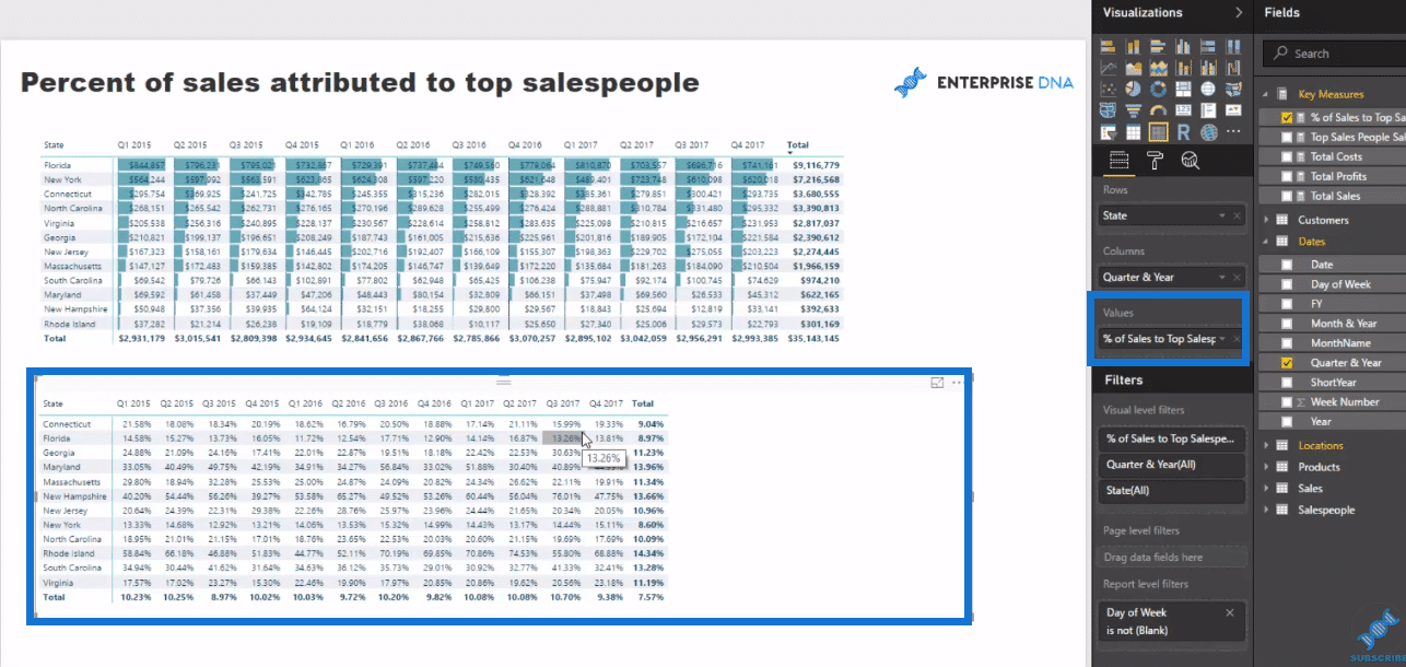
If we compare this table below to the table at the top, it’s not really insightful unless put some conditional formatting on the data bars, right? So let’s use the data bars on this table as well, and then go sort it to give us clear ranking visuals.
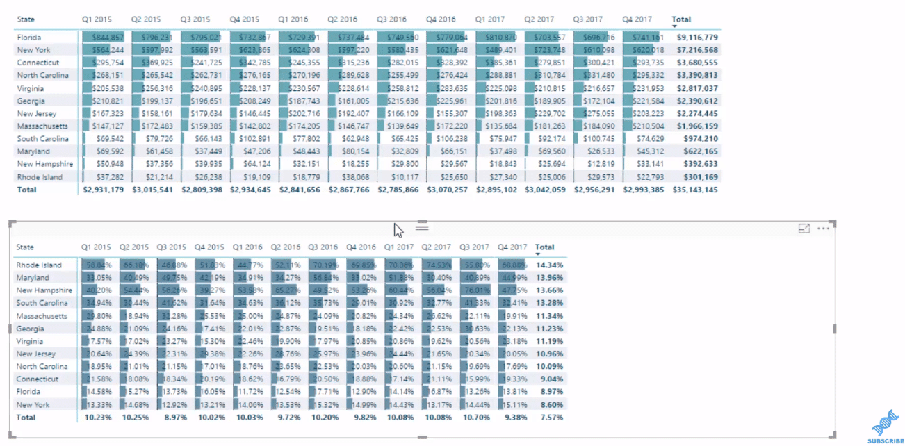
With the data bars, the information are clearly obvious now. We couldn’t achieve such good visualizations like this until the data bars existed.
We could, but we have to create individual Stacked Bar Charts. But it would be so tedious. With data bars, it would be so easy and quick to get these insights.
Lastly, we grab our Salesperson Name, and put our Total Sales against it to create another table at the side. Then, we rank or sort it, and place the filter.
***** Related Links *****
Ranking Insights Using TOPN In Power BI
Create Dynamic Lists of Dimensions using DAX in Power BI
Implement Ranking Logic Across Unique Insights with Power BI – Advanced DAX
Conclusion
By utilizing the new table feature, we have lots of opportunities to drill into the information and get unique insights in Power BI, such as salespeople performance attribution.
In this example, I showcase how effective the features are, together with some efficient ranking DAX measures, in achieving amazing visualizations and sale insights.
We could actually change the formula, Top Sales People Sales, a bit and reuse it. If you really check out the formula, it is just a pattern.
Say for instance, you want to see have the top 1 customer, then we could do that by simply change the number here. This will automatically change the results in the table.
If you are looking to begin mastering DAX formulas, then check out the Mastering DAX Calculations course.
This is where I cover many of the vital concepts around DAX that you need to learn really well to easily implement this type of analytical work across your own data.
Any thoughts or comments, let me know in the comment section below.
Cheers!
Sam


